|
 |
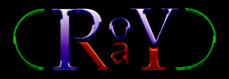
Greetings!
I'm not much good at logos, but I noticed the structural similarities
between 'POV' and 'RAY', and had a brief burst of inspiration.
Once you view the image, this should make sense: 'POV' reads across the
top line, 'RAY' reads across the bottom, and the loops at either end,
well, I just thought they rounded it out nicely.
A more talented soul than I would probably run a spectrum hue through
the loops (or treat them as a hollow, hemispherical cross-section of a
toroid that runs behind the text), and add depth to the stalk of the R,
the a, and the stalk of the Y, to make them stand apart a bit more.
Feel free to rip it off and make better variants, if you think it's got
some value.
In the ongoing search for a cool logo, I just wanted to make sure the
structural aspects of the name itself were recognised.
Henry.
Post a reply to this message
Attachments:
Download 'POVlogoRGB.jpg' (9 KB)
Download 'POVlogoGRAY.jpg' (7 KB)
Preview of image 'POVlogoRGB.jpg'

Preview of image 'POVlogoGRAY.jpg'

|
|