|
 |
In article <38d58747@news.povray.org>, "Bob Hughes"
<per### [at] aol com?subject=PoV-News:> wrote:
> This seems an awful lot of components. I suppose it means the
> randomness causes such lumpiness as to prevent a smoother surface.
> What if a very thin font with very little depth were used, shouldn't
> that help?
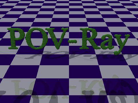
A thinner font does help smooth it out, and I was able to get a little
improvement by tweaking the blob parameters.
I might try a grid arrangement, but I don't think that will do more than
make the lumpiness more regular and predictable.
> And then with large enough sphere components it could be better for
> that.
While larger components will smooth it out, they don't get the details
of the font. Make them too large, and all you get is a slightly
text-like blob of...whatever.
> Although this clumped appearance is very good, I guess it's the
> efficiency people would seek more often.
This may be more efficient than using an external program to generate
the mesh for many uses, and it can do things like julia_fractals and
complex CSG's as well as text objects.
I am attaching a version which uses a different font, some tweaked blob
settings, and 6000 components.
--
Chris Huff
e-mail: chr### [at] yahoocom
Web page: http://chrishuff.dhs.org/ com?subject=PoV-News:> wrote:
> This seems an awful lot of components. I suppose it means the
> randomness causes such lumpiness as to prevent a smoother surface.
> What if a very thin font with very little depth were used, shouldn't
> that help?
A thinner font does help smooth it out, and I was able to get a little
improvement by tweaking the blob parameters.
I might try a grid arrangement, but I don't think that will do more than
make the lumpiness more regular and predictable.
> And then with large enough sphere components it could be better for
> that.
While larger components will smooth it out, they don't get the details
of the font. Make them too large, and all you get is a slightly
text-like blob of...whatever.
> Although this clumped appearance is very good, I guess it's the
> efficiency people would seek more often.
This may be more efficient than using an external program to generate
the mesh for many uses, and it can do things like julia_fractals and
complex CSG's as well as text objects.
I am attaching a version which uses a different font, some tweaked blob
settings, and 6000 components.
--
Chris Huff
e-mail: chr### [at] yahoocom
Web page: http://chrishuff.dhs.org/
Post a reply to this message
Attachments:
Download 'blobbytext2.jpg' (33 KB)
Preview of image 'blobbytext2.jpg'
|
|