|
 |
On 2/5/21 2:28 AM, Thomas de Groot wrote:
> Op 04/02/2021 om 13:56 schreef William F Pokorny:
...
>
> Ah, yes! Luminous bloom! Something I have long intended to use indeed
>
>>
>> Attached a result. I expect it can be better tuned, but I'm happy that
...
>
> Not (yet) convinced. Like Mr says, looks to much like blur here and
> everything is blurred.
>
> I have the intention to do also a stochastic render of the scene. I
> /think/ that would give a better result.
Yes, that would be interesting to see. With the stochastic techniques
I'm always wondering how much is a better render result and how much
looks better because one has introduced noise. And if that last true,
even in part, might we add noise by some more efficient means. Anyway...
Always a thousand ideas.
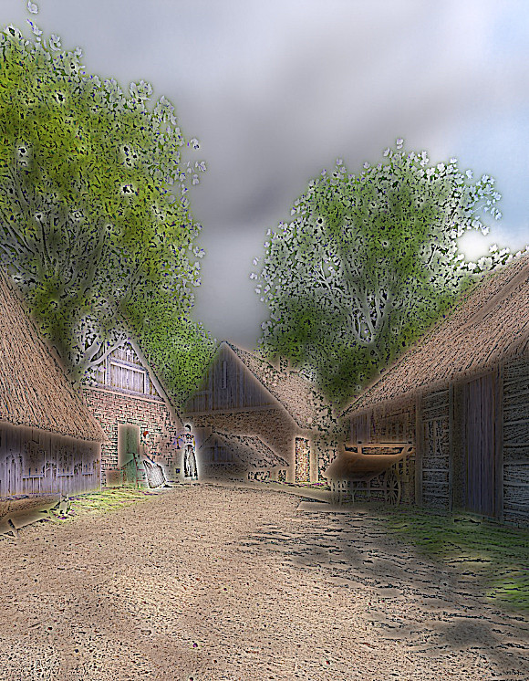
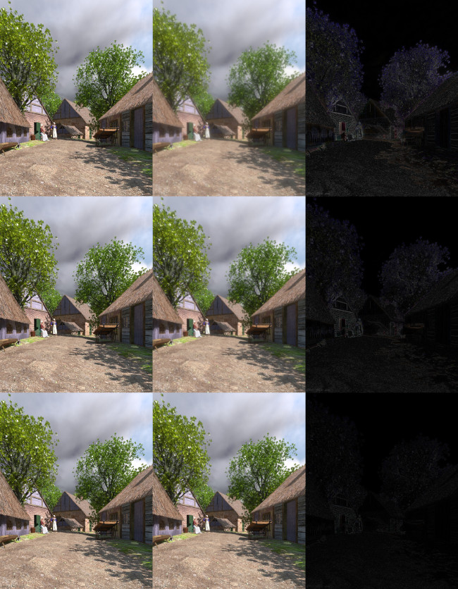
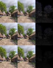
I've been playing with more ideas using your image. Attaching three
images. In toBloomOrOther.jpg showing your original to my already posted
bloom filter image in the top row. In the middle row the bloom filter at
about 1/3 the aggressiveness of the top row. In the bottom row not
really bloom, but more adding noise by regional sampling about each
pixel. Less blur in the bottom two rows, but still maybe too much to
tastes.
While at that, Mr's question about adding more contrast knocked
something loose in my head and I had the thought, "what does average do
with negative weights...?" Well! Interesting stuff - about which I've
not completely wrapped my head.
You can use negative weights. If you get the balance right you can get
an image with more contrast with my bloom filter set up. Using:
#declare PigmentMap00 = pigment_map {
[-1.0 Pigment1 ]
[-0.7 Pigment2 ]
[-0.6 Pigment3 ]
[+0.5 Pigment4 ]
[+0.4 Pigment5 ]
[+0.3 Pigment6 ]
[+0.2 Pigment7 ]
[+0.1 Pigment8 ]
}
#declare PigmMerge = pigment {
average
pigment_map { PigmentMap00 }
}
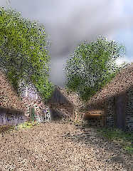
I get the Contrast00.jpg image, which isn't traditional contrast, but
something more along the lines of tone mapping. Without even trying! I
find it amusing it's possible to stumble my way into such functionality.
:-) Aside: I shrank the image size because it got large even as a jpeg
due the detail popping out - the detail jr wanted to see and probably
still can't. ;-)
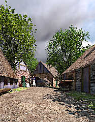
If you get the balance for contrast slightly wrong, other interesting
things happen. See Cartoon00.jpg. The only difference is the -0.6 weight
above was instead +0.6.
Creating these last two images is fast supposing the eight image
pigments into the average function already exist. Whether with effort
and exploration techniques using negative average weights could be made
more finely controllable - in other words, truly usable - I don't know.
So many things to play with and so little time.
Bill P.
Post a reply to this message
Attachments:
Download 'cartoon00.jpg' (269 KB)
Download 'contrast00.jpg' (288 KB)
Download 'tobloomorother.jpg' (198 KB)
Preview of image 'cartoon00.jpg'
Preview of image 'contrast00.jpg'
Preview of image 'tobloomorother.jpg'
|
|