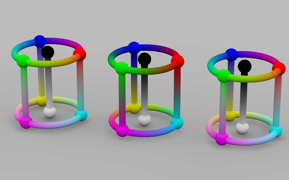
Three different ways to compute gradients:
Left: Interpolation in a linear color space (assumed_gamma 1.0); color
gradients look fine, while greyscale gradients appear to be biased
towards white (despite being physically linear).
Center: Interpolation in a gamma 2.5 color space; greyscale gradients
look better (despite being physically non-linear), but color gradients
have a tendency to look too dark in the transition zone.
Right: Interpolating the R:G:B ratio linearly, then adjusting for a
brightness interpolated in a gamma 2.5 color space, yields both pleasing
color and brightness gradients.
Post a reply to this message
Attachments:
Download 'gradients.png' (149 KB)
Preview of image 'gradients.png'

|