|
 |
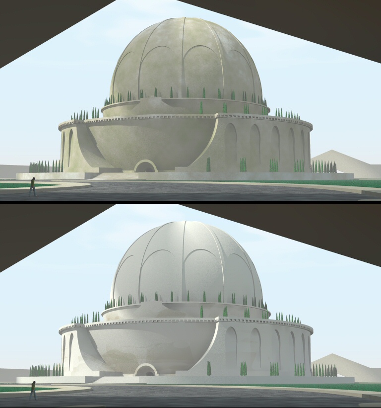
Next results. I used the following settings, at the top without blurring, at
the bottom with blurring. Everything else equal (note: z = up). Personally,
I prefer the non-blurred version as the spots are functional on the
building. Blurring gives ultimately too much accent to the lighter pigment
in the pigment_map (at least in my example).
//===start code
#declare blur_proximity_pattern= false;
object {FinalBuilding
#if( use_df3_proximity_pattern )
texture {
pigment {
pigment_pattern {
average
pigment_map {
#if( blur_proximity_pattern = false )
[ 0.5 df3_pattern ]
#else
#declare n = 0;
#while ( n < 20 )
[ 0.5 df3_pattern translate (halton3D(
n )-<0.5,0.5,0.5>)*7.5 ]
#declare n = n + 1;
#end
#end
#if( add_noise = true )
[ 0.1 slope { <0,0,0.3> 0.5, 1.0 altitude <0,0,0.7> -4, 16.5 }
color_map { [0 rgb 1] [1 rgb 0] } scale 20 ]
[ 0.4 bozo color_map { [0 rgb 0] [1 rgb 1] } scale 4 ]
[ 0.3 bozo color_map { [0 rgb 0] [1 rgb 1] } scale 1 ]
[ 0.2 bozo color_map { [0 rgb 0] [1 rgb 1] } scale 0.33 ]
[ 0.1 bozo color_map { [0 rgb 0] [1 rgb 1] } scale 0.1 ]
#end
}
}
pigment_map {
[0.30 color rgb <0.837064, 0.814426, 0.762936>]
[0.40 color rgb <0.625, 0.5729, 0.454396>]
[0.60 color rgb <0.3854, 0.395833, 0.1875>]
}
}
normal {
granite , 0.2
scale 0.005
}
finish {
ambient 0.0
specular 0.1
roughness 0.006139
}
}
#else
material {CenotaphStone}
#end
}
//===end code
Thomas
Post a reply to this message
Attachments:
Download 'boullee_cenotaphe_proxpat.jpg' (137 KB)
Preview of image 'boullee_cenotaphe_proxpat.jpg'
|
|