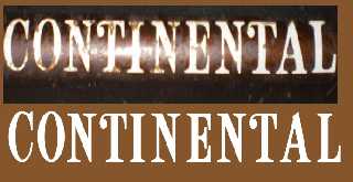
Others who have done this might be interested in my results.
Remade an old decal for my bike. The 1970 original was, I suppose,
hand-drawn and pretty inconsistent. The strangest inconsistency in the
original is that some of the inside curves are rounded (L) and some are
not (N). I made them all square. Rounding at the intersection of two pen
strokes seems wrong to me. None of the original serifs (even within the
same letter) are consistent.
I addition to making it more consistent, I made some changes and created
a "better" spacing algorithm. Most noticeable changes are the C and O
which IMO did not previously have the same feel as the rest of the
letters. Went just a bit over to what I think of as a Deco style with
those two, but it works to my satisfaction. Got bolder with these
changes as I went along, but I still think I've captured the spirit of
the original.
Now to find someone with an ALPS printer (for a water-transfer decal).
-Shay
Post a reply to this message
Attachments:
Download 'logo_ab.jpg' (44 KB)
Preview of image 'logo_ab.jpg'
|

