And the winners are:
i) using less contrast in rgb between text and background 0.15 vs. 1.0
(higher made it horribly worse)!
ii) -J. It's interesting that the docs suggest it for anims anyway.
Anyone had an image that actually suffered artistically for having -J?
"Alain" <aze### [at] qwerty gov> wrote in message
news:41d02228$1@news.povray.org...
> Greg M. Johnson nous apporta ses lumieres ainsi en ce 2004-12-26 21:21...
> :
>
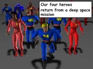
>>Here's a sample image to show how captions can get fuzzy.
>>
>>
>>
>>
> In addition to what the other have said, you may try rgb 1.5 or more for
> the background behind the text. It will still show white, but it will
> cancell part of the aa. You may also try negative rgb value for the text
> itself. Be sure that the text object is barely extruding from it's
> background, like 0.00001 unit or less to prevent the sides from showing.
>
> Alain gov> wrote in message
news:41d02228$1@news.povray.org...
> Greg M. Johnson nous apporta ses lumieres ainsi en ce 2004-12-26 21:21...
> :
>
>>Here's a sample image to show how captions can get fuzzy.
>>
>>
>>
>>
> In addition to what the other have said, you may try rgb 1.5 or more for
> the background behind the text. It will still show white, but it will
> cancell part of the aa. You may also try negative rgb value for the text
> itself. Be sure that the text object is barely extruding from it's
> background, like 0.00001 unit or less to prevent the sides from showing.
>
> Alain
Post a reply to this message
Attachments:
Download 'povcomiclite21.jpg' (50 KB)
Preview of image 'povcomiclite21.jpg'
|


