|
 |
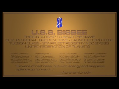
I was working with looking at the effect of doing a difference with text
characters, and lighting them, and that sort of thing, so I did this
commissioning plaque for kicks and giggles while I experimented. For
some reason, this is an incredibly complex object -- it took sixteen
hours to render! I think it's because of the incised nature of the
letters -- it had to figure out shadows and so forth on each of them,
and even so, the crossbars of many of the letters disappeared.
I think I'll wait until 3.5 comes out, before trying this particular
project again... I'm just not
good enough at eyeballing centering, and the lines of text really need
to be centered. I also think that next time, I'll use more than one
light source, and perhaps radiosity as well.
Anyone have any other suggestions for improving it? How 'bout a
suggestion for a better texture for tarnished brass?
--
Dawn McKnight | "Who cares what the hipbone's connected to? I'm in Neurology!"
McK### [at] mac com | -- Justine Devlin, M.D. com | -- Justine Devlin, M.D.
Post a reply to this message
Attachments:
Download 'tucson.jpg' (20 KB)
Preview of image 'tucson.jpg'
|
|