|
 |
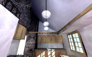
Ok, here are the updates I had time to do today. The wallpaper is history,
the stone pattern on the wall is now a displacement map constructed from an
iso-surface, the radiosity brightness was increased to 5, the diffuse
parameter on many of the surfaces was tweaked, the strip lights were
brightened and changed to blue, the falloff and rates of the lights were
tweaked, and a plant from a tree macro I found was included.
Things I really really really hate that look so CGish I could call them
fake.... The window looks weird. The globes for the lights. The trim wood
near the camera on the right. The overall lack of anything interesting. No
media attenuation. No focal blur. I never put the cupboard door in on the
wall near the camera to the left.
Things I really like and need to emphasize... The rich color and shadow in
the upper left section of the image. The stove. The shape of the lamps. The
organic textures.
Hmm... Seems like this image has more going against it than for it. I'll
come up with some better angles and more junk to throw in there and see what
happens. I've got to come up with a better window. I used a macro I
downloaded somewhere, but the results are so-so in the confines of this
image. Eventually I will finish that darned sink and put in some more
appliances. Oh well.
As usual, applause and awe are preferred, but I need a good kick in the ribs
while I'm sleeping and recovering from a car accident to really get me
going.
Thanks,
D.J.
Post a reply to this message
Attachments:
Download 'Kitchen2.jpg' (25 KB)
Preview of image 'Kitchen2.jpg'

|
 |


![]()