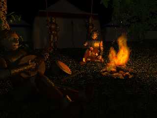
I'm not really satisfied with this one, jet, but can't put my fingers on it.
No AA yet and only poor radiosity settings. It is again quite dark (Jpeg
seems to make it even darker - oh no! it is the white browser background),
so look at it with a warmed up monitor, on gray or black and/or in a dark
room - there is another tree in the background on the right ;-)
Some input would be very appreciated.
Marc-Hendrik
Credits:
Peter Houston for the Blobman
Gilles Tran for the tree macro
Post a reply to this message
Attachments:
Download 'lagerfeuer - wip.jpeg.jpg' (76 KB)
Preview of image 'lagerfeuer - wip.jpeg.jpg'

|


![]()