|
 |
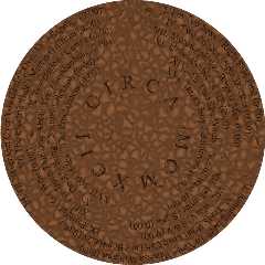
This is yet another test of the circular font macros I've been working
on. In this case, it's a label for a CD I'm planning to make. The track
times haven't been filled in, and the play list is subject to some
change, but this is the basic design I have in mind.
The rock texture is terrible; I need something more sandy and pebbly.
And of course the text in the center isn't in just the right place,
because I haven't measured the proportions of a regular CD label. AND
Superpatch, as you can see by the thin square in the upper left. But,
this is basically just an example, a test design. (Criticisms of
anything but the music are of course very welcome!)
In this case I also wrote a macro to put the text on different rings and
evenly space the text on each ring. I'm also still trying to work out
decent bounding shapes for this sucker. For each text segment I've got
an interection between two planes (or a merge, if the text covers 180+
degrees), a cylinder, and an inverse cylinder. For this render I forgot
to put a bounding shape around the title in the middle, which probably
didn't help rendering time.
For those who care to know the reason for the stone texture, I'm using
an archaeological theme for the cover and label of Circa 1992. I want
this label to look something like a carved tablet. (Hence the texture is
totally wrong.)
Lummox JR
Post a reply to this message
Attachments:
Download 'circa1992label.jpg' (189 KB)
Preview of image 'circa1992label.jpg'

|
 |


![]()