|
 |
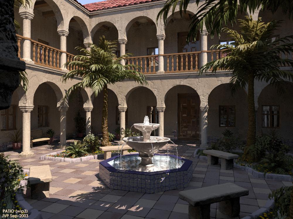
Hi again:
Thanks to all for the comments on the prior wip. Sorry, but as the
lazy I am, I've been delaying the replies untill I had ready the next
wip... ;)
JC(Exther):
> - The water streams still seem to start too horizontally
> - The Palm trees leaves seem a bit too shiny in my opinion
> - The floor tiles look like they have some some of aliasing problem,
>the edges seem grainy.
I've used a real model for the streams, but the problem might be that
the pipes are not very visible and must be lower respect to the water
levels. Thanks for the tip about the leaves: I've reduced the phong now.
I also reduced the grain on the isosurface floor tiles.
Hugo:
> You're not afraid of Iso + Rad ? Maybe I should test it further,
> then...
> [...] I think the light is now too white. Last time it was
> too blue. I'm not easy to satisfy (hrm.. this is sad) The building
> has very regular noise due to the isosurfaces, which is not all good.
> The edges need heavy noise to reveal the imperfections from this
> distance, but the rest of the walls seem a bit too noisy.
Well, I forgot to mention that I used a two-pass method for rad, with
simpler geometry and textures for the saving step. Anyhow, it is slow on
some of the isos with more complicated formulas.
I also changed the white balance, you were right about it being too
neutral. The noise on the isosurfaces is now a custom pigment, wich
gives better results getting ride of regularity. Better now?
Gonzo:
> Very very nice! Only thing missing is me in a hammock sipping a pina
> colada;-)
That would be a "horchata", as this patio is very Valencian. :)
> The only thing that looks odd to me is the arch/columns. The round
> columns have the same noise as the arches above, seems like they
> should be smoother, and the square where they join should be slightly
> different from both.
Yeah, they were too simplistic: I've worked that a bit.
Aaron:
> 1) I think it might be a bit better to make the columns smooth and to
> make the color of the stucco on the arcades vary a bit more, perhaps
> with some water streaking, etc.
Done! :)
> 2) The shadows seem to be too highly-illuminated.
I'm trying to find a good balance, but it is a specially difficult
scene, and could vary highly from monitor to monitor...
Jim Charter:
> I can't believe you wrote a function to make the shape of arches!
Neither me, but I started with the tutorial on the docs, and casually
one of the examples only needed an inversion to resemble somthing like
an arch. From here I started to tweak the shape by trial and error.
Later I added some noise with pigments, and lerned with Mike tutorial to
"join" shapes for the columns. Hard but really funny!
Johan Feyaerts:
> beautiful picture, a bit of splashing water where the falling water
> hits the surface may improve it.
> source: see http://users.skynet.be/johan.feyaerts/raytracing.htm
> source of dome & water
Very nice fountain! Thanks for the tip. I was already making it with
a sort of "boiling water", although it's not very visible.
Thanks again for all the suggestions. I will post the final image next
time, with some details enhanced (and the posible comments to this one,
of course!).
Regards..
--
Jaime Vives Piqueres
La Persistencia de la Ignorancia
http://www.ignorancia.org
Post a reply to this message
Attachments:
Download 'fuente-wip3.jpg' (145 KB)
Preview of image 'fuente-wip3.jpg'
|
|