|
|
|
|
|
|
| |
| |
|
|
|
|
| |
| |
|
|
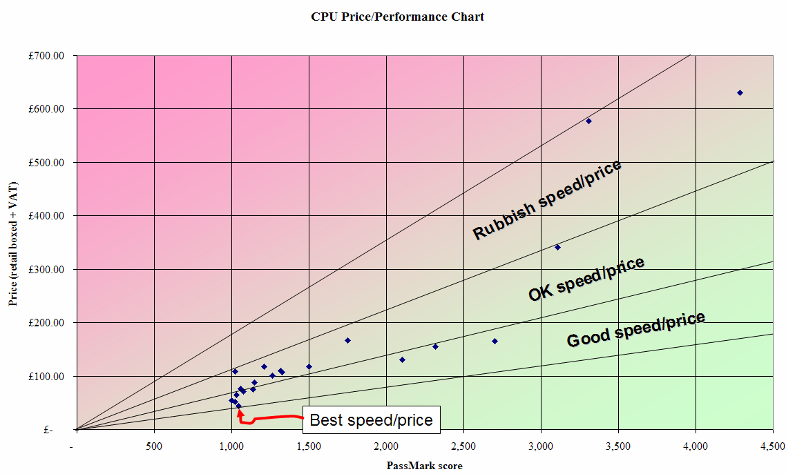
OK, so as you probably worked out, green = good, pink = bad.
(Unbelievably, Excel appears to lack the ability to draw light red.)
The three points on the right of the chart are all Intel Core 2
[Extreme] Quad CPUs. That amonolous-looking middle point might actually
be incorrect. [It's the PassMark rating for an "Intel Core2 Extreme
Q6800 @ 2.98 GHz" together with the ebuyer price for an "Intel Core 2
Extreme Quad QX68002.98 GHz". I'm not 100% sure those are the same product.]
That particularly interesting-looking point at 2,701 is an Intel Core 2
on the whole chart. (The next CPU is over twice the price yet only 15%
faster...)
The two points between 2,000 and 2,500 are both AMD Phenom quad-core
CPUs. (The Phenom 9600 and Phenom 9500, respectively.) The 9500 appears
to be especially good value.
Alternatively, that point at 1,751 appears to be especially *bad* value.
That other interesting point at almost exactly 1,500 is an Intel Core 2
processors of roughly the same price. (Notably the AMD Athlon64 X2 6400+
analyse. Suffice it to say that at these prices, tiny price hikes yield
PassMarks).
Not the twin exponential curves I was expecting. But then, there's still
only about 2-dozen data points here. It turns out ebuyer don't really
have that big a range of CPUs on offer. (E.g., I have a huge stack of
PassMark scores for CPUs that I can't find a price for. They simply
aren't on sale at ebuyer!)
PS. I think the dot at the top of the 1,000 line might be in error too.
The PassMark score is for an "Intel Core2 6320 @ 1.86 GHz", but the
price is for an "Intel Core 2 Duo E6320 @ 1.86 GHz"...
--
http://blog.orphi.me.uk/
http://www.zazzle.com/MathematicalOrchid*
Post a reply to this message
|
|
| |
| |
|
|
|
|
| |
| |
|
|
And lo on Fri, 22 Feb 2008 14:32:41 -0000, Invisible <voi### [at] dev null> did
spake, saying:
> OK, so as you probably worked out, green = good, pink = bad.
> (Unbelievably, Excel appears to lack the ability to draw light red.)
I thought light red was pink?
> The three points on the right of the chart are all Intel Core 2
> [Extreme] Quad CPUs. That amonolous-looking middle point might actuall
y
> be incorrect. [It's the PassMark rating for an "Intel Core2 Extreme
> Q6800 @ 2.98 GHz" together with the ebuyer price for an "Intel Core 2
> Extreme Quad QX68002.98 GHz". I'm not 100% sure those are the same
> product.]
Either that one or the 4000+ passmark looks anomalous. What does the
trendline look like?
--
Phil Cook
--
I once tried to be apathetic, but I just couldn't be bothered
http://flipc.blogspot.com null> did
spake, saying:
> OK, so as you probably worked out, green = good, pink = bad.
> (Unbelievably, Excel appears to lack the ability to draw light red.)
I thought light red was pink?
> The three points on the right of the chart are all Intel Core 2
> [Extreme] Quad CPUs. That amonolous-looking middle point might actuall
y
> be incorrect. [It's the PassMark rating for an "Intel Core2 Extreme
> Q6800 @ 2.98 GHz" together with the ebuyer price for an "Intel Core 2
> Extreme Quad QX68002.98 GHz". I'm not 100% sure those are the same
> product.]
Either that one or the 4000+ passmark looks anomalous. What does the
trendline look like?
--
Phil Cook
--
I once tried to be apathetic, but I just couldn't be bothered
http://flipc.blogspot.com
Post a reply to this message
|
|
| |
| |
|
|
|
|
| |
| |
|
|
Phil Cook wrote:
> And lo on Fri, 22 Feb 2008 14:32:41 -0000, Invisible <voi### [at] devnull> did
> spake, saying:
>
>> OK, so as you probably worked out, green = good, pink = bad.
>> (Unbelievably, Excel appears to lack the ability to draw light red.)
>
> I thought light red was pink?
I used to think that too. Now I realise that "pink" is actually light
purple. (I.e., it's like light red, but with more blue in it...)
>> The three points on the right of the chart are all Intel Core 2
>> [Extreme] Quad CPUs. That amonolous-looking middle point might
>> actually be incorrect. [It's the PassMark rating for an "Intel Core2
>> Extreme Q6800 @ 2.98 GHz" together with the ebuyer price for an "Intel
>> Core 2 Extreme Quad QX68002.98 GHz". I'm not 100% sure those are the
>> same product.]
>
> Either that one or the 4000+ passmark looks anomalous.
Either the QX6800 is really over-priced, or the X9650 is really cheap...
> What does the trendline look like?
Uh... good luck with that. ;-)
--
http://blog.orphi.me.uk/
http://www.zazzle.com/MathematicalOrchid*
Post a reply to this message
|
|
| |
| |
|
|
|
|
| |
| |
|
|
And lo on Fri, 22 Feb 2008 15:40:03 -0000, Invisible <voi### [at] devnull> did
spake, saying:
> Phil Cook wrote:
>> And lo on Fri, 22 Feb 2008 14:32:41 -0000, Invisible <voi### [at] devnull>
>> did spake, saying:
>>
>>> OK, so as you probably worked out, green = good, pink = bad.
>>> (Unbelievably, Excel appears to lack the ability to draw light red.)
>> I thought light red was pink?
>
> I used to think that too. Now I realise that "pink" is actually light
> purple. (I.e., it's like light red, but with more blue in it...)
No that would be the colour known as 'light purple' pink is red with equal
amounts of blue and green, purple is blue with more red then green. At
least that's how I bloody well mix it.
>>> The three points on the right of the chart are all Intel Core 2
>>> [Extreme] Quad CPUs. That amonolous-looking middle point might
>>> actually be incorrect. [It's the PassMark rating for an "Intel Core2
>>> Extreme Q6800 @ 2.98 GHz" together with the ebuyer price for an "Intel
>>> Core 2 Extreme Quad QX68002.98 GHz". I'm not 100% sure those are the
>>> same product.]
>> Either that one or the 4000+ passmark looks anomalous.
>
>
> Either the QX6800 is really over-priced, or the X9650 is really cheap...
>
>> What does the trendline look like?
>
> Uh... good luck with that. ;-)
You're using Excel. Pick the points, right-click and add a trendline, with
that data try an exponentional or moving average.
--
Phil Cook
--
I once tried to be apathetic, but I just couldn't be bothered
http://flipc.blogspot.com
Post a reply to this message
|
|
| |
| |
|
|
|
|
| |
| |
|
|
Gail Shaw wrote:
> "Invisible" <voi### [at] devnull> wrote in message
> news:47bd929b$1@news.povray.org...
>
>> [What I was *expecting* to see was one curve for Intel, and another one
>> way to the right for AMD. But that doesn't appear to be the case...]
>
> AMD's stuff isn't as good as it used to be. From what I've heard, they're
> having some issues with their quad cores.
> My next CPU will be an intel, for the first time since the P3.
My current CPU is an Intel (the E6600, in fact), the first time since my
486!
--
...Ben Chambers
www.pacificwebguy.com
Post a reply to this message
|
|
| |
| |
|
|
|
|
| |
| |
|
|
> OK, so as you probably worked out, green = good, pink = bad.
But that's a bit misleading, because processors with the same
performance/price ratio will come out with different colours. Try drawing
on some lines of constant price/performance - it makes the chart more
interesting...
Post a reply to this message
|
|
| |
| |
|
|
|
|
| |
| |
|
|
scott wrote:
>> OK, so as you probably worked out, green = good, pink = bad.
>
> But that's a bit misleading, because processors with the same
> performance/price ratio will come out with different colours. Try
> drawing on some lines of constant price/performance - it makes the chart
> more interesting...
I can't immediately think of a way of convincing M$ Excel to do that...
It's not the most advanced plotting package ever.
--
http://blog.orphi.me.uk/
http://www.zazzle.com/MathematicalOrchid*
Post a reply to this message
|
|
| |
| |
|
|
|
|
| |
| |
|
|
>> But that's a bit misleading, because processors with the same
>> performance/price ratio will come out with different colours. Try
>> drawing on some lines of constant price/performance - it makes the chart
>> more interesting...
>
> I can't immediately think of a way of convincing M$ Excel to do that...
> It's not the most advanced plotting package ever.
Just create some more series data to add to the plot, with xy values that
start at the origin and then go to some point far away to the upper right.
Then change the style for these series so that it draws the connecting lines
rather than just the data points. Job done :-)
Post a reply to this message
|
|
| |
| |
|
|
|
|
| |
| |
|
|
And lo on Tue, 26 Feb 2008 12:25:21 -0000, Invisible <voi### [at] devnull> did
spake, saying:
> scott wrote:
>>> OK, so as you probably worked out, green = good, pink = bad.
>> But that's a bit misleading, because processors with the same
>> performance/price ratio will come out with different colours. Try
>> drawing on some lines of constant price/performance - it makes the
>> chart more interesting...
>
> I can't immediately think of a way of convincing M$ Excel to do that..
.
> It's not the most advanced plotting package ever.
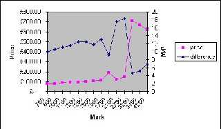
It's more advanced then most people think. I've just knocked up a three
column sheet with price, mark, and mark/price and created a Line on 2 Ax
es
chart plotting performance against price and m/p.
--
Phil Cook
--
I once tried to be apathetic, but I just couldn't be bothered
http://flipc.blogspot.com
Post a reply to this message
Attachments:
Download 'example.jpg' (29 KB)
Preview of image 'example.jpg'
|
|
| |
| |
|
|
|
|
| |
| |
|
|
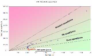
> Just create some more series data to add to the plot, with xy values that
> start at the origin and then go to some point far away to the upper right.
> Then change the style for these series so that it draws the connecting
> lines rather than just the data points. Job done :-)
Seeing as we're all into posting graphs today... what I meant was something
like this:
Post a reply to this message
Attachments:
Download 'image1.png' (91 KB)
Preview of image 'image1.png'
|
|
| |
| |
|
|
|
|
| |
|
|