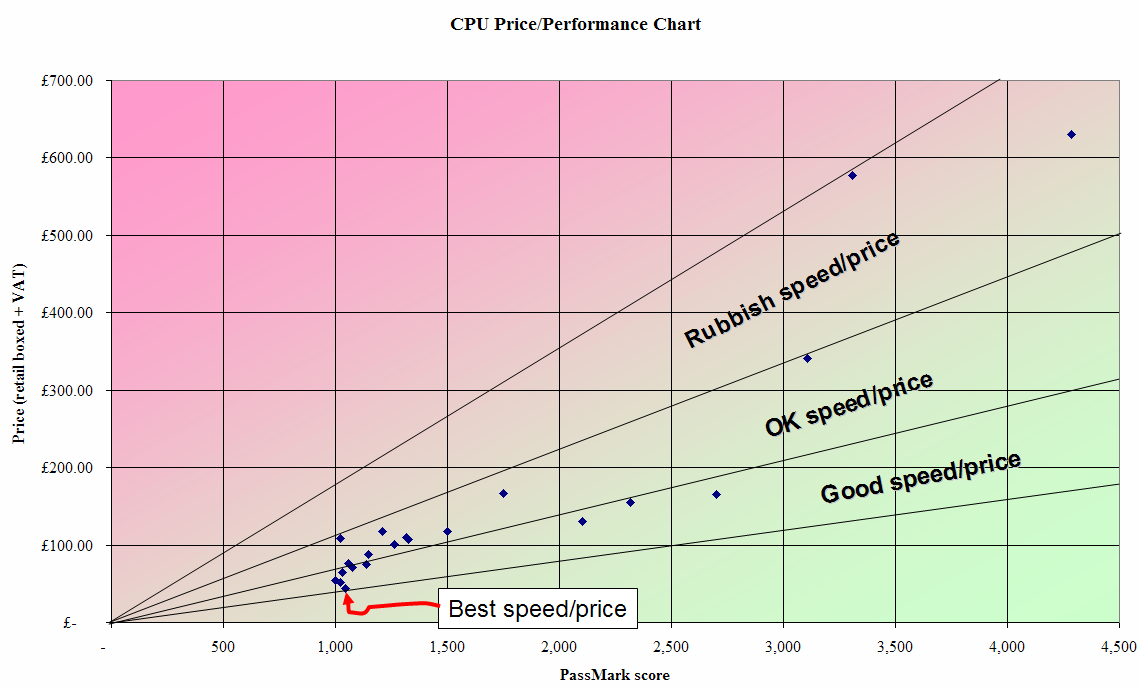
> Just create some more series data to add to the plot, with xy values that
> start at the origin and then go to some point far away to the upper right.
> Then change the style for these series so that it draws the connecting
> lines rather than just the data points. Job done :-)
Seeing as we're all into posting graphs today... what I meant was something
like this:
Post a reply to this message
Attachments:
Download 'image1.png' (91 KB)
Preview of image 'image1.png'
|