|
 |
And lo on Tue, 26 Feb 2008 12:25:21 -0000, Invisible <voi### [at] dev null> did
spake, saying:
> scott wrote:
>>> OK, so as you probably worked out, green = good, pink = bad.
>> But that's a bit misleading, because processors with the same
>> performance/price ratio will come out with different colours. Try
>> drawing on some lines of constant price/performance - it makes the
>> chart more interesting...
>
> I can't immediately think of a way of convincing M$ Excel to do that..
.
> It's not the most advanced plotting package ever.
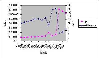
It's more advanced then most people think. I've just knocked up a three
column sheet with price, mark, and mark/price and created a Line on 2 Ax
es
chart plotting performance against price and m/p.
--
Phil Cook
--
I once tried to be apathetic, but I just couldn't be bothered
http://flipc.blogspot.com null> did
spake, saying:
> scott wrote:
>>> OK, so as you probably worked out, green = good, pink = bad.
>> But that's a bit misleading, because processors with the same
>> performance/price ratio will come out with different colours. Try
>> drawing on some lines of constant price/performance - it makes the
>> chart more interesting...
>
> I can't immediately think of a way of convincing M$ Excel to do that..
.
> It's not the most advanced plotting package ever.
It's more advanced then most people think. I've just knocked up a three
column sheet with price, mark, and mark/price and created a Line on 2 Ax
es
chart plotting performance against price and m/p.
--
Phil Cook
--
I once tried to be apathetic, but I just couldn't be bothered
http://flipc.blogspot.com
Post a reply to this message
Attachments:
Download 'example.jpg' (29 KB)
Preview of image 'example.jpg'
|
|


