 |
 |
|
 |
|
 |
|  |
|  |
|
 |
|
 |
|  |
|  |
|
 |
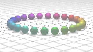
Hi,
After many years of coding, the realistic finish has never been my best point.
Wow could I fix the unrealistic finish of these spheres?
The more I look at them, the more "fake" they look on the image.
I can't find the right combination of ambient, radiance and brilliance.
Regards
B. Gimeno
pd, the source for the Red Sphere
texture {
pigment { Red
}
finish { specular .5
metallic
ambient .2
diffuse .5
}
}
Post a reply to this message
Attachments:
Download 'btfh2.png' (703 KB)
Preview of image 'btfh2.png'

|
 |
|  |
|  |
|
 |
|
 |
|  |
|  |
|
 |
Am 24.11.2017 um 17:38 schrieb B. Gimeno:
> Hi,
> After many years of coding, the realistic finish has never been my best point.
> Wow could I fix the unrealistic finish of these spheres?
> The more I look at them, the more "fake" they look on the image.
> I can't find the right combination of ambient, radiance and brilliance.
Ambient: Never looks realistic. Ditch it. Use radiosity instead (which
as of `#version 3.7` disables ambient; if you need emissive surfaces,
use `emission` in the finish).
Brilliance: Unrealistic hack. Forget it.
Radiance: Don't know what you mean by that in this context.
`metallic` is only reasonable for metals, special metallic paints, or
plastic with metal particles.
Whenever you use `specular` (or `phong`), technically you should also
use `reflection`, and make sure that the parameters correspond well. In
practice this means that you should always use the `specular albedo N`
syntax, where N is the same value as in `reflection`, and you should use
very low `roughness` because official POV-Ray can't do rough reflections
(you'd need UberPOV's blurred reflections for that). If you need dull
surfaces, either turn off highlights entirely, or use micronormals to
control the effective roughness for both reflections and highlights.
If you use reflections (and, as stated above, you always should wherever
you use highlights), you should use either `fresnel on` or `metallic on`
in the reflection block (don't forget to set an ior; even opaque
materials have one). To keep highlight parameters in sync, you should
also use `freshel on` or `metallic on` in the finish block itself.
Make sure the material doesn't reflect more light diffusely than it
receives. The easiest way to accomplish this is to use the `diffuse
albedo FLOAT` syntax, and make sure the parameter doesn't exceed 1.0.
Make sure the material doesn't reflect more light as highlights than it
receives from light sources. The easiest way to accomplis this is to use
the `specular albedo FLOAT` or `phong albedo FLOAT` syntay, and making
sure the sum of specular and phong doesn't exceed 1.0.
Make sure the material doesn't reflect more light in ANY way than it
receives from light sources. If you're using `fresnel on` (or, IIRC,
`metallic on`) at the finish level, this is as easy as following the
above two rules. Otherwise, stick to the `albedo` syntax and make sure
the sum of diffuse, specular and phong doesn't exceed 1.0 either.
Virtually all truly diffuse materials exhibit some level of subsurface
light transport. Do make use of the corresponding feature. Since this
automatically applies a fresnelian effect to the diffuse component, you
should use `fresnel on` at the finish level to also apply a
corresponding fresnelian effect to highlights.
Virtually all dull materials still do exhibit specular highlights and
reflections, even if you don't realize it. Try to model those as such:
Use reflection and highlights (see above), and use micronormals (or
UberPOV) to achieve the diffuse-ish effect resulting from the surface
roughness.
Reflection requires something to reflect. Always make sure you have
interesting surroundings for your objects to reflect (a HDRI sky sphere
does nicely).
Post a reply to this message
|
 |
|  |
|  |
|
 |
|
 |
|  |
|  |
|
 |
"B. Gimeno" <nomail@nomail> wrote:
> Hi,
> After many years of coding, the realistic finish has never been my best point.
> Wow could I fix the unrealistic finish of these spheres?
> The more I look at them, the more "fake" they look on the image.
> I can't find the right combination of ambient, radiance and brilliance.
>
> Regards
> B. Gimeno
>
> pd, the source for the Red Sphere
>
> texture {
> pigment { Red
> }
> finish { specular .5
> metallic
> ambient .2
> diffuse .5
> }
>
> }
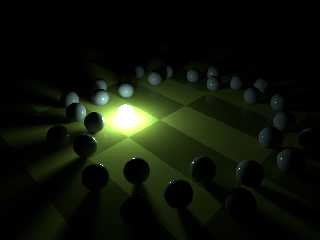
I post an image for your reference,
sphere{
<0,0.14,0.3>, 0.14
texture{
pigment{rgb<0.19,0.18,0.19>}
finish{ambient 0 diffuse 1 brilliance 1.5 reflection {0.01,0.2 falloff
3}}
}
}
Post a reply to this message
Attachments:
Download 'finish test2 6.png' (236 KB)
Preview of image 'finish test2 6.png'

|
 |
|  |
|  |
|
 |
|
 |
|  |
|  |
|
 |
clipka <ano### [at] anonymous org> wrote:
Thank you very much for the advice, I have been experimenting and forcing the
code to optimize results with high parameters of radiosity and blurring. I'm not
entirely happy, but the smoke coming out of the processor tells me this is all
you can do before I call 911.
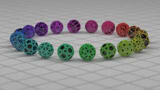
I leave two images of the final result. One of them with levels and curves
adjusted with photoshop, which for my taste improves the result remarkably and
comes closer to what I would like it to look like. The scene was designed as a
scenario to test a rewrite of an old macro of mine to generate pseudo-toroidal
objects with many, (too many) parameters. The tests soon got out of hand and the
final finishing adjustments took control of the scene before I realized it. I
have used another simple macro that I also wrote to generate something similar
to spheres instead of the simple balls of origin. This one has no name, and soon
I will publish the code of the whole scene for your delight.
I've been testing subsurface too. I got strange artifacts and ended up
deactivating it because I thought it would not improve the scene as it was
planned.
any other suggestion, criticism or comment is always welcome,
a greeting
B. Gymene org> wrote:
Thank you very much for the advice, I have been experimenting and forcing the
code to optimize results with high parameters of radiosity and blurring. I'm not
entirely happy, but the smoke coming out of the processor tells me this is all
you can do before I call 911.
I leave two images of the final result. One of them with levels and curves
adjusted with photoshop, which for my taste improves the result remarkably and
comes closer to what I would like it to look like. The scene was designed as a
scenario to test a rewrite of an old macro of mine to generate pseudo-toroidal
objects with many, (too many) parameters. The tests soon got out of hand and the
final finishing adjustments took control of the scene before I realized it. I
have used another simple macro that I also wrote to generate something similar
to spheres instead of the simple balls of origin. This one has no name, and soon
I will publish the code of the whole scene for your delight.
I've been testing subsurface too. I got strange artifacts and ended up
deactivating it because I thought it would not improve the scene as it was
planned.
any other suggestion, criticism or comment is always welcome,
a greeting
B. Gymene
Post a reply to this message
Attachments:
Download 'finalrender.png' (869 KB)
Preview of image 'finalrender.png'

|
 |
|  |
|  |
|
 |
|
 |
|  |
|  |
|
 |
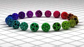
and the photoshopped one
Post a reply to this message
Attachments:
Download 'editedrender.png' (1026 KB)
Preview of image 'editedrender.png'

|
 |
|  |
|  |
|
 |
|
 |
|  |
|  |
|
 |
"B. Gimeno" <nomail@nomail> wrote:
> clipka <ano### [at] anonymous org> wrote:
>
> Thank you very much for the advice, I have been experimenting and forcing the
> code to optimize results with high parameters of radiosity and blurring. I'm not
> entirely happy, but the smoke coming out of the processor tells me this is all
> you can do before I call 911.
> I leave two images of the final result. One of them with levels and curves
> adjusted with photoshop, which for my taste improves the result remarkably and
> comes closer to what I would like it to look like. The scene was designed as a
> scenario to test a rewrite of an old macro of mine to generate pseudo-toroidal
> objects with many, (too many) parameters. The tests soon got out of hand and the
> final finishing adjustments took control of the scene before I realized it. I
> have used another simple macro that I also wrote to generate something similar
> to spheres instead of the simple balls of origin. This one has no name, and soon
> I will publish the code of the whole scene for your delight.
>
> I've been testing subsurface too. I got strange artifacts and ended up
> deactivating it because I thought it would not improve the scene as it was
> planned.
>
> any other suggestion, criticism or comment is always welcome,
> a greeting
> B. Gymene
beautiful spheres. org> wrote:
>
> Thank you very much for the advice, I have been experimenting and forcing the
> code to optimize results with high parameters of radiosity and blurring. I'm not
> entirely happy, but the smoke coming out of the processor tells me this is all
> you can do before I call 911.
> I leave two images of the final result. One of them with levels and curves
> adjusted with photoshop, which for my taste improves the result remarkably and
> comes closer to what I would like it to look like. The scene was designed as a
> scenario to test a rewrite of an old macro of mine to generate pseudo-toroidal
> objects with many, (too many) parameters. The tests soon got out of hand and the
> final finishing adjustments took control of the scene before I realized it. I
> have used another simple macro that I also wrote to generate something similar
> to spheres instead of the simple balls of origin. This one has no name, and soon
> I will publish the code of the whole scene for your delight.
>
> I've been testing subsurface too. I got strange artifacts and ended up
> deactivating it because I thought it would not improve the scene as it was
> planned.
>
> any other suggestion, criticism or comment is always welcome,
> a greeting
> B. Gymene
beautiful spheres.
Post a reply to this message
|
 |
|  |
|  |
|
 |
|
 |
|  |
|  |
|
 |
"B. Gimeno" <nomail@nomail> wrote:
> and the photoshopped one
I have just noticed that the edited version almost completely eliminates the
reflection of the spheres. And this makes me think that when you want a
realistic version of a scene you're actually asking for a retouched version of
reality, just as advertising photography has taught us.
Post a reply to this message
|
 |
|  |
|  |
|
 |
|
 |
|  |
|  |
|
 |
Source posted on http://news.povray.org/povray.text.scene-files/
Post a reply to this message
|
 |
|  |
|  |
|
 |
|
 |
|  |
|  |
|
 |
On 01/12/2017 13:24, B. Gimeno wrote:
> "B. Gimeno" <nomail@nomail> wrote:
>> and the photoshopped one
>
> I have just noticed that the edited version almost completely eliminates the
> reflection of the spheres. And this makes me think that when you want a
> realistic version of a scene you're actually asking for a retouched version of
> reality, just as advertising photography has taught us.
>
That is something that PovRay has taught me. Reality is not all it's
cracked up to be. The mind's eye adds to what the physical eye sees.
--
Regards
Stephen
Post a reply to this message
|
 |
|  |
|  |
|
 |
|
 |
|  |
|  |
|
 |
Am 01.12.2017 um 14:24 schrieb B. Gimeno:
> "B. Gimeno" <nomail@nomail> wrote:
>> and the photoshopped one
>
> I have just noticed that the edited version almost completely eliminates the
> reflection of the spheres. And this makes me think that when you want a
> realistic version of a scene you're actually asking for a retouched version of
> reality, just as advertising photography has taught us.
Not me. I'm going for the unedited version.
Maybe it's a matter of having a calibrated display. Maybe it's personal
taste.
Post a reply to this message
|
 |
|  |
|  |
|
 |
|
 |
|  |


![]()