 |
 |
|
 |
|
 |
|  |
|  |
|
 |
|
 |
|  |
|  |
|
 |
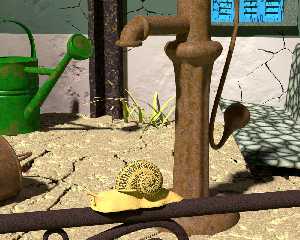
I have not been here for a long time, here is a picture concerning my works on
rust metal textures and walls and grounds. Many objects in the scene comes from
Oyonale or PovObjects. I just made a blob macro for the wall and the ground, and
an intensive work for the textures.
Not yet the final render.
Post a reply to this message
Attachments:
Download 'my_walls_final_001.jpg' (696 KB)
Preview of image 'my_walls_final_001.jpg'

|
 |
|  |
|  |
|
 |
|
 |
|  |
|  |
|
 |
Long time no see indeed. I like your rust textures, except maybe the one
on the U-shaped beam.
Watch out for the jaggies on the cracks :-)
--
Thomas
Post a reply to this message
|
 |
|  |
|  |
|
 |
|
 |
|  |
|  |
|
 |
Thomas de Groot <tho### [at] degroot org> wrote:
> Long time no see indeed. I like your rust textures, except maybe the one
> on the U-shaped beam.
>
> Watch out for the jaggies on the cracks :-)
>
> --
> Thomas
I think the worst texture is the texture of the pump. I cannot obtain exactely
what i want.
About the jaggies on the cracks, it is due to the blob's macro. Hard to set it
fine. org> wrote:
> Long time no see indeed. I like your rust textures, except maybe the one
> on the U-shaped beam.
>
> Watch out for the jaggies on the cracks :-)
>
> --
> Thomas
I think the worst texture is the texture of the pump. I cannot obtain exactely
what i want.
About the jaggies on the cracks, it is due to the blob's macro. Hard to set it
fine.
Post a reply to this message
|
 |
|  |
|  |
|
 |
|
 |
|  |
|  |
|
 |
Am 04.11.2017 um 19:09 schrieb Fractracer:
> Thomas de Groot <tho### [at] degroot org> wrote:
>> Long time no see indeed. I like your rust textures, except maybe the one
>> on the U-shaped beam.
>>
>> Watch out for the jaggies on the cracks :-)
>>
>> --
>> Thomas
>
> I think the worst texture is the texture of the pump. I cannot obtain exactely
> what i want.
> About the jaggies on the cracks, it is due to the blob's macro. Hard to set it
> fine.
>
I agree with Thomas, the worst is the one on the U-shaped beam. The
texture of the pump is not that bad, but it would look better scaled
down a little bit IMO.
A good start for rust textures is the work of one of our best texture
experts: Sean Day. Look for his entry "Old Royal" in the IRTC August
2006. The image and the code are still available at
https://ftp.uni-erlangen.de/pub/graphics/irtc/stills/ where all of the
IRTC entries are stored. But beware, rendering through all this years of
POV can be a bit addictive...
Best regards
Michael org> wrote:
>> Long time no see indeed. I like your rust textures, except maybe the one
>> on the U-shaped beam.
>>
>> Watch out for the jaggies on the cracks :-)
>>
>> --
>> Thomas
>
> I think the worst texture is the texture of the pump. I cannot obtain exactely
> what i want.
> About the jaggies on the cracks, it is due to the blob's macro. Hard to set it
> fine.
>
I agree with Thomas, the worst is the one on the U-shaped beam. The
texture of the pump is not that bad, but it would look better scaled
down a little bit IMO.
A good start for rust textures is the work of one of our best texture
experts: Sean Day. Look for his entry "Old Royal" in the IRTC August
2006. The image and the code are still available at
https://ftp.uni-erlangen.de/pub/graphics/irtc/stills/ where all of the
IRTC entries are stored. But beware, rendering through all this years of
POV can be a bit addictive...
Best regards
Michael
Post a reply to this message
|
 |
|  |
|  |
|
 |
|
 |
|  |
|  |
|
 |
> I have not been here for a long time, here is a picture concerning my works on
> rust metal textures and walls and grounds. Many objects in the scene comes from
> Oyonale or PovObjects. I just made a blob macro for the wall and the ground, and
> an intensive work for the textures.
> Not yet the final render.
>
Nice one.
I agree that the U beam texture just look wrong.
Next, is the snail. It looks like it's on some kind of invisible plastic
sheet. It's body should embrace the pipe/rod it's on.
Post a reply to this message
|
 |
|  |
|  |
|
 |
|
 |
|  |
|  |
|
 |
MichaelJF <mi-### [at] t-online de> wrote:
> I agree with Thomas, the worst is the one on the U-shaped beam. The
> texture of the pump is not that bad, but it would look better scaled
> down a little bit IMO.
The texture of the pump is not enough iron-ic.
For the U-beam, I want an reddish anti-rust paint with small spots of rust or
iron.
> A good start for rust textures is the work of one of our best texture
> experts: Sean Day. Look for his entry "Old Royal" in the IRTC August
> 2006. The image and the code are still available at
> https://ftp.uni-erlangen.de/pub/graphics/irtc/stills/ where all of the
> IRTC entries are stored. But beware, rendering through all this years of
> POV can be a bit addictive...
Thanks for the links and the advices. POV is itself addictive. de> wrote:
> I agree with Thomas, the worst is the one on the U-shaped beam. The
> texture of the pump is not that bad, but it would look better scaled
> down a little bit IMO.
The texture of the pump is not enough iron-ic.
For the U-beam, I want an reddish anti-rust paint with small spots of rust or
iron.
> A good start for rust textures is the work of one of our best texture
> experts: Sean Day. Look for his entry "Old Royal" in the IRTC August
> 2006. The image and the code are still available at
> https://ftp.uni-erlangen.de/pub/graphics/irtc/stills/ where all of the
> IRTC entries are stored. But beware, rendering through all this years of
> POV can be a bit addictive...
Thanks for the links and the advices. POV is itself addictive.
Post a reply to this message
|
 |
|  |
|  |
|
 |
|
 |
|  |
|  |
|
 |
Alain <kua### [at] videotron ca> wrote:
> Nice one.
> I agree that the U beam texture just look wrong.
>
> Next, is the snail. It looks like it's on some kind of invisible plastic
> sheet. It's body should embrace the pipe/rod it's on.
Thank you, you are right for the snail. Since it is a mesh I can't adapt it
exactly to the rod. Maybe I will do make a slug with blobs. ca> wrote:
> Nice one.
> I agree that the U beam texture just look wrong.
>
> Next, is the snail. It looks like it's on some kind of invisible plastic
> sheet. It's body should embrace the pipe/rod it's on.
Thank you, you are right for the snail. Since it is a mesh I can't adapt it
exactly to the rod. Maybe I will do make a slug with blobs.
Post a reply to this message
|
 |
|  |
|  |
|
 |
|
 |
|  |
|  |
|
 |
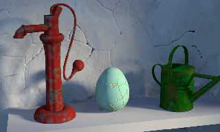
Here comes a better version of the rusted pump.
The wall is not enough fine for the moment...
Post a reply to this message
Attachments:
Download 'inside_wall_001.png' (2827 KB)
Preview of image 'inside_wall_001.png'

|
 |
|  |
|  |
|
 |
|
 |
|  |
|  |
|
 |
Am 08.11.2017 um 20:01 schrieb Fractracer:
> Here comes a better version of the rusted pump.
> The wall is not enough fine for the moment...
Dunno. I think this version of the pump looks nothing like rust at all.
More like red paint, with a brighter primer below, and sanded off in places.
Post a reply to this message
|
 |
|  |
|  |
|
 |
|
 |
|  |
|  |
|
 |
Welcome back! :)
I'd say that rather than try to invent a suitable rust texture from scratch -
because I know how hard that is to do - search for rust textures in the
newsgroups and use those as a starting point for customizing your own.
A fast way to evaluate a lot of variations would be to make a grid of spheres or
boxes with a nested loop, and vary some parameter of the texture from start to
finish.
Post a reply to this message
|
 |
|  |
|  |
|
 |
|
 |
|  |


![]()