 |
 |
|
 |
|
 |
|  |
|  |
|
 |
|
 |
|  |
|  |
|
 |
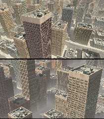
With a little bit of fog thrown in-- smog, or city pollution.
Currently, I'm using 16 different window photo-facades, randomly placed on 450
buildings--each with reflective windows, by way of 'hold-out' mattes and using
POV-ray's image_pattern feature. (Increasing the number of buildings is trivial;
but I need to use more photos, as there is already too much window repetition.)
But I usually make a new photo tile every night!
I've managed to fix four items on my to-do list:
* making sure the windows go all the way to the edges and tops, without being
randomly chopped off. (I also reworked the window photo images to be more
accurate 'tiles'-- a learning experience.) The building widths and heights are
now based on small strict subdivisions of the (larger) tiles-- while still using
the FULL tile textures on the building. That was a happy accident ;-)
* matching the colors of the 'concrete' edges and tops of the buildings to the
average color of the photo facades; looks better than plain gray. The architects
were being creative ;-)
* putting the buildings in a street-grid layout (more or less), so that they no
longer overlap (well, I haven't *seen* any overlaps yet.) This needs more work--
as well as to make the streets go in two 90-degree directions, instead of just
one.
* adding a bit of dirt and aging to the building faces. (The 'dirt' is just an
overlay of several distorted bumps pigments.) Currently, this is also applied
over the window areas as well, which I want to eliminate.
Three things I haven't done yet: cleaning up my code(!); trying out POV-Ray's
new(?) CUBIC pattern for texturing the buildings; and re-working my code to use
heightfields for the building faces, instead of plain boxes. I hope I can do
--that-- without a major re-write!
Comments and criticisms welcome.
Post a reply to this message
Attachments:
Download 'city buildings wip 2a.png' (3359 KB)
Preview of image 'city buildings wip 2a.png'

|
 |
|  |
|  |
|
 |
|
 |
|  |
|  |
|
 |
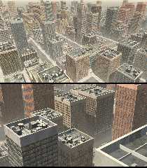
A couple more views...
Forgot to mention that I'm still working on the rooftop 'junk' (obviously!)
Looking at photos of New York City buildings, *every* rooftop is completely
different. Ugh. I'm trying to discern what the overall 'design elements' would
be, in the abstract--i.e., what combination of things and shapes that would
*appear* correct, without being overly detailed. One thing that ALL the NYC
buildings have in common is... large air-conditioners, with huge whirling fans.
And possibly big water tanks. Oh, and probably cell-phone towers or relay
stations.
Post a reply to this message
Attachments:
Download 'city buildings wip 2b.png' (3312 KB)
Preview of image 'city buildings wip 2b.png'

|
 |
|  |
|  |
|
 |
|
 |
|  |
|  |
|
 |
I just noticed something strange about the PNG images I posted: When I look at
the small *preview* images here in my post (using the latest version of
Firefox), they look correct: identical to how they appear on my own machine,
when viewed in either Photoshop or the Windows Photo Viewer. (BTW, I
post-processed the images in PS, but only to combine two renders into one post.)
But when I click on the image previews here-- and the higher-resolution versions
appear-- the gamma of the images isn't correct! They look darker, with more
contrast.
Does anyone else notice this? Right now, I have no idea what's going on, or why
they appear differently on the same website.
Honestly, I simply don't trust PNG images to show up consistently or correctly,
anywhere! :-( I should have posted them as jpegs.
Post a reply to this message
|
 |
|  |
|  |
|
 |
|
 |
|  |
|  |
|
 |
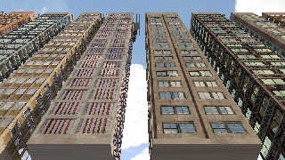
Just a JPEG test for my own purposes, to confirm that it shows up correctly.
(The render is a window reflection test, on some of the basic building units, to
check the slight bumpy normals I added to the 'glass' windows.)
Post a reply to this message
Attachments:
Download 'city buildings wip 2c.jpg' (242 KB)
Preview of image 'city buildings wip 2c.jpg'

|
 |
|  |
|  |
|
 |
|
 |
|  |
|  |
|
 |
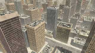
One more image test, again for my own purposes: This PNG is *directly* from
POV-Ray (and NOT post-processed in Photoshop.) If it shows up correctly here
both as a small preview AND as the larger hi-rez image, then the problem will be
in my use of Photoshop, for some strange reason. An interesting experiment...
Post a reply to this message
Attachments:
Download 'city buildings wip 2d.png' (1782 KB)
Preview of image 'city buildings wip 2d.png'

|
 |
|  |
|  |
|
 |
|
 |
|  |
|  |
|
 |
"Kenneth" <kdw### [at] gmail com> wrote:
> One more image test, again for my own purposes: This PNG is *directly* from
> POV-Ray (and NOT post-processed in Photoshop.) If it shows up correctly here
> both as a small preview AND as the larger hi-rez image, then the problem will be
> in my use of Photoshop, for some strange reason. An interesting experiment...
Confirmed(!) THIS PNG image looks correct to me--both the small preview as
well as the larger hi-rez version, when clicking on the preview.
This is indeed strange-- but at least I now have a clue as to what might be
going on, within Photoshop (and how it treats POV-Ray-generated PNG
renders--possibly changing their gamma when I certainly wasn't expecting that.)
I need to test this further.
However...this does NOT explain the difference in appearance here of my
originally posted PNG's-- the previews vs. the hi-rez versions. The only
possible explanation I can come up with is that the newsgroup 'previews' are at
one gamma setting, while the hi-rez versions are shown with a different setting.
Sounds a bit crazy, I know... com> wrote:
> One more image test, again for my own purposes: This PNG is *directly* from
> POV-Ray (and NOT post-processed in Photoshop.) If it shows up correctly here
> both as a small preview AND as the larger hi-rez image, then the problem will be
> in my use of Photoshop, for some strange reason. An interesting experiment...
Confirmed(!) THIS PNG image looks correct to me--both the small preview as
well as the larger hi-rez version, when clicking on the preview.
This is indeed strange-- but at least I now have a clue as to what might be
going on, within Photoshop (and how it treats POV-Ray-generated PNG
renders--possibly changing their gamma when I certainly wasn't expecting that.)
I need to test this further.
However...this does NOT explain the difference in appearance here of my
originally posted PNG's-- the previews vs. the hi-rez versions. The only
possible explanation I can come up with is that the newsgroup 'previews' are at
one gamma setting, while the hi-rez versions are shown with a different setting.
Sounds a bit crazy, I know...
Post a reply to this message
|
 |
|  |
|  |
|
 |
|
 |
|  |
|  |
|
 |
On 5-8-2017 4:44, Kenneth wrote:
>
> One more image test, again for my own purposes: This PNG is *directly* from
> POV-Ray (and NOT post-processed in Photoshop.) If it shows up correctly here
> both as a small preview AND as the larger hi-rez image, then the problem will be
> in my use of Photoshop, for some strange reason. An interesting experiment...
>
Yes, this is much better indeed, although the original ones posted were
awesome already. But, not knowing the problem, it was difficult to judge.
Excellent work, Kenneth!
--
Thomas
Post a reply to this message
|
 |
|  |
|  |
|
 |
|
 |
|  |
|  |
|
 |
hi,
On 05/08/2017 00:15, Kenneth wrote:
> Comments and criticisms welcome.
the word, I believe, is "stonking". :-) looks fabulous.
my only criticism concerns shape + spacing, the buildings are mostly
(near) square and, as an European who has never visited the US of A, the
spaces between buildings don't quite feel right; for an alternative see
https://www.youtube.com/watch?v=gO9JI7FT1V8, the last 30 minutes or so
(start 5:25:00, no rooftops alas).
cheers, jr.
Post a reply to this message
|
 |
|  |
|  |
|
 |
|
 |
|  |
|  |
|
 |
"Kenneth" <kdw### [at] gmail com> wrote:
> With a little bit of fog thrown in-- smog, or city pollution.
This is a nice project, looking good. What happens if the fog is too dense to
see the ground? :)
You could also try to group buildings in blocks, alley-distance apart, with
blocks separated more widely. Maybe vary the height distribution using a
large-scale pigment to select the maxima - you tend to get clusters of tall
buildings in many cities.
[anecdote warning]
I spent quite a bit of time on something similar about a year or so ago, and
it's interesting to see how others approach the same problem differently. I was
making buildings from simple triangle-based boxes, to avoid the textures looking
obvious in close-ups. I then moved on to preparing a city 'plan' by intersecting
street lines to find polygonal blocks, then filling the blocks with buildings
placed very closely together. Both the blocks and the buildings were not
necessarily rectangular. The rooftop furniture was also an issue, and I too
spent a bit of time googling images of Manhattan :)
The block approach proved far too complex and slow for SDL macros, so I moved it
over into a small C++ project with a POV-Ray export to make it more
comprehensible and maintainable. Unfortunately, it's fallen by the wayside for
the time being (stupid real life), but I fully intend to go back to it at some
point!
Keep up the good work.
Bill com> wrote:
> With a little bit of fog thrown in-- smog, or city pollution.
This is a nice project, looking good. What happens if the fog is too dense to
see the ground? :)
You could also try to group buildings in blocks, alley-distance apart, with
blocks separated more widely. Maybe vary the height distribution using a
large-scale pigment to select the maxima - you tend to get clusters of tall
buildings in many cities.
[anecdote warning]
I spent quite a bit of time on something similar about a year or so ago, and
it's interesting to see how others approach the same problem differently. I was
making buildings from simple triangle-based boxes, to avoid the textures looking
obvious in close-ups. I then moved on to preparing a city 'plan' by intersecting
street lines to find polygonal blocks, then filling the blocks with buildings
placed very closely together. Both the blocks and the buildings were not
necessarily rectangular. The rooftop furniture was also an issue, and I too
spent a bit of time googling images of Manhattan :)
The block approach proved far too complex and slow for SDL macros, so I moved it
over into a small C++ project with a POV-Ray export to make it more
comprehensible and maintainable. Unfortunately, it's fallen by the wayside for
the time being (stupid real life), but I fully intend to go back to it at some
point!
Keep up the good work.
Bill
Post a reply to this message
|
 |
|  |
|  |
|
 |
|
 |
|  |
|  |
|
 |
That's really nice.
I think you should also make different photos for the 1st floor of the
buildings. At least to give them an entrance.
Do you plan to add people, vehicles and traffic signs in the street ? It looks
like an endless project ! :-)
"Kenneth" <kdw### [at] gmail com> wrote:
> With a little bit of fog thrown in-- smog, or city pollution.
>
> Currently, I'm using 16 different window photo-facades, randomly placed on 450
> buildings--each with reflective windows, by way of 'hold-out' mattes and using
> POV-ray's image_pattern feature. (Increasing the number of buildings is trivial;
> but I need to use more photos, as there is already too much window repetition.)
> But I usually make a new photo tile every night!
>
> I've managed to fix four items on my to-do list:
>
> * making sure the windows go all the way to the edges and tops, without being
> randomly chopped off. (I also reworked the window photo images to be more
> accurate 'tiles'-- a learning experience.) The building widths and heights are
> now based on small strict subdivisions of the (larger) tiles-- while still using
> the FULL tile textures on the building. That was a happy accident ;-)
>
> * matching the colors of the 'concrete' edges and tops of the buildings to the
> average color of the photo facades; looks better than plain gray. The architects
> were being creative ;-)
>
> * putting the buildings in a street-grid layout (more or less), so that they no
> longer overlap (well, I haven't *seen* any overlaps yet.) This needs more work--
> as well as to make the streets go in two 90-degree directions, instead of just
> one.
>
> * adding a bit of dirt and aging to the building faces. (The 'dirt' is just an
> overlay of several distorted bumps pigments.) Currently, this is also applied
> over the window areas as well, which I want to eliminate.
>
> Three things I haven't done yet: cleaning up my code(!); trying out POV-Ray's
> new(?) CUBIC pattern for texturing the buildings; and re-working my code to use
> heightfields for the building faces, instead of plain boxes. I hope I can do
> --that-- without a major re-write!
>
> Comments and criticisms welcome. com> wrote:
> With a little bit of fog thrown in-- smog, or city pollution.
>
> Currently, I'm using 16 different window photo-facades, randomly placed on 450
> buildings--each with reflective windows, by way of 'hold-out' mattes and using
> POV-ray's image_pattern feature. (Increasing the number of buildings is trivial;
> but I need to use more photos, as there is already too much window repetition.)
> But I usually make a new photo tile every night!
>
> I've managed to fix four items on my to-do list:
>
> * making sure the windows go all the way to the edges and tops, without being
> randomly chopped off. (I also reworked the window photo images to be more
> accurate 'tiles'-- a learning experience.) The building widths and heights are
> now based on small strict subdivisions of the (larger) tiles-- while still using
> the FULL tile textures on the building. That was a happy accident ;-)
>
> * matching the colors of the 'concrete' edges and tops of the buildings to the
> average color of the photo facades; looks better than plain gray. The architects
> were being creative ;-)
>
> * putting the buildings in a street-grid layout (more or less), so that they no
> longer overlap (well, I haven't *seen* any overlaps yet.) This needs more work--
> as well as to make the streets go in two 90-degree directions, instead of just
> one.
>
> * adding a bit of dirt and aging to the building faces. (The 'dirt' is just an
> overlay of several distorted bumps pigments.) Currently, this is also applied
> over the window areas as well, which I want to eliminate.
>
> Three things I haven't done yet: cleaning up my code(!); trying out POV-Ray's
> new(?) CUBIC pattern for texturing the buildings; and re-working my code to use
> heightfields for the building faces, instead of plain boxes. I hope I can do
> --that-- without a major re-write!
>
> Comments and criticisms welcome.
Post a reply to this message
|
 |
|  |
|  |
|
 |
|
 |
|  |
|
 |


![]()