|
|
|
|
|
|
| |
| |
|
|
|
|
| |
| |
|
|
"Kenneth" <kdw### [at] gmail com> wrote:
> Stephen <mca### [at] aolcom> wrote:
>
> >
> > I would try changing the end caps. Maybe a gold texture would make it
> > less like a fluorescent tube. Or something ornamental like a short wire
> > mesh.
> >
> Or maybe half a torus at both ends, both vertical, with one flipped in the
> opposite direction. Like a long 'S' shape.
>
> The possibilities are endless! (That's the most difficult part of designing
> anything-- actually *choosing* only one of countless ideas.) ;-)
>
> By the way, Art Deco (and 'Moderne') are my favorite 'design philosophies' as
> well. Perhaps with a little bit of 'Steampunk' thrown in. (Disney's design for
> the Nautilus submarine in 20,000 LEAGUES UNDER THE SEA is a constant
> inspiration, as are the sleek, ominous Martian saucers in George Pal's 1950's
> version of WAR OF THE WORLDS.)
Unfortunately putting end caps on isn't an option. In the books these crystals
are the result of a single forging. Besides, any substance other then that of
the crystal would be subject to the forces that are summoned when the crystal is
used (as in fused, vapourized, disintegrated, obliterated, eviscerated, etc,
etc). Having written the books, I should, more than anyone else, adhere to the
rules I have already laid down.
I have reworked the mesh for the stave and its core, and that has improved
matters somewhat. See uploaded image. (I am still not entirely satisfied,
though.)
I loved that design for the Nautilus. When I was little I wanted an airfix
model! I also wanted an airfix model of the martian saucers, though I imagine
not much assembly would be required. No fiddly bits! I also love the design of
the Chrysler building and the Columbine inspired scroll work that occasionally
pops up from time to time. I have borrowed a lot from art deco, and gothic. I
also love gothic.
Cheers,
Simon. com> wrote:
> Stephen <mca### [at] aolcom> wrote:
>
> >
> > I would try changing the end caps. Maybe a gold texture would make it
> > less like a fluorescent tube. Or something ornamental like a short wire
> > mesh.
> >
> Or maybe half a torus at both ends, both vertical, with one flipped in the
> opposite direction. Like a long 'S' shape.
>
> The possibilities are endless! (That's the most difficult part of designing
> anything-- actually *choosing* only one of countless ideas.) ;-)
>
> By the way, Art Deco (and 'Moderne') are my favorite 'design philosophies' as
> well. Perhaps with a little bit of 'Steampunk' thrown in. (Disney's design for
> the Nautilus submarine in 20,000 LEAGUES UNDER THE SEA is a constant
> inspiration, as are the sleek, ominous Martian saucers in George Pal's 1950's
> version of WAR OF THE WORLDS.)
Unfortunately putting end caps on isn't an option. In the books these crystals
are the result of a single forging. Besides, any substance other then that of
the crystal would be subject to the forces that are summoned when the crystal is
used (as in fused, vapourized, disintegrated, obliterated, eviscerated, etc,
etc). Having written the books, I should, more than anyone else, adhere to the
rules I have already laid down.
I have reworked the mesh for the stave and its core, and that has improved
matters somewhat. See uploaded image. (I am still not entirely satisfied,
though.)
I loved that design for the Nautilus. When I was little I wanted an airfix
model! I also wanted an airfix model of the martian saucers, though I imagine
not much assembly would be required. No fiddly bits! I also love the design of
the Chrysler building and the Columbine inspired scroll work that occasionally
pops up from time to time. I have borrowed a lot from art deco, and gothic. I
also love gothic.
Cheers,
Simon.
Post a reply to this message
Attachments:
Download 'towar.png' (1560 KB)
Preview of image 'towar.png'
|
|
| |
| |
|
|
|
|
| |
| |
|
|
On 5/23/2017 12:24 PM, Simon J. Cambridge wrote:
> "Kenneth" <kdw### [at] gmailcom> wrote:
>> Stephen <mca### [at] aolcom> wrote:
>>
>>>
>>> I would try changing the end caps. Maybe a gold texture would make it
>>> less like a fluorescent tube. Or something ornamental like a short wire
>>> mesh.
>>>
>> Or maybe half a torus at both ends, both vertical, with one flipped in the
>> opposite direction. Like a long 'S' shape.
>>
>> The possibilities are endless! (That's the most difficult part of designing
>> anything-- actually *choosing* only one of countless ideas.) ;-)
>>
>> By the way, Art Deco (and 'Moderne') are my favorite 'design philosophies' as
>> well. Perhaps with a little bit of 'Steampunk' thrown in. (Disney's design for
>> the Nautilus submarine in 20,000 LEAGUES UNDER THE SEA is a constant
>> inspiration, as are the sleek, ominous Martian saucers in George Pal's 1950's
>> version of WAR OF THE WORLDS.)
>
> Unfortunately putting end caps on isn't an option. In the books these crystals
> are the result of a single forging. Besides, any substance other then that of
> the crystal would be subject to the forces that are summoned when the crystal is
> used (as in fused, vapourized, disintegrated, obliterated, eviscerated, etc,
> etc). Having written the books, I should, more than anyone else, adhere to the
> rules I have already laid down.
>
That is fair enough but I would have left a "get out" clause. ;)
> I have reworked the mesh for the stave and its core, and that has improved
> matters somewhat. See uploaded image. (I am still not entirely satisfied,
> though.)
>
Yes it has. It gives a bit more detail. :)
> I loved that design for the Nautilus. When I was little I wanted an airfix
> model!
Me too. That's why I built a PovRay one. <smug emoji>
I also wanted an airfix model of the martian saucers, though I imagine
> not much assembly would be required. No fiddly bits! I also love the design of
> the Chrysler building and the Columbine inspired scroll work that occasionally
> pops up from time to time. I have borrowed a lot from art deco, and gothic. I
> also love gothic.
>
Baroque! You forgot to mention Baroque. :)
Okay I know that it and Rococo are diagonally opposed but therein lies
the similarity.
[Drat I forgot to take my dried frog pills.]
--
Regards
Stephen
Post a reply to this message
|
|
| |
| |
|
|
|
|
| |
| |
|
|
Stephen <mca### [at] aolcom> wrote:
> On 5/23/2017 12:24 PM, Simon J. Cambridge wrote:
> > "Kenneth" <kdw### [at] gmailcom> wrote:
> >> Stephen <mca### [at] aolcom> wrote:
> >>
> >>>
> >>> I would try changing the end caps. Maybe a gold texture would make it
> >>> less like a fluorescent tube. Or something ornamental like a short wire
> >>> mesh.
> >>>
> >> Or maybe half a torus at both ends, both vertical, with one flipped in the
> >> opposite direction. Like a long 'S' shape.
> >>
> >> The possibilities are endless! (That's the most difficult part of designing
> >> anything-- actually *choosing* only one of countless ideas.) ;-)
> >>
> >> By the way, Art Deco (and 'Moderne') are my favorite 'design philosophies' as
> >> well. Perhaps with a little bit of 'Steampunk' thrown in. (Disney's design for
> >> the Nautilus submarine in 20,000 LEAGUES UNDER THE SEA is a constant
> >> inspiration, as are the sleek, ominous Martian saucers in George Pal's 1950's
> >> version of WAR OF THE WORLDS.)
> >
> > Unfortunately putting end caps on isn't an option. In the books these crystals
> > are the result of a single forging. Besides, any substance other then that of
> > the crystal would be subject to the forces that are summoned when the crystal is
> > used (as in fused, vapourized, disintegrated, obliterated, eviscerated, etc,
> > etc). Having written the books, I should, more than anyone else, adhere to the
> > rules I have already laid down.
> >
>
> That is fair enough but I would have left a "get out" clause. ;)
>
> > I have reworked the mesh for the stave and its core, and that has improved
> > matters somewhat. See uploaded image. (I am still not entirely satisfied,
> > though.)
> >
>
> Yes it has. It gives a bit more detail. :)
>
> > I loved that design for the Nautilus. When I was little I wanted an airfix
> > model!
>
> Me too. That's why I built a PovRay one. <smug emoji>
>
> I also wanted an airfix model of the martian saucers, though I imagine
> > not much assembly would be required. No fiddly bits! I also love the design of
> > the Chrysler building and the Columbine inspired scroll work that occasionally
> > pops up from time to time. I have borrowed a lot from art deco, and gothic. I
> > also love gothic.
> >
>
> Baroque! You forgot to mention Baroque. :)
> Okay I know that it and Rococo are diagonally opposed but therein lies
> the similarity.
> [Drat I forgot to take my dried frog pills.]
>
> --
>
> Regards
> Stephen
I like Baroque, but not Rococo. Rococo is so over the top it goes back around
again for seconds!
And I have to ask. Are you a Bursar?
Cheers,
Simon.
Post a reply to this message
|
|
| |
| |
|
|
|
|
| |
| |
|
|
On 5/24/2017 4:17 PM, Simon J. Cambridge wrote:
> I like Baroque, but not Rococo. Rococo is so over the top it goes back around
> again for seconds!
>
And then asks for more. :-)
> And I have to ask. Are you a Bursar?
Golly gosh! I have never been asked that before.
What makes you ask that?
I have not been involved in academia for more years than I care to
remember. I would say that I am more a horny handed son of toil. But for
the fact that I am lazy, a skiver and my hands are now soft.
--
Regards
Stephen
Post a reply to this message
|
|
| |
| |
|
|
|
|
| |
| |
|
|
On 5/24/2017 5:28 PM, Stephen wrote:
>
>> And I have to ask. Are you a Bursar?
I forgot. I dropped out of the Unseen University (UU failed) :)
--
Regards
Stephen
Post a reply to this message
|
|
| |
| |
|
|
|
|
| |
| |
|
|
Stephen <mca### [at] aolcom> wrote:
> On 5/24/2017 5:28 PM, Stephen wrote:
> >
> >> And I have to ask. Are you a Bursar?
>
>
> I forgot. I dropped out of the Unseen University (UU failed) :)
>
> --
>
> Regards
> Stephen
I could not resist! It is probably the only chance I will ever have to ask that
question.
Cheers,
Simon.
Post a reply to this message
|
|
| |
| |
|
|
|
|
| |
| |
|
|
On 5/24/2017 8:34 PM, Simon J. Cambridge wrote:
> Stephen <mca### [at] aolcom> wrote:
>> On 5/24/2017 5:28 PM, Stephen wrote:
>>>
>>>> And I have to ask. Are you a Bursar?
>>
>>
>> I forgot. I dropped out of the Unseen University (UU failed) :)
>>
>> --
>>
>> Regards
>> Stephen
>
> I could not resist! It is probably the only chance I will ever have to ask that
> question.
>
As long as it makes you happy.
> Cheers,
>
Sláinte
Raises a glass of the golden one.
--
Regards
Stephen
Post a reply to this message
|
|
| |
| |
|
|
|
|
| |
| |
|
|
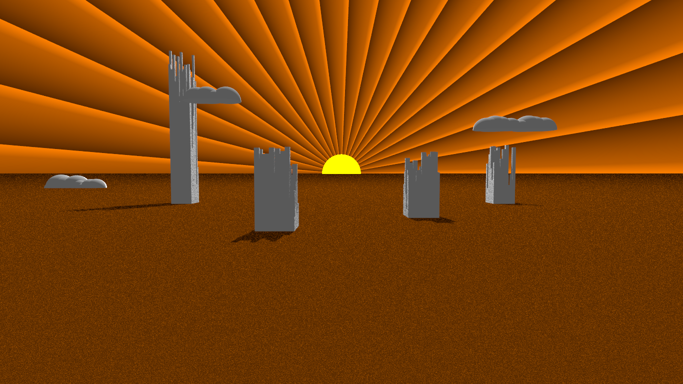
"Kenneth" <kdw### [at] gmailcom> wrote:
> By the way, Art Deco (and 'Moderne') are my favorite 'design philosophies' as
> well. Perhaps with a little bit of 'Steampunk' thrown in. (Disney's design for
> the Nautilus submarine in 20,000 LEAGUES UNDER THE SEA is a constant
> inspiration, as are the sleek, ominous Martian saucers in George Pal's 1950's
> version of WAR OF THE WORLDS.)
That inspired me to do a little doodle over the weekend - based on the kind of
style on several of Signet's printings of Ayn Rand's novels.
By far, Art Nouveau is my favorite style - the flowing organic curves and
integration of natural elements is immensely pleasing to my eye and mind.
Post a reply to this message
Attachments:
Download 'randdoodle.png' (1016 KB)
Preview of image 'randdoodle.png'
|
|
| |
| |
|
|
|
|
| |
| |
|
|
Bald Eagle wrote on 30/05/2017 13:52:
> "Kenneth" <kdw### [at] gmailcom> wrote:
>
>> By the way, Art Deco (and 'Moderne') are my favorite 'design philosophies' as
>> well. Perhaps with a little bit of 'Steampunk' thrown in. (Disney's design for
>> the Nautilus submarine in 20,000 LEAGUES UNDER THE SEA is a constant
>> inspiration, as are the sleek, ominous Martian saucers in George Pal's 1950's
>> version of WAR OF THE WORLDS.)
>
> That inspired me to do a little doodle over the weekend - based on the kind of
> style on several of Signet's printings of Ayn Rand's novels.
>
> By far, Art Nouveau is my favorite style - the flowing organic curves and
> integration of natural elements is immensely pleasing to my eye and mind.
>
>
I definitely like the sun rays.
;-)
Paolo
Post a reply to this message
|
|
| |
| |
|
|
|
|
| |
| |
|
|
Paolo Gibellini <p.g### [at] gmailcom> wrote:
> I definitely like the sun rays.
> ;-)
> Paolo
Heh, thanks :)
For some reason, it's the goofy clouds that really do it for me.
Post a reply to this message
|
|
| |
| |
|
|
|
|
| |
|
|