|
|
|
|
|
|
| |
| |
|
|
|
|
| |
| |
|
|
"SharkD" <nomail@nomail> wrote:
> I would like to continue with this exercise. A couple of questions:
>
> 1) In this last image, did you use a font file or design your own letters using
> CSG?
> 2) How would I go about creating a block for the letters S,O and I? Is it
> possible?
>
> Mike
I started a thread at WhatTheFont to see if an actual font like this has been
created. If not, then I will create it myself.
http://www.myfonts.com/WhatTheFont/forum/viewthread.php?threadid=236091¬ify=1
Mike
Post a reply to this message
|
|
| |
| |
|
|
|
|
| |
| |
|
|
"Cousin Ricky" <ric### [at] yahoo com> wrote:
> The key was keeping the outer radius of curvature of the corner curves to
> no more than the width of a straight line. This meant asymmetrical curves
> for the R and W, but I think they're better-looking for it. (Or is that
> "less clumsy-looking"?)
>
> --
> <Insert witty .sig here>
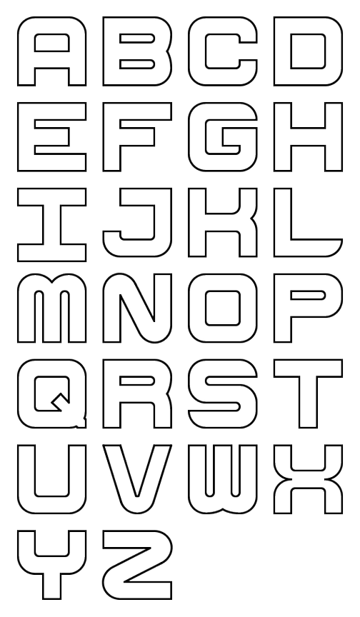
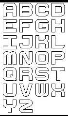
I'm working on a complete font based on the letters you created. I've got
capital A-Z. Not sure if I'm going to stop there or continue with the lower
case, numbers, punctuation, etc..
Mike com> wrote:
> The key was keeping the outer radius of curvature of the corner curves to
> no more than the width of a straight line. This meant asymmetrical curves
> for the R and W, but I think they're better-looking for it. (Or is that
> "less clumsy-looking"?)
>
> --
> <Insert witty .sig here>
I'm working on a complete font based on the letters you created. I've got
capital A-Z. Not sure if I'm going to stop there or continue with the lower
case, numbers, punctuation, etc..
Mike
Post a reply to this message
Attachments:
Download 'cube_font_preview.png' (103 KB)
Preview of image 'cube_font_preview.png'
|
|
| |
| |
|
|
|
|
| |
| |
|
|
On 10/31/2009 11:08 AM, SharkD wrote:
> "Cousin Ricky"<ric### [at] yahoocom> wrote:
>> The key was keeping the outer radius of curvature of the corner curves to
>> no more than the width of a straight line. This meant asymmetrical curves
>> for the R and W, but I think they're better-looking for it. (Or is that
>> "less clumsy-looking"?)
>>
>> --
>> <Insert witty .sig here>
>
> I'm working on a complete font based on the letters you created. I've got
> capital A-Z. Not sure if I'm going to stop there or continue with the lower
> case, numbers, punctuation, etc..
>
> Mike
The Metro Gothic Fat font also looks similar.
http://www.identifont.com/show?54J
It would be tricky to use in a lot of cases, since there are often
little bits that extend beyond the 1x1 unit box.
Mike
Post a reply to this message
|
|
| |
| |
|
|
|
|
| |
| |
|
|
SharkD a écrit :
> On 10/31/2009 11:08 AM, SharkD wrote:
>> "Cousin Ricky"<ric### [at] yahoocom> wrote:
>>> The key was keeping the outer radius of curvature of the corner
>>> curves to
>>> no more than the width of a straight line. This meant asymmetrical
>>> curves
>>> for the R and W, but I think they're better-looking for it. (Or is that
>>> "less clumsy-looking"?)
>>>
>>> --
>>> <Insert witty .sig here>
>>
>> I'm working on a complete font based on the letters you created. I've got
>> capital A-Z. Not sure if I'm going to stop there or continue with the
>> lower
>> case, numbers, punctuation, etc..
>>
>> Mike
>
> The Metro Gothic Fat font also looks similar.
>
> http://www.identifont.com/show?54J
>
> It would be tricky to use in a lot of cases, since there are often
> little bits that extend beyond the 1x1 unit box.
>
> Mike
Accents on uppercase characters are not little
things..."ÀÂÄÃÈÉÊËÎÏĨÔÖÕÛÜŨŶŸÑ" (only those that I can easily
type)
Then, there is the cedil that extend under. "Çç"
Then, there are several lowercase characters that also extend down. "gjpqy"
Alain
Post a reply to this message
|
|
| |
| |
|
|
|
|
| |
|
|