"Cousin Ricky" <ric### [at] yahoo com> wrote:
> The key was keeping the outer radius of curvature of the corner curves to
> no more than the width of a straight line. This meant asymmetrical curves
> for the R and W, but I think they're better-looking for it. (Or is that
> "less clumsy-looking"?)
>
> --
> <Insert witty .sig here>
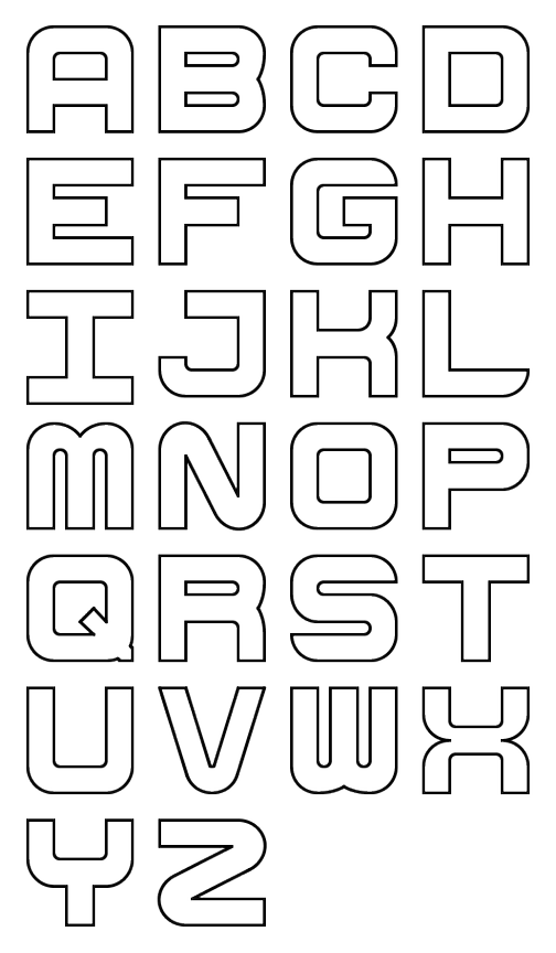
I'm working on a complete font based on the letters you created. I've got
capital A-Z. Not sure if I'm going to stop there or continue with the lower
case, numbers, punctuation, etc..
Mike com> wrote:
> The key was keeping the outer radius of curvature of the corner curves to
> no more than the width of a straight line. This meant asymmetrical curves
> for the R and W, but I think they're better-looking for it. (Or is that
> "less clumsy-looking"?)
>
> --
> <Insert witty .sig here>
I'm working on a complete font based on the letters you created. I've got
capital A-Z. Not sure if I'm going to stop there or continue with the lower
case, numbers, punctuation, etc..
Mike
Post a reply to this message
Attachments:
Download 'cube_font_preview.png' (103 KB)
Preview of image 'cube_font_preview.png'
|