|
|
|
|
|
|
| |
| |
|
|
|
|
| |
| |
|
|
40a60e76@news.povray.org...
>
> "miyoken" <miy### [at] hotmail com> wrote in message
> news:40a60a47@news.povray.org...
> > Beutiful...
> > What meaning is LOTW?
>
> "Landscape of the Week"
>
Oh I thought it was "Load of the wing" :-p
Marc com> wrote in message
> news:40a60a47@news.povray.org...
> > Beutiful...
> > What meaning is LOTW?
>
> "Landscape of the Week"
>
Oh I thought it was "Load of the wing" :-p
Marc
Post a reply to this message
|
|
| |
| |
|
|
|
|
| |
| |
|
|
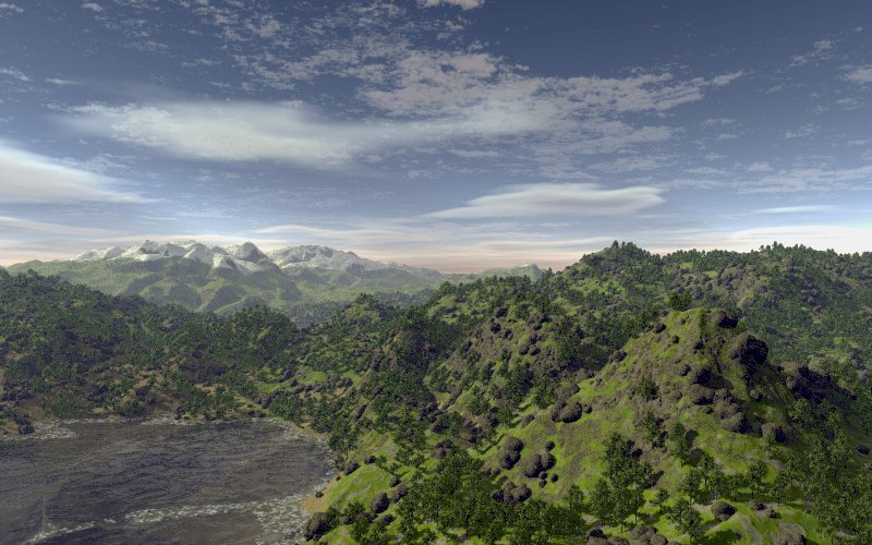
Nathan O'Brien nous apporta ses lumieres ainsi en ce 2004/05/15 02:58... :
> Hi all
>
> just an update on a previous landscape images posted last week for
> comment.
>
> With so many people working on various landscape it migh almost be
> possible to start a LOTW competition. No prizes, just for fun.
>
> Nathan O'Brien
>
> ------------------------------------------------------------------------
>
Very nice, but...
The trees are way to dark, the snow level is much to straight, and maybe
to low, there are two "snow" spots on the near hils on the right...
Alain
Post a reply to this message
|
|
| |
| |
|
|
|
|
| |
| |
|
|
Nathan O'Brien wrote:
> Hi all
>
> just an update on a previous landscape images posted last week for comment.
It's way too dark. Radiosity would have a huge impact.. and the sky
could be brighter at the top, too.
The mountains in the distance look.. extremely odd.
I like the texturing in the foreground, the water, and the vegetation.
-Xplo
Post a reply to this message
|
|
| |
| |
|
|
|
|
| |
| |
|
|
An updated image with some of the changes suggested.
Nathan O'Brien
Post a reply to this message
Attachments:
Download 'new-world3.jpg' (100 KB)
Preview of image 'new-world3.jpg'
|
|
| |
| |
|
|
|
|
| |
| |
|
|
Nathan O'Brien wrote:
> An updated image with some of the changes suggested.
>
> Nathan O'Brien
>
> ------------------------------------------------------------------------
>
snow line is better, but too continuous, too smooth ???
maybe a touch of fog on rhs, skyline seems a fraction sharp
some of the boulders look they should roll downhill, they don't look
embedded in the hillside
vast improvement though
stephen
Post a reply to this message
|
|
| |
| |
|
|
|
|
| |
| |
|
|
Nathan O'Brien wrote:
<snip>
> With so many people working on various landscape it migh almost be
> possible to start a LOTW competition. No prizes, just for fun.
>
> Nathan O'Brien
That's a good idea! I think some really neat ideas could arise out of a competition
like that.
-Sam Benge
Post a reply to this message
|
|
| |
| |
|
|
|
|
| |
| |
|
|
> That's a good idea! I think some really neat ideas could arise out of a
> competition like that.
>
>
> -Sam Benge
>
Yes, I've already used several ideas arising just out of the posts from
this group. If source code was posted as well I'm pretty sure that within
a few months we would have a methedology, + code, that produces results
equal to (or better) than terragen, mojoworld and the like.
--
Using M2, Opera's revolutionary e-mail client: http://www.opera.com/m2/
Post a reply to this message
|
|
| |
| |
|
|
|
|
| |
| |
|
|
stephen parkinson wrote:
> Nathan O'Brien wrote:
>
>> An updated image with some of the changes suggested.
>>
>> Nathan O'Brien
>>
>> ------------------------------------------------------------------------
>>
> snow line is better, but too continuous, too smooth ???
>
> maybe a touch of fog on rhs, skyline seems a fraction sharp
>
> some of the boulders look they should roll downhill, they don't look
> embedded in the hillside
>
> vast improvement though
>
> stephen
>
>
>
further to this
lake, the amount of white water seems out of preportion, maybe also the
lake is too dark
stephen
Post a reply to this message
|
|
| |
| |
|
|
|
|
| |
| |
|
|
> An updated image with some of the changes suggested.
Sky is an improvement. (Although I liked it the other way too.)
Snowline is less of a "line" now. Possibly still too sharp though...
Tree placement seems better on the RHS there - don't know if I'm
imagining it.
Shaddows from the trees need to be fuzzier IMHO. (Although I'm sure this
thing takes forever to render as it is...) Either area light or full
radiosity (with the sky emitting light - just like the real one does).
Not sure about those boulders... maybe they're just too spherical, look
like some variaty of muchrooms or something.
But anyway, apart from all that (sorry) the first image was really good,
and this one is better still. (Especially since the first one didn't
seem to have any AA, and this one does.) Still looks slightly fuzzy -
but they might just be JPEG doing its weirdness. *sigh*
Keep it up!
Andrew @ home.
Post a reply to this message
|
|
| |
| |
|
|
|
|
| |
| |
|
|
Nathan O'Brien wrote:
> An updated image with some of the changes suggested.
>
> Nathan O'Brien
Love the clouds!!!
--
Respectfully, "Leave it to the coward to make a religion
Dan P of his cowardice by preaching humility."
- George Bernard Shaw
http://<broken link>
Post a reply to this message
|
|
| |
| |
|
|
|
|
| |