 |
 |
|
 |
|
 |
|  |
|  |
|
 |
|
 |
|  |
|  |
|
 |
Hi,
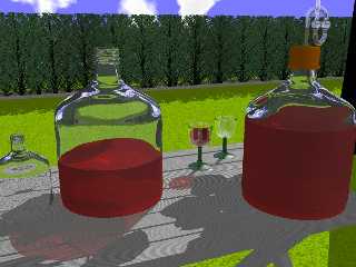
I was just playing around with some transparent items when I got the idea
to this scene. Any comments welcome.
The shadows on the table are from the tree to the right, and the hedge
consists of only one tree in different angles.
Ralf
Post a reply to this message
Attachments:
Download 'wine_1.jpg' (119 KB)
Preview of image 'wine_1.jpg'

|
 |
|  |
|  |
|
 |
|
 |
|  |
|  |
|
 |
Real Good. Nice Layout.
I think you need to lower the "ambient" setting on the table texture.
Although there is a shadow, it dosn't appear any darker, it you see what I
mean. Have you actually specified an Ambient setting for it, or left it at
default?
Post a reply to this message
|
 |
|  |
|  |
|
 |
|
 |
|  |
|  |
|
 |
"Josh" <s### [at] a com> wrote in message news:42cce64f$1@news.povray.org...
> Real Good. Nice Layout.
>
> I think you need to lower the "ambient" setting on the table texture.
> Although there is a shadow, it dosn't appear any darker, it you see what I
> mean. Have you actually specified an Ambient setting for it, or left it
at
> default?
>
>
I agree, the scene looks good except the lighting. it all looks too flat. i
would get rid of all ambient values, and set abient_color in the global
settings to rgb <0,0,0>. com> wrote in message news:42cce64f$1@news.povray.org...
> Real Good. Nice Layout.
>
> I think you need to lower the "ambient" setting on the table texture.
> Although there is a shadow, it dosn't appear any darker, it you see what I
> mean. Have you actually specified an Ambient setting for it, or left it
at
> default?
>
>
I agree, the scene looks good except the lighting. it all looks too flat. i
would get rid of all ambient values, and set abient_color in the global
settings to rgb <0,0,0>.
Post a reply to this message
|
 |
|  |
|  |
|
 |
|
 |
|  |
|  |
|
 |
Hi,
thanks for your replies.
>> I think you need to lower the "ambient" setting on the table texture.
>> Although there is a shadow, it dosn't appear any darker, it you see
>> what I mean. Have you actually specified an Ambient setting for it,or
>> left it at default?
The table has only "pigment {color Gray80}".
I just added an ambient 0.0 and started rendering again.
> I agree, the scene looks good except the lighting. it all looks too
> flat. i would get rid of all ambient values, and set abient_color inthe
> global settings to rgb <0,0,0>.
I only set some ambient attributes for the wine glasses (0.2) and one
for the sky_sphere (ambient 1).
I used no radiosity and only two light sources high above:
light_source {
<500, 500, 500>
color White
}
light_source {
<500, 500, -500>
color Gray20
shadowless
}
The first one respresents the sun, the second the brightness of
the sky. Perhaps I should give an area light a try?
Ahh, and I see, I copied this statement from the skeleton too:
global_settings {
assumed_gamma 1.0
}
Is this correct for this scene?
Greetings
Ralf
Post a reply to this message
|
 |
|  |
|  |
|
 |
|
 |
|  |
|  |
|
 |
if you will to try it I'd suggest explicitly setting "ambient 0" in one
texture at a time and rendering. That way you'll see the effect
progressively and get a real good feel for the effect it has.
Definitely give an area light a go, they make a real difference. I usually
build the model with a standard point light and put in an area light when
I'm close to the final render. The Area Light makes the scene!
Post a reply to this message
|
 |
|  |
|  |
|
 |
|
 |
|  |
|  |
|
 |
You know you've been using Linx too long when...
...somebody posts a picture of an alcoholic beverage, and you were
expecting a screenshot of M$ Word running under KDE. :-|
Post a reply to this message
|
 |
|  |
|  |
|
 |
|
 |
|  |


![]()