 |
 |
|
 |
|
 |
|  |
|  |
|
 |
|
 |
|  |
|  |
|
 |
Hello,
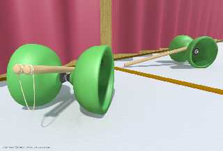
I could need some help on making this scene more realistic. :-)
Thanks!
Post a reply to this message
Attachments:
Download 'diabolo-web.jpg' (112 KB)
Preview of image 'diabolo-web.jpg'

|
 |
|  |
|  |
|
 |
|
 |
|  |
|  |
|
 |
emzic wrote:
> Hello,
>
> I could need some help on making this scene more realistic. :-)
>
> Thanks!
Beutiful, and very intelligent scene, just with few elements.
Keep it up!
Bye
--
Txemi Jendrix
www.txemijendrix.com
Post a reply to this message
|
 |
|  |
|  |
|
 |
|
 |
|  |
|  |
|
 |
nice image. one thing i've learned is that lighting can make even the most
simple image (eg sphere on a plane) look really good. unfortunately, i'm
not an expert on the lighting either. why not try an area spotlight on the
object?
emzic <emz### [at] SPAMembege com> wrote:
> Hello,
>
> I could need some help on making this scene more realistic. :-)
>
> Thanks! com> wrote:
> Hello,
>
> I could need some help on making this scene more realistic. :-)
>
> Thanks!
Post a reply to this message
|
 |
|  |
|  |
|
 |
|
 |
|  |
|  |
|
 |
Very nice!
> I could need some help on making this scene more realistic. :-)
I always got a problem with mirrors in CG. They tend to look too
realistic and IMHO they make the scene more complicated. The texture of
the diabolo is already pretty nice, it almost looks like you used
subsurface scattering. If you didn't perhaps that would be the ultimate
thing. The curtain needs a normal, perhaps something using the quilted
pattern. In general I'd say that the image is a bit too bright.
HTH & Keep up the work!
Florian
--
camera{look_at-y*10location<8,-3,-8>*10}#local a=0;#while(a<999)sphere{
#local _=.01*a-4.99;#local p=a*.01-5;#local c=.01*a-4.995;<sin(p*pi)*5p
*10pow(p,5)*.01>sin(c*c*c*.1)+1pigment{rgb 3}}#local a=a+1;#end
/******** http://www.torfbold.com ******** http://www.imp.org ********/
Post a reply to this message
|
 |
|  |
|  |
|
 |
|
 |
|  |
|  |
|
 |
> I could need some help on making this scene more realistic. :-)
I'd suggest giving the floor a texture that is more visible than the current
one. One first glance it just seems like a simple, one-colored surface.
Then, I'd do something with the mirror. Less than 100% reflection maybe, so
that the reflection is a little darker than the actual ojects are. Finally,
some more contrast on the shadows, make them a little darker. Any you could
try focal blur, which can be quite difficult sometimes, as too much creates
a sense of micro-scale, and too little isn't visible.
Regards,
Tim
--
"Tim Nikias v2.0"
Homepage: <http://www.nolights.de>
Post a reply to this message
|
 |
|  |
|  |
|
 |
|
 |
|  |
|  |
|
 |
Florian Brucker <tor### [at] torfbold com> wrote in news:416044e7$1
@news.povray.org:
> Very nice!
>
>> I could need some help on making this scene more realistic. :-)
> I always got a problem with mirrors in CG. They tend to look too
> realistic and IMHO they make the scene more complicated. The texture of
> the diabolo is already pretty nice, it almost looks like you used
> subsurface scattering.
no i didnt. what is it?
thanks a lot everybody for the feedback! com> wrote in news:416044e7$1
@news.povray.org:
> Very nice!
>
>> I could need some help on making this scene more realistic. :-)
> I always got a problem with mirrors in CG. They tend to look too
> realistic and IMHO they make the scene more complicated. The texture of
> the diabolo is already pretty nice, it almost looks like you used
> subsurface scattering.
no i didnt. what is it?
thanks a lot everybody for the feedback!
Post a reply to this message
|
 |
|  |
|  |
|
 |
|
 |
|  |
|  |
|
 |
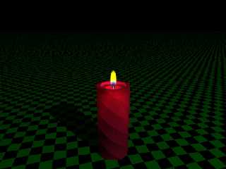
There are others here more knowlegable than myself, but afaik a sub-surface
scattering is basically a media statement in a partially transparent object.
I'm not sure what uses other people put it to, but I've seen it used to make
a glass of milk look realistic, and I used it in the attatched image.
ADB
emzic wrote:
> Florian Brucker <tor### [at] torfbold com> wrote in news:416044e7$1
> @news.povray.org:
>
> > Very nice!
> >
> >> I could need some help on making this scene more realistic. :-)
> > I always got a problem with mirrors in CG. They tend to look too
> > realistic and IMHO they make the scene more complicated. The texture of
> > the diabolo is already pretty nice, it almost looks like you used
> > subsurface scattering.
>
> no i didnt. what is it?
>
> thanks a lot everybody for the feedback! com> wrote in news:416044e7$1
> @news.povray.org:
>
> > Very nice!
> >
> >> I could need some help on making this scene more realistic. :-)
> > I always got a problem with mirrors in CG. They tend to look too
> > realistic and IMHO they make the scene more complicated. The texture of
> > the diabolo is already pretty nice, it almost looks like you used
> > subsurface scattering.
>
> no i didnt. what is it?
>
> thanks a lot everybody for the feedback!
Post a reply to this message
Attachments:
Download 'witchcandle.jpg' (51 KB)
Preview of image 'witchcandle.jpg'

|
 |
|  |
|  |
|
 |
|
 |
|  |
|  |
|
 |
"emzic" <emz### [at] SPAMembege com> wrote in message
news:Xns9577FA6AC7A4emzicNOSPAMembegecom@203.29.75.35...
> Hello,
>
> I could need some help on making this scene more realistic. :-)
>
> Thanks!
>
>
the lighting seems too bright, or atleast too flat. I would work on that a
little, but I don't have any good suggestions. There are some typical
lighting set ups in real life photo shoots. a trip to the library might
result in a lighting book. I know Barnes & Noble has a lot of lighting
books... i've paged through them on occasion.
good luck! com> wrote in message
news:Xns9577FA6AC7A4emzicNOSPAMembegecom@203.29.75.35...
> Hello,
>
> I could need some help on making this scene more realistic. :-)
>
> Thanks!
>
>
the lighting seems too bright, or atleast too flat. I would work on that a
little, but I don't have any good suggestions. There are some typical
lighting set ups in real life photo shoots. a trip to the library might
result in a lighting book. I know Barnes & Noble has a lot of lighting
books... i've paged through them on occasion.
good luck!
Post a reply to this message
|
 |
|  |
|  |
|
 |
|
 |
|  |
|  |
|
 |
"Tim Nikias" <JUSTTHELOWERCASE:timISNOTnikias(at)gmx.netWARE> wrote in
news:41604883$1@news.povray.org:
> I'd suggest giving the floor a texture that is more visible than the
> current one. One first glance it just seems like a simple, one-colored
> surface. Then, I'd do something with the mirror. Less than 100%
> reflection maybe, so that the reflection is a little darker than the
> actual ojects are. Finally, some more contrast on the shadows, make
> them a little darker.
how could i make the shadows darker?
i have only one light in the scene with intensity <1,0.95,0.95>
thanks!
Post a reply to this message
|
 |
|  |
|  |
|
 |
|
 |
|  |
|  |
|
 |
emzic <emz### [at] SPAMembege com> wrote:
> "Tim Nikias" <JUSTTHELOWERCASE:timISNOTnikias(at)gmx.netWARE> wrote in
> news:41604883$1@news.povray.org:
>
> > I'd suggest giving the floor a texture that is more visible than the
> > current one. One first glance it just seems like a simple, one-colored
> > surface. Then, I'd do something with the mirror. Less than 100%
> > reflection maybe, so that the reflection is a little darker than the
> > actual ojects are. Finally, some more contrast on the shadows, make
> > them a little darker.
>
> how could i make the shadows darker?
> i have only one light in the scene with intensity <1,0.95,0.95>
>
> thanks!
Well, I'm not an expert, but I think that you can fiddle with the diffuse
parameter on your objects a bit. Make your objects reflect less diffuse
light, and add more lights to keep the brightness level. This will bump up
the contrast a bit. Also, make sure all your objects have ambient set to
zero. I can't tell if you do or not, but it's a pretty bright looking scene
for only one light. The default ambient value of 0.1 is not usually useful
when rendering with radiosity turned on.
- dan B hentschel com> wrote:
> "Tim Nikias" <JUSTTHELOWERCASE:timISNOTnikias(at)gmx.netWARE> wrote in
> news:41604883$1@news.povray.org:
>
> > I'd suggest giving the floor a texture that is more visible than the
> > current one. One first glance it just seems like a simple, one-colored
> > surface. Then, I'd do something with the mirror. Less than 100%
> > reflection maybe, so that the reflection is a little darker than the
> > actual ojects are. Finally, some more contrast on the shadows, make
> > them a little darker.
>
> how could i make the shadows darker?
> i have only one light in the scene with intensity <1,0.95,0.95>
>
> thanks!
Well, I'm not an expert, but I think that you can fiddle with the diffuse
parameter on your objects a bit. Make your objects reflect less diffuse
light, and add more lights to keep the brightness level. This will bump up
the contrast a bit. Also, make sure all your objects have ambient set to
zero. I can't tell if you do or not, but it's a pretty bright looking scene
for only one light. The default ambient value of 0.1 is not usually useful
when rendering with radiosity turned on.
- dan B hentschel
Post a reply to this message
|
 |
|  |
|  |
|
 |
|
 |
|  |


![]()