 |
 |
|
 |
|
 |
|  |
|  |
|
 |
From: Jaime Vives Piqueres
Subject: 3dRender.com Lighting Challenge
Date: 23 Dec 2009 09:43:22
Message: <4b322c8a@news.povray.org>
|
|
 |
|  |
|  |
|
 |
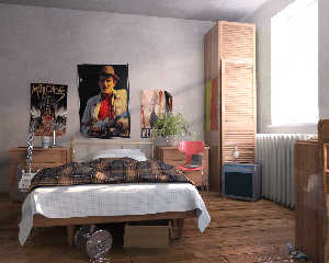
Hi all:
I didn't really mean to enter the challenge, but after looking at the ugly
export they offer, I had to demonstrate that better options can be offered
to POV-Ray artists if they really want some povers to enter the challenge.
So, I used Poseray to convert the OBJ format offered into POV SDL. The
scene is really nice, and very detailed, but unfortunately the author was a
bit lazy with the object naming. The solution, to avoid excesive trial &
error, was to use Wings3D just to identify the object names (I didn't touch
anything within Wings3D).
Because the main challenge is the lighting, I didn't even bother to uvmap
the objects that don't have uvmaps, and most materials are not final
still... I wanted to focus on the lighting, which I think I finally solved
with a variation the classic arealight-on-the-window trick. I'm not
satisfied with the overexposing of the windows and blinds, but in general
the trick seems to work well with just 1 rad bounce.
As a bonus, I added postprocessed media. Using a third pass with black
objects and without area lights, I got a "media mask" wich I applied as an
overlapping layer on The Gimp.
Known problems not work commenting:
+ Black artifacts on some meshes: should be corrected with a re-export
from Poseray with better smoothing (I hope!).
+ Chromed metals look waaaay too fake (although it will be realistic for
those fake-chrome plastics on toys).
+ The bed sheet needs some subdivision, but this was on the original scene.
Suggestions and criticism welcome, as usual...
P.S.: Combined render time was about 16 hours with MegaPOV.
--
Jaime Vives Piqueres
http://www.ignorancia.org
Post a reply to this message
Attachments:
Download 'bedroom-13-ppmedia.jpg' (342 KB)
Preview of image 'bedroom-13-ppmedia.jpg'

|
 |
|  |
|  |
|
 |
|
 |
|  |
|  |
|
 |
Jaime Vives Piqueres <jai### [at] ignorancia org> wrote:
> So, I used Poseray to convert the OBJ format offered into POV SDL. The
> scene is really nice, and very detailed, but unfortunately the author was a
> bit lazy with the object naming. The solution, to avoid excesive trial &
> error, was to use Wings3D just to identify the object names (I didn't touch
> anything within Wings3D).
Fantastic job on the conversion - is there any chance of making your version of
the scene available?
> Because the main challenge is the lighting, I didn't even bother to uvmap
> the objects that don't have uvmaps, and most materials are not final
> still... I wanted to focus on the lighting, which I think I finally solved
> with a variation the classic arealight-on-the-window trick. I'm not
> satisfied with the overexposing of the windows and blinds, but in general
> the trick seems to work well with just 1 rad bounce.
>
> As a bonus, I added postprocessed media. Using a third pass with black
> objects and without area lights, I got a "media mask" wich I applied as an
> overlapping layer on The Gimp.
Wow - it looks really good. The lighting seems extremely natural, and nicely
evocative of the morning light streaming through the window.
> Known problems not work commenting:
>
> + Chromed metals look waaaay too fake (although it will be realistic for
> those fake-chrome plastics on toys).
Yeah - are you using focal blur instead of AA?
> Suggestions and criticism welcome, as usual...
Only that the scene could have more contrast - it seems almost too flat given it
is lit by the morning sun. The area light/sky sphere seems to be much brighter
than I would expect (if I'm reading your lighting rig right).
Cheers,
Edouard. org> wrote:
> So, I used Poseray to convert the OBJ format offered into POV SDL. The
> scene is really nice, and very detailed, but unfortunately the author was a
> bit lazy with the object naming. The solution, to avoid excesive trial &
> error, was to use Wings3D just to identify the object names (I didn't touch
> anything within Wings3D).
Fantastic job on the conversion - is there any chance of making your version of
the scene available?
> Because the main challenge is the lighting, I didn't even bother to uvmap
> the objects that don't have uvmaps, and most materials are not final
> still... I wanted to focus on the lighting, which I think I finally solved
> with a variation the classic arealight-on-the-window trick. I'm not
> satisfied with the overexposing of the windows and blinds, but in general
> the trick seems to work well with just 1 rad bounce.
>
> As a bonus, I added postprocessed media. Using a third pass with black
> objects and without area lights, I got a "media mask" wich I applied as an
> overlapping layer on The Gimp.
Wow - it looks really good. The lighting seems extremely natural, and nicely
evocative of the morning light streaming through the window.
> Known problems not work commenting:
>
> + Chromed metals look waaaay too fake (although it will be realistic for
> those fake-chrome plastics on toys).
Yeah - are you using focal blur instead of AA?
> Suggestions and criticism welcome, as usual...
Only that the scene could have more contrast - it seems almost too flat given it
is lit by the morning sun. The area light/sky sphere seems to be much brighter
than I would expect (if I'm reading your lighting rig right).
Cheers,
Edouard.
Post a reply to this message
|
 |
|  |
|  |
|
 |
From: Jaime Vives Piqueres
Subject: Re: 3dRender.com Lighting Challenge
Date: 23 Dec 2009 15:04:23
Message: <4b3277c7@news.povray.org>
|
|
 |
|  |
|  |
|
 |
> Fantastic job on the conversion - is there any chance of making your
> version of the scene available?
Yes, I will do, but right now it is a mess... or were you asking just
for the _geom.inc files exported with Poseray?
> Wow - it looks really good. The lighting seems extremely natural, and
> nicely evocative of the morning light streaming through the window.
Thanks!
> Only that the scene could have more contrast - it seems almost too flat
> given it is lit by the morning sun. The area light/sky sphere seems to be
> much brighter than I would expect (if I'm reading your lighting rig
> right).
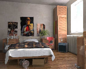
Yes, I think I overdone the sky light... but the lack of contrast is
also due to the addition of the media mask, I think (see the "dry" render
attached).
--
Jaime Vives Piqueres
http://www.ignorancia.org
Post a reply to this message
Attachments:
Download 'bedroom-13-dry.jpg' (350 KB)
Preview of image 'bedroom-13-dry.jpg'

|
 |
|  |
|  |
|
 |
|
 |
|  |
|  |
|
 |
Jaime Vives Piqueres wrote:
> Hi all:
>
> I didn't really mean to enter the challenge, but after looking at the
> ugly
> export they offer, I had to demonstrate that better options can be offered
> to POV-Ray artists if they really want some povers to enter the challenge.
>
> So, I used Poseray to convert the OBJ format offered into POV SDL. The
> scene is really nice, and very detailed, but unfortunately the author was a
> bit lazy with the object naming. The solution, to avoid excesive trial &
> error, was to use Wings3D just to identify the object names (I didn't touch
> anything within Wings3D).
>
> Because the main challenge is the lighting, I didn't even bother to uvmap
> the objects that don't have uvmaps, and most materials are not final
> still... I wanted to focus on the lighting, which I think I finally solved
> with a variation the classic arealight-on-the-window trick. I'm not
> satisfied with the overexposing of the windows and blinds, but in general
> the trick seems to work well with just 1 rad bounce.
>
> As a bonus, I added postprocessed media. Using a third pass with black
> objects and without area lights, I got a "media mask" wich I applied as an
> overlapping layer on The Gimp.
>
> Known problems not work commenting:
>
> + Black artifacts on some meshes: should be corrected with a re-export
> from Poseray with better smoothing (I hope!).
>
> + Chromed metals look waaaay too fake (although it will be realistic for
> those fake-chrome plastics on toys).
>
> + The bed sheet needs some subdivision, but this was on the original
> scene.
>
> Suggestions and criticism welcome, as usual...
>
>
> P.S.: Combined render time was about 16 hours with MegaPOV.
>
>
>
> ------------------------------------------------------------------------
>
Heh heh, our resident lighting guru steps up. Good job Jaime.
Post a reply to this message
|
 |
|  |
|  |
|
 |
|
 |
|  |
|  |
|
 |
Jim Charter <jrc### [at] msn com> wrote:
> Heh heh, our resident lighting guru steps up. Good job Jaime.
was a sure bet. :)
I also liked the dirty paint job on the walls. Too many people just assign a
pigment and a rough material and are done with it. com> wrote:
> Heh heh, our resident lighting guru steps up. Good job Jaime.
was a sure bet. :)
I also liked the dirty paint job on the walls. Too many people just assign a
pigment and a rough material and are done with it.
Post a reply to this message
|
 |
|  |
|  |
|
 |
From: Jaime Vives Piqueres
Subject: Re: 3dRender.com Lighting Challenge
Date: 24 Dec 2009 03:27:10
Message: <4b3325de@news.povray.org>
|
|
 |
|  |
|  |
|
 |
> I also liked the dirty paint job on the walls. Too many people just assign a
> pigment and a rough material and are done with it.
That's a proceduralized image_map, of course... ;)
material{
texture{
uv_mapping
pigment{
image_map{
jpeg "mayang-concrete_rectangular_slabs_seamless.jpg"
interpolate 2
}
rotate 90*z
scale .25
warp{
displace{cells scale .1 turbulence .3} // <--- the trick
}
}
}
}
--
Jaime Vives Piqueres
http://www.ignorancia.org
Post a reply to this message
|
 |
|  |
|  |
|
 |
|
 |
|  |
|  |
|
 |
Jaime Vives Piqueres wrote:
>> I also liked the dirty paint job on the walls. Too many people just
>> assign a
>> pigment and a rough material and are done with it.
>
> That's a proceduralized image_map, of course... ;)
>
Oh! Thanks for that :)
I look forward to the final version.
--
Best Regards,
Stephen
Post a reply to this message
|
 |
|  |
|  |
|
 |
From: Jaime Vives Piqueres
Subject: Re: 3dRender.com Lighting Challenge
Date: 29 Dec 2009 16:38:10
Message: <4b3a76c2@news.povray.org>
|
|
 |
|  |
|  |
|
 |
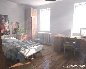
Here is the final pic that I posted at the challenge forum. It could have
used still more work, but I was distracted with the camera effects
experiments... will see if I can do better on the next challenge. ;)
--
Jaime Vives Piqueres
http://www.ignorancia.org
Post a reply to this message
Attachments:
Download 'bedroom-15-mediapp.jpg' (315 KB)
Preview of image 'bedroom-15-mediapp.jpg'

|
 |
|  |
|  |
|
 |
|
 |
|  |
|  |
|
 |
Jaime Vives Piqueres wrote:
> Here is the final pic that I posted at the challenge forum. It could have
> used still more work, but I was distracted with the camera effects
> experiments... will see if I can do better on the next challenge. ;)
*cough* *cough*
Why is your room so dusty?
*wheeze*
I mean, sure, it shows off those nice light rays, but IRL those only
look that prominent if there's smoke or lots and lots of dust in the air.
--
Tim Cook
http://empyrean.freesitespace.net
Post a reply to this message
|
 |
|  |
|  |
|
 |
|
 |
|  |
|  |
|
 |
I realize that it's part of the original model, but I would not want to walk around on
that floor barefoot; I could no
longer count to 20.
Post a reply to this message
|
 |
|  |
|  |
|
 |
|
 |
|  |


![]()