 |
 |
|
 |
|
 |
|  |
|  |
|
 |
|
 |
|  |
|  |
|
 |
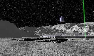
Getting closer, but still not there yet.
Post a reply to this message
Attachments:
Download 'AsteroidCity2.jpg' (260 KB)
Preview of image 'AsteroidCity2.jpg'

|
 |
|  |
|  |
|
 |
|
 |
|  |
|  |
|
 |
> Getting closer, but still not there yet.
I think you need to work on the lighting. Too much of the scene is covered
in grey patches of unlit surfaces, IMHO.
- Slime
[ http://www.slimeland.com/ ]
Post a reply to this message
|
 |
|  |
|  |
|
 |
|
 |
|  |
|  |
|
 |
Yeah, throw a radiosity block into your global settings and tweak it from
there. Should come out pretty well.
Skip
Post a reply to this message
|
 |
|  |
|  |
|
 |
|
 |
|  |
|  |
|
 |
4141e575$1@news.povray.org...
> > Getting closer, but still not there yet.
>
> I think you need to work on the lighting. Too much of the scene is covered
> in grey patches of unlit surfaces, IMHO.
>
> - Slime
> [ http://www.slimeland.com/ ]
>
On this point, I think using radiosity means you have to put ambient 0 on
every texture you don't want to be emitting light.
Unlit surfaces should be less flat.
Marc
Post a reply to this message
|
 |
|  |
|  |
|
 |
|
 |
|  |
|  |
|
 |
Marc Jacquier wrote:
> On this point, I think using radiosity means you have to put ambient 0 on
> every texture you don't want to be emitting light.
Not explicitly; assuming those textures don't already have individual
ambient settings, setting ambient 0 in #default will do the trick.
Textures that ARE supposed to glow can still have nonzero ambient.
On this note.. Bryan, if you replace the ambient with radiosity, low
quality settings will work fine (count 5 - 30, recursion 1, error_bound
1 - .5). You can always increase them later if you want to pick out
small details.
-Xplo
Post a reply to this message
|
 |
|  |
|  |
|
 |
|
 |
|  |
|  |
|
 |
> Yeah, throw a radiosity block into your global settings and tweak it from
> there. Should come out pretty well.
Radiosity is a possibility but not even really necessary; I'd decrease the
ambient light significantly (it's space after all), maybe move the primary
light source to illuminate more, and add a dim shadowless light somewhere to
get some shading in the unlit areas.
Of course, on top of that, everything could use better textures, but I'm
assuming that hasn't really been worked on yet.
The stars could be improved also; they look kind of stretched and stuff.
More like whitish blobs than bright distant objects.
- Slime
[ http://www.slimeland.com/ ]
Post a reply to this message
|
 |
|  |
|  |
|
 |
|
 |
|  |
|  |
|
 |
Bryan Valencia wrote:
> Getting closer, but still not there yet.
>
Nice, seems like it's been awhile since we've had some traditional
spacescapes, (just Gail's recent scene.) I like the sweep of the
composition and the continuity of foreground and background. The
foreground terrain texture works remarkably well.
I recently picked up some classic scifi hard-science type easy-reads
Ben Bova for instance.
Would an asteroid like this be cratered?
Is it true that space equipment is perpetually scarred by radiation and
dust bombardment like they picture it in those novels?
Looks like you got some good crit from the others.
Post a reply to this message
|
 |
|  |
|  |
|
 |
|
 |
|  |
|  |
|
 |
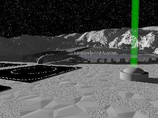
Actually that _was_ with radiosity. This is what it looks like without.
The goal here is not to highlight the nuances of the unlit rock. It's a fantasy scene
about a
colony on a large asteroid.
I could maybe use some ideas on rad settings to make it less boring.
Here are the current settings - pretty much pasted out of the insert menu...
radiosity {
pretrace_start 0.08
pretrace_end 0.01
count 40
nearest_count 10
error_bound 0.5
recursion_limit 1
low_error_factor .5
gray_threshold 0.0
minimum_reuse 0.015
brightness .2
adc_bailout 0.01/2
normal on
}
Post a reply to this message
Attachments:
Download 'AsteroidCity.jpg' (232 KB)
Preview of image 'AsteroidCity.jpg'

|
 |
|  |
|  |
|
 |
|
 |
|  |
|  |
|
 |
Oops that was the wrong attachment, sorry.
Post a reply to this message
|
 |
|  |
|  |
|
 |
|
 |
|  |
|  |
|
 |
Very nice. I like how you softened the becon-beam, but you might try
placing one at each corner of the landing pad to create a descent
coridoor effect. Just a suggestion.
Is this an asteroid mine, or an actual habitat?
I like the concept of the Thistledown from Greg Bear's "EON"
ADB
Bryan Valencia wrote:
> Getting closer, but still not there yet.
>
> [Image]
Post a reply to this message
|
 |
|  |
|  |
|
 |
|
 |
|  |


![]()