 |
 |
|
 |
|
 |
|  |
|  |
|
 |
|
 |
|  |
|  |
|
 |
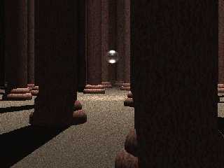
this is my first image, and i want some feedback.
for any WOT fans out there, this is the Stone of Tear, and i will eventually
replace the crystal sphere with a crystal sword.
for anyone else, i just want feedback in general.
Post a reply to this message
Attachments:
Download 'tear.jpg' (36 KB)
Preview of image 'tear.jpg'

|
 |
|  |
|  |
|
 |
|
 |
|  |
|  |
|
 |
First of all: It would be more polite to say "I'd like some feedback"
instead of "I want some feedback". No demands here, please. :-)
Regarding the image itself: the textures, aside the crystal sphere, a really
flat. If the columns should be made of marble or such, I'd suggest some
specular in the finish, and perhaps some reflection, this also applies to
the floor, which is *really* grainy. Either you're using a very small scaled
texture, or the light has some issues, maybe coincident surfaces or such?
A nice beginners image, but normally, a first image on the newsgroups is a
RSOCP-Variant: "Reflective Sphere on Checkered Plane". You'll find hundreds,
if not thousands variations on that on the newsgroups. Once that "test" is
passed, you're free to post. ;-)
Regards,
Tim
--
"Tim Nikias v2.0"
Homepage: <http://www.nolights.de>
Post a reply to this message
|
 |
|  |
|  |
|
 |
|
 |
|  |
|  |
|
 |
> No demands here, please. :-)
LOL
Post a reply to this message
|
 |
|  |
|  |
|
 |
|
 |
|  |
|  |
|
 |
"Tim Nikias" <JUSTTHELOWERCASE:timISNOTnikias(at)gmx.netWARE> wrote:
> First of all: It would be more polite to say "I'd like some feedback"
> instead of "I want some feedback". No demands here, please. :-)
ok, then, i'll remember that for next time
>
> Regarding the image itself: the textures, aside the crystal sphere, a really
> flat. If the columns should be made of marble or such, I'd suggest some
> specular in the finish, and perhaps some reflection, this also applies to
> the floor, which is *really* grainy. Either you're using a very small scaled
> texture, or the light has some issues, maybe coincident surfaces or such?
yes, the floor is a very, very scaled down texture, but for the flatness
issues, i just used the standard textures that came with textures.inc
i might try fooling around with some of those numbers, though if it will
help
>
> A nice beginners image, but normally, a first image on the newsgroups is a
> RSOCP-Variant: "Reflective Sphere on Checkered Plane". You'll find hundreds,
> if not thousands variations on that on the newsgroups. Once that "test" is
> passed, you're free to post. ;-)
As far as the 'standard beginner' image, i've never been one for holding
back.
jumping in the deep end is the fastest way to learn how to swim.
acually, my *first* image attempt was a pair of cupped hands holding a pile
of sand with a miniature desert scene in it over a pool of water. (for the
irtc desert competition)
needless to say, it was a miserable failure as an image, but i got lots of
practice working with solids and shadows :)
>
> Regards,
> Tim
>
thank you
:)
Post a reply to this message
|
 |
|  |
|  |
|
 |
|
 |
|  |
|  |
|
 |
Maybe add one or two dim lights with the "shadowless" keyword. Lighting is
very difficult with POV. (For me, anyway...) Also, a spotlight might look
good on your crystal sword, and you'll definitely want to use photons.
Regards,
Dave
Post a reply to this message
|
 |
|  |
|  |
|
 |
|
 |
|  |
|  |
|
 |
Good start.
Use an area light to soften the shadows.
Post a reply to this message
|
 |
|  |
|  |
|
 |
|
 |
|  |
|  |
|
 |
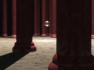
ok, i fixed the problems set forth in the original reply, and i think the
overall effect is really a lot better.
for the grainy, i multiplied the stone texture for the floor by a factor of
1000.
i also made the columns redder (what i always imagined in the books, and i
removed the innermost ring of columns (seemed a little crowded to me)
the sphere(soon to be sword) is, in fact lit by 3 spotlights. two of which
are something like 150 above the center and one is only 50.
aside from a simple "global_settings {ambient_light 1 }", there is no other
light in the image.
Post a reply to this message
Attachments:
Download 'tear2.jpg' (29 KB)
Preview of image 'tear2.jpg'

|
 |
|  |
|  |
|
 |
|
 |
|  |
|  |
|
 |
> aside from a simple "global_settings {ambient_light 1 }", there is no
other
> light in the image.
Actually, that is just the default setting, IIRC. It's use is for the
ambient-settings in the finishes of the object's texturing. Objects that
aren't directly lit by any actual lightsource would just appear black, and
many a beginner's images would end up being pits of darkness with few
lighted spots. To simulate a very crude ambient lighting, ambient thus
lights up all surfaces, disregarding the actual amount of light or shadow
they get. I hope my phrasing wasn't too complicated, but you can always look
for "ambient" in the documentation.
Regards,
Tim
--
"Tim Nikias v2.0"
Homepage: <http://www.nolights.de>
Post a reply to this message
|
 |
|  |
|  |
|
 |
|
 |
|  |
|  |
|
 |
"Tim Nikias" <JUSTTHELOWERCASE:timISNOTnikias(at)gmx.netWARE> wrote:
> > aside from a simple "global_settings {ambient_light 1 }", there is no
> other
> > light in the image.
>
> Actually, that is just the default setting, IIRC. It's use is for the
> ambient-settings in the finishes of the object's texturing. Objects that
> aren't directly lit by any actual lightsource would just appear black, and
> many a beginner's images would end up being pits of darkness with few
> lighted spots. To simulate a very crude ambient lighting, ambient thus
> lights up all surfaces, disregarding the actual amount of light or shadow
> they get. I hope my phrasing wasn't too complicated, but you can always look
> for "ambient" in the documentation.
>
> Regards,
> Tim
>
> --
> "Tim Nikias v2.0"
> Homepage: <http://www.nolights.de>
no, thats ok.
i just assumed that the default ambient setting was 0.
my mistake
Post a reply to this message
|
 |
|  |
|  |
|
 |
|
 |
|  |
|
 |


![]()