|
|
|
|
|
|
| |
| |
|
|
|
|
| |
| |
|
|
On Wed, 30 Jan 2002 23:14:48 +0100, JRG wrote:
> The funniest term I've found so far is *wedgie* (specifically "giving wedgies").
> ROTL, I couldn't believe such a word existed for such a thing!
Here we call it a grundey, I think it sounds better than wegie.
--
#local i=.1;#local I=(i/i)/i;#local l=(i+i)/i;#local ll=(I/i)/l;box{<-ll,
-((I/I)+l),-ll><ll,-l,ll>pigment{checker scale l}finish{ambient((I/l)/I)+
(l/I)}}sphere{<i-i,l-l,(I/l)>l/l pigment{rgb((I/l)/I)}finish{reflection((
I/l)/I)-(l/I)specular(I/l)/I}}light_source{<I-l,I+I,(I-l)/l>l/l} // Steve
Post a reply to this message
|
|
| |
| |
|
|
|
|
| |
| |
|
|
Another word for my personal selfmade dictionary.
Post a reply to this message
|
|
| |
| |
|
|
|
|
| |
| |
|
|
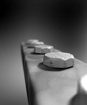
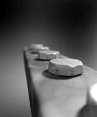
Sent your rendering through Paint Shop Pro 7's automatic contrast
adjustment. I thought the results were a significant improvement. The
added contrast brings out the details in the picture.
Post a reply to this message
Attachments:
Download 'Boltspp.jpg' (9 KB)
Preview of image 'Boltspp.jpg'

|
|
| |
| |
|
|
|
|
| |
| |
|
|
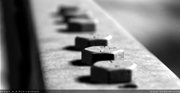
Aww Damn... You beat me too the punch:-) I did the same thing, only in
Photoshop, in my opinion Photoshop does a better job.
"Skip Talbot" <sta### [at] uiuc edu> wrote in message
news:3c58e829@news.povray.org...
> Sent your rendering through Paint Shop Pro 7's automatic contrast
> adjustment. I thought the results were a significant improvement. The
> added contrast brings out the details in the picture.
>
>
> edu> wrote in message
news:3c58e829@news.povray.org...
> Sent your rendering through Paint Shop Pro 7's automatic contrast
> adjustment. I thought the results were a significant improvement. The
> added contrast brings out the details in the picture.
>
>
>
Post a reply to this message
Attachments:
Download 'Bolts.jpg' (11 KB)
Preview of image 'Bolts.jpg'
|
|
| |
| |
|
|
|
|
| |
| |
|
|
"Hugo" <hua### [at] post3teledk> wrote in message
news:3c580489$1@news.povray.org...
> I refuse to think any other renderer can do better than Pov, so we must
find
> a solution to this! I've tried to make realistic bolts myself without much
> luck.. Hmm.. First of all, could you point me to your reference picture?
See attatched picture
> As you said, more contrast would be good.. Maybe some more specular
> reflection wouldn't be unrealistic because in real life, the dusty look
does
> not have to be *everywhere* on the bolt.. Some parts are typically quite
> shiny, because they have been scratched.
Specular is turned on, but my textures are all messed up and need reworking.
My 'dirt' looks nothing like dirt.. too smooth (on the block base)
>
> And do I see a line from one end of the bolt to the other, like it's a
> screw? Is that line supposed to be there? If so, make it deeper.
That's supposed to be scratches on the surface.. just a scaled normal.
> If you want to keep such a closeup view, I'm afraid blurred reflection
will
> be necessary.
Yes.. good point. I have lost the example code for blurred textures that was
posted recently. I'll try and locate it.
All the best,
Andy Cocker
Post a reply to this message
Attachments:
Download 'bolts_600.jpg' (42 KB)
Preview of image 'bolts_600.jpg'

|
|
| |
| |
|
|
|
|
| |
| |
|
|
> Sent your rendering through Paint Shop Pro 7's automatic contrast
> adjustment. I thought the results were a significant improvement. The
> added contrast brings out the details in the picture.
I find that all povray output benefits from that one filter. are we all
doing something wrong, or is povray the maker of washed out images.....
--
Rick
Kitty5 WebDesign - http://Kitty5.com
POV-Ray News & Resources - http://Povray.co.uk
TEL : +44 (01270) 501101 - FAX : +44 (01270) 251105 - ICQ : 15776037
PGP Public Key
http://pgpkeys.mit.edu:11371/pks/lookup?op=get&search=0x231E1CEA
Post a reply to this message
|
|
| |
| |
|
|
|
|
| |
| |
|
|
Minor hue variations in texture/environment/lights would enhance
the image, unless it's supposed to be b&w :) I would try LDRI
lighting. Like in this one: http://www.pp.htv.fi/kkivisal/bolt_nut.gif
Texture is mostly reflective averaged bumps dents normal.
Actually just wrapped this image around a sphere and used
area light. Works well with MegaPOV blurred reflection
and provides some variation in lighting when used with radiosity
and not so reflective objects.
http://www.pp.htv.fi/kkivisal/shop.jpg
_____________
Kari Kivisalo
Post a reply to this message
|
|
| |
| |
|
|
|
|
| |
| |
|
|
Oh... :o) Your image already looks better than brazil's! The bolts look
more realistic in your version! The ground does not.. The postprocessing by
Skip Talbert and Thomas Lake are an improvement too, but should be done
internally in Pov for greatest usefulness.
The shadows in brazil's version are too dark...
Looking forward to see your next bolt version!
Regards,
Hugo
Post a reply to this message
|
|
| |
| |
|
|
|
|
| |
| |
|
|
I agree. What kind of control do you have over that feature in Photoshop?
PSP's control lets you control the bias, strength, and appearance but only
as a few simple radio button options.
Post a reply to this message
|
|
| |
| |
|
|
|
|
| |
| |
|
|
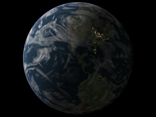
Post a reply to this message
Attachments:
Download 'earth50pp.jpg' (23 KB)
Download 'earth50.jpg' (21 KB)
Preview of image 'earth50pp.jpg'

Preview of image 'earth50.jpg'
|
|
| |
| |
|
|
|
|
| |