 |
 |
|
 |
|
 |
|  |
|  |
|
 |
|
 |
|  |
|  |
|
 |
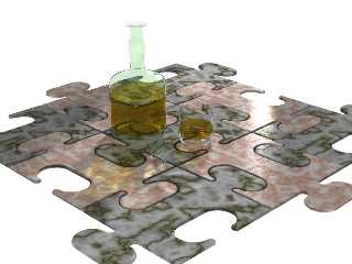
Well, here goes nothing. 9h45min worth of it.
The bottle, glass and (almost invisible) cap are all lathes defined (cubic
splines, BTW). I made the mistake of choosing a very light green as the
color for the bottle and cap, while choosing some varieties of green also
for five of the tiles. Poor choices, I know, but I won't repeat them.
Some technical characteristics:
* max_trace_level is set to 10.
* There is an area light iluminating the scene from behind.
* Radiosity is on, with all default parameters but the count, which is set
to 50.
* Photons are on, with all default parameters. They are shot at all objects
but the tiles and the white background.
I can think of several ways to improve the looks of this scene, but your
comments, as always, are welcome. What I am really interested in, though,
are ways to use radiosity and photons in this scene and still get better
render times. Any thoughts on that?
Ruy
Post a reply to this message
Attachments:
Download 'Booze 2.jpg' (35 KB)
Preview of image 'Booze 2.jpg'

|
 |
|  |
|  |
|
 |
|
 |
|  |
|  |
|
 |
I like it. Perhaps the tiles should be a bit thicker.
--
David Fontaine <dav### [at] faricy net> ICQ 55354965
My raytracing gallery: http://davidf.faricy.net/ net> ICQ 55354965
My raytracing gallery: http://davidf.faricy.net/
Post a reply to this message
|
 |
|  |
|  |
|
 |
|
 |
|  |
|  |
|
 |
Ruy wrote:
> I can think of several ways to improve the looks of this scene, but your
> comments, as always, are welcome. What I am really interested in, though,
> are ways to use radiosity and photons in this scene and still get better
> render times. Any thoughts on that?
The glass of the bottle seems way too thin, compared to a
normal bottle.
Best,
S.
----------------------------------------------------------
Steven Pigeon Ph. D. candidate
University of Montreal.
pig### [at] iro umontreal umontreal ca Topic: data compression
----------------------------------------------------------
http://www.iro.umontreal.ca/~pigeon ca Topic: data compression
----------------------------------------------------------
http://www.iro.umontreal.ca/~pigeon
Post a reply to this message
|
 |
|  |
|  |
|
 |
|
 |
|  |
|  |
|
 |
> I can think of several ways to improve the looks of this scene, but your
> comments, as always, are welcome. What I am really interested in, though,
> are ways to use radiosity and photons in this scene and still get better
> render times. Any thoughts on that?
It only needs a "real scene" around, to have something to reflect.
About render times, area+radiosity+glass is a very slow combination, and
I doubt you can do something to decrease it except by loosing quality.
--
Jaime Vives Piqueres
La Persistencia de la Ignorancia
http://www.ignorancia.org/
Post a reply to this message
|
 |
|  |
|  |
|
 |
|
 |
|  |
|  |
|
 |
Aside from the bottle neck and the tiles being a bit thin, i think its
perfect :) - well worth the 9 hours
--
Rick
Kitty5 WebDesign - http://Kitty5.com
POV-Ray News & Resources - http://Povray.co.uk
TEL : +44 (01270) 501101 - FAX : +44 (01270) 251105 - ICQ : 15776037
PGP Public Key
http://pgpkeys.mit.edu:11371/pks/lookup?op=get&search=0x231E1CEA
Post a reply to this message
|
 |
|  |
|  |
|
 |
|
 |
|  |
|
 |


![]()