|
|
|
|
|
|
| |
| |
|
|
|
|
| |
| |
|
|
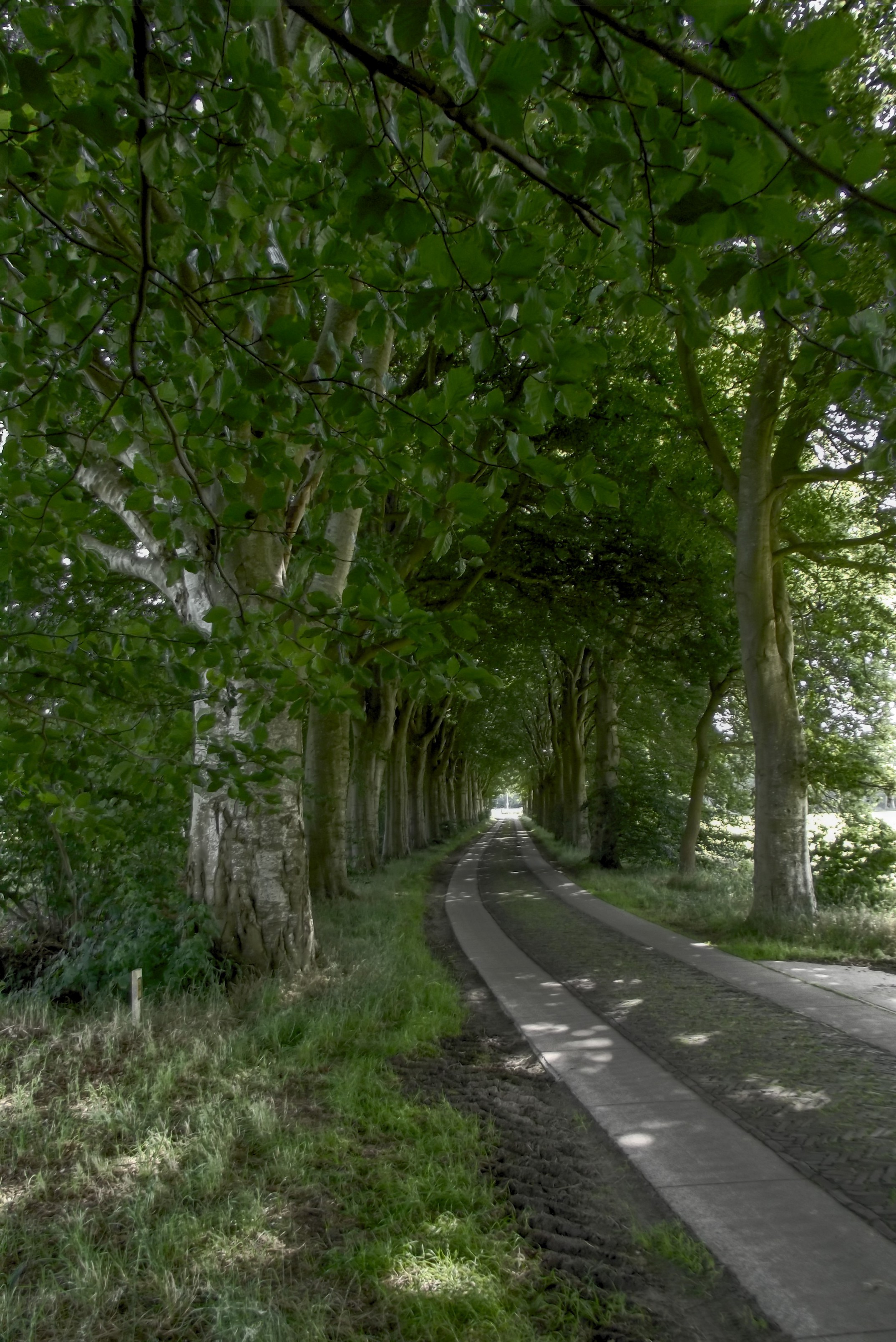
It had been a long time pending, but finally I have done something I
wanted to do for some time. My compact digital camera (Fujifilm FinePix
S8000fd) has the possibility to automatically make three shots with
different lighting parameters which makes HDR processing possible. I
took the shots last summer. I have been experimenting now with the
Fusion F1 application (http://fusion-hdr.com/home) to make HDR
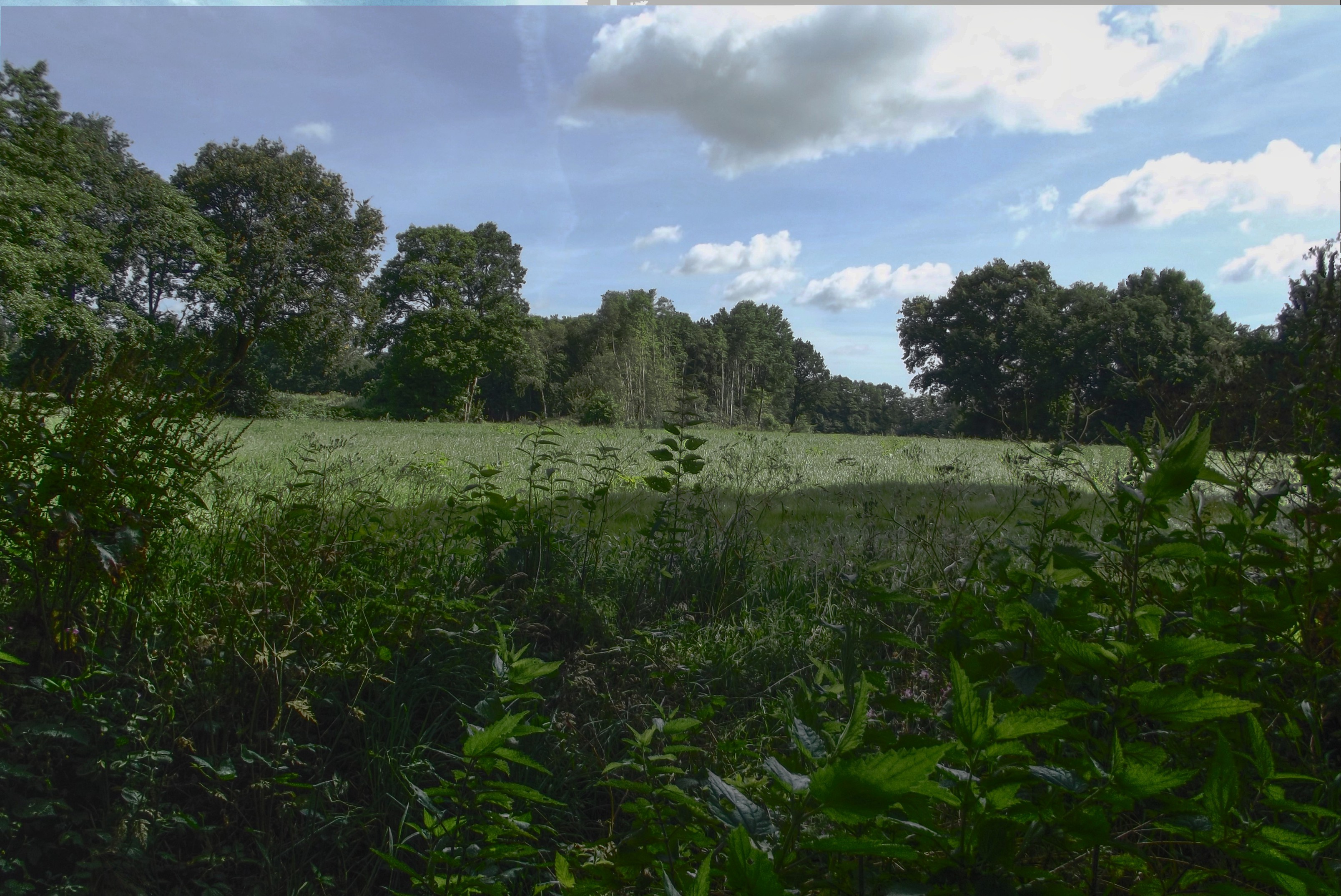
composites. Here is one result, from my neighbourhood.

--
Thomas
Post a reply to this message
Attachments:
Download 'dscf0128_hdr_mode_1.jpg' (1301 KB)
Preview of image 'dscf0128_hdr_mode_1.jpg'
|
|
| |
| |
|
|
|
|
| |
| |
|
|
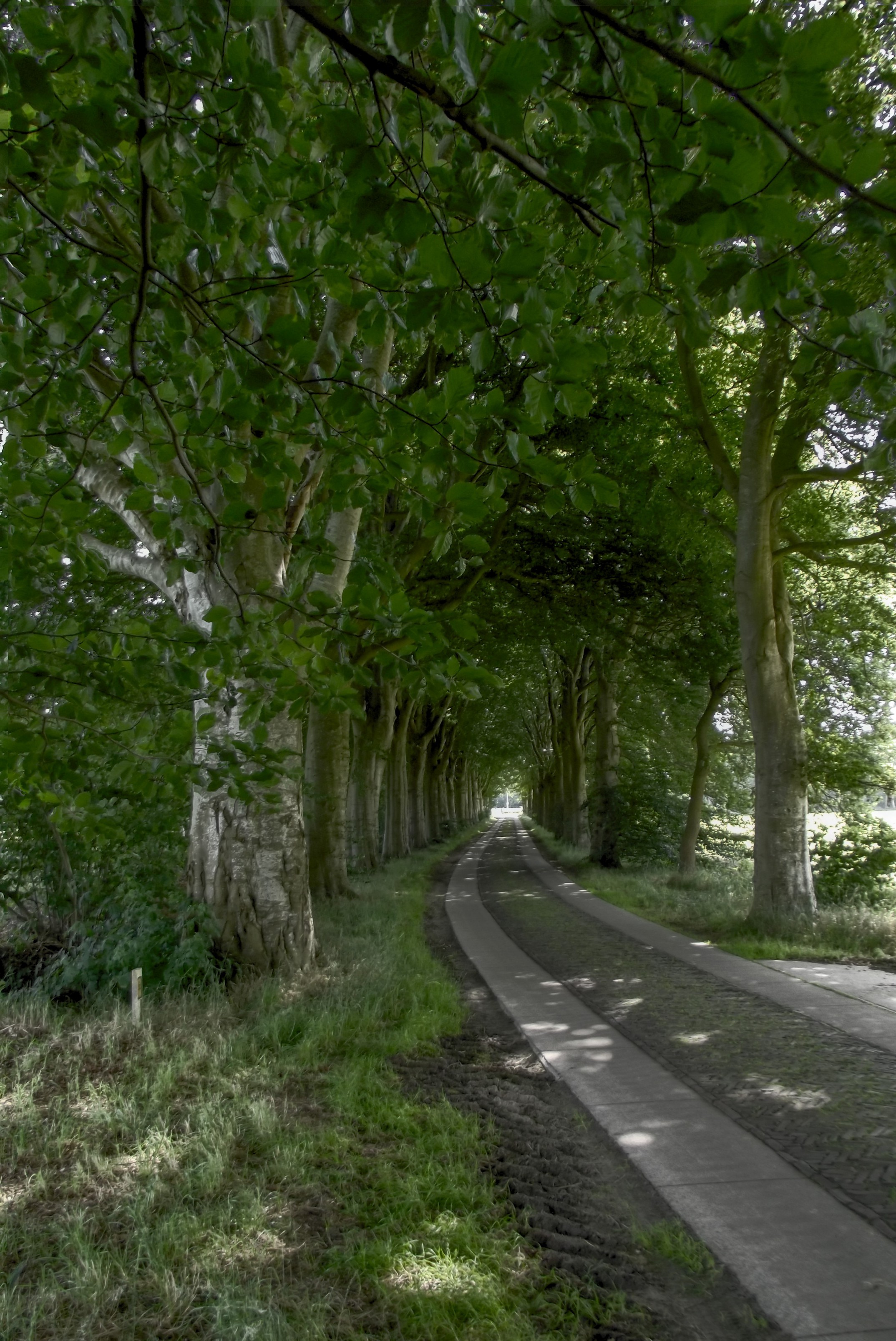
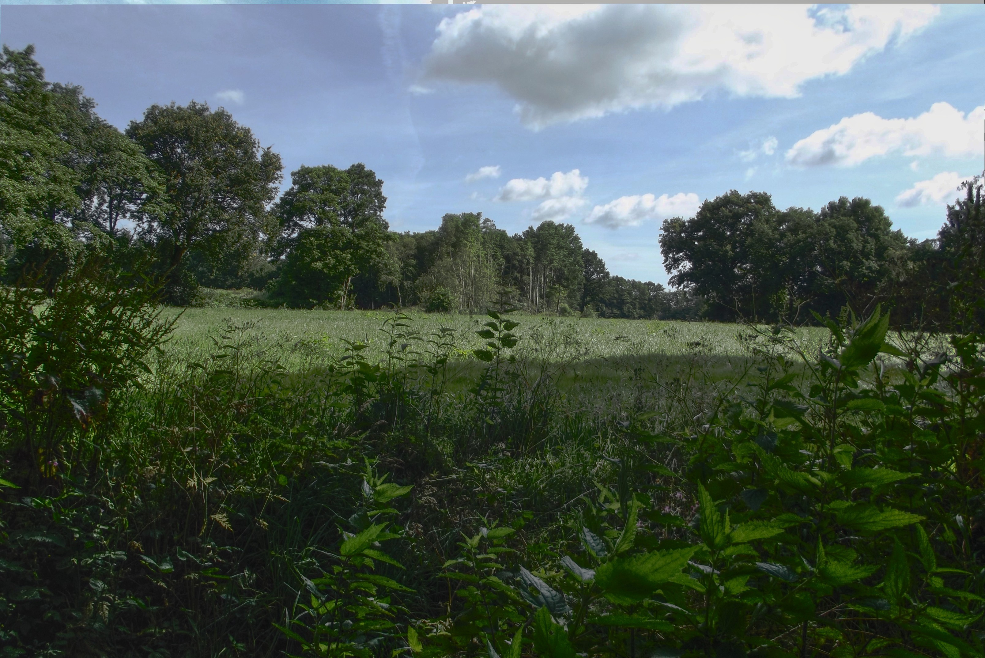
Here is another.

--
Thomas
Post a reply to this message
Attachments:
Download 'dscf0125_hdr_mode_1.jpg' (1347 KB)
Preview of image 'dscf0125_hdr_mode_1.jpg'
|
|
| |
| |
|
|
|
|
| |
| |
|
|
On 2017/01/24 02:52 PM, Thomas de Groot wrote:
> Here is another.
>

Beautiful.

.. and now you can get an HDR TV to view it properly..

:)

--
________________________________________

-Nekar Xenos-
Post a reply to this message
|
|
| |
| |
|
|
|
|
| |
| |
|
|
Am 24.01.2017 um 17:02 schrieb Nekar Xenos:
> On 2017/01/24 02:52 PM, Thomas de Groot wrote:
>> Here is another.
>>
>
> Beautiful.
>
> .. and now you can get an HDR TV to view it properly..
>
> :)

No, he can't. It's a JPEG, so all the HDR information has already been
lost when he saved the image.

Nice try, Thomas :P
Post a reply to this message
|
|
| |
| |
|
|
|
|
| |
| |
|
|
Thomas de Groot <tho### [at] degroot org> wrote:
> It had been a long time pending, but finally I have done something I
> wanted to do for some time...
> (clip)
> Here is one result, from my neighbourhood.
>
Really beautiful, just the photo itself. Looks like a painting. I haven't tried
any HDR photography yet; my consumer-grade Canon camera doesn't take RAW
images-- but it *might* be able to take a series of bracketed exposures like
yours does, although I haven't tried that yet(!)
The 2nd photo looks a *bit* dark in the shadows (or rather, 'muddy'), IMO, but
still nice. org> wrote:
> It had been a long time pending, but finally I have done something I
> wanted to do for some time...
> (clip)
> Here is one result, from my neighbourhood.
>
Really beautiful, just the photo itself. Looks like a painting. I haven't tried
any HDR photography yet; my consumer-grade Canon camera doesn't take RAW
images-- but it *might* be able to take a series of bracketed exposures like
yours does, although I haven't tried that yet(!)
The 2nd photo looks a *bit* dark in the shadows (or rather, 'muddy'), IMO, but
still nice.
Post a reply to this message
|
|
| |
| |
|
|
|
|
| |
| |
|
|
On 1/24/2017 4:34 PM, clipka wrote:
> Am 24.01.2017 um 17:02 schrieb Nekar Xenos:
>> On 2017/01/24 02:52 PM, Thomas de Groot wrote:
>>> Here is another.
>>>
>>
>> Beautiful.
>>
>> .. and now you can get an HDR TV to view it properly..
>>
>> :)
>
> No, he can't. It's a JPEG, so all the HDR information has already been
> lost when he saved the image.
>

You mean the images he posted are JPEGs?

> Nice try, Thomas :P
>

Nice try clipka. ;)

--

Regards
     Stephen
Post a reply to this message
|
|
| |
| |
|
|
|
|
| |
| |
|
|
On 1/24/2017 7:36 PM, Kenneth wrote:
> Thomas de Groot <tho### [at] degrootorg> wrote:
>> It had been a long time pending, but finally I have done something I
>> wanted to do for some time...
>> (clip)
>> Here is one result, from my neighbourhood.
>>
>
> Really beautiful, just the photo itself.

It is nice but the background is missing something.
I know. Mountains. :-)

> Looks like a painting. I haven't tried
> any HDR photography yet; my consumer-grade Canon camera doesn't take RAW
> images-- but it *might* be able to take a series of bracketed exposures like
> yours does, although I haven't tried that yet(!)
>
> The 2nd photo looks a *bit* dark in the shadows (or rather, 'muddy'), IMO, but
> still nice.
>
It looks fine on my monitor. In fact from a Dutch master it is very
light. ;-)


--

Regards
     Stephen
Post a reply to this message
|
|
| |
| |
|
|
|
|
| |
| |
|
|
Thomas de Groot <tho### [at] degrootorg> wrote:
> ...I have been experimenting now with the
> Fusion F1 application (http://fusion-hdr.com/home) to make HDR
> composites.
>

Thanks for the link, by the way.

Several years ago, I tried writing a POV_Ray scene to *try* and do my own
image-blending and tone-mapping, from three or more camera exposures (all just
JPEG images, naturally.) The code basically used the trace function and
eval_pigment, to simply compare brightness levels (and maybe color saturation)
of each image's pixels, then to choose which pixel looked... 'better.' (Ha.)
Although the *method* worked, the results were... not as good as I had hoped.
:-(  No surprise there-- my method wasn't very sophisticated (to say the least!)
One thing (among many) that I neglected to take into account was the 'local
contrast' between a pixel and its surrounding pixels. If I understand
tone-mapping at all, this local-contrast idea is an important one.

Oh well, it was worth a try!
Post a reply to this message
|
|
| |
| |
|
|
|
|
| |
| |
|
|
Thanks, all, for the comments indeed.

The first image, with the trees, shows some problems in the top left,
maybe due to alignment problems there when the wind moved the leaves.
Also, this is not a top end camera so I cannot guarantee the lens
quality but it is appropriate for my own use. And of course Christoph is
right: no hdr properties left /in/ the photograph itself. ;-)

--
Thomas
Post a reply to this message
|
|
| |
| |
|
|
|
|
| |
| |
|
|
On 24-1-2017 21:00, Stephen wrote:
> On 1/24/2017 7:36 PM, Kenneth wrote:
>> Thomas de Groot <tho### [at] degrootorg> wrote:
>>> It had been a long time pending, but finally I have done something I
>>> wanted to do for some time...
>>> (clip)
>>> Here is one result, from my neighbourhood.
>>>
>>
>> Really beautiful, just the photo itself.
>
> It is nice but the background is missing something.
> I know. Mountains. :-)

That is because you are standing on top of the mountain. :-) It is a
high point in the landscape: an ice-age dune.

>
>> Looks like a painting. I haven't tried
>> any HDR photography yet; my consumer-grade Canon camera doesn't take RAW
>> images-- but it *might* be able to take a series of bracketed
>> exposures like
>> yours does, although I haven't tried that yet(!)
>>
>> The 2nd photo looks a *bit* dark in the shadows (or rather, 'muddy'),
>> IMO, but
>> still nice.
>>
> It looks fine on my monitor. In fact from a Dutch master it is very
> light. ;-)
>

I am playing with the settings in the program. I find the hdr settings a
bit muddy too. The alternative 'sum' settings seem to result in crisper
results.


--
Thomas
Post a reply to this message
|
|
| |
| |
|
|
|
|
| |
| |
|
|
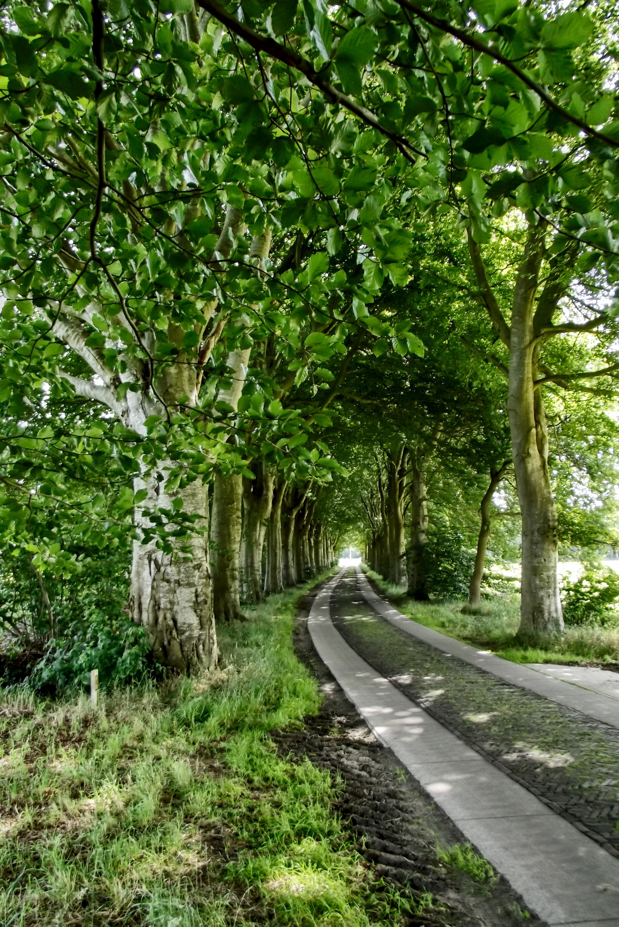
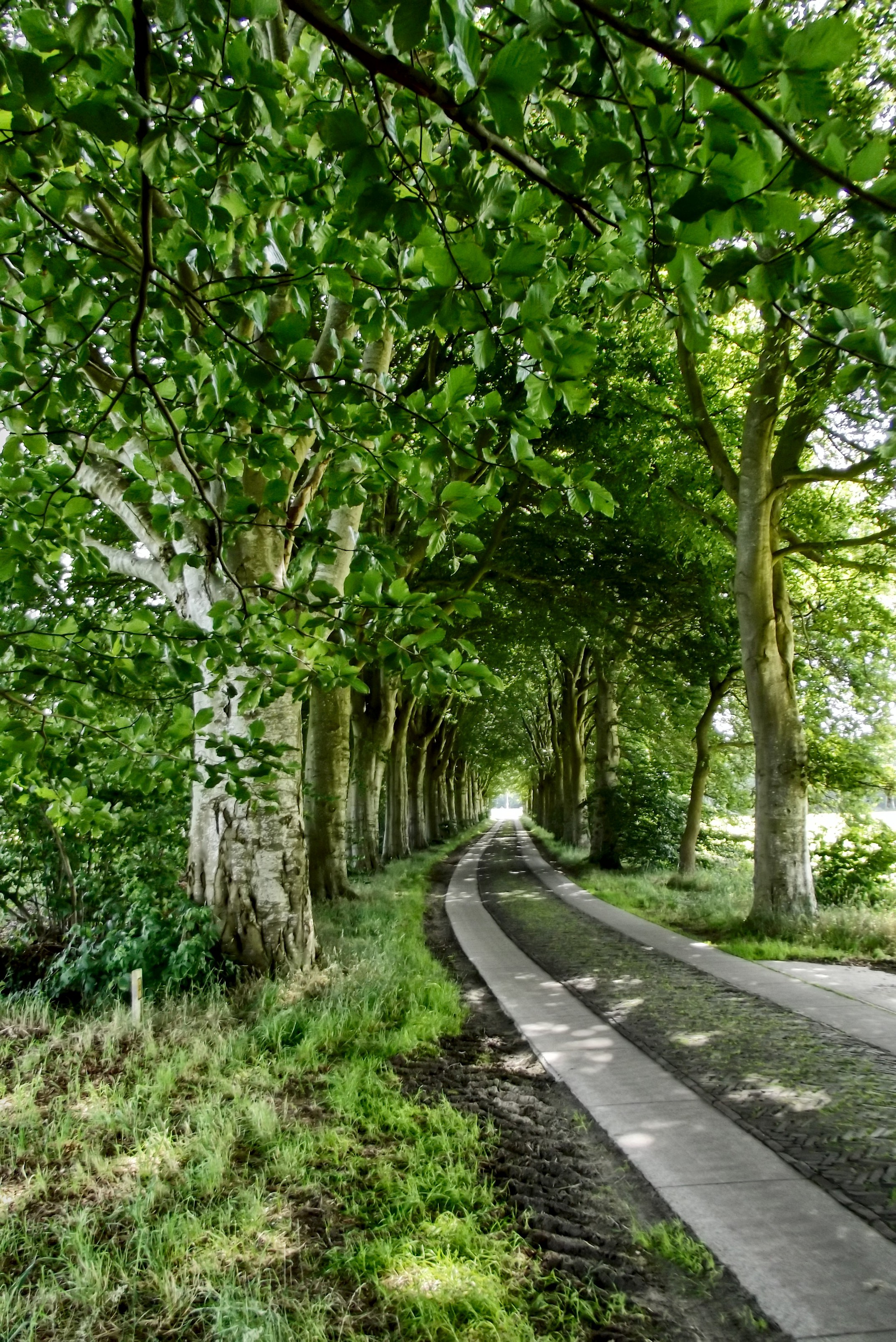
As a comparison, this is a version using the summation operator instead
of the hdr operator. The colours are still a bit lurid to my taste but
the image is crisp.


--
Thomas
Post a reply to this message
Attachments:
Download 'dscf0128_sum_mode_1.jpg' (1833 KB)
Preview of image 'dscf0128_sum_mode_1.jpg'
|
|
| |
| |
|
|
|
|
| |
| |
|
|
On 1/25/2017 7:57 AM, Thomas de Groot wrote:
> On 24-1-2017 21:00, Stephen wrote:
>> On 1/24/2017 7:36 PM, Kenneth wrote:
>>> Thomas de Groot <tho### [at] degrootorg> wrote:
>>>> It had been a long time pending, but finally I have done something I
>>>> wanted to do for some time...
>>>> (clip)
>>>> Here is one result, from my neighbourhood.
>>>>
>>>
>>> Really beautiful, just the photo itself.
>>
>> It is nice but the background is missing something.
>> I know. Mountains. :-)
>
> That is because you are standing on top of the mountain. :-) It is a
> high point in the landscape: an ice-age dune.
>

Ah! Vaalserberg. I thank Yadgar for his photographs a few years ago.


:-)

--

Regards
     Stephen
Post a reply to this message
|
|
| |
| |
|
|
|
|
| |
| |
|
|
On Wed, 25 Jan 2017 13:20:31 +0100, Thomas de Groot wrote:

> As a comparison, this is a version using the summation operator instead
> of the hdr operator. The colours are still a bit lurid to my taste but
> the image is crisp.

I have to admit that I really like this one - I tend to prefer my colour
photos with a higher saturation like this.


--
"I learned long ago, never to wrestle with a pig. You get dirty, and
besides, the pig likes it." - George Bernard Shaw
Post a reply to this message
|
|
| |
| |
|
|
|
|
| |
| |
|
|
On 1/25/2017 5:26 PM, Jim Henderson wrote:
> On Wed, 25 Jan 2017 13:20:31 +0100, Thomas de Groot wrote:
>
>> As a comparison, this is a version using the summation operator instead
>> of the hdr operator. The colours are still a bit lurid to my taste but
>> the image is crisp.
>
> I have to admit that I really like this one - I tend to prefer my colour
> photos with a higher saturation like this.
>

I prefer the original. It looks even better if you modify the gamma to
0.8 in PaintShop Pro.
But only Thomas knows how bright the day was.

--

Regards
     Stephen
Post a reply to this message
|
|
| |
| |
|
|
|
|
| |
| |
|
|
On 25-1-2017 14:50, Stephen wrote:
> On 1/25/2017 7:57 AM, Thomas de Groot wrote:
>> On 24-1-2017 21:00, Stephen wrote:
>>> On 1/24/2017 7:36 PM, Kenneth wrote:
>>>> Thomas de Groot <tho### [at] degrootorg> wrote:
>>>>> It had been a long time pending, but finally I have done something I
>>>>> wanted to do for some time...
>>>>> (clip)
>>>>> Here is one result, from my neighbourhood.
>>>>>
>>>>
>>>> Really beautiful, just the photo itself.
>>>
>>> It is nice but the background is missing something.
>>> I know. Mountains. :-)
>>
>> That is because you are standing on top of the mountain. :-) It is a
>> high point in the landscape: an ice-age dune.
>>
>
> Ah! Vaalserberg. I thank Yadgar for his photographs a few years ago.
>
>
> :-)
>

  No, not that one ;-) This one is much smaller and much farther north.

--
Thomas
Post a reply to this message
|
|
| |
| |
|
|
|
|
| |
| |
|
|
On 25-1-2017 19:13, Stephen wrote:
> On 1/25/2017 5:26 PM, Jim Henderson wrote:
>> On Wed, 25 Jan 2017 13:20:31 +0100, Thomas de Groot wrote:
>>
>>> As a comparison, this is a version using the summation operator instead
>>> of the hdr operator. The colours are still a bit lurid to my taste but
>>> the image is crisp.
>>
>> I have to admit that I really like this one - I tend to prefer my colour
>> photos with a higher saturation like this.
>>
>
> I prefer the original. It looks even better if you modify the gamma to
> 0.8 in PaintShop Pro.
> But only Thomas knows how bright the day was.
>

It really is a matter of taste. Personally, I prefer a lower saturation.
With a gamma of 0.8 in PSP it comes closer but the shadows are too dark.
Best is to tweak the parameters further in Fusion. There is a certain
learning curve to undergo :-)

Following the PSP method though, after the gamma adjustment, adjust
Highlight/Midtone/Shadow using the Dynamic adjustment method, and set
Shadow to 7. Don't touch the others.

--
Thomas
Post a reply to this message
|
|
| |
| |
|
|
|
|
| |
| |
|
|
On 1/26/2017 7:50 AM, Thomas de Groot wrote:
> On 25-1-2017 14:50, Stephen wrote:
>> On 1/25/2017 7:57 AM, Thomas de Groot wrote:
>>> On 24-1-2017 21:00, Stephen wrote:
>>>> On 1/24/2017 7:36 PM, Kenneth wrote:
>>>>> Thomas de Groot <tho### [at] degrootorg> wrote:
>>>>>> It had been a long time pending, but finally I have done something I
>>>>>> wanted to do for some time...
>>>>>> (clip)
>>>>>> Here is one result, from my neighbourhood.
>>>>>>
>>>>>
>>>>> Really beautiful, just the photo itself.
>>>>
>>>> It is nice but the background is missing something.
>>>> I know. Mountains. :-)
>>>
>>> That is because you are standing on top of the mountain. :-) It is a
>>> high point in the landscape: an ice-age dune.
>>>
>>
>> Ah! Vaalserberg. I thank Yadgar for his photographs a few years ago.
>>
>>
>> :-)
>>
>
>   No, not that one ;-) This one is much smaller and much farther north.
>

I did not know that the Netherlands had two mountains. Be careful that
you don't trip over them. :-P

--

Regards
     Stephen
Post a reply to this message
|
|
| |
| |
|
|
|
|
| |
| |
|
|
On 1/26/2017 8:03 AM, Thomas de Groot wrote:
> On 25-1-2017 19:13, Stephen wrote:
>> On 1/25/2017 5:26 PM, Jim Henderson wrote:
>>> On Wed, 25 Jan 2017 13:20:31 +0100, Thomas de Groot wrote:
>>>
>>>> As a comparison, this is a version using the summation operator instead
>>>> of the hdr operator. The colours are still a bit lurid to my taste but
>>>> the image is crisp.
>>>
>>> I have to admit that I really like this one - I tend to prefer my colour
>>> photos with a higher saturation like this.
>>>
>>
>> I prefer the original. It looks even better if you modify the gamma to
>> 0.8 in PaintShop Pro.
>> But only Thomas knows how bright the day was.
>>
>
> It really is a matter of taste.Personally, I prefer a lower saturation.

It is if you don't know what the original seen looked like.

> With a gamma of 0.8 in PSP it comes closer but the shadows are too dark.
> Best is to tweak the parameters further in Fusion. There is a certain
> learning curve to undergo :-)
>

As with everything useful. :-)

> Following the PSP method though, after the gamma adjustment, adjust
> Highlight/Midtone/Shadow using the Dynamic adjustment method, and set
> Shadow to 7. Don't touch the others.
>

PSP has two modes, absolute and relative. Using absolute it is much
darker and looks like you are in a tunnel. I like that better even
though I normally don't like dark shadows.

--

Regards
     Stephen
Post a reply to this message
|
|
| |
| |
|
|
|
|
| |
| |
|
|
On 26-1-2017 9:50, Stephen wrote:
> On 1/26/2017 7:50 AM, Thomas de Groot wrote:
>> On 25-1-2017 14:50, Stephen wrote:
>>> On 1/25/2017 7:57 AM, Thomas de Groot wrote:
>>>> On 24-1-2017 21:00, Stephen wrote:
>>>>> On 1/24/2017 7:36 PM, Kenneth wrote:
>>>>>> Thomas de Groot <tho### [at] degrootorg> wrote:
>>>>>>> It had been a long time pending, but finally I have done something I
>>>>>>> wanted to do for some time...
>>>>>>> (clip)
>>>>>>> Here is one result, from my neighbourhood.
>>>>>>>
>>>>>>
>>>>>> Really beautiful, just the photo itself.
>>>>>
>>>>> It is nice but the background is missing something.
>>>>> I know. Mountains. :-)
>>>>
>>>> That is because you are standing on top of the mountain. :-) It is a
>>>> high point in the landscape: an ice-age dune.
>>>>
>>>
>>> Ah! Vaalserberg. I thank Yadgar for his photographs a few years ago.
>>>
>>>
>>> :-)
>>>
>>
>>   No, not that one ;-) This one is much smaller and much farther north.
>>
>
> I did not know that the Netherlands had two mountains. Be careful that
> you don't trip over them. :-P
>

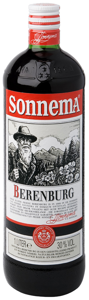
We brag her about the Frisian Alps. They even appear on the label of
booze bottles (sorry, for once I attach an image here. Won't do it again)

--
Thomas
Post a reply to this message
Attachments:
Download 'sonnema-berenburg.jpg' (265 KB)
Preview of image 'sonnema-berenburg.jpg'
|
|
| |
| |
|
|
|
|
| |
| |
|
|
On 1/26/2017 9:11 AM, Thomas de Groot wrote:
>>
>
> We brag her about the Frisian Alps. They even appear on the label of
> booze bottles (sorry, for once I attach an image here. Won't do it again)


Nice one. I must remember that. :-)

As for the attachment. OT only keeps posts for about a fortnight, IIRC.
So your drinking habits will not be recorded for ever. :-P
30% by volume, tasty.

--

Regards
     Stephen
Post a reply to this message
|
|
| |
| |
|
|
|
|
| |
| |
|
|
On 26-1-2017 10:25, Stephen wrote:
> On 1/26/2017 9:11 AM, Thomas de Groot wrote:
>>>
>>
>> We brag her about the Frisian Alps. They even appear on the label of
>> booze bottles (sorry, for once I attach an image here. Won't do it again)
>
>
> Nice one. I must remember that. :-)
>
> As for the attachment. OT only keeps posts for about a fortnight, IIRC.
> So your drinking habits will not be recorded for ever. :-P
> 30% by volume, tasty.
>

That is a comfort. In fact, I was temporarily confused - by (lack of)
alcohol? - thinking I was posting on a povray ng and not ot. ;-)

As for this particular brand of alcohol, it is most typical for the
winter season, and more particularly when there is ice and skating is
possible...

--
Thomas
Post a reply to this message
|
|
| |
| |
|
|
|
|
| |
| |
|
|
Am 26.01.2017 um 09:50 schrieb Stephen:

> I did not know that the Netherlands had two mountains. Be careful that
> you don't trip over them. :-P

To my knowledge they do have moles, so they probably have more than two ;)
Post a reply to this message
|
|
| |
| |
|
|
|
|
| |
| |
|
|
On Thu, 26 Jan 2017 09:08:33 +0000, Stephen wrote:

>>>> I have to admit that I really like this one - I tend to prefer my
>>>> colour photos with a higher saturation like this.
>>>>
>>>>
>>> I prefer the original. It looks even better if you modify the gamma to
>>> 0.8 in PaintShop Pro.
>>> But only Thomas knows how bright the day was.
>>>
>>>
>> It really is a matter of taste.Personally, I prefer a lower saturation.
>
> It is if you don't know what the original seen looked like.

And even then, it can vary from person to person.  I tend to find that
photos I take appear more washed out than I recall, which is why I tend
to push the colour saturation up.


--
"I learned long ago, never to wrestle with a pig. You get dirty, and
besides, the pig likes it." - George Bernard Shaw
Post a reply to this message
|
|
| |
| |
|
|
|
|
| |
| |
|
|
On 26-1-2017 10:08, Stephen wrote:

> PSP has two modes, absolute and relative. Using absolute it is much
> darker and looks like you are in a tunnel. I like that better even
> though I normally don't like dark shadows.
>

I don't know about those. I have an ancient version of PSP, version 8,
before Corel took over.

--
Thomas
Post a reply to this message
|
|
| |
| |
|
|
|
|
| |
| |
|
|
On 1/28/2017 12:41 PM, Thomas de Groot wrote:
> On 26-1-2017 10:08, Stephen wrote:
>
>> PSP has two modes, absolute and relative. Using absolute it is much
>> darker and looks like you are in a tunnel. I like that better even
>> though I normally don't like dark shadows.
>>
>
> I don't know about those. I have an ancient version of PSP, version 8,
> before Corel took over.
>

Mine is Ver 9 again before Corel took over.

--

Regards
     Stephen
Post a reply to this message
|
|
| |
| |
|
|
|
|
| |
| |
|
|
On 28-1-2017 17:12, Stephen wrote:
> On 1/28/2017 12:41 PM, Thomas de Groot wrote:
>> On 26-1-2017 10:08, Stephen wrote:
>>
>>> PSP has two modes, absolute and relative. Using absolute it is much
>>> darker and looks like you are in a tunnel. I like that better even
>>> though I normally don't like dark shadows.
>>>
>>
>> I don't know about those. I have an ancient version of PSP, version 8,
>> before Corel took over.
>>
>
> Mine is Ver 9 again before Corel took over.
>

It seems that those two modes were introduced then. I searched the help
but without result.

--
Thomas
Post a reply to this message
|
|
| |
| |
|
|
|
|
| |
| |
|
|
On 1/29/2017 7:50 AM, Thomas de Groot wrote:
> On 28-1-2017 17:12, Stephen wrote:
>> On 1/28/2017 12:41 PM, Thomas de Groot wrote:
>>> On 26-1-2017 10:08, Stephen wrote:
>>>
>>>> PSP has two modes, absolute and relative. Using absolute it is much
>>>> darker and looks like you are in a tunnel. I like that better even
>>>> though I normally don't like dark shadows.
>>>>
>>>
>>> I don't know about those. I have an ancient version of PSP, version 8,
>>> before Corel took over.
>>>
>>
>> Mine is Ver 9 again before Corel took over.
>>
>
> It seems that those two modes were introduced then. I searched the help
> but without result.
>

That's what I thought when you mentioned PSP8. I've should also have a
copy of Ver. 4, somewhere. It fitted onto a 3½-inch floppy.
I like the program cheep, easy to use and can use Photoshop addons.

--

Regards
     Stephen
Post a reply to this message
|
|
| |
| |
|
|
|
|
| |
| |
|
|
On 29-1-2017 10:04, Stephen wrote:
> On 1/29/2017 7:50 AM, Thomas de Groot wrote:
>> On 28-1-2017 17:12, Stephen wrote:
>>> On 1/28/2017 12:41 PM, Thomas de Groot wrote:
>>>> On 26-1-2017 10:08, Stephen wrote:
>>>>
>>>>> PSP has two modes, absolute and relative. Using absolute it is much
>>>>> darker and looks like you are in a tunnel. I like that better even
>>>>> though I normally don't like dark shadows.
>>>>>
>>>>
>>>> I don't know about those. I have an ancient version of PSP, version 8,
>>>> before Corel took over.
>>>>
>>>
>>> Mine is Ver 9 again before Corel took over.
>>>
>>
>> It seems that those two modes were introduced then. I searched the help
>> but without result.
>>
>
> That's what I thought when you mentioned PSP8. I've should also have a
> copy of Ver. 4, somewhere. It fitted onto a 3½-inch floppy.
> I like the program cheep, easy to use and can use Photoshop addons.
>

Out of curiosity I checked my CD-ROM's and I still have versions 4, 5,
6, 7, and 8! I then stopped collecting. :-)

--
Thomas
Post a reply to this message
|
|
| |
| |
|
|
|
|
| |
| |
|
|
On 1/29/2017 12:17 PM, Thomas de Groot wrote:
> On 29-1-2017 10:04, Stephen wrote:
>> On 1/29/2017 7:50 AM, Thomas de Groot wrote:
>>> On 28-1-2017 17:12, Stephen wrote:
>>>> On 1/28/2017 12:41 PM, Thomas de Groot wrote:
>>>>> On 26-1-2017 10:08, Stephen wrote:
>>>>>
>>>>>> PSP has two modes, absolute and relative. Using absolute it is much
>>>>>> darker and looks like you are in a tunnel. I like that better even
>>>>>> though I normally don't like dark shadows.
>>>>>>
>>>>>
>>>>> I don't know about those. I have an ancient version of PSP, version 8,
>>>>> before Corel took over.
>>>>>
>>>>
>>>> Mine is Ver 9 again before Corel took over.
>>>>
>>>
>>> It seems that those two modes were introduced then. I searched the help
>>> but without result.
>>>
>>
>> That's what I thought when you mentioned PSP8. I've should also have a
>> copy of Ver. 4, somewhere. It fitted onto a 3½-inch floppy.
>> I like the program cheep, easy to use and can use Photoshop addons.
>>
>
> Out of curiosity I checked my CD-ROM's and I still have versions 4, 5,
> 6, 7, and 8! I then stopped collecting. :-)
>

M4 PSP 4 is probably on an old laptop or even a zip drive.

--

Regards
     Stephen
Post a reply to this message
|
|
| |
| |
|
|
|
|
| |