|
|
|
|
|
|
| |
| |
|
|
|
|
| |
| |
|
|
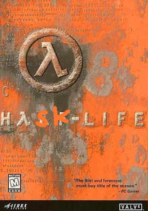
OK, let's try something...

Click this:

   http://www.ruby-lang.org/en/

Pretty, isn't it?

Now click this:

   http://www.python.org/

Not quite so good, eh?

Now this:

   http://clean.cs.ru.nl/

OK, but nothing fancy.

Now this:

   http://www.erlang.org/

Hmm, not looking so hot now.

Finally, try this:

   http://www.haskell.org/

Highly unfavourable, eh? Looks cheap, amaturish and uninviting.

I guess this is why nobody ever uses Haskell...
Post a reply to this message
|
|
| |
| |
|
|
|
|
| |
| |
|
|
> OK, let's try something...

Haha I could do the same with the competitors of the company I work for,
then list our company website (which isn't even <company_name>.com because
they can't be bothered to pay off some company 10000x smaller that already
has it).  But sadly I doubt anyone would take any notice.
Post a reply to this message
|
|
| |
| |
|
|
|
|
| |
| |
|
|
scott wrote:

> Haha I could do the same with the competitors of the company I work for,
> then list our company website (which isn't even <company_name>.com
> because they can't be bothered to pay off some company 10000x smaller
> that already has it).  But sadly I doubt anyone would take any notice.

Ooo... web whores. :-D

"We'll register this DNS name first, and then charge its rightful owners
10,000,000 USD! We'll be rich! RICH!!"

Kinda like patent trolls...
Post a reply to this message
|
|
| |
| |
|
|
|
|
| |
| |
|
|
scott wrote:

> Haha I could do the same with the competitors of the company I work for,

Remind me... Who the hell do you work for?
Post a reply to this message
|
|
| |
| |
|
|
|
|
| |
| |
|
|
And lo On Tue, 16 Dec 2008 15:01:57 -0000, Invisible <voi### [at] dev null> did
spake thusly:
> scott wrote:
>
>> Haha I could do the same with the competitors of the company I work
>> for, then list our company website (which isn't even <company_name>.com
>> because they can't be bothered to pay off some company 10000x smaller
>> that already has it). But sadly I doubt anyone would take any notice.
>
> Ooo... web whores. :-D
>
> "We'll register this DNS name first, and then charge its rightful owners
> 10,000,000 USD! We'll be rich! RICH!!"
>
> Kinda like patent trolls...
Not necessarily. We've called <name> and have <name>.co.uk, as we're
international we also took <name>.com. Now another company in Spain is
also called <name> and do something completely different to us, they
missed out on the .com and ended up with .com.es. We don't want their name
and they haven't offered to buy ours from us, we did use to get their
email from time to time when we had a catchall address though.
--
Phil Cook
--
I once tried to be apathetic, but I just couldn't be bothered
http://flipc.blogspot.com null> did
spake thusly:
> scott wrote:
>
>> Haha I could do the same with the competitors of the company I work
>> for, then list our company website (which isn't even <company_name>.com
>> because they can't be bothered to pay off some company 10000x smaller
>> that already has it). But sadly I doubt anyone would take any notice.
>
> Ooo... web whores. :-D
>
> "We'll register this DNS name first, and then charge its rightful owners
> 10,000,000 USD! We'll be rich! RICH!!"
>
> Kinda like patent trolls...
Not necessarily. We've called <name> and have <name>.co.uk, as we're
international we also took <name>.com. Now another company in Spain is
also called <name> and do something completely different to us, they
missed out on the .com and ended up with .com.es. We don't want their name
and they haven't offered to buy ours from us, we did use to get their
email from time to time when we had a catchall address though.
--
Phil Cook
--
I once tried to be apathetic, but I just couldn't be bothered
http://flipc.blogspot.com
Post a reply to this message
|
|
| |
| |
|
|
|
|
| |
| |
|
|
>> Ooo... web whores. :-D
>>
>> "We'll register this DNS name first, and then charge its rightful owners
>> 10,000,000 USD! We'll be rich! RICH!!"
>>
>> Kinda like patent trolls...
>
> Not necessarily. We've called <name> and have <name>.co.uk, as we're
> international we also took <name>.com. Now another company in Spain is
> also called <name> and do something completely different to us, they
> missed out on the .com and ended up with .com.es. We don't want their name
> and they haven't offered to buy ours from us, we did use to get their
> email from time to time when we had a catchall address though.

Our company has offices and factories in pretty much every country
worldwide, yet the <name>.com belongs to some very small not-for-profit
company based in the US that works in just one city.
Post a reply to this message
|
|
| |
| |
|
|
|
|
| |
| |
|
|
And now the Haskell guys are having a contest to design a new logo...
Post a reply to this message
Attachments:
Download '48894-001.bin.jpg' (21 KB)
Preview of image '48894-001.bin.jpg'
|
|
| |
| |
|
|
|
|
| |
| |
|
|
Invisible escreveu:
> OK, let's try something...
>   http://www.haskell.org/
>
> Highly unfavourable, eh? Looks cheap, amaturish and uninviting.

Hmm, I always liked it's CSS.  Well, if it shall make you happy, try this:

http://www.alu.org/alu/home

:P

Python and Ruby are targetted at pragmatic people who want to glue
together many different systems with a hip new-fangled language smelling
of wet paint.  They know that to grab these people they should use lots
of flash.

Lisp and Haskell are more like targetting researchers and people who
love theoretical stuff... ;)
Post a reply to this message
|
|
| |
| |
|
|
|
|
| |
| |
|
|
huahuhua

Great!
Post a reply to this message
|
|
| |
| |
|
|
|
|
| |
| |
|
|
nemesis wrote:
> Invisible escreveu:
>> OK, let's try something...
>>   http://www.haskell.org/
>>
>> Highly unfavourable, eh? Looks cheap, amaturish and uninviting.
>
> Hmm, I always liked it's CSS.  Well, if it shall make you happy, try this:
>
> http://www.alu.org/alu/home
>
> :P

Eww ick! What an ugly shade of green. (And green is my favourit colour!)

> Python and Ruby are targetted at pragmatic people who want to glue
> together many different systems with a hip new-fangled language smelling
> of wet paint.  They know that to grab these people they should use lots
> of flash.
>
> Lisp and Haskell are more like targetting researchers and people who
> love theoretical stuff... ;)

Heh. I'd still like to see the Haskell website look as pretty as the
Ruby one.

But then, Ruby's logo is... a ruby. Python's is two stylised snakes. I'm
not really sure what Haskell could have here...

Also, the "Hello World is tivial; here it is!" part. We could copy that
so easily...
Post a reply to this message
|
|
| |
| |
|
|
|
|
| |
| |
|
|
For me is the BEST language ever made by men. Yeah their site needs
make-up but comparing with its features cosmetics for me drops to zero
importance.


In American(USA) slang terms: Haskell is the shit! :D

Sorry if the above was offensive but it puts it the way i feel it.
Post a reply to this message
|
|
| |
| |
|
|
|
|
| |
| |
|
|
nemesis wrote:
> Lisp and Haskell are more like targetting researchers and people who
> love theoretical stuff... ;)

And the Erlang people don't really care if you use Erlang. Much like many
other open source systems, they use it internally and make it available to
you if you feel like it.  (They don't have a bug-tracker up, because then
you might be able to see proprietary bugs, for example.)

--
   Darren New, San Diego CA, USA (PST)
   The NFL should go international. I'd pay to
   see the Detroit Lions vs the Roman Catholics.
Post a reply to this message
|
|
| |
| |
|
|
|
|
| |
| |
|
|
Darren New <dne### [at] sanrrcom> wrote:
> you if you feel like it.  (They don't have a bug-tracker up, because then
> you might be able to see proprietary bugs, for example.)

"proprietary bugs" was a finding. :D
Post a reply to this message
|
|
| |
| |
|
|
|
|
| |
| |
|
|
"Invisible" <voi### [at] devnull> wrote in message
news:4947d193$1@news.povray.org...
> I'm  not really sure what Haskell could have here...

I know it's a pretty weak idea but all I think about when I hear "Haskell"
is Wallys' smarmy buddy Eddie!

Jim
Post a reply to this message
|
|
| |
| |
|
|
|
|
| |
| |
|
|
>> I'm  not really sure what Haskell could have here...
>
> I know it's a pretty weak idea but all I think about when I hear "Haskell"
> is Wallys' smarmy buddy Eddie!

It's actually named after a person.

That person's name - absurdly enough - was Haskell B. Curry. o_O

They were going to name the language Curry - but they figured the jokes
would never end. As it is, they failed to realise that Haskell sounds
just like Pascal (which is also a programming language), and also
"hassle" and "rascle"...

--
http://blog.orphi.me.uk/
http://www.zazzle.com/MathematicalOrchid*
Post a reply to this message
|
|
| |
| |
|
|
|
|
| |
| |
|
|
Invisible wrote:
> nemesis wrote:
>> Hmm, I always liked it's CSS.  Well, if it shall make you happy, try
>> this:
>>
>> http://www.alu.org/alu/home
>>
>> :P
>
> Eww ick! What an ugly shade of green. (And green is my favourit colour!)

Looks yellow to me.
Post a reply to this message
|
|
| |
| |
|
|
|
|
| |
| |
|
|
>> Haha I could do the same with the competitors of the company I work for,
>
> Remind me... Who the hell do you work for?

A Japanese company that makes LCDs and TVs and stuff.

They don't seem to have the hang of European style marketing yet, and think
that a website design for a Japanese audience will also work well in Europe.
Actually I think it's more that the IT systems worldwide are so fragmented
that each country basically does what it thinks best with their very small
team of people, and you end up with a load of separate websites that all
look completely different and nobody sees the need for the .com domain.
Occasionally someone from Japan sees one of these other websites and makes
some demands about what should be changed, and you end up with hideous
looking stuff.

Given that sales last year in Europe alone were several billion pounds, I
think they should spend some money on getting their online presence
together, but then that's just me and nobody who makes that sort of decision
even knows I exist!
Post a reply to this message
|
|
| |
| |
|
|
|
|
| |
| |
|
|
scott wrote:

>> Remind me... Who the hell do you work for?
>
> A Japanese company that makes LCDs and TVs and stuff.
>
> They don't seem to have the hang of European style marketing yet, and
> think that a website design for a Japanese audience will also work well
> in Europe. Actually I think it's more that the IT systems worldwide are
> so fragmented that each country basically does what it thinks best with
> their very small team of people, and you end up with a load of separate
> websites that all look completely different and nobody sees the need for
> the .com domain. Occasionally someone from Japan sees one of these other
> websites and makes some demands about what should be changed, and you
> end up with hideous looking stuff.
>
> Given that sales last year in Europe alone were several billion pounds,
> I think they should spend some money on getting their online presence
> together, but then that's just me and nobody who makes that sort of
> decision even knows I exist!

Sounds familiar... :-S


The company *I* work for has been known by a small handful of different
acronyms in its time. Apparently "this confuses our customers", so we're
on a big rebranding kick. We're throwing away all the old names and
sticking to just one of them from now on. And we've got a shiny new logo
that consists of that name. (It's actually rather nice, as corporate
logos go. At least it looks clean and modern now!)

And we're changing our website and our email addresses to match. Oh,
except it *doesn't* match. It's one of the old acronyms.

Wait... WTF?
Post a reply to this message
|
|
| |
| |
|
|
|
|
| |
| |
|
|
nemesis wrote:
> huahuhua
>
> Great!

Actually, my favourit so far is this...

http://media.nokrev.com/junk/haskell-logos/logo7.png

It looks a tad harsh, but the genius of it is that it's 5 straight
lines. You can render it any way you like, and it's still the logo! :-D

Hell, you can even do this:

  ____   ____
  \   \  \   \
   \   \  \   \
    \   \  \   \   __________
     \   \  \   \  \_________|
      \   \  \   \
      /   /  /    \  ________
     /   /  /      \ \_______|
    /   /  /   /\   \
   /   /  /   /  \   \
  /___/  /___/    \___\

;-)
Post a reply to this message
|
|
| |
| |
|
|
|
|
| |
| |
|
|
> Actually, my favourit so far is this...
>
> http://media.nokrev.com/junk/haskell-logos/logo7.png
>
> It looks a tad harsh, but the genius of it is that it's 5 straight
> lines. You can render it any way you like, and it's still the logo! :-D

It does look nice simple and effective, but put some colour in there!
Post a reply to this message
|
|
| |
| |
|
|
|
|
| |
| |
|
|
scott wrote:
>> Actually, my favourit so far is this...
>>
>> http://media.nokrev.com/junk/haskell-logos/logo7.png
>>
>> It looks a tad harsh, but the genius of it is that it's 5 straight
>> lines. You can render it any way you like, and it's still the logo! :-D
>
> It does look nice simple and effective, but put some colour in there!

Well, yeah. It's a tad monochrome. And somebody complained that it looks
too "millitary" with all the sharp angles. But that's just it - it's
such a simple shape that you can draw it several different ways, and
it's still the same symbol. So you can experiment with assorted colours,
line styles, curves, etc. But I think the *shape* itself is a good idea. ;-)

And then some other dude goes "hey, I don't think we should have a logo
with a lambda in it, or any other syntactic elements".

Had *you* noticed the lambda in there? Did you realise that the symbol
is based on the monadic bind operator? Or did it just look like an
interesting shape to you?
Post a reply to this message
|
|
| |
| |
|
|
|
|
| |
| |
|
|
On Mon, 22 Dec 2008 12:44:07 +0000, Invisible <voi### [at] devnull> wrote:

>
>Had *you* noticed the lambda in there? Did you realise that the symbol
>is based on the monadic bind operator? Or did it just look like an
>interesting shape to you?

The first thing I thought was "Mu onwards".
--

Regards
     Stephen
Post a reply to this message
|
|
| |
| |
|
|
|
|
| |
| |
|
|
Invisible wrote:

> It looks a tad harsh, but the genius of it is that it's 5 straight
> lines. You can render it any way you like, and it's still the logo! :-D

The sixth number is six, not five.

-Aero
Post a reply to this message
|
|
| |
| |
|
|
|
|
| |