|
|
|
|
|
|
| |
| |
|
|
|
|
| |
| |
|
|
http://chromatek.com/what-is-chromadepth/design-guide-2/

I've been reading their documentation, but I can't figure out if the
progression from near to far is linear or not. I.e. is blue just as far
from green as green is from blue? Or is it exponential? I plan on doing
some experiments in the near future, but I can't figure out for sure
whether this is the case.


Mike
Post a reply to this message
|
|
| |
| |
|
|
|
|
| |
| |
|
|
I took a look at that web page, and it *is* difficult to figure out how the
color blending (for depth cues) should be done.

But here's a 'thought experiment':

Let's say that on a clear day (in the real world), the distant horizon is twenty
miles away (just a guess.) Between 19 1/2 and 20 miles out, there is almost *no*
3D effect that we can discern; whereas, from your eyes to 1/2 mile out, there
is much more of a 3D effect. (In fact, the '3D appearance' of objects in a scene
becomes much more pronounced, the closer those objects are to our eyes.)

Translating that into color blending (using two random colors): If pure GREEN is
located at your eye position, and pure BLUE is 20 miles out, it would seem that
the 'middle blend' of the two colors should *not* be at the 10-mile mark, but
should be much closer to your eye position-- maybe at the 3-mile mark(?)  So, it
seems that the color blend should not be linear, but exponential in some way.
Post a reply to this message
|
|
| |
| |
|
|
|
|
| |
| |
|
|
On 1/16/2016 5:37 AM, Kenneth wrote:
> I took a look at that web page, and it *is* difficult to figure out how the
> color blending (for depth cues) should be done.
>
> But here's a 'thought experiment':
>
> Let's say that on a clear day (in the real world), the distant horizon is twenty
> miles away (just a guess.) Between 19 1/2 and 20 miles out, there is almost *no*
> 3D effect that we can discern; whereas, from your eyes to 1/2 mile out, there
> is much more of a 3D effect. (In fact, the '3D appearance' of objects in a scene
> becomes much more pronounced, the closer those objects are to our eyes.)
>
> Translating that into color blending (using two random colors): If pure GREEN is
> located at your eye position, and pure BLUE is 20 miles out, it would seem that
> the 'middle blend' of the two colors should *not* be at the 10-mile mark, but
> should be much closer to your eye position-- maybe at the 3-mile mark(?)  So, it
> seems that the color blend should not be linear, but exponential in some way.
>
>
>
>


In section 3.4.2.1.3 Angles of the docs it gives the following formula:

direction_length = 0.5 * right_length / tan(angle / 2)

Maybe distance is related to the perceived change in foreshortening in
the same way, based on tan(angle)?

Mike
Post a reply to this message
|
|
| |
| |
|
|
|
|
| |
| |
|
|
Am 16.01.2016 um 06:53 schrieb Mike Horvath:
> http://chromatek.com/what-is-chromadepth/design-guide-2/
>
> I've been reading their documentation, but I can't figure out if the
> progression from near to far is linear or not. I.e. is blue just as far
> from green as green is from blue? Or is it exponential? I plan on doing
> some experiments in the near future, but I can't figure out for sure
> whether this is the case.

Strictly speaking you can expect depth cues to progress in steps:
There's one fixed distance corresponding to Red, one corresponding to
Green, and one corresponding to Blue. All of which will depend on your
display's primary colours.

Any colour in between just corresponds to a superposition of two
different depths.

This is especially true if you have a wide-gamut display, i.e. each
primary covers only a narrow band of wavelengths.
Post a reply to this message
|
|
| |
| |
|
|
|
|
| |
| |
|
|
I created the following pigment to be used with ChromaDepth glasses:

	pigment
	{
		gradient vnormalize(Camera_Location - Camera_LookAt) * -1
		color_map
		{
			[0/4 srgb <1,0,0,>]
			[1/4 srgb <1,1,0,>]
			[2/4 srgb <0,1,0,>]
			[3/4 srgb <0,1,1,>]
			[4/4 srgb <0,0,1,>]
		}
		scale vlength(Camera_Location - Camera_LookAt) * 100
		translate Camera_Location
	}

However, the relationship between distance and color is linear in my
example. How do I change this so that the hue is based on atan(distance
from camera)? Thanks!


Mike
Post a reply to this message
|
|
| |
| |
|
|
|
|
| |
| |
|
|
On 1/17/2016 11:07 PM, Mike Horvath wrote:
> I created the following pigment to be used with ChromaDepth glasses:
>
>      pigment
>      {
>          gradient vnormalize(Camera_Location - Camera_LookAt) * -1
>          color_map
>          {
>              [0/4 srgb <1,0,0,>]
>              [1/4 srgb <1,1,0,>]
>              [2/4 srgb <0,1,0,>]
>              [3/4 srgb <0,1,1,>]
>              [4/4 srgb <0,0,1,>]
>          }
>          scale vlength(Camera_Location - Camera_LookAt) * 100
>          translate Camera_Location
>      }
>
> However, the relationship between distance and color is linear in my
> example. How do I change this so that the hue is based on atan(distance
> from camera)? Thanks!
>
>
> Mike

Or maybe it should be twice the distance from the camera location to
look_at?


Mike
Post a reply to this message
|
|
| |
| |
|
|
|
|
| |
| |
|
|
On 1/16/2016 2:44 PM, clipka wrote:
> Am 16.01.2016 um 06:53 schrieb Mike Horvath:
>> http://chromatek.com/what-is-chromadepth/design-guide-2/
>>
>> I've been reading their documentation, but I can't figure out if the
>> progression from near to far is linear or not. I.e. is blue just as far
>> from green as green is from blue? Or is it exponential? I plan on doing
>> some experiments in the near future, but I can't figure out for sure
>> whether this is the case.
>
> Strictly speaking you can expect depth cues to progress in steps:
> There's one fixed distance corresponding to Red, one corresponding to
> Green, and one corresponding to Blue. All of which will depend on your
> display's primary colours.
>
> Any colour in between just corresponds to a superposition of two
> different depths.
>
> This is especially true if you have a wide-gamut display, i.e. each
> primary covers only a narrow band of wavelengths.
>

Are you sure? Yellow definitely looks closer than blue, and blends
smoothly into the neighboring colors.

I *have* noticed a superposition when looking at magenta. It looks both
closer and farther than other colors next to it. It's a hard sensation
to describe.

Mike
Post a reply to this message
|
|
| |
| |
|
|
|
|
| |
| |
|
|
On 1/19/2016 5:37 AM, Mike Horvath wrote:
> On 1/16/2016 2:44 PM, clipka wrote:
>> Am 16.01.2016 um 06:53 schrieb Mike Horvath:
>>> http://chromatek.com/what-is-chromadepth/design-guide-2/
>>>
>>> I've been reading their documentation, but I can't figure out if the
>>> progression from near to far is linear or not. I.e. is blue just as far
>>> from green as green is from blue? Or is it exponential? I plan on doing
>>> some experiments in the near future, but I can't figure out for sure
>>> whether this is the case.
>>
>> Strictly speaking you can expect depth cues to progress in steps:
>> There's one fixed distance corresponding to Red, one corresponding to
>> Green, and one corresponding to Blue. All of which will depend on your
>> display's primary colours.
>>
>> Any colour in between just corresponds to a superposition of two
>> different depths.
>>
>> This is especially true if you have a wide-gamut display, i.e. each
>> primary covers only a narrow band of wavelengths.
>>
>
> Are you sure? Yellow definitely looks closer than blue, and blends
> smoothly into the neighboring colors.
>
> I *have* noticed a superposition when looking at magenta. It looks both
> closer and farther than other colors next to it. It's a hard sensation
> to describe.
>
> Mike

Forgot to say that this lead me to believe that spectral colors are the
only ones that work properly. Magenta is not a spectral color.


Mike
Post a reply to this message
|
|
| |
| |
|
|
|
|
| |
| |
|
|
Le 16-01-19 05:37, Mike Horvath a écrit :
> On 1/16/2016 2:44 PM, clipka wrote:
>> Am 16.01.2016 um 06:53 schrieb Mike Horvath:
>>> http://chromatek.com/what-is-chromadepth/design-guide-2/
>>>
>>> I've been reading their documentation, but I can't figure out if the
>>> progression from near to far is linear or not. I.e. is blue just as far
>>> from green as green is from blue? Or is it exponential? I plan on doing
>>> some experiments in the near future, but I can't figure out for sure
>>> whether this is the case.
>>
>> Strictly speaking you can expect depth cues to progress in steps:
>> There's one fixed distance corresponding to Red, one corresponding to
>> Green, and one corresponding to Blue. All of which will depend on your
>> display's primary colours.
>>
>> Any colour in between just corresponds to a superposition of two
>> different depths.
>>
>> This is especially true if you have a wide-gamut display, i.e. each
>> primary covers only a narrow band of wavelengths.
>>
>
> Are you sure? Yellow definitely looks closer than blue, and blends
> smoothly into the neighboring colors.
>
> I *have* noticed a superposition when looking at magenta. It looks both
> closer and farther than other colors next to it. It's a hard sensation
> to describe.
>
> Mike

Magenta is a mix of red and blue, both ends of the spectrum.
So, the red part looks closer, and the blue part looks farther.
Post a reply to this message
|
|
| |
| |
|
|
|
|
| |
| |
|
|
Am 19.01.2016 um 11:41 schrieb Mike Horvath:

>>> Strictly speaking you can expect depth cues to progress in steps:
>>> There's one fixed distance corresponding to Red, one corresponding to
>>> Green, and one corresponding to Blue. All of which will depend on your
>>> display's primary colours.
>>>
>>> Any colour in between just corresponds to a superposition of two
>>> different depths.
>>>
>>> This is especially true if you have a wide-gamut display, i.e. each
>>> primary covers only a narrow band of wavelengths.
>>>
>>
>> Are you sure? Yellow definitely looks closer than blue, and blends
>> smoothly into the neighboring colors.
>>
>> I *have* noticed a superposition when looking at magenta. It looks both
>> closer and farther than other colors next to it. It's a hard sensation
>> to describe.
>>
>> Mike
>
> Forgot to say that this lead me to believe that spectral colors are the
> only ones that work properly. Magenta is not a spectral color.

Which is exactly what I'm saying: In computer displays, anything except
pure Red, pure Green or pure Blue is /never/ a spectral colour -- it's
always a superposition of those three basic colours.

In classic displays, even those are not pure spectral colours -- which
"blurs" them in depth and thus makes the superposition-nature of
in-between colours less obvious.

Wide-gamut displays, on the other hand, require comparatively "pure"
primary colours to achieve their wide gamut, which "sharpens" them in
depth, and thus will easily reveal the superposition-nature of
in-between colours.
Post a reply to this message
|
|
| |
| |
|
|
|
|
| |
| |
|
|
On 1/19/2016 12:53 PM, clipka wrote:
> Am 19.01.2016 um 11:41 schrieb Mike Horvath:
>
>>>> Strictly speaking you can expect depth cues to progress in steps:
>>>> There's one fixed distance corresponding to Red, one corresponding to
>>>> Green, and one corresponding to Blue. All of which will depend on your
>>>> display's primary colours.
>>>>
>>>> Any colour in between just corresponds to a superposition of two
>>>> different depths.
>>>>
>>>> This is especially true if you have a wide-gamut display, i.e. each
>>>> primary covers only a narrow band of wavelengths.
>>>>
>>>
>>> Are you sure? Yellow definitely looks closer than blue, and blends
>>> smoothly into the neighboring colors.
>>>
>>> I *have* noticed a superposition when looking at magenta. It looks both
>>> closer and farther than other colors next to it. It's a hard sensation
>>> to describe.
>>>
>>> Mike
>>
>> Forgot to say that this lead me to believe that spectral colors are the
>> only ones that work properly. Magenta is not a spectral color.
>
> Which is exactly what I'm saying: In computer displays, anything except
> pure Red, pure Green or pure Blue is /never/ a spectral colour -- it's
> always a superposition of those three basic colours.
>
> In classic displays, even those are not pure spectral colours -- which
> "blurs" them in depth and thus makes the superposition-nature of
> in-between colours less obvious.
>
> Wide-gamut displays, on the other hand, require comparatively "pure"
> primary colours to achieve their wide gamut, which "sharpens" them in
> depth, and thus will easily reveal the superposition-nature of
> in-between colours.
>


I was reading their website the other day, and found their technical page:

http://chromatek.com/what-is-chromadepth/chromadepth-technical-explanation/

According to them, the glasses work on computer displays and printed
materials too.

Quote: "On a black background, red will appear closest, blue furthest,
and the other colors will fall in-between according to their place in
the rainbow (red, orange, yellow, green, blue)."

So, any color should work okay, not just the primaries.


Mike
Post a reply to this message
|
|
| |
| |
|
|
|
|
| |
| |
|
|
On 1/17/2016 11:07 PM, Mike Horvath wrote:
> I created the following pigment to be used with ChromaDepth glasses:
>
>      pigment
>      {
>          gradient vnormalize(Camera_Location - Camera_LookAt) * -1
>          color_map
>          {
>              [0/4 srgb <1,0,0,>]
>              [1/4 srgb <1,1,0,>]
>              [2/4 srgb <0,1,0,>]
>              [3/4 srgb <0,1,1,>]
>              [4/4 srgb <0,0,1,>]
>          }
>          scale vlength(Camera_Location - Camera_LookAt) * 100
>          translate Camera_Location
>      }
>
> However, the relationship between distance and color is linear in my
> example. How do I change this so that the hue is based on atan(distance
> from camera)? Thanks!
>
>
> Mike


I am now using a macro.

	#macro MakeChromadepthTexture(CameraLocation, CameraLookAt)
		pigment
		{
			spherical
			color_map
			{
				#for (i, 0, 240, 1)
					[i/240 color rgb CHSL2RGB(<240 - i, 1, 1/2>)]
				#end
			}
		}
	//	finish
	//	{
	//		ambient 1
	//		diffuse 0
	//	}
		scale vlength(CameraLocation - CameraLookAt) * 2
		translate CameraLocation
	#end

But my question is the same. How do I replace `spherical` with
`atan(distance from camera)`? Possibly, the camera measurements will no
longer be necessary.

Thanks.


Mike
Post a reply to this message
|
|
| |
| |
|
|
|
|
| |
| |
|
|
There is some OpenGL shader code here, but I don't know how to read it.

http://web.engr.oregonstate.edu/~mjb/chromadepth/


Mike
Post a reply to this message
|
|
| |
| |
|
|
|
|
| |
| |
|
|
Looks like if you wanted to do that, it's just an HSV-style color map / gradient
in the z-direction.

Just take your object and scale the pattern to that z-size.
Post a reply to this message
|
|
| |
| |
|
|
|
|
| |
| |
|
|
On 2/15/2018 6:44 PM, Bald Eagle wrote:
> Looks like if you wanted to do that, it's just an HSV-style color map / gradient
> in the z-direction.
>
> Just take your object and scale the pattern to that z-size.
>
>

That's what I'm doing, currently.

Mike
Post a reply to this message
|
|
| |
| |
|
|
|
|
| |
| |
|
|
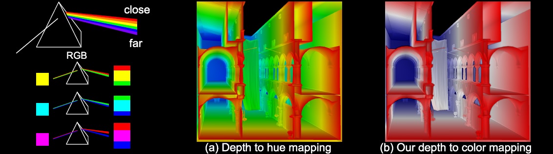
I found a paper which proposes an alternate color interpolation for the
same glasses. Instead of using red, green and blue to encode depth, the
new method uses red, white and blue.

https://graphics.tudelft.nl/Publications-new/2014/SE14a/

How would I create a pigment that works like this? Thanks.


Mike
Post a reply to this message
Attachments:
Download 'teaser.jpg' (92 KB)
Preview of image 'teaser.jpg'
|
|
| |
| |
|
|
|
|
| |
| |
|
|
On 17-2-2018 6:24, Mike Horvath wrote:
> I found a paper which proposes an alternate color interpolation for the
> same glasses. Instead of using red, green and blue to encode depth, the
> new method uses red, white and blue.
>
> https://graphics.tudelft.nl/Publications-new/2014/SE14a/
>
> How would I create a pigment that works like this? Thanks.
>
>

Maybe this?

pigment {
   gradient z
   color_map {
     [0.00 Red]
     [0.50 White]
     [1.00 Blue]
   }
   scale <1, 1, DepthOfScene>
}

Maybe you have to switch Blue and Red. Not sure.

--
Thomas
Post a reply to this message
|
|
| |
| |
|
|
|
|
| |
| |
|
|
On 2/17/2018 2:55 AM, Thomas de Groot wrote:
> On 17-2-2018 6:24, Mike Horvath wrote:
>> I found a paper which proposes an alternate color interpolation for
>> the same glasses. Instead of using red, green and blue to encode
>> depth, the new method uses red, white and blue.
>>
>> https://graphics.tudelft.nl/Publications-new/2014/SE14a/
>>
>> How would I create a pigment that works like this? Thanks.
>>
>>
>
> Maybe this?
>
> pigment {
>    gradient z
>    color_map {
>      [0.00 Red]
>      [0.50 White]
>      [1.00 Blue]
>    }
>    scale <1, 1, DepthOfScene>
> }
>
> Maybe you have to switch Blue and Red. Not sure.
>


Would spherical be better than gradient? That's what I've been using.


Mike
Post a reply to this message
|
|
| |
| |
|
|
|
|
| |
| |
|
|
On 17-2-2018 11:52, Mike Horvath wrote:
> On 2/17/2018 2:55 AM, Thomas de Groot wrote:
>> On 17-2-2018 6:24, Mike Horvath wrote:
>>> I found a paper which proposes an alternate color interpolation for
>>> the same glasses. Instead of using red, green and blue to encode
>>> depth, the new method uses red, white and blue.
>>>
>>> https://graphics.tudelft.nl/Publications-new/2014/SE14a/
>>>
>>> How would I create a pigment that works like this? Thanks.
>>>
>>>
>>
>> Maybe this?
>>
>> pigment {
>>    gradient z
>>    color_map {
>>      [0.00 Red]
>>      [0.50 White]
>>      [1.00 Blue]
>>    }
>>    scale <1, 1, DepthOfScene>
>> }
>>
>> Maybe you have to switch Blue and Red. Not sure.
>>
>
>
> Would spherical be better than gradient? That's what I've been using.
>
>

Yes indeed. See this test file I found in my archives.


--
Thomas
Post a reply to this message
Attachments:
Download 'tdg_depth_map.pov.txt' (3 KB)
|
|
| |
| |
|
|
|
|
| |
| |
|
|
On 1/16/2016 12:53 AM, Mike Horvath wrote:
> http://chromatek.com/what-is-chromadepth/design-guide-2/
>
> I've been reading their documentation, but I can't figure out if the
> progression from near to far is linear or not. I.e. is blue just as far
> from green as green is from blue? Or is it exponential? I plan on doing
> some experiments in the near future, but I can't figure out for sure
> whether this is the case.
>
>
> Mike

Okay, I asked on Stack Exchange, but no one wanted to bite and the topic
got closed. No feedback as always.

https://physics.stackexchange.com/questions/385827/chromadepth-glasses


Mike
Post a reply to this message
|
|
| |
| |
|
|
|
|
| |
|
|