 |
 |
|
 |
|
 |
|  |
|  |
|
 |
|
 |
|  |
|  |
|
 |
I refer to the thread in povray.general - Future of missing "assume_gamma"
(http://news.povray.org/povray.general/thread/%3Cweb.5dbe6e69db426e49984b401a0%40news.povray.org%3E/).
I always rendered with gamm 1.0 from 1999 to 2005. Then I realized Gilles Tran
went back from gamma 1 to gamma 2.2 back in 2002 or 2003. Christoph Gerber
always used gamma 2.6 in his fantastic images (e.g.
http://hof.povray.org/River.html).
I know all the arguments for gamma 1.0 - but I like the sharper contrasts coming
with gamma 2.2.
Of course I tried several times to get the same effects with gamma 1.0, but most
of the times I used gamma 2.2 in the end.
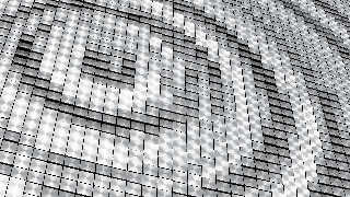
Here I show an image of a display I saw in a mall, consisting of about 50*100
small tiltable plates (brushed aluminum I assume) showing some animated
patterns.
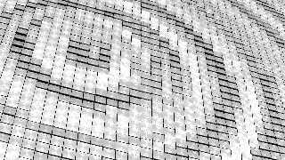
I tried hard to get a similar image with gamma 1, but no chance - it always
looked boring to me.
But perhaps I'm wrong - here is the source -
#version 3.7;
#declare RAD = 4;
global_settings {
assumed_gamma 2.2
max_trace_level 5
noise_generator 2
#if(RAD > 0)
radiosity {
pretrace_start 0.08
pretrace_end 0.04/RAD
count 30*RAD
nearest_count min (20, RAD)
error_bound 2/RAD
low_error_factor 0.5
recursion_limit 1
gray_threshold 0
minimum_reuse 0.015
brightness 1
adc_bailout 0.005
normal on
media on
}
#end
}
#include "stdinc.inc"
camera {
ultra_wide_angle
location <21,-22.4,-28>
look_at <30,16,0>
right x*16/9
angle 30
}
light_source {
<0,0,-100000>
color rgb 2.42
}
sky_sphere {
pigment {
average
pigment_map {
[1 function {max (min (y, 1), 0)}
color_map {
[0 rgb 2.35]
[0.96 rgb 4.5]
[1 rgb 13.5]
}
]
[1 function {max (min (y, 1), 0)}
turbulence 0.2
color_map {
[0 rgbt 1]
[0.5 rgbt <0.385,0.77,1.1,1>]
}
rotate z*-45
]
}
}
}
plane {
z, 1
pigment {color rgb 0}
finish {reflection {0, 0.5}}
}
#macro RoundBox (A, B, Edge)
#local AA = <min (A.x,B.x),min (A.y,B.y),min (A.z,B.z)>;
#local BB = <max (A.x,B.x),max (A.y,B.y),max (A.z,B.z)>;
#local LBF = AA;
#local RBF = <BB.x,AA.y,AA.z>;
#local RBB = <BB.x,AA.y,BB.z>;
#local LBB = <AA.x,AA.y,BB.z>;
#local LTF = <AA.x,BB.y,AA.z>;
#local RTF = <BB.x,BB.y,AA.z>;
#local RTB = BB;
#local LTB = <AA.x,BB.y,BB.z>;
union {
sphere {LBF, Edge}
sphere {RBF, Edge}
sphere {RBB, Edge}
sphere {LBB, Edge}
sphere {LTF, Edge}
sphere {RTF, Edge}
sphere {RTB, Edge}
sphere {LTB, Edge}
cylinder {LBF, RBF, Edge}
cylinder {LBB, RBB, Edge}
cylinder {LTB, RTB, Edge}
cylinder {LTF, RTF, Edge}
cylinder {LBF, LTF, Edge}
cylinder {RBF, RTF, Edge}
cylinder {RBB, RTB, Edge}
cylinder {LBB, LTB, Edge}
cylinder {LTB, LTF, Edge}
cylinder {LBB, LBF, Edge}
cylinder {RTB, RTF, Edge}
cylinder {RBB, RBF, Edge}
box {AA-Edge*x, BB+Edge*x}
box {AA-Edge*y, BB+Edge*y}
box {AA-Edge*z, BB+Edge*z}
}
#end
#declare metal =
texture {
pigment {color rgb <1,0.98,0.96>}
finish {
diffuse 0.1
specular 0.5
metallic
reflection 0.2
}
normal {
wood
scale 0.0005
slope_map {
[0 <0.5, 1>]
[0.25 <1, 0>]
[0.5 <0.5, -1>]
[0.75 <0, 0>]
[1 <0.5, 1>]
}
accuracy 0.0001
}
}
#declare metal2 =
texture {
pigment {color rgb <1,0.98,0.96>}
finish {
diffuse 0.1
specular 0.5
metallic
reflection 0.2
}
normal {
wrinkles
scale 0.01
bump_size 0.1
accuracy 0.0001
}
}
#declare f_tilt =
function {
pigment {
waves
translate <24,18,0>
}
}
#declare s = seed (7);
#declare Tx = -110;
#declare Ty = -155;
#while (Ty < 110)
#while (Tx < 155)
union {
object {
RoundBox (<-0.44,-0.44,-0.44>, <0.44,0.44,0.44>,
0.04)
scale <1,1,0.05>
texture {metal}
rotate x*(f_tilt (Tx,Ty,0).x-0.5)*60
translate <Tx,Ty,0>+0.5
}
cylinder {
<-0.5,0,0.04>, <0.5,0,0.04>, 0.0125
texture {metal2}
translate <Tx,Ty,0>+0.5
}
}
#declare Tx = Tx+1;
#end
#declare Tx = 0;
#declare Ty = Ty+1;
#end
Regards,
Norbert
Post a reply to this message
Attachments:
Download 'display.jpg' (732 KB)
Preview of image 'display.jpg'

|
 |
|  |
|  |
|
 |
|
 |
|  |
|  |
|
 |
On 11/8/19 1:45 PM, Norbert Kern wrote:
> I know all the arguments for gamma 1.0 - but I like the sharper contrasts coming
> with gamma 2.2.
My movie is gamma 1.7. I started at 2.2. After the arguments, I tried
1.0, but it was really dark and I needed to add a lot more lights and I
wasn't feeling like adding a lot more lights. So I added *some* lights,
and settled at gamma 1.7.
I think it gives it more of an animation look and less of a realistic
look, which I'm kind of going for.
--
dik
Rendered 22,919,500,800 of 40,928,716,800 pixels (55%)
Post a reply to this message
|
 |
|  |
|  |
|
 |
|
 |
|  |
|  |
|
 |
"Norbert Kern" <nor### [at] t-online de> wrote:
> I know all the arguments for gamma 1.0 - but I like the sharper contrasts coming
> with gamma 2.2.
To get sharper contrasts while retaining the physically realistic assumed_gamma
1.0:
With radiosity, have a dark environment, e.g., dark walls, dark sky.
Without radiosity, use very low ambients. de> wrote:
> I know all the arguments for gamma 1.0 - but I like the sharper contrasts coming
> with gamma 2.2.
To get sharper contrasts while retaining the physically realistic assumed_gamma
1.0:
With radiosity, have a dark environment, e.g., dark walls, dark sky.
Without radiosity, use very low ambients.
Post a reply to this message
|
 |
|  |
|  |
|
 |
|
 |
|  |
|  |
|
 |
"Norbert Kern" <nor### [at] t-online de> wrote:
> I refer to the thread in povray.general - Future of missing "assume_gamma"
>
(http://news.povray.org/povray.general/thread/%3Cweb.5dbe6e69db426e49984b401a0%40news.povray.org%3E/).
>
> I always rendered with gamm 1.0 from 1999 to 2005. Then I realized Gilles Tran
> went back from gamma 1 to gamma 2.2 back in 2002 or 2003. Christoph Gerber
> always used gamma 2.6 in his fantastic images (e.g.
> http://hof.povray.org/River.html).
>
> I know all the arguments for gamma 1.0 - but I like the sharper contrasts coming
> with gamma 2.2.
>
I agree. I just re-read Clipka's directives and noted that he was not /that/
rigid anymore in the end. As a reminder to all interested, I post the document
here.
> Of course I tried several times to get the same effects with gamma 1.0, but most
> of the times I used gamma 2.2 in the end.
> Here I show an image of a display I saw in a mall, consisting of about 50*100
> small tiltable plates (brushed aluminum I assume) showing some animated
> patterns.
>
> I tried hard to get a similar image with gamma 1, but no chance - it always
> looked boring to me.
>
> But perhaps I'm wrong - here is the source -
>
I have been playing with your scene and it is difficult (impossible?) to achieve
indeed. de> wrote:
> I refer to the thread in povray.general - Future of missing "assume_gamma"
>
(http://news.povray.org/povray.general/thread/%3Cweb.5dbe6e69db426e49984b401a0%40news.povray.org%3E/).
>
> I always rendered with gamm 1.0 from 1999 to 2005. Then I realized Gilles Tran
> went back from gamma 1 to gamma 2.2 back in 2002 or 2003. Christoph Gerber
> always used gamma 2.6 in his fantastic images (e.g.
> http://hof.povray.org/River.html).
>
> I know all the arguments for gamma 1.0 - but I like the sharper contrasts coming
> with gamma 2.2.
>
I agree. I just re-read Clipka's directives and noted that he was not /that/
rigid anymore in the end. As a reminder to all interested, I post the document
here.
> Of course I tried several times to get the same effects with gamma 1.0, but most
> of the times I used gamma 2.2 in the end.
> Here I show an image of a display I saw in a mall, consisting of about 50*100
> small tiltable plates (brushed aluminum I assume) showing some animated
> patterns.
>
> I tried hard to get a similar image with gamma 1, but no chance - it always
> looked boring to me.
>
> But perhaps I'm wrong - here is the source -
>
I have been playing with your scene and it is difficult (impossible?) to achieve
indeed.
Post a reply to this message
Attachments:
Download 'clipkas gamma tutorial.pdf' (423 KB)
|
 |
|  |
|  |
|
 |
|
 |
|  |
|  |
|
 |
> On 11/8/19 1:45 PM, Norbert Kern wrote:
>
>> I know all the arguments for gamma 1.0 - but I like the sharper
>> contrasts coming
>> with gamma 2.2.
>
> 1.0, but it was really dark and I needed to add a lot more lights and I
> wasn't feeling like adding a lot more lights. So I added *some* lights,
> and settled at gamma 1.7.
> I think it gives it more of an animation look and less of a realistic
> look, which I'm kind of going for.
>
>
Don't add more light, but make them brighter.
Post a reply to this message
|
 |
|  |
|  |
|
 |
|
 |
|  |
|  |
|
 |
Alain Martel <kua### [at] videotron ca> wrote:
> Don't add more light, but make them brighter.
Yeah - White*10, also add diffuse values to your finishes, and possibly even
experiment with adding in small amounts of emission.
I've also had success with installing a diffuse reflector - somewhere between a
plane and a hemisphere behind the camera. Like a HUGE fill light.
If you're using a sky_sphere in any of the scenes - you can get a huge amount of
brightness added to your scene that way too. ca> wrote:
> Don't add more light, but make them brighter.
Yeah - White*10, also add diffuse values to your finishes, and possibly even
experiment with adding in small amounts of emission.
I've also had success with installing a diffuse reflector - somewhere between a
plane and a hemisphere behind the camera. Like a HUGE fill light.
If you're using a sky_sphere in any of the scenes - you can get a huge amount of
brightness added to your scene that way too.
Post a reply to this message
|
 |
|  |
|  |
|
 |
|
 |
|  |
|  |
|
 |
The best I could do is appended here. In the end, after different
experiments, I only changed the sky_sphere, replacing it by a sphere
where I could control the finish. Assumed_gamma set to 1.0 of course.
Norbert: I do not know how your sky_sphere pigment works :-/
sphere {
0, 1
pigment {
gradient <0, 1 ,0>
color_map {
blend_mode 3 blend_gamma 2.2
[0.00 rgb <1.0, 1.0, 1.0>*0.9]
[0.35 rgb <0.8, 0.8, 0.8>*0.3]
[0.65 rgb <0.8, 0.8, 0.8>*0.3]
[1.00 rgb <1.0, 1.0, 1.0>*0.9]
}
scale 2
warp {turbulence 0.5}
}
finish {emission 1 diffuse 1.0 specular 0}
scale 10e6
translate -23.0*y
}
the blend_mode and blend_gamma commands come with version 3.7.1 and
above (i.e 3.8). However, I do not see any difference by their use. I
confess that I do not really understand their explanation in the wiki.
--
Thomas
Post a reply to this message
Attachments:
Download 'nk_assumed gamma discussion.jpg' (779 KB)
Preview of image 'nk_assumed gamma discussion.jpg'

|
 |
|  |
|  |
|
 |
|
 |
|  |
|  |
|
 |
>
It's similar to a gradient y, but with only a single ramp.
function {max (min (y, 1), 0)}
The max(y,0) clamp out everything under 0.
The min(y,1) clamp out everything over 1.
Leaving you with :
-infinity..0 =0, [0..1] ramping from zero to one, than stay at one.
It is extremely bright, ranging from White*2.35 up to White*13.5.
It may be intended to simulate the glare from the Sun at the zenith.
The second does the same, but with some turbulence. Also, it's fully
transmiting. Try is with filter rather than transmit :
color_map {
[0 rgbf 1]
[0.5 rgbf <0.385,0.77,1.1,1>]
}
Things that make that render look washed out with assumed_gamma 1 :
The light is very bright at 2.42.
The sky_sphere is extremely bright.
You may want to make the sky_sphere darker, as well as the light.
Change the base colour_map :
color_map{
[0 rgb<0.06,0.1,0.5>]
[0.98 rgb<0.1, 0.3,1>]
[1 rgb 5]
}
Change the light_source to :
light_source {
<0,0,-1000>
color rgb 1.2
parallel
}
When using assumed_gamma >1, values larger than 1 get shifted toward 1,
making the scene darker. This also affect reflections and highlights,
reducing their contribution.
Alain
Post a reply to this message
|
 |
|  |
|  |
|
 |
|
 |
|  |
|  |
|
 |
Op 12/11/2019 om 17:04 schreef Alain Martel:
>>
>
> It's similar to a gradient y, but with only a single ramp.
> function {max (min (y, 1), 0)}
>
> The max(y,0) clamp out everything under 0.
> The min(y,1) clamp out everything over 1.
> Leaving you with :
> -infinity..0 =0, [0..1] ramping from zero to one, than stay at one.
> It is extremely bright, ranging from White*2.35 up to White*13.5.
> It may be intended to simulate the glare from the Sun at the zenith.
>
I assumed as much but personally I am very wary of rgb values higher
than 1, and these are really extreme. In such cases I much prefer to use
a finish {emission} setting instead.
--
Thomas
Post a reply to this message
|
 |
|  |
|  |
|
 |
|
 |
|  |
|  |
|
 |
On 11/8/19 1:45 PM, Norbert Kern wrote:
> I refer to the thread in povray.general - Future of missing "assume_gamma"
>
(http://news.povray.org/povray.general/thread/%3Cweb.5dbe6e69db426e49984b401a0%40news.povray.org%3E/).
>
...
> I tried hard to get a similar image with gamma 1, but no chance - it always
> looked boring to me.
>
> But perhaps I'm wrong - here is the source -
>
Firstly, with the scene, like the photon one back in September, it would
be useful to know how you rendered and post-processed to get the posted
image. The scenes, if rendered "normally," are extremely noisy with
respect to highlights - making, especially, any adaptive AA noisy too. I
had to use +am1 +a0.0 +r9 to get anything approaching your very clean
image. My guess is you're rendering very large images and scaling down?
Anyway, attached are two images and an updated scene file.
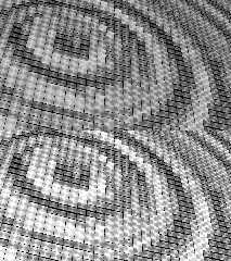
In AG22_mostlyGammaCorrect.jpg A and C are your 2.2 assumed_gamma scene.
B assumed_gamma (AG) to 1.0. D is a gimp gamma corrected version of B.
Trying to demonstrate that, 'mostly,' the AG 2.2 is a gamma correction
for bad linear color space textures - no matter where that correction is
done.
Due history, many textures were created around other than 1.0 gammas. If
they work for a desired result, I say use them. I do. That said, I don't
think other than assumed_gamma 1.0 the best path forward and I primarily
use AG 1.0.
In UpdateAG1v38story.jpg I'm showing at top the attached scene where
I've applied my current, usual AG 2.2 to AG 1.0 changes. The image comes
out a little dim compared to yours. On the bottom I've used gimp
(color->levels) - being lazy - to adjust the intensity of the brightest
parts to white. Normally the intensity of the lighting environment must
be increased after an AG 2.2 -> 1.0 conversion. I'd suggest something
like pow(2.42,1.5) in place of 2.42 as a start - and then dial it in
from there. Somebody did the same sort of tuning with the AG2.2 scene
set up too. Yes, normally the sky_sphere texture would be adjusted too,
but here, I don't think it's contributing much to the result.
So, easy right! Well, not always. It's still the case AG 2.2 scenes are
sometimes hard - or impossible - to map exactly to AG 1.0. It gets more
complicated with layered textures, not grey colors, color-interactions
and, of course, matching any non-physical something or other - including
AG 2.2 error - employed for effect.
Where layered textures have transparency, I find it hard to match the AG
2.2 transitions between textures. We might be able to improve this last
with modifications to the new to 3.8 blend_mode/blend_gamma features or
perhaps additional features or a utility. Not sure. Might be this less
of an issue if designing original 1.0 textures rather than converting
old stuff.
Warp, over on the developer mailing list, once mentioned we'd ideally
have implemented some utility which parses AG-not1.0 textures/scenes and
creates the initial AG 1.0 ones. Something to help people get into the
AG 1.0 space and mindset quickly. With some exceptions, I think our AG
1.0 struggles have as much to do with POV-Ray's history and practicing
momentum as anything.
Also true I'm less of a texture/material expert than many of you.
Bill P.
Post a reply to this message
Attachments:
Download 'updateag1v38story.jpg' (410 KB)
Download 'utf-8' (5 KB)
Download 'ag22_mostlygammacorrect.jpg' (327 KB)
Preview of image 'updateag1v38story.jpg'

Preview of image 'ag22_mostlygammacorrect.jpg'

|
 |
|  |
|  |
|
 |
|
 |
|  |
|
 |


![]()