 |
 |
|
 |
|
 |
|  |
|  |
|
 |
|
 |
|  |
|  |
|
 |
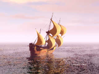
So I made a ship. It took me a while--this is certainly my most ambitious
Wings3D project I've ever attempted. In fact, I had never really attempted any
UV mapping in Wings before, but it turned out to be easier than I thought.
There's still plenty of details I'd like to add, but over all, I'm very happy
with my efforts so far. Now all I need is that patch that the brilliant minds
around here were developing to support translucency for those sails!
Larger render coming soon.
Post a reply to this message
Attachments:
Download 'kirkscaravel.jpg' (144 KB)
Preview of image 'kirkscaravel.jpg'

|
 |
|  |
|  |
|
 |
|
 |
|  |
|  |
|
 |
Kirk Andrews schrieb:
> There's still plenty of details I'd like to add, but over all, I'm very happy
> with my efforts so far. Now all I need is that patch that the brilliant minds
> around here were developing to support translucency for those sails!
Just get the current beta and you have that patch.
Post a reply to this message
|
 |
|  |
|  |
|
 |
|
 |
|  |
|  |
|
 |
It's very nice! Specially the photography. Very moody.
Post a reply to this message
|
 |
|  |
|  |
|
 |
|
 |
|  |
|  |
|
 |
"Kirk Andrews" <kir### [at] tektonart com> wrote:
> Now all I need is that patch that the brilliant minds
> around here were developing to support translucency for those sails!
>
Eh, I really like your stylistic approach so far. I think the artistic merit of
this work comes in that you don't have 100.00 score on what folks call
"technical merit" (i.e., sliding down into the Uncanny Valley). I think that
adding too many
touches of photorealism could mess this up. com> wrote:
> Now all I need is that patch that the brilliant minds
> around here were developing to support translucency for those sails!
>
Eh, I really like your stylistic approach so far. I think the artistic merit of
this work comes in that you don't have 100.00 score on what folks call
"technical merit" (i.e., sliding down into the Uncanny Valley). I think that
adding too many
touches of photorealism could mess this up.
Post a reply to this message
|
 |
|  |
|  |
|
 |
|
 |
|  |
|  |
|
 |
Great image. There's a bit of graininess to it, and on one hand I think it
adds something to the image, but on the other hand I wonder what it would
look like with more AA and/or higher resolution.
- Slime
[ http://www.slimeland.com/ ]
Post a reply to this message
|
 |
|  |
|  |
|
 |
|
 |
|  |
|  |
|
 |
I love that.
Thomas
Post a reply to this message
|
 |
|  |
|  |
|
 |
|
 |
|  |
|  |
|
 |
web.4aca706fd99cc1e51322341f0@news.povray.org...
> So I made a ship. It took me a while--this is certainly my most ambitious
> Wings3D project I've ever attempted. In fact, I had never really
> attempted any
> UV mapping in Wings before, but it turned out to be easier than I thought.
>
> There's still plenty of details I'd like to add, but over all, I'm very
> happy
> with my efforts so far. Now all I need is that patch that the brilliant
> minds
> around here were developing to support translucency for those sails!
>
> Larger render coming soon.
>
>
I really love it !
She is rather plump :)
Is that the Sargasso sea ? The water is very brownish
Marc
Post a reply to this message
|
 |
|  |
|  |
|
 |
|
 |
|  |
|  |
|
 |
"gregjohn" <pte### [at] yahoo com> wrote:
> "Kirk Andrews" <kir### [at] tektonart com> wrote:
> "Kirk Andrews" <kir### [at] tektonart com> wrote:
> > Now all I need is that patch that the brilliant minds
> > around here were developing to support translucency for those sails!
> >
>
> Eh, I really like your stylistic approach so far. I think the artistic merit of
> this work comes in that you don't have 100.00 score on what folks call
> "technical merit" (i.e., sliding down into the Uncanny Valley). I think that
> adding too many
> touches of photorealism could mess this up.
Thanks! ... I think? com> wrote:
> > Now all I need is that patch that the brilliant minds
> > around here were developing to support translucency for those sails!
> >
>
> Eh, I really like your stylistic approach so far. I think the artistic merit of
> this work comes in that you don't have 100.00 score on what folks call
> "technical merit" (i.e., sliding down into the Uncanny Valley). I think that
> adding too many
> touches of photorealism could mess this up.
Thanks! ... I think?
Post a reply to this message
|
 |
|  |
|  |
|
 |
|
 |
|  |
|  |
|
 |
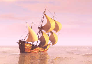
Thanks everyone. Here's a larger render:
Post a reply to this message
Attachments:
Download 'onthesea2_06.jpg' (216 KB)
Preview of image 'onthesea2_06.jpg'

|
 |
|  |
|  |
|
 |
|
 |
|  |
|  |
|
 |
Wow!
Is this using focal blur to smudge the horizon?
Post a reply to this message
|
 |
|  |
|  |
|
 |
|
 |
|  |


![]()