 |
 |
|
 |
|
 |
|  |
|  |
|
 |
|
 |
|  |
|  |
|
 |
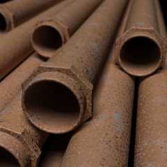
Again one of those images which looked great when thumbnail-sized (during
test renderings), but look too clean in full size. Well, here it is anyways.
Post a reply to this message
Attachments:
Download 'RustyPipes.jpg' (56 KB)
Preview of image 'RustyPipes.jpg'

|
 |
|  |
|  |
|
 |
|
 |
|  |
|  |
|
 |
Warp <war### [at] tag povray povray org> wrote:
> Again one of those images which looked great when thumbnail-sized (during
> test renderings), but look too clean in full size. Well, here it is anyways.
Too true! Focal blur makes it more realistic than you'd think, though.
Needs a nice fine turbulence warp with high octaves and omega, then a normal
block with the same parameters. org> wrote:
> Again one of those images which looked great when thumbnail-sized (during
> test renderings), but look too clean in full size. Well, here it is anyways.
Too true! Focal blur makes it more realistic than you'd think, though.
Needs a nice fine turbulence warp with high octaves and omega, then a normal
block with the same parameters.
Post a reply to this message
|
 |
|  |
|  |
|
 |
|
 |
|  |
|  |
|
 |
"Warp" <war### [at] tag povray povray org> wrote in message
news:49afbbc3@news.povray.org...
> Again one of those images which looked great when thumbnail-sized (during
> test renderings), but look too clean in full size. Well, here it is
> anyways.
I'm afraid I have to agree :(
The parts that are out of focus, look very good, but the in-focus parts need
a more defined geometry.
I like the lighting though!!
cu!
--
#macro G(b,e)b+(e-b)*C/50#end#macro _(b,e,k,l)#local C=0;#while(C<50)
sphere{G(b,e)+3*z.1pigment{rgb G(k,l)}finish{ambient 1}}#local C=C+1;
#end#end _(y-x,y,x,x+y)_(y,-x-y,x+y,y)_(-x-y,-y,y,y+z)_(-y,y,y+z,x+y)
_(0x+y.5+y/2x)_(0x-y.5+y/2x) // ZK http://www.povplace.com org> wrote in message
news:49afbbc3@news.povray.org...
> Again one of those images which looked great when thumbnail-sized (during
> test renderings), but look too clean in full size. Well, here it is
> anyways.
I'm afraid I have to agree :(
The parts that are out of focus, look very good, but the in-focus parts need
a more defined geometry.
I like the lighting though!!
cu!
--
#macro G(b,e)b+(e-b)*C/50#end#macro _(b,e,k,l)#local C=0;#while(C<50)
sphere{G(b,e)+3*z.1pigment{rgb G(k,l)}finish{ambient 1}}#local C=C+1;
#end#end _(y-x,y,x,x+y)_(y,-x-y,x+y,y)_(-x-y,-y,y,y+z)_(-y,y,y+z,x+y)
_(0x+y.5+y/2x)_(0x-y.5+y/2x) // ZK http://www.povplace.com
Post a reply to this message
|
 |
|  |
|  |
|
 |
|
 |
|  |
|  |
|
 |
On 5 Mar 2009 06:47:17 -0500, Warp <war### [at] tag povray povray org> wrote:
> Again one of those images which looked great when thumbnail-sized (during
>test renderings), but look too clean in full size. Well, here it is anyways.
To me the plane of focus looks in the wrong place. If I was taking
that as a picture i would have focused on the flange of the front
pipe. The focus looks just behind that .
John org> wrote:
> Again one of those images which looked great when thumbnail-sized (during
>test renderings), but look too clean in full size. Well, here it is anyways.
To me the plane of focus looks in the wrong place. If I was taking
that as a picture i would have focused on the flange of the front
pipe. The focus looks just behind that .
John
Post a reply to this message
|
 |
|  |
|  |
|
 |
|
 |
|  |
|  |
|
 |
Warp wrote:
> Again one of those images which looked great when thumbnail-sized (during
> test renderings), but look too clean in full size. Well, here it is anyways.
>
>
Shows how much effect you can get out of basic noise. The image is
plausible.
Post a reply to this message
|
 |
|  |
|  |
|
 |
|
 |
|  |
|  |
|
 |
> Again one of those images which looked great when thumbnail-sized (during
> test renderings), but look too clean in full size. Well, here it is
> anyways.
Don't you select a sub-area first to check out the texture at full
resolution?
Looks pretty good anyway, just needs more high fequency noise.
- Slime
[ http://www.slimeland.com/ ]
Post a reply to this message
|
 |
|  |
|  |
|
 |
|
 |
|  |
|  |
|
 |
Warp <war### [at] tag povray povray org> wrote:
> Again one of those images which looked great when thumbnail-sized (during
> test renderings), but look too clean in full size. Well, here it is anyways.
Very nice!
Warp, however I think that you can do much better, than this! :-D
--
Carlo org> wrote:
> Again one of those images which looked great when thumbnail-sized (during
> test renderings), but look too clean in full size. Well, here it is anyways.
Very nice!
Warp, however I think that you can do much better, than this! :-D
--
Carlo
Post a reply to this message
|
 |
|  |
|  |
|
 |
|
 |
|  |


![]()