 |
 |
|
 |
|
 |
|  |
|  |
|
 |
From: William F Pokorny
Subject: Sample scene. Outline text{} yuqk R19 docs
Date: 23 Mar 2025 23:32:22
Message: <67e0d246$1@news.povray.org>
|
|
 |
|  |
|  |
|
 |
Attached is another image and sample scene.
Recently, there were discussions about outline fonts and turning text
into 'functions' with gradient values suitable for isosurface use. With
the latter I was reminded of a long dropped experiment for creating
gradient images of text characters by projecting a parallel area light
through the text{} object.
It happened too, in my yuqk rework of the text{} object I added 'open'
and 'caps' capabilities to return only side surface intersections or cap
/ end surface intersections.
Further, in the coming R19 release of yuqk, the text{} object supports a
true zero thickness - which sets the inside test to return false and, if
using 'caps', only the top cap surface intersections are returned. In
other words, there is now a method to get true 2D text{} surfaces.
Though a very tiny thicknesses would work as light projected through
text{}s for this outlined font method in official POV-Ray releases, 2D
surfaces are ideal for the job.
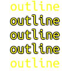
Anyhow. A technique to turn any font into an outline font as seen in the
image. The downside of the method is the final renders are slow.
Bill P.
Post a reply to this message
Attachments:
Download 'outlinefontmethod.png' (77 KB)
Download 'outlinefontmethod.pov.txt' (3 KB)
Preview of image 'outlinefontmethod.png'

|
 |
|  |
|  |
|
 |
From: William F Pokorny
Subject: Re: Sample scene. Outline text{} yuqk R19 docs
Date: 31 Mar 2025 12:15:42
Message: <67eabfae$1@news.povray.org>
|
|
 |
|  |
|  |
|
 |
On 3/23/25 23:32, William F Pokorny wrote:
> Anyhow. A technique to turn any font into an outline font as seen in the
> image.
My eldest granddaughter has started to read. I used this outline method
to create a - very colorful - printed letter sent to her by post.
Afterward, I found myself playing with variations while trying to speed
the final renders - and get a smoother transition between the outline
shadow an character(*).
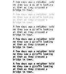
In the attached image, the top sub-image uses traditional text objects
in front of a white plane, heavy AA and no lights.
The remaining five sub-images turn off AA and removed the visible text
objects - using only the area light projected through 2D text surfaces
onto a white plane technique. Top to bottom, the magnitude of the
negative light is increased in steps.
Stumbled into it, but it Looks pretty good to me as another POV-Ray
'text / font processing' technique.
Bill P.
(*) - Anti-Aliasing works hard, but not well, due the large differences
in channel values. It's basically the opposite of the jaggies we get
with very bright regions. The outline technique here using large
negative light values - which get clamped black for display and output.
Post a reply to this message
Attachments:
Download 'arealghtprjthru.png' (100 KB)
Preview of image 'arealghtprjthru.png'

|
 |
|  |
|  |
|
 |
|
 |
|  |
|  |
|
 |
William F Pokorny <ano### [at] anonymous org> wrote:
> On 3/23/25 23:32, William F Pokorny wrote:
> Stumbled into it, but it Looks pretty good to me as another POV-Ray
> 'text / font processing' technique.
That's a very nice faux-bold font.
Apply a shear transform, and you ought to get a faux-italic as well.
It would be cool if an alert reader (TM) worked out some kind of markup macro to
allow \u, \i, \b to make concatenating formatted text a bit easier.
I'll pencil that in as Task # 4397 in my foot-tall to-do pile... ;)
Hope you granddaughter enjoys the letter. :)
- BW
Where is the book in which the teacher can read about what teaching is? The
children themselves are this book. We should not learn to teach out of any book
other than the one lying open before us and consisting of the children
themselves.
Rudolf Steiner org> wrote:
> On 3/23/25 23:32, William F Pokorny wrote:
> Stumbled into it, but it Looks pretty good to me as another POV-Ray
> 'text / font processing' technique.
That's a very nice faux-bold font.
Apply a shear transform, and you ought to get a faux-italic as well.
It would be cool if an alert reader (TM) worked out some kind of markup macro to
allow \u, \i, \b to make concatenating formatted text a bit easier.
I'll pencil that in as Task # 4397 in my foot-tall to-do pile... ;)
Hope you granddaughter enjoys the letter. :)
- BW
Where is the book in which the teacher can read about what teaching is? The
children themselves are this book. We should not learn to teach out of any book
other than the one lying open before us and consisting of the children
themselves.
Rudolf Steiner
Post a reply to this message
|
 |
|  |
|  |
|
 |
|
 |
|  |
|
 |


![]()