|
|
|
|
|
|
| |
| |
|
|
|
|
| |
| |
|
|
I started looking at a yuqk version of documentation for the text{}
object. I quickly found out I've been decades clueless about the offset
vector; Always setting the value to 0 - or maybe 0.1*x, if I wanted a
little extra space between characters.

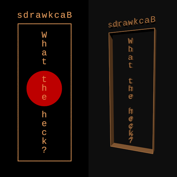
Well, we can already do vertical and right to left text so long as it is
a mono-space font. I've long thought this a missing feature in POV-Ray.
For example:

text {
     ttf "/home/pokorny/Fonts/LiberationMono-Regular.ttf"
     "What the heck?",
     1.0, <-0.6,-1.0,0>
     pigment { rgb <.7,.3,.1> }
     finish { emission 1 }
     translate <-0.3,5.75,0>
     scale 0.1
}

text {
     ttf "/home/pokorny/Fonts/LiberationMono-Regular.ttf"
     "Backwards",
     1.0, <-1.3,0,0>
     pigment { rgb <.7,.3,.1> }
     finish { emission 1 }
     translate <+2.6,8.0,0>
     scale 0.1
}

Only tricky part is figuring out the base character size and spacing.
I've not found an easy and reliable way to do that as yet. I got to the
above values by trial and error.

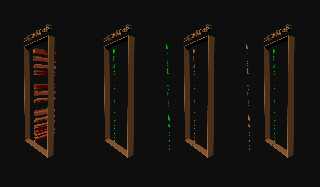
Used box characters for the rectangular frame using the strings:
"┌─────────┐", "└─────────┘" and
"│││││││││││││││",

Bill P.
Post a reply to this message
Attachments:
Download 'textoffsetsstory.png' (48 KB)
Preview of image 'textoffsetsstory.png'
|
|
| |
| |
|
|
|
|
| |
| |
|
|
William F Pokorny <ano### [at] anonymous org> wrote:
> I quickly found out I've been decades clueless about the offset
> vector; Always setting the value to 0 - or maybe 0.1*x, if I wanted a
> little extra space between characters.
I.i.r.c. Ron Parker has once posted a macro for "kerning"(?), can't find it any
more.
ingo org> wrote:
> I quickly found out I've been decades clueless about the offset
> vector; Always setting the value to 0 - or maybe 0.1*x, if I wanted a
> little extra space between characters.
I.i.r.c. Ron Parker has once posted a macro for "kerning"(?), can't find it any
more.
ingo
Post a reply to this message
|
|
| |
| |
|
|
|
|
| |
| |
|
|
William F Pokorny <ano### [at] anonymousorg> wrote:
> I started looking at a yuqk version of documentation for the text{}
> object. I quickly found out I've been decades clueless about the offset
> vector; Always setting the value to 0 - or maybe 0.1*x, if I wanted a
> little extra space between characters.

You and me both.
I don't even use a "vector" - I always set it to 0.
So I'm invisibly using <0, 0, 0>

Perhaps the docs can be edited to give a slightly better example.

Docs:
The horizontal spacing is handled by POV-Ray internally including any kerning
information stored in the font. The required vector <Offset> defines any extra
translation between each character. Normally you should specify a zero for this
value. Specifying 0.1*x would put additional 0.1 units of space between each
character. Here is an example:

text {
  ttf "timrom.ttf" "POV-Ray" 1, 0
  pigment { Red }
  }


Also, I'll probably want tiny example scene that better/best demonstrates
whatever else it is that you discover in playing with this heretofore ignored
feature.

Thanks!

- BW
Post a reply to this message
|
|
| |
| |
|
|
From: Jörg "Yadgar" Bleimann
Subject: Re: Other things the text object can do.
Date: 4 Mar 2025 15:24:58
Message: <67c7619a$1@news.povray.org>
|
|
|
| |
| |
|
|
Banzai!

On 04.03.25 16:35, William F Pokorny wrote:
> I started looking at a yuqk version of documentation for the text{}
> object. I quickly found out I've been decades clueless about the offset
> vector; Always setting the value to 0 - or maybe 0.1*x, if I wanted a
> little extra space between characters.
>
> Well, we can already do vertical and right to left text so long as it is
> a mono-space font. I've long thought this a missing feature in POV-Ray.
> For example:
>
> text {
>      ttf "/home/pokorny/Fonts/LiberationMono-Regular.ttf"
>      "What the heck?",
>      1.0, <-0.6,-1.0,0>
>      pigment { rgb <.7,.3,.1> }
>      finish { emission 1 }
>      translate <-0.3,5.75,0>
>      scale 0.1
> }

Kawaii!

Sayonara,

Yadugaru
Post a reply to this message
|
|
| |
| |
|
|
|
|
| |
| |
|
|
William F Pokorny <ano### [at] anonymousorg> wrote:
>
> Only tricky part is figuring out the base character size and spacing.
> I've not found an easy and reliable way to do that as yet. I got to the
> above values by trial and error.
>
> Used box characters for the rectangular frame using the strings:
> "┌─────────┐",
"└────
─────┘" and
"││││││││││
│││││",
>
> Bill P.

If you are using a mono-type font, this worked for me:

#local _t1 = text { ttf "fontname.ttf" "A" 1.0, 0 }
#local _t2 = text { ttf "fontname.ttf" "AA" 1.0, 0 }
#local _t1sz = max_extent(_t1) - min_extent(_t1);
#local _t2sz = max_extent(_t2) - min_extent(_t2);
#local _unit_width = (_t2sz - _t1sz).x;

text { ttf "fontname.ttf" "What the heck?" 1.0, -2*unit_width*x }
text { ttf "fontname.ttf" "What the heck?" 1.0, <-unit_width, -1, 0> translate
<0, 14, 0> }

-- Chris R
Post a reply to this message
Attachments:
Download 'text_test.png' (155 KB)
Preview of image 'text_test.png'

|
|
| |
| |
|
|
|
|
| |
| |
|
|
On 3/4/25 15:24, Jörg "Yadgar" Bleimann wrote:
> Banzai!
>
...
>
> Kawaii!
>
> Sayonara,
>
> Yadugaru
>

:-)
Post a reply to this message
|
|
| |
| |
|
|
|
|
| |
| |
|
|
On 3/5/25 09:11, Chris R wrote:

> If you are using a mono-type font, this worked for me:
>
> #local _t1 = text { ttf "fontname.ttf" "A" 1.0, 0 }
> #local _t2 = text { ttf "fontname.ttf" "AA" 1.0, 0 }
> #local _t1sz = max_extent(_t1) - min_extent(_t1);
> #local _t2sz = max_extent(_t2) - min_extent(_t2);
> #local _unit_width = (_t2sz - _t1sz).x;

Thank you Chris!

This approach is working for me with the couple of mono-space fonts just
tried.

Along with using the height of the vertical box character for the unit
height.

Bill P.
Post a reply to this message
|
|
| |
| |
|
|
|
|
| |
| |
|
|
"ingo" <nomail@nomail> wrote:

> I.i.r.c. Ron Parker has once posted a macro for "kerning"(?), can't find it any
> more.
>

This post references the macro, but still can't find it:

https://news.povray.org/povray.general/message/%3Cslrn90m9mi.23r.ron.parker%40fwi.com%3E/#%3Cslrn90m9mi.23r.ron.parker%
40fwi.com%3E

ingo
Post a reply to this message
|
|
| |
| |
|
|
|
|
| |
| |
|
|
"ingo" <nomail@nomail> wrote:
> "ingo" <nomail@nomail> wrote:
>
> > I.i.r.c. Ron Parker has once posted a macro for "kerning"(?), can't find it any
> > more.
> >
>
> This post references the macro, but still can't find it:
>
>
https://news.povray.org/povray.general/message/%3Cslrn90m9mi.23r.ron.parker%40fwi.com%3E/#%3Cslrn90m9mi.23r.ron.parke
r%
> 40fwi.com%3E
>
> ingo

It looks like it might not be on the (current) server anymore.
Which means that this is either a job for TdG or Chris Cason ...
Post a reply to this message
|
|
| |
| |
|
|
|
|
| |
| |
|
|
"Chris R" <car### [at] comcastnet> wrote:
> William F Pokorny <ano### [at] anonymousorg> wrote:
> >
> > Only tricky part is figuring out the base character size and spacing.
> > I've not found an easy and reliable way to do that as yet. I got to the
> > above values by trial and error.
> >
> > Used box characters for the rectangular frame using the strings:
> > "┌─────────┐",
"└───γ
2;
> ─────┘" and
"│││││││││γ
4;
> │││││",
> >
> > Bill P.
>
> If you are using a mono-type font, this worked for me:
>
> #local _t1 = text { ttf "fontname.ttf" "A" 1.0, 0 }
> #local _t2 = text { ttf "fontname.ttf" "AA" 1.0, 0 }
> #local _t1sz = max_extent(_t1) - min_extent(_t1);
> #local _t2sz = max_extent(_t2) - min_extent(_t2);
> #local _unit_width = (_t2sz - _t1sz).x;
>
> text { ttf "fontname.ttf" "What the heck?" 1.0, -2*unit_width*x }
> text { ttf "fontname.ttf" "What the heck?" 1.0, <-unit_width, -1, 0> translate
> <0, 14, 0> }
>
> -- Chris R
I remember this little trick. But I didn't want to be limited to mono-type
fonts so I wrote a macro that cut a string into pieces and place each letter
separately. And promptly forgot about it.
Post a reply to this message
|
|
| |
| |
|
|
|
|
| |
| |
|
|
Op 05/03/2025 om 20:22 schreef Bald Eagle:
> "ingo" <nomail@nomail> wrote:
>> "ingo" <nomail@nomail> wrote:
>>
>>> I.i.r.c. Ron Parker has once posted a macro for "kerning"(?), can't find it any
>>> more.
>>>
>>
>> This post references the macro, but still can't find it:
>>
>>
https://news.povray.org/povray.general/message/%3Cslrn90m9mi.23r.ron.parker%40fwi.com%3E/#%3Cslrn90m9mi.23r.ron.parke
> r%
>> 40fwi.com%3E
>>
>> ingo
>
> It looks like it might not be on the (current) server anymore.
> Which means that this is either a job for TdG or Chris Cason ...
>

Could this be it?

https://news.povray.org/povray.binaries.images/message/%3Cslrn8s4ajs.2q7.ron.parker%40fwi.com%3E/#%3Cslrn8s4ajs.2q7.ron.parker%40fwi.com%3E


--
Thomas [just waking up from his winter sleep]
Post a reply to this message
|
|
| |
| |
|
|
|
|
| |
| |
|
|
Thomas de Groot <tho### [at] degrootorg> wrote:

> Could this be it?
>
>
https://news.povray.org/povray.binaries.images/message/%3Cslrn8s4ajs.2q7.ron.parker%40fwi.com%3E/#%3Cslrn8s4ajs.2q7.r
on.parker%40fwi.com%3E
>

Yes, that is the core of the macro(s) Ron posted in p.programming. Thanks.


Lekker geslapen deze winter?

ingo
Post a reply to this message
|
|
| |
| |
|
|
|
|
| |
| |
|
|
Op 06/03/2025 om 11:44 schreef ingo:
> Thomas de Groot <tho### [at] degrootorg> wrote:
>
>> Could this be it?
>>
>>
https://news.povray.org/povray.binaries.images/message/%3Cslrn8s4ajs.2q7.ron.parker%40fwi.com%3E/#%3Cslrn8s4ajs.2q7.r
> on.parker%40fwi.com%3E
>>
>
> Yes, that is the core of the macro(s) Ron posted in p.programming. Thanks.
>
Strangely enough, My search did not show the relevant message(s) in
p.programming. I used "Ron Parker + kerning" In the Search bar of the
povray.org newsgroups...

>
> Lekker geslapen deze winter?
>
Ach ja, bedankt! Wel een beetje onrustig... ;-)

> ingo
>
>
>


--
Thomas
Post a reply to this message
|
|
| |
| |
|
|
|
|
| |
| |
|
|
Op 06/03/2025 om 13:46 schreef Thomas de Groot:
> Strangely enough, My search did not show the relevant message(s) in
> p.programming. I used "Ron Parker + kerning" In the Search bar of the
> povray.org newsgroups...
>

...but this seems to be the message:

https://news.povray.org/povray.programming/thread/%3C38B18153.72BE%40aol.com%3E/?ttop=445029&toff=800&mtop=84879&moff=20

Go to about the end of the thread.

--
Thomas
Post a reply to this message
|
|
| |
| |
|
|
|
|
| |
| |
|
|
Thomas de Groot <tho### [at] degrootorg> wrote:

>
> ...but this seems to be the message:
>
>
https://news.povray.org/povray.programming/thread/%3C38B18153.72BE%40aol.com%3E/?ttop=445029&toff=800&mtop=84879&moff
=20
>
> Go to about the end of the thread.

Thank you, it appears I hallucinated there to be more and Google hates me.
Couldn't find it searching several ways.

ingo
Post a reply to this message
|
|
| |
| |
|
|
|
|
| |
| |
|
|
"ingo" <nomail@nomail> wrote:

> Thank you, it appears I hallucinated there to be more and Google hates me.
> Couldn't find it searching several ways.

Me neither.
Google sucks the big suck.
I even tried searching specifically for "font metric function" and got nothing.

Useless is being generous.  Search engines today are worse than useless.

However, persistence wins the day!  :)


Welcome back, Thomas.

- BW
Post a reply to this message
|
|
| |
| |
|
|
|
|
| |
| |
|
|
hi,

"Bald Eagle" <cre### [at] netscapenet> wrote:
> "ingo" <nomail@nomail> wrote:
> > Thank you, it appears I hallucinated there to be more and Google hates me.
> > Couldn't find it searching several ways.
> Me neither.
> Google sucks the big suck.
> I even tried searching specifically for "font metric function" and got nothing.
>
> Useless is being generous.  Search engines today are worse than useless.

sort of agree, but perhaps your combined activity has caused Google "to wake up"
:-), typing "ron parker font" in the above 'Search' shows the relevant result,
top of list.

> Welcome back, Thomas.


regards, jr.
Post a reply to this message
|
|
| |
| |
|
|
|
|
| |
| |
|
|
"jr" <cre### [at] gmailcom> wrote:

> > Useless is being generous.  Search engines today are worse than useless.
>
> sort of agree, but perhaps your combined activity has caused Google "to wake up"
> :-), typing "ron parker font" in the above 'Search' shows the relevant result,
> top of list.

I just did exactly that, and that thread isn't on my list at all.
3 pages of results, and not one of them is the proper thread.

It has to do with cookies and all of this "tailored search results" BS
Wish I could use Yandex or some of the other ones from this computer.

We need a private search engine for the newsgroups!

- BW
Post a reply to this message
|
|
| |
| |
|
|
|
|
| |
| |
|
|
I did find these though, which may be of related interest.

https://news.povray.org/povray.text.scene-files/thread/%3C4004808c%241%40news.povray.org%3E/?ttop=441451&toff=350

https://news.povray.org/povray.beta-test/thread/%3C3bd48bf6%40news.povray.org%3E/?ttop=441402&toff=1900

https://news.povray.org/povray.programming/thread/%3C38B18153.72BE%40aol.com%3E/?ttop=445029&toff=800&mtop=84879&moff=2
0
Post a reply to this message
|
|
| |
| |
|
|
|
|
| |
| |
|
|
"Bald Eagle" <cre### [at] netscapenet> wrote

>
https://news.povray.org/povray.beta-test/thread/%3C3bd48bf6%40news.povray.org%3E/?ttop=441402&toff=1900

The explanation in the last post of this thread is the interesting bit. Last
post:
https://news.povray.org/povray.beta-test/message/%3Cslrn9tdjuv.32q.ron.parker%40fwi.com%3E/#%3Cslrn9tdjuv.32q.ron.parke
r%40fwi.com%3E

ingo
Post a reply to this message
|
|
| |
| |
|
|
|
|
| |
| |
|
|
"Leroy" <whe### [at] gmailcom> wrote:
> "Chris R" <car### [at] comcastnet> wrote:
> > William F Pokorny <ano### [at] anonymousorg> wrote:
> > >
> > > Only tricky part is figuring out the base character size and spacing.
> > > I've not found an easy and reliable way to do that as yet. I got to the
> > > above values by trial and error.
> > >
> > > Used box characters for the rectangular frame using the strings:
> > > "┌─────────┐",
"└───	
47
> 2;
> > ─────┘" and
"│││││││││	
47
> 4;
> > │││││",
> > >
> > > Bill P.
> >
> > If you are using a mono-type font, this worked for me:
> >
> > #local _t1 = text { ttf "fontname.ttf" "A" 1.0, 0 }
> > #local _t2 = text { ttf "fontname.ttf" "AA" 1.0, 0 }
> > #local _t1sz = max_extent(_t1) - min_extent(_t1);
> > #local _t2sz = max_extent(_t2) - min_extent(_t2);
> > #local _unit_width = (_t2sz - _t1sz).x;
> >
> > text { ttf "fontname.ttf" "What the heck?" 1.0, -2*unit_width*x }
> > text { ttf "fontname.ttf" "What the heck?" 1.0, <-unit_width, -1, 0> translate
> > <0, 14, 0> }
> >
> > -- Chris R
>
> I remember this little trick. But I didn't want to be limited to mono-type
> fonts so I wrote a macro that cut a string into pieces and place each letter
> separately. And promptly forgot about it.
Aah! In the meantime, I went down a rabbit hole and essentially did the same
thing...
See: https://github.com/carath63/povlibrary
library/libtext.inc
Examples/text_test.pov
Here is an example of using that technique to lay out text around a cylinder, up
a helix, and following a spline. The spline relies on how close your the
distance between letters lines up with the distance between spline points. As
you can see, it didn't work very well once the letters moved around the front
curve of the spline. Still trying to figure out how to fix that.
-- Chris R
Post a reply to this message
Attachments:
Download 'text_test.png' (98 KB)
Preview of image 'text_test.png'

|
|
| |
| |
|
|
|
|
| |
| |
|
|
"Chris R" <car### [at] comcastnet> wrote:
> "Leroy" <whe### [at] gmailcom> wrote:
> > "Chris R" <car### [at] comcastnet> wrote:
> > > William F Pokorny <ano### [at] anonymousorg> wrote:
> > > >
> > > > Only tricky part is figuring out the base character size and spacing.
> > > > I've not found an easy and reliable way to do that as yet. I got to the
> > > > above values by trial and error.
> > > >
> > > > Used box characters for the rectangular frame using the strings:
> > > >
"┌─────────┐",
"└───&
#9
> 47
> > 2;
> > > ─────┘" and
"│││││││││&
#9
> 47
> > 4;
> > > │││││",
> > > >
> > > > Bill P.
> > >
> > > If you are using a mono-type font, this worked for me:
> > >
> > > #local _t1 = text { ttf "fontname.ttf" "A" 1.0, 0 }
> > > #local _t2 = text { ttf "fontname.ttf" "AA" 1.0, 0 }
> > > #local _t1sz = max_extent(_t1) - min_extent(_t1);
> > > #local _t2sz = max_extent(_t2) - min_extent(_t2);
> > > #local _unit_width = (_t2sz - _t1sz).x;
> > >
> > > text { ttf "fontname.ttf" "What the heck?" 1.0, -2*unit_width*x }
> > > text { ttf "fontname.ttf" "What the heck?" 1.0, <-unit_width, -1, 0> translate
> > > <0, 14, 0> }
> > >
> > > -- Chris R
> >
> > I remember this little trick. But I didn't want to be limited to  mono-type
> > fonts so I wrote a macro that cut a string into pieces and place each letter
> > separately. And promptly forgot about it.
>
> Aah!  In the meantime, I went down a rabbit hole and essentially did the same
> thing...
>
> See: https://github.com/carath63/povlibrary
> library/libtext.inc
> Examples/text_test.pov
>
> Here is an example of using that technique to lay out text around a cylinder, up
> a helix, and following a spline.  The spline relies on how close your the
> distance between letters lines up with the distance between spline points.  As
> you can see, it didn't work very well once the letters moved around the front
> curve of the spline.  Still trying to figure out how to fix that.
>
> -- Chris R

To prove my spline layout code is correct, I created some tools for converting a
spline whose values have an arbitrary range into a spline whose values go from
0.0 to the computed length of the spline over the given range of values.  Using
a spline that has been tuned this way gave a much better result in laying out
the text.

-- Chris R
Post a reply to this message
Attachments:
Download 'text_test.png' (85 KB)
Preview of image 'text_test.png'

|
|
| |
| |
|
|
|
|
| |
| |
|
|
"Chris R" <car### [at] comcastnet> wrote:

> To prove my spline layout code is correct, I created some tools for converting a
> spline whose values have an arbitrary range into a spline whose values go from
> 0.0 to the computed length of the spline over the given range of values.  Using
> a spline that has been tuned this way gave a much better result in laying out
> the text.

are you aware that there are spline macros to do this sort of thing?
IIRC, they are in transforms.inc

- BW
Post a reply to this message
|
|
| |
| |
|
|
|
|
| |
| |
|
|
"Bald Eagle" <cre### [at] netscapenet> wrote:
> "Chris R" <car### [at] comcastnet> wrote:
>
> > To prove my spline layout code is correct, I created some tools for converting a
> > spline whose values have an arbitrary range into a spline whose values go from
> > 0.0 to the computed length of the spline over the given range of values.  Using
> > a spline that has been tuned this way gave a much better result in laying out
> > the text.
>
> are you aware that there are spline macros to do this sort of thing?
> IIRC, they are in transforms.inc
>
> - BW

I knew in the back of my head that I had used the Spline_Trans macro before, but
couldn't remember what it was called or where it was.  Thanks!

I'll probably create a new version of my Text Spline alignment macro and replace
my code for computing the rotations with this, which allow for banking the text
as well, which would be cool.

The macro still has to do the work of computing the offset based on the letter
spacing, and then using this macro to do the placement and orientation.  And I
haven't seen anything equivalent to the code I wrote to convert a Spline using
arbitrary values with a Spline that uses distances along the spline curve for
values, so I think that's still useful.

-- Chris R
Post a reply to this message
|
|
| |
| |
|
|
|
|
| |
| |
|
|
"Chris R" <car### [at] comcastnet> wrote:

> The macro still has to do the work of computing the offset based on the letter
> spacing, and then using this macro to do the placement and orientation.  And I
> haven't seen anything equivalent to the code I wrote to convert a Spline using
> arbitrary values with a Spline that uses distances along the spline curve for
> values, so I think that's still useful.

I didn't have a lot of time when I was trying to find what I was looking for.

I think if you're able to locate (or someone can post a link to) Chris Colefax's
spline macros - my understanding is that there was all of that kind of stuff in
there as well.

I've never used any of these macros, and my memory tells me that the good macros
had something to do with a rollercoaster animation....

It's possible I might have some of these Colefax macros squirreled away
somewhere.
Won't have the opportunity to dig around for them and post until maybe Sunday.

We also really ought to have a thread where ALL of the Colefax macros are listed
and posted as attachments, and then they can be collected into a single zip so
that they aren't lost.

- BW
Post a reply to this message
|
|
| |
| |
|
|
|
|
| |
| |
|
|
"Chris R" <car### [at] comcastnet> wrote:
> "Bald Eagle" <cre### [at] netscapenet> wrote:
> > "Chris R" <car### [at] comcastnet> wrote:
> >
> > > To prove my spline layout code is correct, I created some tools for converting a
> > > spline whose values have an arbitrary range into a spline whose values go from
> > > 0.0 to the computed length of the spline over the given range of values.  Using
> > > a spline that has been tuned this way gave a much better result in laying out
> > > the text.
> >
> > are you aware that there are spline macros to do this sort of thing?
> > IIRC, they are in transforms.inc
> >
> > - BW
>
> I knew in the back of my head that I had used the Spline_Trans macro before, but
> couldn't remember what it was called or where it was.  Thanks!
>
> I'll probably create a new version of my Text Spline alignment macro and replace
> my code for computing the rotations with this, which allow for banking the text
> as well, which would be cool.
>
> The macro still has to do the work of computing the offset based on the letter
> spacing, and then using this macro to do the placement and orientation.  And I
> haven't seen anything equivalent to the code I wrote to convert a Spline using
> arbitrary values with a Spline that uses distances along the spline curve for
> values, so I think that's still useful.
>
> -- Chris R

Time to move on, but here's the previous image using the new macro using
Spline_Trans with a Banking value of 1.0.  I used a more interesting font as
well.  The banking is subtle, but you can see it on the downward curve around
the "good people" section.

-- Chris R
Post a reply to this message
Attachments:
Download 'text_test.png' (95 KB)
Preview of image 'text_test.png'

|
|
| |
| |
|
|
|
|
| |
| |
|
|
Also, of course, Friedrich Lohmueller's site.

https://www.f-lohmueller.de/pov_tut/animate/pov_anie.htm
(near bottom)
Post a reply to this message
|
|
| |
| |
|
|
|
|
| |
| |
|
|
"Bald Eagle" <cre### [at] netscapenet> wrote:
> Also, of course, Friedrich Lohmueller's site.
>
> https://www.f-lohmueller.de/pov_tut/animate/pov_anie.htm
> (near bottom)

How could I forget that!  I used to take my morning coffee and pick a random
link from his site to explore things you can do in POV-Ray and how to do them.
If I had gone back to this, I would have seen the "Orient your object in the +Z
axis" comment, instead of my trial and error that found I had to rotate the text
objects 90 degrees!

-- Chris R
Post a reply to this message
|
|
| |
| |
|
|
|
|
| |
| |
|
|
"Chris R" <car### [at] comcastnet> wrote:
> "Bald Eagle" <cre### [at] netscapenet> wrote:
> > Also, of course, Friedrich Lohmueller's site.
> >
> > https://www.f-lohmueller.de/pov_tut/animate/pov_anie.htm
> > (near bottom)
>
> How could I forget that!

Because there is SO MUCH to take in, that eventually some information starts to
fall of the stack.

https://en.wikipedia.org/wiki/Dunbar%27s_number

And I'm sure that you've written enough code to have forgotten how the code you
wrote 3 days ago works, because it was _obvious_ at the time.  ;)

Glad you're having fun with POV-Ray and coding animations.  Sometimes we learn
new things in the process of revisiting and relearning old things.

And then we add those NEW lessons onto the stack!  :D

- BW
Post a reply to this message
|
|
| |
| |
|
|
|
|
| |
| |
|
|
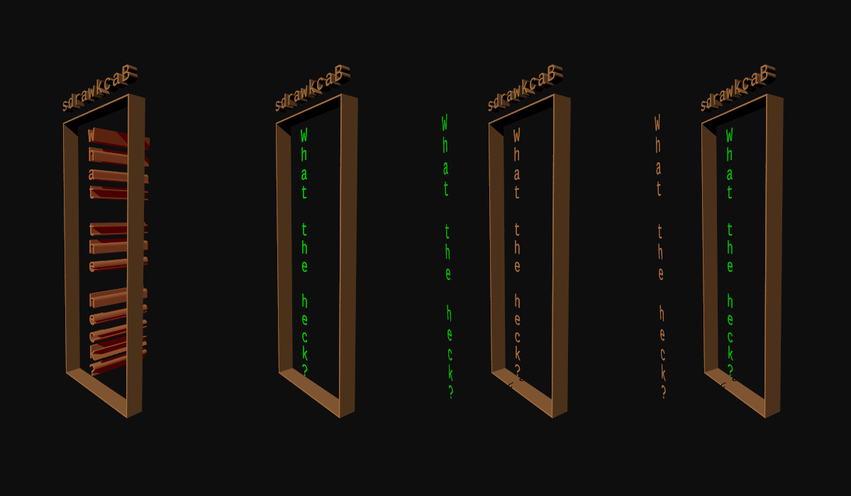
On 3/4/25 10:35, William F Pokorny wrote:
> I started looking at a yuqk version of documentation for the text{} object.

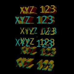
Playing with the thickness parameter.

I've always specified values >0, but it works with values at 0 and with
negative values. With the latter though, by intent or mistake, only
renders the front and back surfaces - and the interior exterior
treatments are interesting / different(*).

Iideally we'd have an 'open' capability with text{}, but the way the
negative thickness values are working allows us to somewhat easily add
front and back surface textures which are different than the text{} sides.

The images use an 'interior_texture{}' that is green for the "What the
heck" string. Only matters with the negative thickness on the third and
fourth sub images. The fourth also using 'inverse'.

Bill P.

(*) Jerome contributed fixes to v3.8 which stabilized the interior /
exterior surface treatments for text{} objects with +z thicknesses. This
means prior versions will behave differently.
Post a reply to this message
Attachments:
Download 'textthicknessstory.png' (85 KB)
Preview of image 'textthicknessstory.png'
|
|
| |
| |
|
|
|
|
| |
| |
|
|
William F Pokorny <ano### [at] anonymousorg> wrote:

> The images use an 'interior_texture{}' that is green for the "What the
> heck" string. Only matters with the negative thickness on the third and
> fourth sub images. The fourth also using 'inverse'.

This is all pretty interesting - especially using "inverse"  I always forget to
try and use that in things.

I do notice that there is something - a shadow? - present in the two rightmost
images that are not present in the two leftmost.  Significant in any way?

- BW
Post a reply to this message
|
|
| |
| |
|
|
|
|
| |
| |
|
|
On 3/19/25 08:04, Bald Eagle wrote:
> I do notice that there is something - a shadow? - present in the two rightmost
> images that are not present in the two leftmost.  Significant in any way?

No. I think they are showing up where they should be(*).

Bill P.

(*) For the moment, let's ignore the fact I often get things wrong. :-)
Post a reply to this message
|
|
| |
| |
|
|
|
|
| |
| |
|
|
William F Pokorny <ano### [at] anonymousorg> wrote:

> (*) For the moment, let's ignore the fact I often get things wrong. :-)

On the topic of assured mutual ignorance, I find your terms acceptable.  ;)
Post a reply to this message
|
|
| |
| |
|
|
|
|
| |
| |
|
|
On 3/19/25 02:25, William F Pokorny wrote:
> Playing with the thickness parameter.
>
> I've always specified values >0, but it works with values at 0 and with
> negative values. With the latter though, by intent or mistake, only
> renders the front and back surfaces - and the interior exterior
> treatments are interesting / different(*).
>
> Iideally we'd have an 'open' capability with text{}, but the way the
> negative thickness values are working allows us to somewhat easily add
> front and back surface textures which are different than the text{} sides.

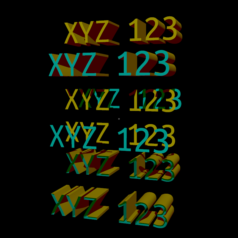
OK. Attached a sample image for many of the text{} updates coming in
release R19 of the yuqk fork. Namely, new text{} features 'caps' and
'open' along with fixes for negative thickness specifications. Negative
thickness becomes an OK thing to do and not something which only partly
works.

Bill P.
Post a reply to this message
Attachments:
Download 'caps_open_features.png' (78 KB)
Download 'caps_open_features.pov.txt' (5 KB)
Preview of image 'caps_open_features.png'
|
|
| |
| |
|
|
|
|
| |
| |
|
|
William F Pokorny <ano### [at] anonymousorg> wrote:

> OK. Attached a sample image for many of the text{} updates coming in
> release R19 of the yuqk fork. Namely, new text{} features 'caps' and
> 'open' along with fixes for negative thickness specifications. Negative
> thickness becomes an OK thing to do and not something which only partly
> works.

This is really cool, and actually very useful.
I often need to apply text to an image, but have to juggle the color depending
upon what color/brightness the background is.  Now we can have 2 contrasting
colors in a single glyph so that it always shows up reasonably well.

It will be interesting to experiment with things like gradients and other
patterns.

Now that you're neck-deep in the font code, can you ramble on about what you've
discovered / know about?

How difficult would it be to access the fundamental Bezier spline control points
for ttf fonts?

Can you make text render a tight spline rather than a thick outline?  A
"center-line" font?

Are these things dependent on how the font is defined in the file?

- BW
Post a reply to this message
|
|
| |
| |
|
|
|
|
| |
| |
|
|
ALSO:

If there were an under-the-hood Quadratic Bezier SDF, then you could actually do
real, high-quality text isosurfaces without all of the workarounds.

https://www.shadertoy.com/view/MlKcDD

https://iquilezles.org/articles/distfunctions2d/

and you could probably do some pretty nice in-fill of the text objects as well,
given that you'd have a gradient inside as well.

There are other Bezier SDF shaders as well.
Plus plenty of articles, blogs, etc.

https://astiopin.github.io/2019/01/06/sdf-on-gpu.html
https://vladjuckov.github.io/beziers-sdf/
https://forum.vvvv.org/t/inspirational-links-for-beziers-sdf-text-rendering-math-in-general-and-a-question/19989
https://www.desmos.com/calculator/kgmpkabruq
https://github.com/bio998/Unity-c-sharp-3D-Bezier-SDF/blob/master/BezierSDF.cs

- BW
Post a reply to this message
|
|
| |
| |
|
|
|
|
| |
| |
|
|
On 3/25/25 08:19, Bald Eagle wrote:
> Now that you're neck-deep in the font code, can you ramble on about what you've
> discovered / know about?

I'll soon post the first draft of the yuqk text{} documentation to:

   https://news.povray.org/povray.pov4.discussion.general/

>
> How difficult would it be to access the fundamental Bezier spline control points
> for ttf fonts?

Easy-ish to hack something. To do well, I don't know. Plus, I have
serious doubts that such font features fit well within POV-Ray. The font
(and font application) game as a whole is big and messy.

So, it's ttfdump, and similar external tooling for now.

>
> Can you make text render a tight spline rather than a thick outline?  A
> "center-line" font?
>
> Are these things dependent on how the font is defined in the file?

They are. Creating center line / offset splines automatically is not
easy (or even always possible) to do. IIRC, clipka mentioned 'stroke
fonts' exist, but I've had no exposure to them.

Your questions touch on an interesting topic. Namely, additional ttf
fonts designed specifically for POV-Ray use as building block shapes.
I'd probably start with a square aspect ratio, box character font.
Adding rounded corner shapes and the like to it too.

Thank you for the references in your follow-on post. I've stored them in
my BillW directory for later use.

Bill P.


Aside: clipka created a FreeType fork some years back. It had issues
when I tested it, but it's on my list to dig into that code someday.
Perhaps, that work a reasonable path to extending the font formats
POV-Ray supports.
Post a reply to this message
|
|
| |
| |
|
|
|
|
| |