|
|
|
|
|
|
| |
| |
|
|
|
|
| |
| |
|
|
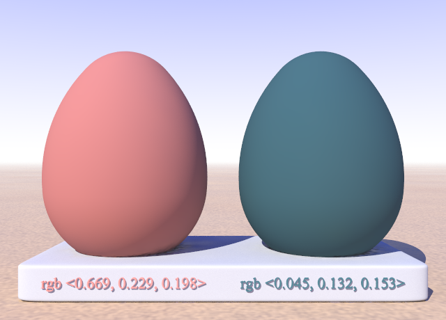
Want to play with complementary colours? in rgb or srgb mode? Try this.
Nothing special, just messing around for a change, away from granites...

--
Thomas
Post a reply to this message
Attachments:
Download 'complementarycolours_test.pov.txt' (6 KB)
Download 'complementarycolours_test.png' (195 KB)
Preview of image 'complementarycolours_test.png'
|
|
| |
| |
|
|
|
|
| |
| |
|
|
On 5/27/2021 11:04 AM, Thomas de Groot wrote:
> Want to play with complementary colours? in rgb or srgb mode? Try this.
> Nothing special, just messing around for a change, away from granites...
>

This gets complicated.

Are you just selecting complementary hues? Are you keeping saturation
and lightness the same?

What if you select complementary saturations and lightnesses as well?

What about Munsell system or CIELab? You are going to get different
values in those systems as well.


Mike
Post a reply to this message
|
|
| |
| |
|
|
|
|
| |
| |
|
|
Op 27/05/2021 om 19:29 schreef Mike Horvath:
> On 5/27/2021 11:04 AM, Thomas de Groot wrote:
>> Want to play with complementary colours? in rgb or srgb mode? Try
>> this. Nothing special, just messing around for a change, away from
>> granites...
>>
>
> This gets complicated.
>
> Are you just selecting complementary hues? Are you keeping saturation
> and lightness the same?
>
> What if you select complementary saturations and lightnesses as well?
>
> What about Munsell system or CIELab? You are going to get different
> values in those systems as well.
>

You are certainly right :-) However, I just wanted to keep it simple
while working on a scene, and get a colour complementary to another
there, without all the complications I know nothing about anyway. You
know, "I have this colour, what is its quick-and-dirty complement". That
kind of thing. As I said, nothing special, just handy to have at hand
while doing other things.

--
Thomas
Post a reply to this message
|
|
| |
| |
|
|
|
|
| |
| |
|
|
Am 27.05.2021 um 17:04 schrieb Thomas de Groot:
> Want to play with complementary colours? in rgb or srgb mode? Try this.
> Nothing special, just messing around for a change, away from granites...
>
I admit that I did not followed the granite discussion (too much
entries). But red and blue are not complementary to each other in any
colour modell I knew. Blue is complementary to some shade of yellow and
red to some shade of green. There is a colour modell which takes red and
cyan and blue and orange as complementary, but I could not find red and
blue.

Best regards
Michael
Post a reply to this message
|
|
| |
| |
|
|
|
|
| |
| |
|
|
Thomas de Groot <tho### [at] degroot org> wrote:
> Want to play with complementary colours? in rgb or srgb mode? Try this.
> Nothing special, just messing around for a change, away from granites...
>
> --
> Thomas
Inspiring ... could we get triadics? :-) org> wrote:
> Want to play with complementary colours? in rgb or srgb mode? Try this.
> Nothing special, just messing around for a change, away from granites...
>
> --
> Thomas
Inspiring ... could we get triadics? :-)
Post a reply to this message
|
|
| |
| |
|
|
|
|
| |
| |
|
|
On 5/27/2021 11:04 AM, Thomas de Groot wrote:
> Want to play with complementary colours? in rgb or srgb mode? Try this.
> Nothing special, just messing around for a change, away from granites...
>

Also, keep in mind (and you already may have!) that the idea of
"complementary colors" was created for the RYB color model not RGB.


Mike
Post a reply to this message
|
|
| |
| |
|
|
|
|
| |
| |
|
|
On 5/28/2021 4:53 PM, Mike Horvath wrote:
> On 5/27/2021 11:04 AM, Thomas de Groot wrote:
>> Want to play with complementary colours? in rgb or srgb mode? Try
>> this. Nothing special, just messing around for a change, away from
>> granites...
>>
>
> Also, keep in mind (and you already may have!) that the idea of
> "complementary colors" was created for the RYB color model not RGB.
>
>
> Mike

Basically, the idea is that colors diametrically opposed on the RYB
color wheel "go well" with each other, and colors diametrically opposed
on the RGB color wheel tend to "clash" heavily. I'm not sure why this is
the case, and why the RYB color wheel "looks nice" (at least in Western
art).


Mike
Post a reply to this message
|
|
| |
| |
|
|
|
|
| |
| |
|
|
On 5/28/2021 5:04 PM, Mike Horvath wrote:> I'm not sure why this is >
the case, and why the RYB color wheel "looks nice" (at least in Western
 > art).
I have not seen a good explanation of this in my research.


Mike
Post a reply to this message
|
|
| |
| |
|
|
|
|
| |
| |
|
|
Le 2021-05-28 à 14:34, MichaelJF a écrit :
> Am 27.05.2021 um 17:04 schrieb Thomas de Groot:
>> Want to play with complementary colours? in rgb or srgb mode? Try
>> this. Nothing special, just messing around for a change, away from
>> granites...
>>
> I admit that I did not followed the granite discussion (too much
> entries). But red and blue are not complementary to each other in any
> colour modell I knew. Blue is complementary to some shade of yellow and
> red to some shade of green. There is a colour modell which takes red and
> cyan and blue and orange as complementary, but I could not find red and
> blue.
>
> Best regards
> Michael
Red, green and blue are the additive primaries, or RGB. Their usual
complement are the subtractive primaries : Magenta for green, yellow for
blue and cyan for red, or YCM.

This can obviously change if you use some other colour space.
Post a reply to this message
|
|
| |
| |
|
|
|
|
| |
| |
|
|
On 5/28/2021 5:06 PM, Mike Horvath wrote:
> On 5/28/2021 5:04 PM, Mike Horvath wrote:> I'm not sure why this is >
> the case, and why the RYB color wheel "looks nice" (at least in Western
>  > art).
> I have not seen a good explanation of this in my research.
>
>
> Mike

An analog might be the major scale in music. The seven notes A to G are
not equidistant across an octave, yet they "sound nicer" (at least to
Westerners) so they are given greater weight/bias than the other five
tones. Dunno if it ultimately makes the life of someone learning music
for the first time easier or harder, though.


Mike
Post a reply to this message
|
|
| |
| |
|
|
|
|
| |
| |
|
|
On 5/28/2021 5:04 PM, Mike Horvath wrote:
> Basically, the idea is that colors diametrically opposed on the RYB
> color wheel "go well" with each other, and colors diametrically opposed
> on the RGB color wheel tend to "clash" heavily. I'm not sure why this is
> the case, and why the RYB color wheel "looks nice" (at least in Western
> art).
>
>
> Mike


I am confusing "complementary colors" with "triadic colors".

Never mind, sorry.


Mike
Post a reply to this message
|
|
| |
| |
|
|
|
|
| |
| |
|
|
Op 28/05/2021 om 21:08 schreef Mr:
> Thomas de Groot <tho### [at] degrootorg> wrote:
>> Want to play with complementary colours? in rgb or srgb mode? Try this.
>> Nothing special, just messing around for a change, away from granites...
>>
>> --
>> Thomas
>
> Inspiring ... could we get triadics? :-)
>
Well... I do not want to open a can of worms here as I already did
apparently ;-)

So maybe... but as I already mentioned earlier, I am just messing around
to get something of a complementary (?) colour I can use and tweak as I
want afterwards in a scene. Consider it the equivalent of pressing paint
tubes on your palet and happily mixing the mess. :-) That is how I work,
really.

This whole exercise does not go beyond that. No hidden or arcane intentions.

--
Thomas
Post a reply to this message
|
|
| |
| |
|
|
|
|
| |
| |
|
|
Am 28.05.2021 um 23:16 schrieb Mike Horvath:

> An analog might be the major scale in music. The seven notes A to G are
> not equidistant across an octave, yet they "sound nicer" (at least to
> Westerners) so they are given greater weight/bias than the other five
> tones. Dunno if it ultimately makes the life of someone learning music
> for the first time easier or harder, though.

Bad example, because the science behind musical harmony is reasonably
well understood. It all boils down to stuff the Pythagoreans already
knew about, which is all about the frequency ratios.

The only complication is the invention of temperaments, which introduce
a slight offset to just intonation to get some other benefits of musical
expression.
Post a reply to this message
|
|
| |
| |
|
|
|
|
| |
| |
|
|
Am 28.05.2021 um 23:04 schrieb Mike Horvath:

> Basically, the idea is that colors diametrically opposed on the RYB
> color wheel "go well" with each other, and colors diametrically opposed
> on the RGB color wheel tend to "clash" heavily. I'm not sure why this is
> the case, and why the RYB color wheel "looks nice" (at least in Western
> art).

I would argue that the perceived "clash" of complementary colors in the
RGB system (highly saturated EGB colors, that is) is due to such colors
NEVER EVER occurring besides each other in the natural world. They
simply cannot. Because those extreme colours _per se_ can never be
achieved reflectively from natural white-ish light.

For example, to get pure RGB red, you need to blast out red light in
such a narrow spectral band, that the brightness within said band
exceeds the brightness within the corresponding band of natural
white-ish light.
Post a reply to this message
|
|
| |
| |
|
|
|
|
| |
| |
|
|
clipka <ano### [at] anonymousorg> wrote:

> Bad example, because the science behind musical harmony is reasonably
> well understood. It all boils down to stuff the Pythagoreans already
> knew about, which is all about the frequency ratios.
>
> The only complication is the invention of temperaments, which introduce
> a slight offset to just intonation to get some other benefits of musical
> expression.

Until you get into the really wild stuff of which 432 vs 440 is probably only
the tip of the iceberg. . .

https://www.youtube.com/watch?v=Rt3EAPDn-Ug
https://www.youtube.com/watch?v=LjR0WpWwLrE

For a flying pirouette into the deep end, clutch your energy crystals and
search: Rosslyn Chapel and you'll land firmly into Giza, Angkor Wat, Hypogeum
territory.


Meanwhile, decades later, millions are still endlessly amused by "more cowbell!"
Post a reply to this message
|
|
| |
| |
|
|
|
|
| |
| |
|
|
On 5/30/2021 8:03 AM, clipka wrote:
> Am 28.05.2021 um 23:04 schrieb Mike Horvath:
>
>> Basically, the idea is that colors diametrically opposed on the RYB
>> color wheel "go well" with each other, and colors diametrically
>> opposed on the RGB color wheel tend to "clash" heavily. I'm not sure
>> why this is the case, and why the RYB color wheel "looks nice" (at
>> least in Western art).
>
> I would argue that the perceived "clash" of complementary colors in the
> RGB system (highly saturated EGB colors, that is) is due to such colors
> NEVER EVER occurring besides each other in the natural world. They
> simply cannot. Because those extreme colours _per se_ can never be
> achieved reflectively from natural white-ish light.
>
> For example, to get pure RGB red, you need to blast out red light in
> such a narrow spectral band, that the brightness within said band
> exceeds the brightness within the corresponding band of natural
> white-ish light.

I just think it's weird that colors 120 degrees apart from each other in
the RYB color wheel always "match", whereas nothing like that exists for
the RGB color wheel.


Mike
Post a reply to this message
|
|
| |
| |
|
|
|
|
| |
| |
|
|
On 5/30/2021 8:16 PM, Mike Horvath wrote:
> I just think it's weird that colors 120 degrees apart from each other in
> the RYB color wheel always "match", whereas nothing like that exists for
> the RGB color wheel.
>
>
> Mike

Though I suppose they could "match" only because we've always been
shown/told that they "match". I.e. tradition.


Mike
Post a reply to this message
|
|
| |
| |
|
|
|
|
| |
| |
|
|
On 5/30/2021 9:01 AM, Bald Eagle wrote:
> https://www.youtube.com/watch?v=Rt3EAPDn-Ug

I like one of the comments:

"The 440 is tense/uptight. The 432 is richer, deeper and has clarity.
It’s more open, at least to me anyway."

I would agree 440 sounds a little tinny, less mellow.


Mike
Post a reply to this message
|
|
| |
| |
|
|
|
|
| |
| |
|
|
On 5/30/2021 9:01 AM, Bald Eagle wrote:
> Until you get into the really wild stuff of which 432 vs 440 is probably only
> the tip of the iceberg. . .
>
> https://www.youtube.com/watch?v=Rt3EAPDn-Ug
> https://www.youtube.com/watch?v=LjR0WpWwLrE
>
> For a flying pirouette into the deep end, clutch your energy crystals and
> search: Rosslyn Chapel and you'll land firmly into Giza, Angkor Wat, Hypogeum
> territory.
>
>
> Meanwhile, decades later, millions are still endlessly amused by "more cowbell!"
>

When I was heavily into POV, I would see things in terms of shapes and
colors. Like, "That's a red pyramidal idea!" or "That's so blue cube!"
Now that I read and write more, I see things in terms of black print on
white paper; letters and sentences, and words rearranging themselves to
fit correct grammar. A musician might hear tones and see notes all the
time. A carpenter, linear forces (such as a hammer hitting a nail) and
simple geometry. Someone who watches movies a lot might think in terms
of two-dimensionally projected images. Likewise, people of the New Age
persuasion have their own language in which they view the world. (And,
no, language does not just exist in the mouth or written/printed word.)


Mike
Post a reply to this message
|
|
| |
| |
|
|
|
|
| |
| |
|
|
On 5/30/2021 9:06 PM, Mike Horvath wrote:
> Someone who watches movies a lot might think in terms
> of two-dimensionally projected images.

And light and shadow.


Mike
Post a reply to this message
|
|
| |
| |
|
|
|
|
| |
| |
|
|
On 5/30/2021 9:06 PM, Mike Horvath wrote:
> When I was heavily into POV, I would see things in terms of shapes and
> colors. Like, "That's a red pyramidal idea!" or "That's so blue cube!"
> Now that I read and write more, I see things in terms of black print on
> white paper; letters and sentences, and words rearranging themselves to
> fit correct grammar. A musician might hear tones and see notes all the
> time. A carpenter, linear forces (such as a hammer hitting a nail) and
> simple geometry. Someone who watches movies a lot might think in terms
> of two-dimensionally projected images. Likewise, people of the New Age
> persuasion have their own language in which they view the world. (And,
> no, language does not just exist in the mouth or written/printed word.)
>
>
> Mike

My point is we are shaped by the things we spend most of our days doing,
or thinking about.


Mike
Post a reply to this message
|
|
| |
| |
|
|
|
|
| |