|
|
|
|
|
|
| |
| |
|
|
|
|
| |
| |
|
|
Thomas de Groot <tho### [at] degroot org> wrote:
> Finally, using a blending technique developed by Tekno Frannansa, The
> attached granite, based on the latest preceding one, looks also the most
> natural!
>
> --
> Thomas
Hi! I could imagine it for an outdoor landscape. But for other closer framed
use, I presently can't say that I prefer it over the other results so far:
Something still feels "blurry" about it. Sorry to be that vague. I still believe
it could be due to something default in the specular component / or maybe the
camera has aperture? / or there is just no normal bump distortion at all which
could suffice to lead to this perceived lack of contrast?
At this stage, to properly evaluate the patterns, a close up 1000+ px side
render from less than 1 meter distance and more than 10 cm area visible carrying
your graduated floor now really seems absolutely necessary to see anything.
I feel like I'm spoiling myself a movie by looking at it from a phone streamed
screener file :-D org> wrote:
> Finally, using a blending technique developed by Tekno Frannansa, The
> attached granite, based on the latest preceding one, looks also the most
> natural!
>
> --
> Thomas
Hi! I could imagine it for an outdoor landscape. But for other closer framed
use, I presently can't say that I prefer it over the other results so far:
Something still feels "blurry" about it. Sorry to be that vague. I still believe
it could be due to something default in the specular component / or maybe the
camera has aperture? / or there is just no normal bump distortion at all which
could suffice to lead to this perceived lack of contrast?
At this stage, to properly evaluate the patterns, a close up 1000+ px side
render from less than 1 meter distance and more than 10 cm area visible carrying
your graduated floor now really seems absolutely necessary to see anything.
I feel like I'm spoiling myself a movie by looking at it from a phone streamed
screener file :-D
Post a reply to this message
|
|
| |
| |
|
|
|
|
| |
| |
|
|
Op 3-5-2021 om 17:10 schreef Mr:
> Thomas de Groot <tho### [at] degrootorg> wrote:
>> Finally, using a blending technique developed by Tekno Frannansa, The
>> attached granite, based on the latest preceding one, looks also the most
>> natural!
>>
>> --
>> Thomas
>
> Hi! I could imagine it for an outdoor landscape. But for other closer framed
> use, I presently can't say that I prefer it over the other results so far:
>
> Something still feels "blurry" about it. Sorry to be that vague. I still believe
> it could be due to something default in the specular component / or maybe the
> camera has aperture? / or there is just no normal bump distortion at all which
> could suffice to lead to this perceived lack of contrast?
>
I am afraid you need to be more explicit because I do not really
understand. What is blurry here? I see rather /crisp/ minerals in a
random pattern. Maybe I should post the code? you could test it better I
suppose.
> At this stage, to properly evaluate the patterns, a close up 1000+ px side
> render from less than 1 meter distance and more than 10 cm area visible carrying
> your graduated floor now really seems absolutely necessary to see anything.
>
I truly cannot imagine what you can gain by such a render. What are you
looking for exactly? If I do what you say, you will see a bunch of
coloured pixels, or am I thinking in the wrong direction?
> I feel like I'm spoiling myself a movie by looking at it from a phone streamed
> screener file :-D
>
That would be a sorry business indeed. However, I still wonder /what/
you see exactly (or do not see)...
--
Thomas
Post a reply to this message
|
|
| |
| |
|
|
|
|
| |
| |
|
|
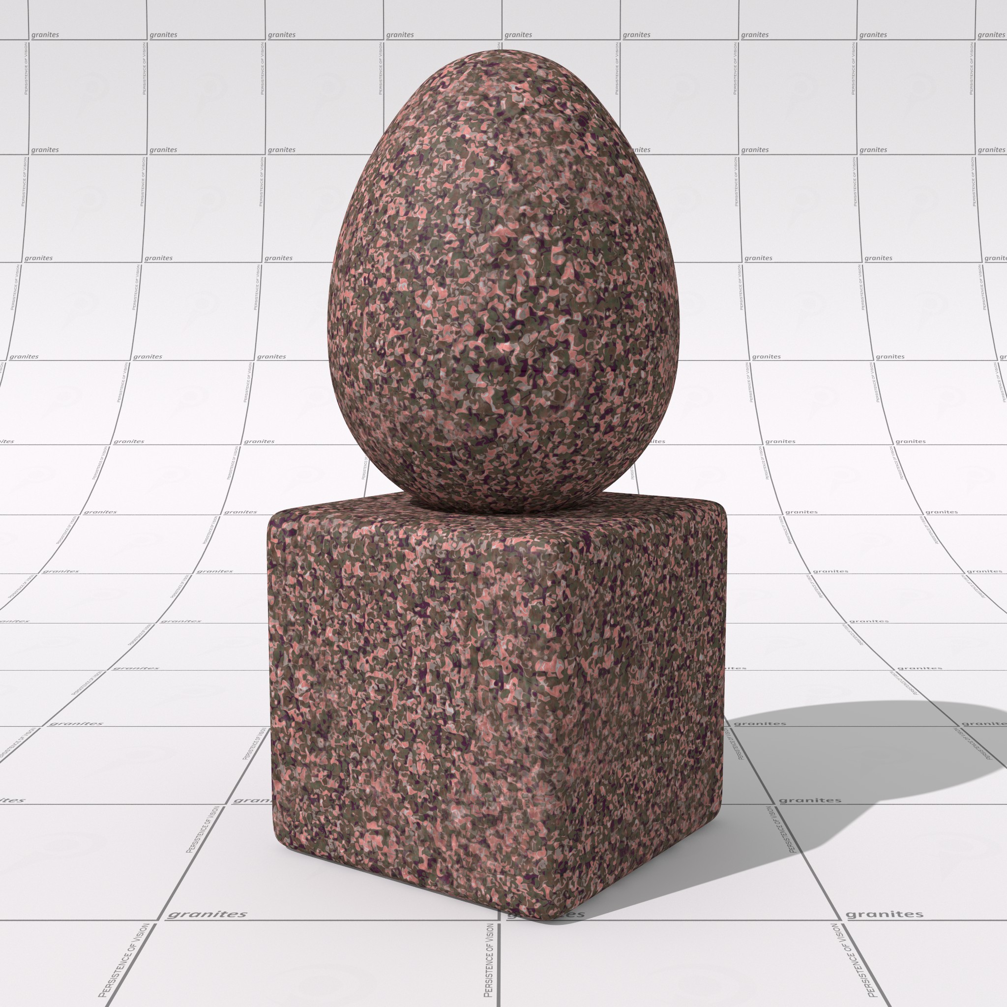
Thomas de Groot <tho### [at] degrootorg> wrote:
> For your judgment again.
This is pretty spectacular, as was the prior ovus example.
I think what Maurice is trying to point out is the "frosted" look of the blurred
pattern.
I think the earlier prototype StepNoise example was more impressive than the
current iteration.
And I'm not sure why you chose to do several experiments with start and end both
equal to 0.5 - as that is just the cells pattern.
But I must say that I really like this frosted look for an outdoor, weathered
piece of natural stone, as this is really what it looks like, with dust, and
evaporated rain, and pollen, etc. Adding that displacement or normal really
gives it that natural look as well.
I think Maurice is looking for that lack of micro-surface texture that leads to
a lot of air - which has a different ior than the minerals and leads to that dry
paper / freshly applied transparent tape look. Polishing, wetting, and waxing
gives it that sharp, crisp, high-contrast look with more saturated colors and
clearer delineations between the grains.
At least that's what I'm speculating.
However, all in all, this is very pleasing, and extremely encouraging progress!
Post a reply to this message
|
|
| |
| |
|
|
|
|
| |
| |
|
|
A few more comments:
Op 03/05/2021 om 17:10 schreef Mr:
> Thomas de Groot <tho### [at] degrootorg> wrote:
>> Finally, using a blending technique developed by Tekno Frannansa, The
>> attached granite, based on the latest preceding one, looks also the most
>> natural!
>>
>> --
>> Thomas
>
> Hi! I could imagine it for an outdoor landscape. But for other closer framed
> use, I presently can't say that I prefer it over the other results so far:
>
Yes. Please note that the "blended" cells texture /is/ for the
weathered, outdoor, aspect of any granitic rock you may come across. The
"fresh" look is when such a boulder is broken. For granitic landscapes,
this texture /as is/ would not be convenient and a much simpler one
should replace it, for instance something based on one of those
landscape textures created by Jaime Vives Piqueres.
Anyway, a combination of "weathered" and "fresh" is shown in my image
GraniteTest.jpg, posted a bit earlier.
> Something still feels "blurry" about it. Sorry to be that vague. I still believe
> it could be due to something default in the specular component / or maybe the
> camera has aperture? / or there is just no normal bump distortion at all which
> could suffice to lead to this perceived lack of contrast?
>
Nothing of the sort I believe. The camera is a standard one (no
aperture) but the environment is just a white featureless space. Maybe
that is causing your "lack of contrast"?
As for the finish, the following is used (based on code provided by Ive):
//start code---------------------------------------------
#macro Dull_Highlights()
specular 0.05
roughness 0.1
#end
finish { //frosted version
diffuse albedo 0.6 brilliance 1.5
Dull_Highlights() // a small amount of highlights for realism
}
//end code---------------------------------------------
> At this stage, to properly evaluate the patterns, a close up 1000+ px side
> render from less than 1 meter distance and more than 10 cm area visible carrying
> your graduated floor now really seems absolutely necessary to see anything.
>
I shall render a 2048x2048 px "fresh" granite image today. Don't be
surprised: it is not really believable any more as a granite, but it may
generate comments towards a better code, and that is ultimately, the
purpose of this exercise.
> I feel like I'm spoiling myself a movie by looking at it from a phone streamed
> screener file :-D
>
--
Thomas
Post a reply to this message
|
|
| |
| |
|
|
|
|
| |
| |
|
|
Op 03/05/2021 om 19:21 schreef Bald Eagle:
> Thomas de Groot <tho### [at] degrootorg> wrote:
>> For your judgment again.
>
> This is pretty spectacular, as was the prior ovus example.
>
> I think what Maurice is trying to point out is the "frosted" look of the blurred
> pattern.
> I think the earlier prototype StepNoise example was more impressive than the
> current iteration.
Both are necessary. The blended version is the weathered granite look,
the crisp version is the fresh granite look.
> And I'm not sure why you chose to do several experiments with start and end both
> equal to 0.5 - as that is just the cells pattern.
>
No secret there: just for convenience while testing the omega, lambda
and octaves. The top row of the experiment shows start and end
variations both. I guess that more differences would be shown with a
"simpler" colour_map? Not sure about this. I want to investigate a bit
further.
> But I must say that I really like this frosted look for an outdoor, weathered
> piece of natural stone, as this is really what it looks like, with dust, and
> evaporated rain, and pollen, etc. Adding that displacement or normal really
> gives it that natural look as well.
>
I guess this is almost as close as you can get to a believable granite.
> I think Maurice is looking for that lack of micro-surface texture that leads to
> a lot of air - which has a different ior than the minerals and leads to that dry
> paper / freshly applied transparent tape look. Polishing, wetting, and waxing
> gives it that sharp, crisp, high-contrast look with more saturated colors and
> clearer delineations between the grains.
>
> At least that's what I'm speculating.
>
Maybe. I am not sure yet about what he means.
> However, all in all, this is very pleasing, and extremely encouraging progress!
>
Absolutely.
--
Thomas
Post a reply to this message
|
|
| |
| |
|
|
|
|
| |
| |
|
|
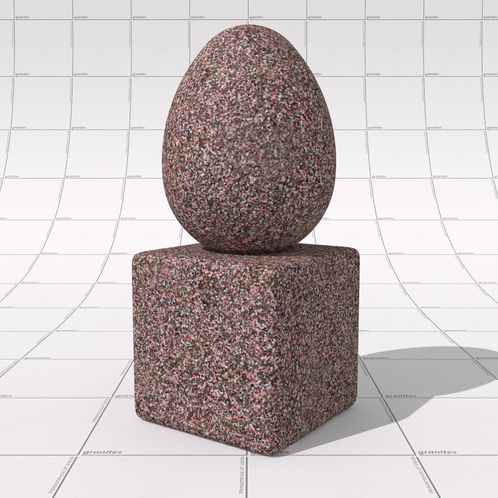
A 2048x2048px render.
StepNoise settings: Start=0.2; End=0.8; Turbulence=0.325; and octaves=2;
lambda=1; omega=2;
--
Thomas
Post a reply to this message
Attachments:
Download 'dakotagrains_testbig.jpg' (685 KB)
Preview of image 'dakotagrains_testbig.jpg'
|
|
| |
| |
|
|
|
|
| |
| |
|
|
Op 3-5-2021 om 19:21 schreef Bald Eagle:
> However, all in all, this is very pleasing, and extremely encouraging progress!
>
As an alternative, I am examining the use of another pattern: crackle solid.
It might be an interesting option...
--
Thomas
Post a reply to this message
|
|
| |
| |
|
|
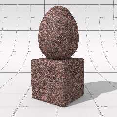
From: Thomas de Groot
Subject: Re: Granites Intermezzo - using crackle solid pattern
Date: 5 May 2021 10:57:48
Message: <6092b26c@news.povray.org>
|
|
|
| |
| |
|
|
I think this is a perfect alternative to all the preceding!
The basic pigment_pattern used for the mineral grains as well as for the
mask controlling the size distribution through the rock, is crackle
solid. It has the advantage to well-discriminate between the different
minerals, better than all the previous experiments. I found this out by
examining a couple of traditional POV-Ray stone textures, more
especially T_Stone_28.inc, and tweak from there before substituting the
results here.
I think that the "blurry" aspect that Mr was complaining about, came in
fact from the size distribution within the mask pattern. It may still
exist a bit, but I developed a mask with less diffuse transitions.
--
Thomas
Post a reply to this message
Attachments:
Download 'dakotagrains_testbig3.jpg' (237 KB)
Preview of image 'dakotagrains_testbig3.jpg'
|
|
| |
| |
|
|
|
|
| |
| |
|
|
Thomas de Groot <tho### [at] degrootorg> wrote:
> I think this is a perfect alternative to all the preceding!
>
> The basic pigment_pattern used for the mineral grains as well as for the
> mask controlling the size distribution through the rock, is crackle
> solid. It has the advantage to well-discriminate between the different
> minerals, better than all the previous experiments. I found this out by
> examining a couple of traditional POV-Ray stone textures, more
> especially T_Stone_28.inc, and tweak from there before substituting the
> results here.
>
> I think that the "blurry" aspect that Mr was complaining about, came in
> fact from the size distribution within the mask pattern. It may still
> exist a bit, but I developed a mask with less diffuse transitions.
>
> --
> Thomas
This sure looks good. I guess my trouble with this scale and contrast/definition
is that I must be loosing track of what context the current image you show is
made for, and thus probably do not have in mind the proper type of real photo
referenced granite occurence. Once we can play with parameters and get these
various photo references side by side with the renders thing will certainly look
fine and more versatile than if made with just one average reference.
If will it or does it already have configuration presets? something along : 1
Raw outside (worn out with slightly blurry patches) 2 raw inside (same pigment,
neater, and with normal bump) 3 polished: same as before without bump and with
slight mirror reflection?
What troubles me, with the scale is that initial picture I saw ad red flakes
around 1cm size while this frosted has rather 1mm... can the first one still be
made easily?
Post a reply to this message
|
|
| |
| |
|
|
|
|
| |
| |
|
|
Thomas de Groot <tho### [at] degrootorg> wrote:
> I think this is a perfect alternative to all the preceding!
>
> The basic pigment_pattern used for the mineral grains as well as for the
> mask controlling the size distribution through the rock, is crackle
> solid.
That's working out just as nicely.
IIRC, crackle solid has different "metrics" and you can get the adjacent cell
effect like you're showing, but also a sort of pavers-and-mortar effect.
These are all looking good, and it will be really nice if there's a way to mix /
blend some of the different patterns and texture_maps, or even the same pattern
at different scales.
Post a reply to this message
|
|
| |
| |
|
|
|
|
| |
|
|