|
|
|
|
|
|
| |
| |
|
|
|
|
| |
| |
|
|
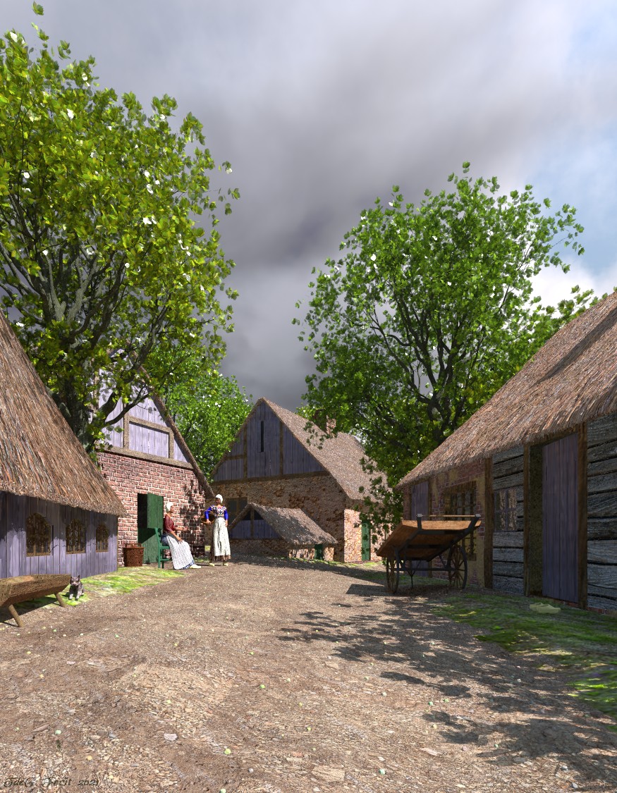
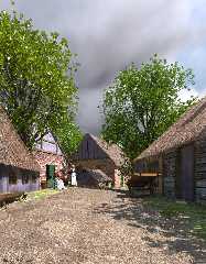
Finally, after about four months.

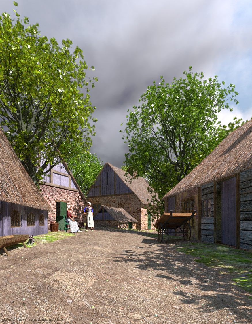
The scene is inspired by late nineteenth century paintings of the Late
Romantic school and Genre pieces.

This is about the first scene were I made /really/ use of pigment
patterns (road, thatched roofs, dirt on walls) and the Displacement tool
in Poseray (thatched roofs). Those will be tools I shall come back too
frequently.

--
Thomas
Post a reply to this message
Attachments:
Download 'a quiet lane_final.jpg' (353 KB)
Preview of image 'a quiet lane_final.jpg'
|
|
| |
| |
|
|
|
|
| |
| |
|
|
On 2/4/21 3:06 AM, Thomas de Groot wrote:
> Finally, after about four months.
>
> The scene is inspired by late nineteenth century paintings of the Late
> Romantic school and Genre pieces.
>
> This is about the first scene were I made /really/ use of pigment
> patterns (road, thatched roofs, dirt on walls) and the Displacement tool
> in Poseray (thatched roofs). Those will be tools I shall come back too
> frequently.
>

oh... there you go. nice!
Post a reply to this message
|
|
| |
| |
|
|
|
|
| |
| |
|
|
Thomas de Groot <tho### [at] degroot org> wrote:
> Finally, after about four months.
>
> The scene is inspired by late nineteenth century paintings of the Late
> Romantic school and Genre pieces.
>
> This is about the first scene were I made /really/ use of pigment
> patterns (road, thatched roofs, dirt on walls) and the Displacement tool
> in Poseray (thatched roofs). Those will be tools I shall come back too
> frequently.
>
> --
> Thomas
Wow! :-)
Pascal org> wrote:
> Finally, after about four months.
>
> The scene is inspired by late nineteenth century paintings of the Late
> Romantic school and Genre pieces.
>
> This is about the first scene were I made /really/ use of pigment
> patterns (road, thatched roofs, dirt on walls) and the Displacement tool
> in Poseray (thatched roofs). Those will be tools I shall come back too
> frequently.
>
> --
> Thomas
Wow! :-)
Pascal
Post a reply to this message
|
|
| |
| |
|
|
|
|
| |
| |
|
|
Thomas de Groot <tho### [at] degrootorg> wrote:
> Finally, after about four months.
>
> The scene is inspired by late nineteenth century paintings of the Late
> Romantic school and Genre pieces.
>
> This is about the first scene were I made /really/ use of pigment
> patterns (road, thatched roofs, dirt on walls) and the Displacement tool
> in Poseray (thatched roofs). Those will be tools I shall come back too
> frequently.
>
> --
> Thomas

Great ! The perspective is very welcoming and background trees are quite
detailed.
Post a reply to this message
|
|
| |
| |
|
|
|
|
| |
| |
|
|
On 2/4/21 3:06 AM, Thomas de Groot wrote:
> Finally, after about four months.
>
> The scene is inspired by late nineteenth century paintings of the Late
> Romantic school and Genre pieces.
>
> This is about the first scene were I made /really/ use of pigment
> patterns (road, thatched roofs, dirt on walls) and the Displacement tool
> in Poseray (thatched roofs). Those will be tools I shall come back too
> frequently.
>
Excellent! I very much like the feel of it.

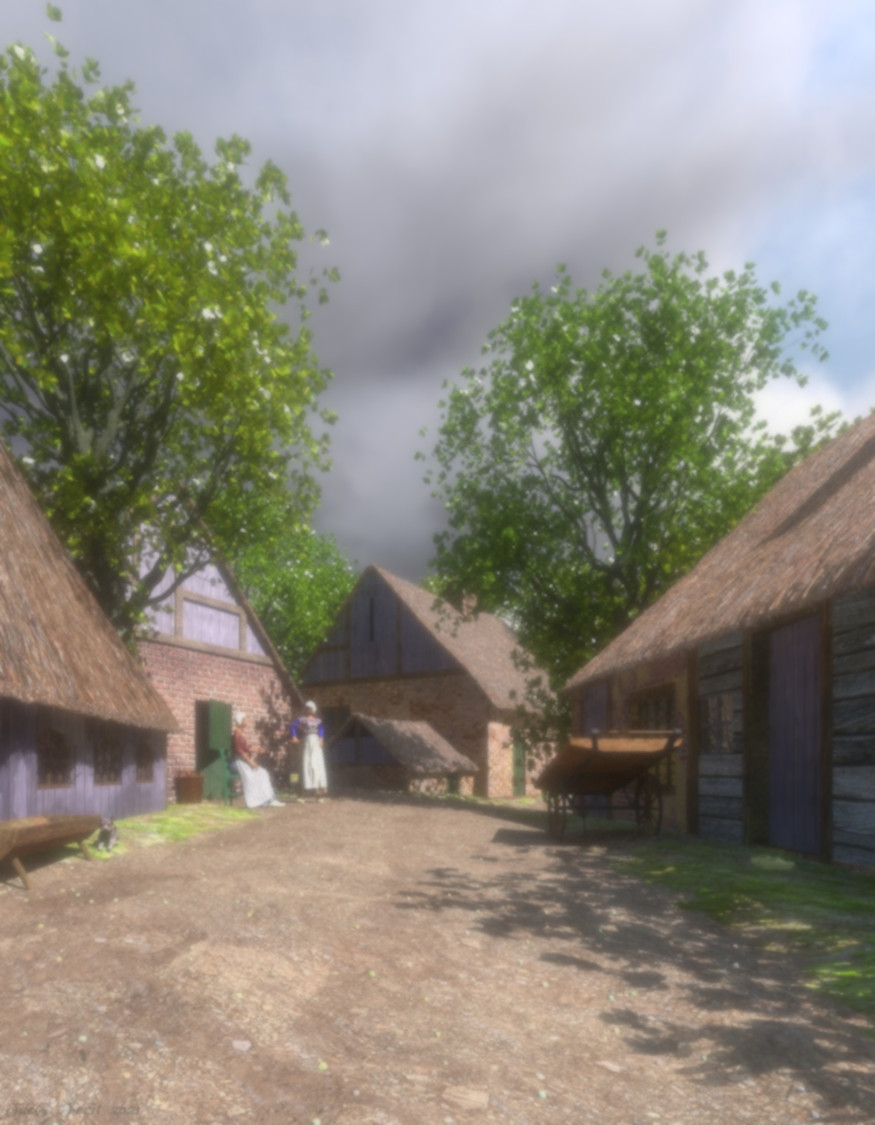
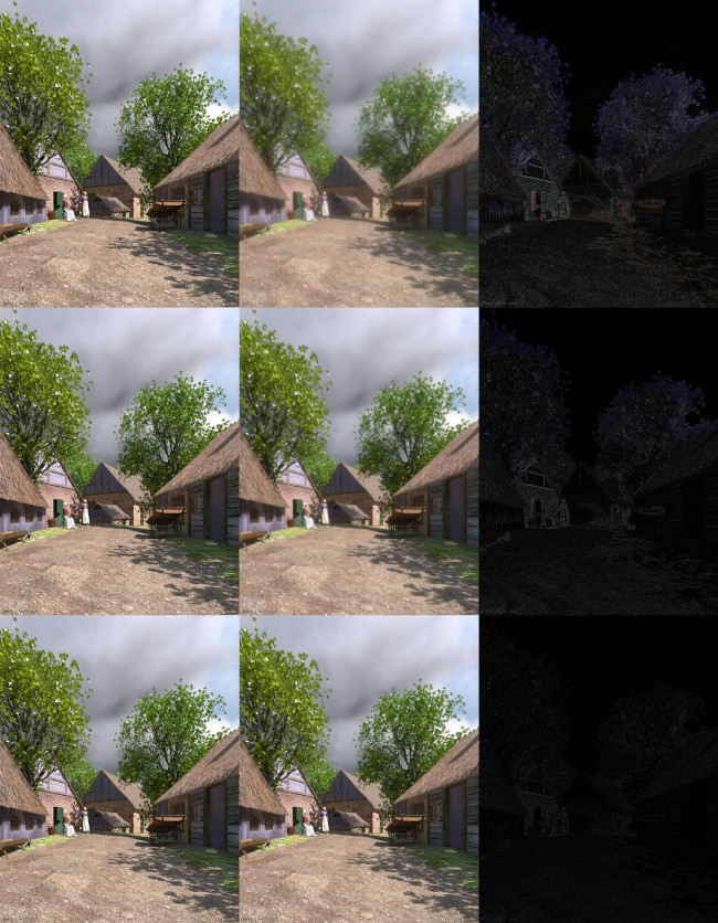
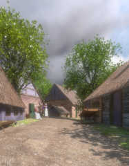
I hope it's OK that I've borrowed your image to test an idea? Namely,
using the extended AA jitter capabilities of the povr branch for a bloom
post process feature.

It's something like what Sam Benge was playing with 6 or 7 years back -
except less "luminous" oriented. The aim is a filter to take the edge
off rendered images; Something which makes the result look less
rendered/perfect/clean.

Attached a result. I expect it can be better tuned, but I'm happy that
it looks workable on the first attempt. It is not cheap as post process
features go. Twenty minutes or so on my two core i3(1). As currently
implemented it's a two stage, nine render total process. All POV-Ray
(povr).

Bill P.

(1) The sampling could be done against the original scene - but that's
more expensive. However, it would be an approach more true at the edges
of the image.
Post a reply to this message
Attachments:
Download 'bigjitterbloompost.jpg' (195 KB)
Preview of image 'bigjitterbloompost.jpg'
|
|
| |
| |
|
|
|
|
| |
| |
|
|
William F Pokorny <ano### [at] anonymousorg> wrote:
> On 2/4/21 3:06 AM, Thomas de Groot wrote:
> > Finally, after about four months.
> >
> > The scene is inspired by late nineteenth century paintings of the Late
> > Romantic school and Genre pieces.
> >
> > This is about the first scene were I made /really/ use of pigment
> > patterns (road, thatched roofs, dirt on walls) and the Displacement tool
> > in Poseray (thatched roofs). Those will be tools I shall come back too
> > frequently.
> >
> Excellent! I very much like the feel of it.
>
> I hope it's OK that I've borrowed your image to test an idea? Namely,
> using the extended AA jitter capabilities of the povr branch for a bloom
> post process feature.
>
> It's something like what Sam Benge was playing with 6 or 7 years back -
> except less "luminous" oriented. The aim is a filter to take the edge
> off rendered images; Something which makes the result look less
> rendered/perfect/clean.
>
> Attached a result. I expect it can be better tuned, but I'm happy that
> it looks workable on the first attempt. It is not cheap as post process
> features go. Twenty minutes or so on my two core i3(1). As currently
> implemented it's a two stage, nine render total process. All POV-Ray
> (povr).
>
> Bill P.
>
> (1) The sampling could be done against the original scene - but that's
> more expensive. However, it would be an approach more true at the edges
> of the image.

A bloom can be useful. What's nice is that there is no artefact, but currently
everything is blurred. Could there be some contrast or value threshold to make
it  less destructive?
Post a reply to this message
|
|
| |
| |
|
|
|
|
| |
| |
|
|
Thomas de Groot <tho### [at] degrootorg> wrote:
> Finally, after about four months.
>
> The scene is inspired by late nineteenth century paintings of the Late
> Romantic school and Genre pieces.
>
> This is about the first scene were I made /really/ use of pigment
> patterns (road, thatched roofs, dirt on walls) and the Displacement tool
> in Poseray (thatched roofs). Those will be tools I shall come back too
> frequently.

Wow, this is really impressive Thomas, nicely done sir! Nice lighting, it's such
a pleasing composition and mood. And I see the cat made it into the shot :)

Cheers,
Rob
Post a reply to this message
|
|
| |
| |
|
|
|
|
| |
| |
|
|
On 2/4/21 8:06 AM, Mr wrote:
> William F Pokorny <ano### [at] anonymousorg> wrote:
...
>
> A bloom can be useful. What's nice is that there is no artefact, but currently
> everything is blurred. Could there be some contrast or value threshold to make
> it  less destructive?
>

This initial implementation blooms into everything - so it's going to
blur to some degree, if you use the filter. You can lesson the bloom
strength - make things sharper, but then the bloom effect itself fades.

An enhancement that could be tried I suppose, would be to leave "dark"
to some criterea regions untouched. Not sure how "natural" it would
look. More complicated things always possible - but then it might be
rendering large and scaling down say is a better way to go. At some
point if you don't want a bloom filter, you are into something else.

On the time to run this filer... I remembered after posting I was using
a development, '-O optimization only', build. It'll be faster with a
normal performance compile/link - but still expensive.

Bill P.
Post a reply to this message
|
|
| |
| |
|
|
|
|
| |
| |
|
|
Thomas de Groot <tho### [at] degrootorg> wrote:
> Finally, after about four months.
>
> The scene is inspired by late nineteenth century paintings of the Late
> Romantic school and Genre pieces.
>
> This is about the first scene were I made /really/ use of pigment
> patterns (road, thatched roofs, dirt on walls) and the Displacement tool
> in Poseray (thatched roofs). Those will be tools I shall come back too
> frequently.
>
> --
> Thomas

Well done, Thomas.
You were really inspired here!
I wouldn't mind living there.

Cheers
Ton
Post a reply to this message
|
|
| |
| |
|
|
|
|
| |
| |
|
|
Op 04/02/2021 om 13:56 schreef William F Pokorny:
> On 2/4/21 3:06 AM, Thomas de Groot wrote:
>> Finally, after about four months.
>>
>> The scene is inspired by late nineteenth century paintings of the Late
>> Romantic school and Genre pieces.
>>
>> This is about the first scene were I made /really/ use of pigment
>> patterns (road, thatched roofs, dirt on walls) and the Displacement
>> tool in Poseray (thatched roofs). Those will be tools I shall come
>> back too frequently.
>>
> Excellent! I very much like the feel of it.

Thanks!

>
> I hope it's OK that I've borrowed your image to test an idea? Namely,
> using the extended AA jitter capabilities of the povr branch for a bloom
> post process feature.

You are welcome; be my guest.

>
> It's something like what Sam Benge was playing with 6 or 7 years back -
> except less "luminous" oriented. The aim is a filter to take the edge
> off rendered images; Something which makes the result look less
> rendered/perfect/clean.

Ah, yes! Luminous bloom! Something I have long intended to use indeed

>
> Attached a result. I expect it can be better tuned, but I'm happy that
> it looks workable on the first attempt. It is not cheap as post process
> features go. Twenty minutes or so on my two core i3(1). As currently
> implemented it's a two stage, nine render total process. All POV-Ray
> (povr).

Not (yet) convinced. Like Mr says, looks to much like blur here and
everything is blurred.

I have the intention to do also a stochastic render of the scene. I
/think/ that would give a better result. It probably will take some
extra render time; the present render already took about 12 hours,
especially the upper half of the image obviously because of the trees.

>
> Bill P.
>
> (1) The sampling could be done against the original scene - but that's
> more expensive. However, it would be an approach more true at the edges
> of the image.


--
Thomas
Post a reply to this message
|
|
| |
| |
|
|
|
|
| |
| |
|
|
Op 04/02/2021 om 22:53 schreef Ton:
> Thomas de Groot <tho### [at] degrootorg> wrote:
>> Finally, after about four months.
>>
>> The scene is inspired by late nineteenth century paintings of the Late
>> Romantic school and Genre pieces.
>>
>> This is about the first scene were I made /really/ use of pigment
>> patterns (road, thatched roofs, dirt on walls) and the Displacement tool
>> in Poseray (thatched roofs). Those will be tools I shall come back too
>> frequently.
>>
>> --
>> Thomas
>
> Well done, Thomas.
> You were really inspired here!
> I wouldn't mind living there.
>
> Cheers
> Ton
>
>

Thanks Ton. A pleasant place to live apparently, although in a dream
last night, there appears to be a darker side to the scene...

"You have been poving to much when... you start dreaming about your scenes."

--
Thomas
Post a reply to this message
|
|
| |
| |
|
|
|
|
| |
| |
|
|
Op 04/02/2021 om 15:34 schreef Robert McGregor:
> Thomas de Groot <tho### [at] degrootorg> wrote:
>> Finally, after about four months.
>>
>> The scene is inspired by late nineteenth century paintings of the Late
>> Romantic school and Genre pieces.
>>
>> This is about the first scene were I made /really/ use of pigment
>> patterns (road, thatched roofs, dirt on walls) and the Displacement tool
>> in Poseray (thatched roofs). Those will be tools I shall come back too
>> frequently.
>
> Wow, this is really impressive Thomas, nicely done sir! Nice lighting, it's such
> a pleasing composition and mood. And I see the cat made it into the shot :)
>
> Cheers,
> Rob
>
>
>

Thanks indeed, Robert. I tried to keep the cat out, but it just jumped
over the screen edge and was lost. Found it there when I finished the
render, very pleased of itself.

I did an extensive research on period paintings and peasant costumes,
mainly 19th century to early 20th but with some excursions into earlier
ones, most notably Rembrandt and van der Heijden. Costumes I simplified
a little to keep Poser happy.

The trees are Xfrog's "The Noble One".

I tend to take more and more time to build my scenes carefully, also
taking much more time to try out (new) features. That is a good thing
certainly. You grow into it and now it is difficult to take leave. ;-|

--
Thomas
Post a reply to this message
|
|
| |
| |
|
|
|
|
| |
| |
|
|
Op 04/02/2021 om 13:51 schreef Mr:
> Thomas de Groot <tho### [at] degrootorg> wrote:
>> Finally, after about four months.
>>
>> The scene is inspired by late nineteenth century paintings of the Late
>> Romantic school and Genre pieces.
>>
>> This is about the first scene were I made /really/ use of pigment
>> patterns (road, thatched roofs, dirt on walls) and the Displacement tool
>> in Poseray (thatched roofs). Those will be tools I shall come back too
>> frequently.
>>
>> --
>> Thomas
>
> Great ! The perspective is very welcoming and background trees are quite
> detailed.
>

Thank you very much indeed. The whole scene is the result of a chain of
earlier scenes starting with the "Acres of Diamonds" Challenge at the
TC-RTC, continuing with "Storm Pending" last year, and now "A Quiet
Lane", all three based on the same landscape. The only difference now is
that the ground of the lane is a mesh2 object based on that part of the
original landscape (which is still present, hidden behind the farm houses).

--
Thomas
Post a reply to this message
|
|
| |
| |
|
|
|
|
| |
| |
|
|
Op 04/02/2021 om 13:03 schreef BayashiPascal:
> Thomas de Groot <tho### [at] degrootorg> wrote:
>> Finally, after about four months.
>>
>> The scene is inspired by late nineteenth century paintings of the Late
>> Romantic school and Genre pieces.
>>
>> This is about the first scene were I made /really/ use of pigment
>> patterns (road, thatched roofs, dirt on walls) and the Displacement tool
>> in Poseray (thatched roofs). Those will be tools I shall come back too
>> frequently.
>>
>> --
>> Thomas
>
> Wow! :-)
>
>
> Pascal
>
>

Thank you! :-)

--
Thomas
Post a reply to this message
|
|
| |
| |
|
|
|
|
| |
| |
|
|
Op 04/02/2021 om 11:21 schreef Ash Holsenback:
> On 2/4/21 3:06 AM, Thomas de Groot wrote:
>> Finally, after about four months.
>>
>> The scene is inspired by late nineteenth century paintings of the Late
>> Romantic school and Genre pieces.
>>
>> This is about the first scene were I made /really/ use of pigment
>> patterns (road, thatched roofs, dirt on walls) and the Displacement
>> tool in Poseray (thatched roofs). Those will be tools I shall come
>> back too frequently.
>>
>
> oh... there you go. nice!

Thanks! Yes, finally, curtains up! ;-)

--
Thomas
Post a reply to this message
|
|
| |
| |
|
|
|
|
| |
| |
|
|
hi,

Thomas de Groot <tho### [at] degrootorg> wrote:
> ...
> The scene is inspired by late nineteenth century paintings of the Late
> Romantic school and Genre pieces.
> '''

although "pastoral" isn't my thing, agree with others - quality.  the image
looks as if it could have "jumped off" someone's easel.

two small nits (:-)).  the current resolution is too low for zooming in on
detail, and the barn door still needs either a lintel, or a frame, to support
the bricks across it.


regards, jr.
Post a reply to this message
|
|
| |
| |
|
|
|
|
| |
| |
|
|
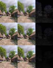
On 2/5/21 2:28 AM, Thomas de Groot wrote:
> Op 04/02/2021 om 13:56 schreef William F Pokorny:
...
>
> Ah, yes! Luminous bloom! Something I have long intended to use indeed
>
>>
>> Attached a result. I expect it can be better tuned, but I'm happy that
...
>
> Not (yet) convinced. Like Mr says, looks to much like blur here and
> everything is blurred.
>
> I have the intention to do also a stochastic render of the scene. I
> /think/ that would give a better result.

Yes, that would be interesting to see. With the stochastic techniques
I'm always wondering how much is a better render result and how much
looks better because one has introduced noise. And if that last true,
even in part, might we add noise by some more efficient means. Anyway...
Always a thousand ideas.

I've been playing with more ideas using your image. Attaching three
images. In toBloomOrOther.jpg showing your original to my already posted
bloom filter image in the top row. In the middle row the bloom filter at
about 1/3 the aggressiveness of the top row. In the bottom row not
really bloom, but more adding noise by regional sampling about each
pixel. Less blur in the bottom two rows, but still maybe too much to
tastes.

While at that, Mr's question about adding more contrast knocked
something loose in my head and I had the thought, "what does average do
with negative weights...?" Well! Interesting stuff - about which I've
not completely wrapped my head.

You can use negative weights. If you get the balance right you can get
an image with more contrast with my bloom filter set up. Using:

      #declare PigmentMap00 = pigment_map {
     [-1.0 Pigment1 ]
     [-0.7 Pigment2 ]
     [-0.6 Pigment3 ]
     [+0.5 Pigment4 ]
     [+0.4 Pigment5 ]
     [+0.3 Pigment6 ]
     [+0.2 Pigment7 ]
     [+0.1 Pigment8 ]
}
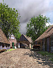
#declare PigmMerge = pigment {
     average
     pigment_map { PigmentMap00 }
}

I get the Contrast00.jpg image, which isn't traditional contrast, but
something more along the lines of tone mapping. Without even trying! I
find it amusing it's possible to stumble my way into such functionality.
:-) Aside: I shrank the image size because it got large even as a jpeg
due the detail popping out - the detail jr wanted to see and probably
still can't. ;-)

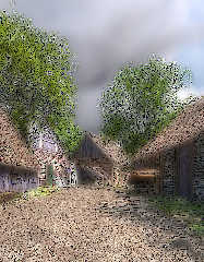
If you get the balance for contrast slightly wrong, other interesting
things happen. See Cartoon00.jpg. The only difference is the -0.6 weight
above was instead +0.6.

Creating these last two images is fast supposing the eight image
pigments into the average function already exist. Whether with effort
and exploration techniques using negative average weights could be made
more finely controllable - in other words, truly usable - I don't know.

So many things to play with and so little time.

Bill P.
Post a reply to this message
Attachments:
Download 'cartoon00.jpg' (269 KB)
Download 'contrast00.jpg' (288 KB)
Download 'tobloomorother.jpg' (198 KB)
Preview of image 'cartoon00.jpg'
Preview of image 'contrast00.jpg'
Preview of image 'tobloomorother.jpg'
|
|
| |
| |
|
|
|
|
| |
| |
|
|
Le 2021-02-04 à 03:06, Thomas de Groot a écrit :
> Finally, after about four months.
>
> The scene is inspired by late nineteenth century paintings of the Late
> Romantic school and Genre pieces.
>
> This is about the first scene were I made /really/ use of pigment
> patterns (road, thatched roofs, dirt on walls) and the Displacement tool
> in Poseray (thatched roofs). Those will be tools I shall come back too
> frequently.
>

Master work !
Post a reply to this message
|
|
| |
| |
|
|
|
|
| |
| |
|
|
in news:601bab05@news.povray.org Thomas de Groot wrote:

> Finally, after about four months.
>

"Een mooi erf" in the dutch tradition.

Ingo
Post a reply to this message
|
|
| |
| |
|
|
|
|
| |
| |
|
|
Op 05/02/2021 om 10:48 schreef jr:
> hi,
>
> Thomas de Groot <tho### [at] degrootorg> wrote:
>> ...
>> The scene is inspired by late nineteenth century paintings of the Late
>> Romantic school and Genre pieces.
>> '''
>
> although "pastoral" isn't my thing, agree with others - quality.  the image
> looks as if it could have "jumped off" someone's easel.
>
> two small nits (:-)).  the current resolution is too low for zooming in on
> detail, and the barn door still needs either a lintel, or a frame, to support
> the bricks across it.
>
>
> regards, jr.
>

Thanks indeed.

Ah, my friend, zooming is not allowed, hmm? Anyway, zooming in on a
painting will also only reveal blobs of paint ;-)

Ah! That lintel! The builder has been fired and the situation corrected
before anything untoward would happen.

Next render (stochastic) will show the new situation.

--
Thomas
Post a reply to this message
|
|
| |
| |
|
|
|
|
| |
| |
|
|
Op 05/02/2021 om 17:02 schreef Alain Martel:
> Le 2021-02-04 à 03:06, Thomas de Groot a écrit :
>> Finally, after about four months.
>>
>> The scene is inspired by late nineteenth century paintings of the Late
>> Romantic school and Genre pieces.
>>
>> This is about the first scene were I made /really/ use of pigment
>> patterns (road, thatched roofs, dirt on walls) and the Displacement
>> tool in Poseray (thatched roofs). Those will be tools I shall come
>> back too frequently.
>>
>
> Master work !

Thank you!

--
Thomas
Post a reply to this message
|
|
| |
| |
|
|
|
|
| |
| |
|
|
Op 05/02/2021 om 19:53 schreef ingo:
> in news:601bab05@news.povray.org Thomas de Groot wrote:
>
>> Finally, after about four months.
>>
>
> "Een mooi erf" in the dutch tradition.
>
> Ingo
>

LOL yes indeed! Everything was put 'spic en span' before I had set up my
easel.

--
Thomas
Post a reply to this message
|
|
| |
| |
|
|
|
|
| |
| |
|
|
Op 05/02/2021 om 15:52 schreef William F Pokorny:
> On 2/5/21 2:28 AM, Thomas de Groot wrote:
>> I have the intention to do also a stochastic render of the scene. I
>> /think/ that would give a better result.
>
> Yes, that would be interesting to see. With the stochastic techniques
> I'm always wondering how much is a better render result and how much
> looks better because one has introduced noise. And if that last true,
> even in part, might we add noise by some more efficient means. Anyway...
> Always a thousand ideas.

I have started a stochastic render and so far it looks good: finer
details becoming clearer. No special settings at this moment: +a0.1
+ac0.95 +r3. I later want to see how, drastically decreasing +ac, will
turn out. Noise should be more visible then.

>
> I've been playing with more ideas using your image. Attaching three
> images. In toBloomOrOther.jpg showing your original to my already posted
> bloom filter image in the top row. In the middle row the bloom filter at
> about 1/3 the aggressiveness of the top row. In the bottom row not
> really bloom, but more adding noise by regional sampling about each
> pixel. Less blur in the bottom two rows, but still maybe too much to
> tastes.

I need to study those images a bit longer. Interesting stuff indeed.

>
> While at that, Mr's question about adding more contrast knocked
> something loose in my head and I had the thought, "what does average do
> with negative weights...?" Well! Interesting stuff - about which I've
> not completely wrapped my head.
>
> You can use negative weights. If you get the balance right you can get
> an image with more contrast with my bloom filter set up. Using:
>
>       #declare PigmentMap00 = pigment_map {
>      [-1.0 Pigment1 ]
>      [-0.7 Pigment2 ]
>      [-0.6 Pigment3 ]
>      [+0.5 Pigment4 ]
>      [+0.4 Pigment5 ]
>      [+0.3 Pigment6 ]
>      [+0.2 Pigment7 ]
>      [+0.1 Pigment8 ]
> }
> #declare PigmMerge = pigment {
>      average
>      pigment_map { PigmentMap00 }
> }
>
> I get the Contrast00.jpg image, which isn't traditional contrast, but
> something more along the lines of tone mapping. Without even trying! I
> find it amusing it's possible to stumble my way into such functionality.
> :-) Aside: I shrank the image size because it got large even as a jpeg
> due the detail popping out - the detail jr wanted to see and probably
> still can't. ;-)

Jr is presently battling the sticky paint on his fingers. :-)

>
> If you get the balance for contrast slightly wrong, other interesting
> things happen. See Cartoon00.jpg. The only difference is the -0.6 weight
> above was instead +0.6.

I like the Cartoon version!

>
> Creating these last two images is fast supposing the eight image
> pigments into the average function already exist. Whether with effort
> and exploration techniques using negative average weights could be made
> more finely controllable - in other words, truly usable - I don't know.
>

I need to look close here. This is interesting.

> So many things to play with and so little time.

True. True. I am glad this image fires off the neurons.

>
> Bill P.


--
Thomas
Post a reply to this message
|
|
| |
| |
|
|
|
|
| |
| |
|
|
Am 04.02.2021 um 09:06 schrieb Thomas de Groot:
> Finally, after about four months.
>
> The scene is inspired by late nineteenth century paintings of the Late
> Romantic school and Genre pieces.
>
> This is about the first scene were I made /really/ use of pigment
> patterns (road, thatched roofs, dirt on walls) and the Displacement tool
> in Poseray (thatched roofs). Those will be tools I shall come back too
> frequently.
>
A very nice image indeed. The road texture is perfect. Maybe the caps
and the skirts of the maids are a lttle bit to clean and the cat seems
to have the size of a lynx. But this are only small flaws to a very
great image.

Congratulations
Michael
Post a reply to this message
|
|
| |
| |
|
|
|
|
| |
| |
|
|
On 2/7/2021 1:36 PM, MichaelJF wrote:
> Am 04.02.2021 um 09:06 schrieb Thomas de Groot:
>> Finally, after about four months.
>>
>> The scene is inspired by late nineteenth century paintings of the Late
>> Romantic school and Genre pieces.
>>
>> This is about the first scene were I made /really/ use of pigment
>> patterns (road, thatched roofs, dirt on walls) and the Displacement
>> tool in Poseray (thatched roofs). Those will be tools I shall come
>> back too frequently.
>>
> A very nice image indeed. The road texture is perfect. Maybe the caps
> and the skirts of the maids are a lttle bit to clean and the cat seems
> to have the size of a lynx. But this are only small flaws to a very
> great image.
>
> Congratulations
> Michael


Nice image!

I thought it was a Schnauzer.


Mike
Post a reply to this message
|
|
| |
| |
|
|
|
|
| |
| |
|
|
Op 07/02/2021 om 19:36 schreef MichaelJF:
> Am 04.02.2021 um 09:06 schrieb Thomas de Groot:
>> Finally, after about four months.
>>
>> The scene is inspired by late nineteenth century paintings of the Late
>> Romantic school and Genre pieces.
>>
>> This is about the first scene were I made /really/ use of pigment
>> patterns (road, thatched roofs, dirt on walls) and the Displacement
>> tool in Poseray (thatched roofs). Those will be tools I shall come
>> back too frequently.
>>
> A very nice image indeed. The road texture is perfect. Maybe the caps
> and the skirts of the maids are a lttle bit to clean and the cat seems
> to have the size of a lynx. But this are only small flaws to a very
> great image.
>
> Congratulations
> Michael


Thank you Michael!

What you see is an effect of perspective. The cat is cat-sized when it
walks back to its mistress, asking for milk. So: illusion!

The caps are certainly /not/ too clean; maybe the lower edge of the
skirts (which you can hardly see) or the aprons. However, this is not
about naturalism and a denunciation of poor living conditions in the
country side. ;-)

--
Thomas
Post a reply to this message
|
|
| |
| |
|
|
|
|
| |
| |
|
|
Op 07/02/2021 om 23:27 schreef Mike Horvath:
> On 2/7/2021 1:36 PM, MichaelJF wrote:
>> Am 04.02.2021 um 09:06 schrieb Thomas de Groot:
>>> Finally, after about four months.
>>>
>>> The scene is inspired by late nineteenth century paintings of the
>>> Late Romantic school and Genre pieces.
>>>
>>> This is about the first scene were I made /really/ use of pigment
>>> patterns (road, thatched roofs, dirt on walls) and the Displacement
>>> tool in Poseray (thatched roofs). Those will be tools I shall come
>>> back too frequently.
>>>
>> A very nice image indeed. The road texture is perfect. Maybe the caps
>> and the skirts of the maids are a lttle bit to clean and the cat seems
>> to have the size of a lynx. But this are only small flaws to a very
>> great image.
>>
>> Congratulations
>> Michael
>
>
> Nice image!
>
> I thought it was a Schnauzer.
>
>
> Mike


LOL no. Just a cat. Perspective playing tricks.

--
Thomas
Post a reply to this message
|
|
| |
| |
|
|
|
|
| |
| |
|
|
Thomas de Groot wrote on 04/02/2021 09:06:
> Finally, after about four months.
>
> The scene is inspired by late nineteenth century paintings of the Late
> Romantic school and Genre pieces.
>
> This is about the first scene were I made /really/ use of pigment
> patterns (road, thatched roofs, dirt on walls) and the Displacement tool
> in Poseray (thatched roofs). Those will be tools I shall come back too
> frequently.
>

The mood is incredibly... beautiful.
Bravo!

Paolo
Post a reply to this message
|
|
| |
| |
|
|
|
|
| |
| |
|
|
Op 08/02/2021 om 11:15 schreef Paolo Gibellini:
> Thomas de Groot wrote on 04/02/2021 09:06:
>> Finally, after about four months.
>>
>> The scene is inspired by late nineteenth century paintings of the Late
>> Romantic school and Genre pieces.
>>
>> This is about the first scene were I made /really/ use of pigment
>> patterns (road, thatched roofs, dirt on walls) and the Displacement
>> tool in Poseray (thatched roofs). Those will be tools I shall come
>> back too frequently.
>>
>
> The mood is incredibly... beautiful.
> Bravo!
>
> Paolo

Thank you indeed, Paolo.

--
Thomas
Post a reply to this message
|
|
| |
| |
|
|
|
|
| |
| |
|
|
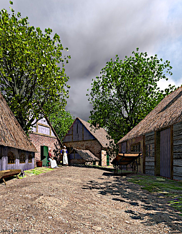
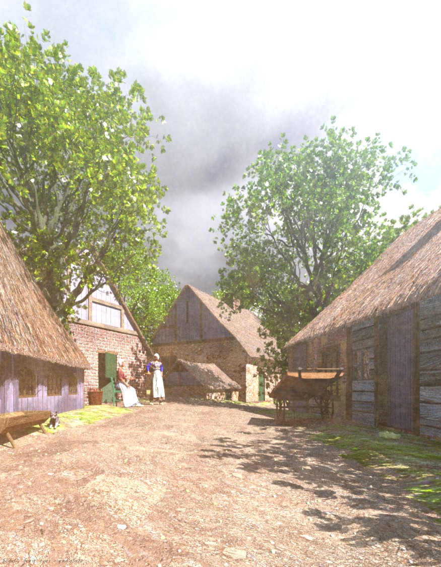
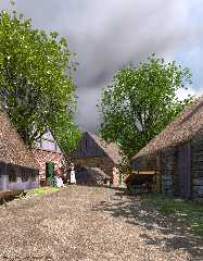
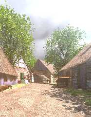
Second state of the scene, this time rendered with stochastic aa. Took
about 16 hours on an i5 laptop (for what it's worth). The quality is
slightly better, especially where small twigs are concerned. I probably
could use even better settings but I do not want to wait much longer for
a render as other things are pressing.

Following Bill's comment about Sam Benge's Luminous Bloom, I dusted the
facility off, adapted it to latest pov version (gamma and emission) and
tweaked the settings until I got this somewhat painterly output. I like
it but am not going to experiment much further at present.

--
Thomas
Post a reply to this message
Attachments:
Download 'a quiet lane_final_2.jpg' (374 KB)
Download 'a quiet lane_final_2_bloom.jpg' (302 KB)
Preview of image 'a quiet lane_final_2.jpg'
Preview of image 'a quiet lane_final_2_bloom.jpg'
|
|
| |
| |
|
|
|
|
| |
| |
|
|
On 2/11/21 2:40 AM, Thomas de Groot wrote:
> Second state of the scene, this time rendered with stochastic aa. Took
> about 16 hours on an i5 laptop (for what it's worth). The quality is
> slightly better, especially where small twigs are concerned. I probably
> could use even better settings but I do not want to wait much longer for
> a render as other things are pressing.
>
> Following Bill's comment about Sam Benge's Luminous Bloom, I dusted the
> facility off, adapted it to latest pov version (gamma and emission) and
> tweaked the settings until I got this somewhat painterly output. I like
> it but am not going to experiment much further at present.
>

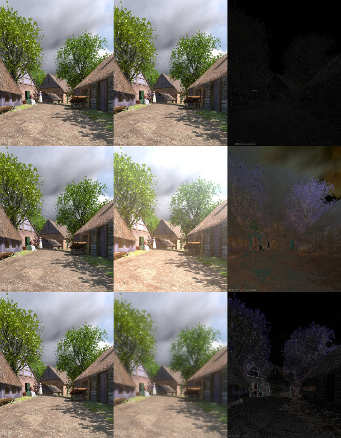
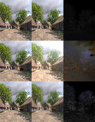
Attaching an image of three image to image compares.

Top row your initial post to the one with stochastic aa. The middle row
your _2 post to the luminous bloom result. Bottom row your original post
compared to my first posted bloom filter image (the most blurry one).

Obvious the luminous bloom filter is acting differently than my AA based
bloom filter. Sam's being more luminous (true to its name) and less
blurry. Just now took a quick look at my local copy of his (version 7b).
I'd forgotten his has different modes of bloom (7 of them) plus ability
to cutomize many aspects! His filter is simply much more developed and
flexible with a somewhat different primary aim.

Bill P.
Post a reply to this message
Attachments:
Download 'quiet_lane_compares.jpg' (238 KB)
Preview of image 'quiet_lane_compares.jpg'
|
|
| |
| |
|
|
|
|
| |
| |
|
|
Op 11/02/2021 om 11:18 schreef William F Pokorny:
> On 2/11/21 2:40 AM, Thomas de Groot wrote:
>> Second state of the scene, this time rendered with stochastic aa. Took
>> about 16 hours on an i5 laptop (for what it's worth). The quality is
>> slightly better, especially where small twigs are concerned. I
>> probably could use even better settings but I do not want to wait much
>> longer for a render as other things are pressing.
>>
>> Following Bill's comment about Sam Benge's Luminous Bloom, I dusted
>> the facility off, adapted it to latest pov version (gamma and
>> emission) and tweaked the settings until I got this somewhat painterly
>> output. I like it but am not going to experiment much further at present.
>>
>
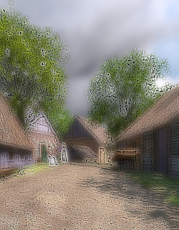
> Attaching an image of three image to image compares.
>
> Top row your initial post to the one with stochastic aa. The middle row
> your _2 post to the luminous bloom result. Bottom row your original post
> compared to my first posted bloom filter image (the most blurry one).
>
> Obvious the luminous bloom filter is acting differently than my AA based
> bloom filter. Sam's being more luminous (true to its name) and less
> blurry. Just now took a quick look at my local copy of his (version 7b).
> I'd forgotten his has different modes of bloom (7 of them) plus ability
> to cutomize many aspects! His filter is simply much more developed and
> flexible with a somewhat different primary aim.
>
> Bill P.

I forgot to mention that I used Sam's version 6, which only has his
original bloom. Version 7 (a and/or b) have indeed some more options
which I have not tried.

--
Thomas
Post a reply to this message
|
|
| |
| |
|
|
|
|
| |
| |
|
|
hi,

William F Pokorny <ano### [at] anonymousorg> wrote:
> On 2/11/21 2:40 AM, Thomas de Groot wrote:
> > ...
> Attaching an image of three image to image compares.
> ...

I hope it's not heresy (Thomas) to say that I think the centre and bottom right
"diffs" even more attractive than the actual image.  :-)


regards, jr.
Post a reply to this message
|
|
| |
| |
|
|
|
|
| |
| |
|
|
Op 12/02/2021 om 10:36 schreef jr:
> hi,
>
> William F Pokorny <ano### [at] anonymousorg> wrote:
>> On 2/11/21 2:40 AM, Thomas de Groot wrote:
>>> ...
>> Attaching an image of three image to image compares.
>> ...
>
> I hope it's not heresy (Thomas) to say that I think the centre and bottom right
> "diffs" even more attractive than the actual image.  :-)
>
>
> regards, jr.
>

I will bear my cross meekly :-)

--
Thomas
Post a reply to this message
|
|
| |
| |
|
|
|
|
| |
| |
|
|
Thomas de Groot <tho### [at] degrootorg> wrote:
> Second state of the scene, this time rendered with stochastic aa...
>
> Following Bill's comment about Sam Benge's Luminous Bloom, I dusted the
> facility off, adapted it to latest pov version (gamma and emission) and
> tweaked the settings until I got this somewhat painterly output. I like
> it but am not going to experiment much further at present.
>

That's a beautiful and pastoral scene; sorry that I had not commented previously
(too many POV-ray tasks and tests taking up my time.) I love the thatched roofs,
and the overall setting (and lighting.) I actually prefer the non-bloom image.
IMO, that effect seems to work/look better when applied to larger or simpler
shapes-- as opposed to 'blooming' lots of fine details, which looks more like an
overall haze. Or maybe that's the intended effect here ;-)
Post a reply to this message
|
|
| |
| |
|
|
|
|
| |
| |
|
|
Op 19/02/2021 om 23:34 schreef Kenneth:
> Thomas de Groot <tho### [at] degrootorg> wrote:
>> Second state of the scene, this time rendered with stochastic aa...
>>
>> Following Bill's comment about Sam Benge's Luminous Bloom, I dusted the
>> facility off, adapted it to latest pov version (gamma and emission) and
>> tweaked the settings until I got this somewhat painterly output. I like
>> it but am not going to experiment much further at present.
>>
>
> That's a beautiful and pastoral scene; sorry that I had not commented previously
> (too many POV-ray tasks and tests taking up my time.) I love the thatched roofs,
> and the overall setting (and lighting.) I actually prefer the non-bloom image.
> IMO, that effect seems to work/look better when applied to larger or simpler
> shapes-- as opposed to 'blooming' lots of fine details, which looks more like an
> overall haze. Or maybe that's the intended effect here ;-)
>
>

Thank you Kenneth. The bloom version is - as far as I am concerned -
only an excursion out of curiosity following Bill's comment. It was
something I was curious about after all that time. I like its effect but
it is not my favourite either and anyway the scene was not created with
bloom in mind. My real intention was the re-creation of those 19th
century ideas about the country side (sometimes stimulated by underlying
social viewpoints) especially after the invention of paint tubes which
enabled artists to work in the open air.

--
Thomas
Post a reply to this message
|
|
| |
| |
|
|
|
|
| |
| |
|
|
On 2021-02-20 3:31 AM (-4), Thomas de Groot wrote:
>
>  My real intention was the re-creation of those 19th
> century ideas about the country side (sometimes stimulated by underlying
> social viewpoints) especially after the invention of paint tubes which
> enabled artists to work in the open air.

It never occurred to me that an invention I take for granted would be so
consequential.  But of course in the days when artists had to grind
their own pigments, the paint would have dried out faster outdoors.

My gosh, and stuck inside with all that turpentine!
Post a reply to this message
|
|
| |
| |
|
|
|
|
| |
| |
|
|
Op 20/02/2021 om 21:32 schreef Cousin Ricky:
> On 2021-02-20 3:31 AM (-4), Thomas de Groot wrote:
>>
>>  My real intention was the re-creation of those 19th century ideas
>> about the country side (sometimes stimulated by underlying social
>> viewpoints) especially after the invention of paint tubes which
>> enabled artists to work in the open air.
>
> It never occurred to me that an invention I take for granted would be so
> consequential.  But of course in the days when artists had to grind
> their own pigments, the paint would have dried out faster outdoors.
>
> My gosh, and stuck inside with all that turpentine!

<grin>
What would Vincent van Gogh have done without tubes...?

--
Thomas
Post a reply to this message
|
|
| |
| |
|
|
|
|
| |
| |
|
|
Thomas de Groot <tho### [at] degrootorg> wrote:
> Second state of the scene, this time rendered with stochastic aa. Took
> about 16 hours on an i5 laptop (for what it's worth). The quality is
> slightly better, especially where small twigs are concerned. I probably
> could use even better settings but I do not want to wait much longer for
> a render as other things are pressing.
>
> Following Bill's comment about Sam Benge's Luminous Bloom, I dusted the
> facility off, adapted it to latest pov version (gamma and emission) and
> tweaked the settings until I got this somewhat painterly output. I like
> it but am not going to experiment much further at present.
>
> --
> Thomas

Wow Thomas, these are great the composition of the scene is fantastic. Is the
sky an image map? I especially love the effect you have on the ground.
Post a reply to this message
|
|
| |
| |
|
|
|
|
| |
| |
|
|
Op 11/04/2021 om 18:02 schreef s.day:
> Thomas de Groot <tho### [at] degrootorg> wrote:
>> Second state of the scene, this time rendered with stochastic aa. Took
>> about 16 hours on an i5 laptop (for what it's worth). The quality is
>> slightly better, especially where small twigs are concerned. I probably
>> could use even better settings but I do not want to wait much longer for
>> a render as other things are pressing.
>>
>> Following Bill's comment about Sam Benge's Luminous Bloom, I dusted the
>> facility off, adapted it to latest pov version (gamma and emission) and
>> tweaked the settings until I got this somewhat painterly output. I like
>> it but am not going to experiment much further at present.
>>
>> --
>> Thomas
>
> Wow Thomas, these are great the composition of the scene is fantastic. Is the
> sky an image map? I especially love the effect you have on the ground.
>

Hey! Long time no see! And thank you indeed.

The sky is not an image map. It is a layered media using Mick
Hazelgrove's clouds macro. See:

http://news.povray.org/povray.binaries.utilities/thread/%3C5f9e664c%241%40news.povray.org%3E/

Yes, the ground is interesting indeed: the result of a complex
pigment_pattern using different image maps.

--
Thomas
Post a reply to this message
|
|
| |
| |
|
|
|
|
| |