|
|
|
|
|
|
| |
| |
|
|
|
|
| |
| |
|
|
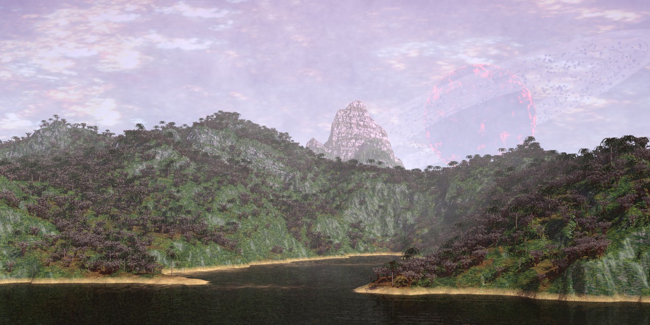
A scene I have been working on for some time, with different
interruptions. This is a first final version; possibly, some changes
will take place.

The background star field and the landscape are based on Apophysis
images http://apophysis.org/, the first as an .exr file, the second as
basis for the height_field. The scene is a subtle play with different
light_groups.

The vegetation was modelled with Dryad, a little free application from
stanford.edu
http://news.stanford.edu/news/2008/january9/dryad-010908.html that seems
to have disappeared from the net.

--
Thomas
Post a reply to this message
Attachments:
Download 'stranger moon_05.jpg' (207 KB)
Preview of image 'stranger moon_05.jpg'
|
|
| |
| |
|
|
|
|
| |
| |
|
|
Thomas de Groot <tho### [at] degroot org> wrote:
> A scene I have been working on for some time, with different
> interruptions. This is a first final version; possibly, some changes
> will take place.
>
> The background star field and the landscape are based on Apophysis
> images http://apophysis.org/, the first as an .exr file, the second as
> basis for the height_field. The scene is a subtle play with different
> light_groups.
>
> The vegetation was modelled with Dryad, a little free application from
> stanford.edu
> http://news.stanford.edu/news/2008/january9/dryad-010908.html that seems
> to have disappeared from the net.
>
> --
> Thomas
Hello, I feel compelled to criticize to be constructive and always look for
improvement, but I Love the picture, geometric and tonal composition... now to
the nitpicking:
The image works much better in small preview than at a bigger scale. This
reveals a good potential, and lack of some details:
* The tree trunks are too straight
* The trees have not enough color variations (how many different tree models?
maybe changing some of them for a new one with slightly different color would
solve this)
* Though this may be realistic, the water appears too dark , that is probably
because the view angle is too high, with Fresnel not allowing the sky color to
get reflected enough, lowering it might also let us see some of the surface
waves to add some nice detail that probably are already there.
Be careful not to loose that type of background rock you have, it's beautiful
and makes much of the point of the picture.
* isn't scale of the clouds too small? making them bigger would create larger
holes where the "moon" could be let visible and still get some occlusion from
the clouds, because as it is, the moon looks closer than the clouds.
*beaches are too vertical, ideally a small fringe of the terrain with lower
slope would make them less linear, but I guess it must be difficult depending on
how procedurally the height field was generated... If not possible then I would
try to make the sandy yellow line much thinner to make up for that.
Great work and a hard subject to depict ! org> wrote:
> A scene I have been working on for some time, with different
> interruptions. This is a first final version; possibly, some changes
> will take place.
>
> The background star field and the landscape are based on Apophysis
> images http://apophysis.org/, the first as an .exr file, the second as
> basis for the height_field. The scene is a subtle play with different
> light_groups.
>
> The vegetation was modelled with Dryad, a little free application from
> stanford.edu
> http://news.stanford.edu/news/2008/january9/dryad-010908.html that seems
> to have disappeared from the net.
>
> --
> Thomas
Hello, I feel compelled to criticize to be constructive and always look for
improvement, but I Love the picture, geometric and tonal composition... now to
the nitpicking:
The image works much better in small preview than at a bigger scale. This
reveals a good potential, and lack of some details:
* The tree trunks are too straight
* The trees have not enough color variations (how many different tree models?
maybe changing some of them for a new one with slightly different color would
solve this)
* Though this may be realistic, the water appears too dark , that is probably
because the view angle is too high, with Fresnel not allowing the sky color to
get reflected enough, lowering it might also let us see some of the surface
waves to add some nice detail that probably are already there.
Be careful not to loose that type of background rock you have, it's beautiful
and makes much of the point of the picture.
* isn't scale of the clouds too small? making them bigger would create larger
holes where the "moon" could be let visible and still get some occlusion from
the clouds, because as it is, the moon looks closer than the clouds.
*beaches are too vertical, ideally a small fringe of the terrain with lower
slope would make them less linear, but I guess it must be difficult depending on
how procedurally the height field was generated... If not possible then I would
try to make the sandy yellow line much thinner to make up for that.
Great work and a hard subject to depict !
Post a reply to this message
|
|
| |
| |
|
|
|
|
| |
| |
|
|
On 13-3-2017 11:12, Mr wrote:
> Thomas de Groot <tho### [at] degrootorg> wrote:
>> A scene I have been working on for some time, with different
>> interruptions. This is a first final version; possibly, some changes
>> will take place.
>>
>> The background star field and the landscape are based on Apophysis
>> images http://apophysis.org/, the first as an .exr file, the second as
>> basis for the height_field. The scene is a subtle play with different
>> light_groups.
>>
>> The vegetation was modelled with Dryad, a little free application from
>> stanford.edu
>> http://news.stanford.edu/news/2008/january9/dryad-010908.html that seems
>> to have disappeared from the net.
>>
>> --
>> Thomas
>
> Hello, I feel compelled to criticize to be constructive and always look for
> improvement, but I Love the picture, geometric and tonal composition... now to
> the nitpicking:

I am always happy when people nitpick. I like to do it myself too with
others and believe it is to everybody's good :-)

> The image works much better in small preview than at a bigger scale. This
> reveals a good potential, and lack of some details:
> * The tree trunks are too straight
> * The trees have not enough color variations (how many different tree models?
> maybe changing some of them for a new one with slightly different color would
> solve this)

Absolutely true on both points. Those are some of the planned
improvements. Dryad needs a bit of massaging to give better results and
I only used two models here, which of course is way too few.

> * Though this may be realistic, the water appears too dark , that is probably
> because the view angle is too high, with Fresnel not allowing the sky color to
> get reflected enough, lowering it might also let us see some of the surface
> waves to add some nice detail that probably are already there.
> Be careful not to loose that type of background rock you have, it's beautiful
> and makes much of the point of the picture.

There is matter for some thoughts here. The water is a media with
absorption and scattering densities. The surface itself has too little
reflection indeed and could be improved.

>
> * isn't scale of the clouds too small? making them bigger would create larger
> holes where the "moon" could be let visible and still get some occlusion from
> the clouds, because as it is, the moon looks closer than the clouds.
> *beaches are too vertical, ideally a small fringe of the terrain with lower
> slope would make them less linear, but I guess it must be difficult depending on
> how procedurally the height field was generated... If not possible then I would
> try to make the sandy yellow line much thinner to make up for that.

I was expecting this! ;-) The point is that those as /not/ clouds but a
starscape, maybe somewhere closer to the galaxy's hub. Star clusters and
groupings are supposed to represent this aspect. Of course, the
image_map used of an Apophysis flame is not really star-like nor
realistic but I liked this nonetheless for an alien sky, and why go all
the realistic way after all?

As far as clouds are concerned, there is a scattering media present
which expresses the heat of this planet but no clouds are formed at this
hour of the day.

>
> Great work and a hard subject to depict !
>

Thanks!

--
Thomas
Post a reply to this message
|
|
| |
| |
|
|
|
|
| |
| |
|
|
Thomas de Groot <tho### [at] degrootorg> wrote:

> >> The vegetation was modelled with Dryad, a little free application from
> >> stanford.edu
> >> http://news.stanford.edu/news/2008/january9/dryad-010908.html that seems
> >> to have disappeared from the net.

If it's at all possible, that would be a great application to share with folks,
since vegetation is whole area of its own, that can be a HUGE time sink.  Since
it was being given away for free at the time , I don't know if you need any
other permission from the author to share the version you have.


> I am always happy when people nitpick. I like to do it myself too with
> others and believe it is to everybody's good :-)

Indeed.   Constructive nitpicking, like "This here has a problem, which can be
fixed if you do X, Y, or Z...." helps people learn to look at their scenes with
a more discerning and critical eye, and most importantly, LEARN how to avoid and
fix those problems.  This makes for a stronger raytracing community.  :)

> > * The tree trunks are too straight
Maybe.  They're alien trees.  I'd perhaps say "they're all too uniform /
similar."

> > * The trees have not enough color variations (how many different tree models?
> > maybe changing some of them for a new one with slightly different color would
> > solve this)

Coding good looking variation is definitely a tremendous skill.


Once again Thomas - great landscape, and a very nice atmosphere.   I always
enjoy looking at your scenes, and have something to learn, and a level of
accomplishment to strive for in my own work.  I really like the higher-contrast,
crisper, clearer foreground to the right which really adds a sense of depth to
the scene.   Perhaps having some of that on the left might help the scene "pop"
more...
Post a reply to this message
|
|
| |
| |
|
|
|
|
| |
| |
|
|
On 3/13/2017 2:21 PM, Bald Eagle wrote:
> Thomas de Groot<tho### [at] degrootorg>  wrote:
>
>>>> > >>The vegetation was modelled with Dryad, a little free application from
>>>> > >>stanford.edu
>>>> > >>http://news.stanford.edu/news/2008/january9/dryad-010908.html  that seems
>>>> > >>to have disappeared from the net.
> If it's at all possible, that would be a great application to share with folks,
> since vegetation is whole area of its own, that can be a HUGE time sink.  Since
> it was being given away for free at the time , I don't know if you need any
> other permission from the author to share the version you have.
>
>

But if you use the Wayback machine it can be found here.

https://web.archive.org/web/20090123034022/http://dryad.stanford.edu/download.php?os=windows

There is a Mac version available.

License

Dryad is free for you to use for any purpose, including commercial
applications. However, Dryad is provided entirely "as is" and without
warranties of any kind. Please note that, for our research, we collect
some anonymous usage statistics about Dryad.

--

Regards
     Stephen
Post a reply to this message
|
|
| |
| |
|
|
|
|
| |
| |
|
|
Stephen <mca### [at] aolcom> wrote:

> But if you use the Wayback machine it can be found here.
>
https://web.archive.org/web/20090123034022/http://dryad.stanford.edu/download.php?os=windows
>
> There is a Mac version available.

Thanks Stephen!  :)

And...  "Click on the dice button to get a new tree that is like your current
one but slightly different."
Super useful.
Post a reply to this message
|
|
| |
| |
|
|
|
|
| |
| |
|
|
On 3/13/2017 4:10 PM, Bald Eagle wrote:
> Stephen <mca### [at] aolcom> wrote:
>
>> But if you use the Wayback machine it can be found here.
>>
https://web.archive.org/web/20090123034022/http://dryad.stanford.edu/download.php?os=windows
>>
>> There is a Mac version available.
>
> Thanks Stephen!  :)
>
> And...  "Click on the dice button to get a new tree that is like your current
> one but slightly different."
> Super useful.
>
>
>
Selecting a tree and moving the mouse over the RH window is super dooper. :)


--

Regards
     Stephen
Post a reply to this message
|
|
| |
| |
|
|
|
|
| |
| |
|
|
Image colors look a little washed out and could use some saturation.
Post a reply to this message
|
|
| |
| |
|
|
|
|
| |
| |
|
|
On 14-3-2017 5:56, jhu wrote:
> Image colors look a little washed out and could use some saturation.
>

That is the atmospheric media.

--
Thomas
Post a reply to this message
|
|
| |
| |
|
|
|
|
| |
| |
|
|
On 13-3-2017 15:21, Bald Eagle wrote:
> Thomas de Groot <tho### [at] degrootorg> wrote:
>
>>>> The vegetation was modelled with Dryad, a little free application from
>>>> stanford.edu
>>>> http://news.stanford.edu/news/2008/january9/dryad-010908.html that seems
>>>> to have disappeared from the net.
>
> If it's at all possible, that would be a great application to share with folks,
> since vegetation is whole area of its own, that can be a HUGE time sink.  Since
> it was being given away for free at the time , I don't know if you need any
> other permission from the author to share the version you have.
>

I had not thought about the Wayback Machine. Fortunately, I have Stephen
to take care of those details ;-)

>
>> I am always happy when people nitpick. I like to do it myself too with
>> others and believe it is to everybody's good :-)
>
> Indeed.   Constructive nitpicking, like "This here has a problem, which can be
> fixed if you do X, Y, or Z...." helps people learn to look at their scenes with
> a more discerning and critical eye, and most importantly, LEARN how to avoid and
> fix those problems.  This makes for a stronger raytracing community.  :)

I totally agree. I guess that about 70% of my POV-Ray skills come from
the examples and help from others. And my learning curve is still quite
steep.

>
>>> * The tree trunks are too straight
> Maybe.  They're alien trees.  I'd perhaps say "they're all too uniform /
> similar."

Probably, those trees will remain straight, but there needs to be much
more variation in tree/bush types.

>
>>> * The trees have not enough color variations (how many different tree models?
>>> maybe changing some of them for a new one with slightly different color would
>>> solve this)
>
> Coding good looking variation is definitely a tremendous skill.

I have been lazy (like so often) and postponed that work to phase 2. ;-)

>
>
> Once again Thomas - great landscape, and a very nice atmosphere.   I always
> enjoy looking at your scenes, and have something to learn, and a level of
> accomplishment to strive for in my own work.  I really like the higher-contrast,
> crisper, clearer foreground to the right which really adds a sense of depth to
> the scene.   Perhaps having some of that on the left might help the scene "pop"
> more...
>

Thank you very much indeed. :-)

The media at the left of the scene is a bit thicker than on the right.
Partly because the shore is a tiny bit farther away but mostly because
of the turbulence of the media, like mist shrouds thinning out or
thickening locally. It was important to me that at least some part of
the scene were crisper.

--
Thomas
Post a reply to this message
|
|
| |
| |
|
|
|
|
| |
| |
|
|
On 13-3-2017 17:31, Stephen wrote:
> On 3/13/2017 4:10 PM, Bald Eagle wrote:
>> Stephen <mca### [at] aolcom> wrote:
>>
>>> But if you use the Wayback machine it can be found here.
>>>
https://web.archive.org/web/20090123034022/http://dryad.stanford.edu/download.php?os=windows
>>>
>>>
>>> There is a Mac version available.
>>
>> Thanks Stephen!  :)
>>
>> And...  "Click on the dice button to get a new tree that is like your
>> current
>> one but slightly different."
>> Super useful.
>>
>>
>>
> Selecting a tree and moving the mouse over the RH window is super
> dooper. :)
>
>

Dryad has all kinds of nice surprises and is innovative in several ways.
However, the trees can remain a bit 'primitive' and are better for
background work I think.

--
Thomas
Post a reply to this message
|
|
| |
| |
|
|
|
|
| |
| |
|
|
On 3/14/2017 8:02 AM, Thomas de Groot wrote:
> On 13-3-2017 17:31, Stephen wrote:

>>>
>>>
>>>
>> Selecting a tree and moving the mouse over the RH window is super
>> dooper. :)
>>
>>
>
> Dryad has all kinds of nice surprises and is innovative in several ways.
> However, the trees can remain a bit 'primitive' and are better for
> background work I think.
>

The leaves are certainly primitive. :-)
But for a background I can see it working, as in your image.
Talking of which, I really like it. But as usual I too find it a bit
washed out. I generally drop the gamma a bit to view it.

--

Regards
     Stephen
Post a reply to this message
|
|
| |
| |
|
|
|
|
| |
| |
|
|
On 14-3-2017 9:19, Stephen wrote:
> On 3/14/2017 8:02 AM, Thomas de Groot wrote:
>> On 13-3-2017 17:31, Stephen wrote:
>
>>>>
>>>>
>>>>
>>> Selecting a tree and moving the mouse over the RH window is super
>>> dooper. :)
>>>
>>>
>>
>> Dryad has all kinds of nice surprises and is innovative in several ways.
>> However, the trees can remain a bit 'primitive' and are better for
>> background work I think.
>>
>
> The leaves are certainly primitive. :-)
> But for a background I can see it working, as in your image.
> Talking of which, I really like it. But as usual I too find it a bit
> washed out. I generally drop the gamma a bit to view it.
>

It probably is what I prefer myself. ;-) Otherwise it is all gamma 1 and
srgb colours.

--
Thomas
Post a reply to this message
|
|
| |
| |
|
|
|
|
| |
| |
|
|
On 3/14/2017 12:10 PM, Thomas de Groot wrote:
> On 14-3-2017 9:19, Stephen wrote:

>>
>> The leaves are certainly primitive. :-)
>> But for a background I can see it working, as in your image.
>> Talking of which, I really like it. But as usual I too find it a bit
>> washed out. I generally drop the gamma a bit to view it.
>>
>
> It probably is what I prefer myself. ;-) Otherwise it is all gamma 1 and
> srgb colours.
>

Yes or your monitor's output Vs mine. I normally don't like images where
there is a lot of detail in the dark parts unlike actual paintings.
Where I do. :-¦

--

Regards
     Stephen
Post a reply to this message
|
|
| |
| |
|
|
|
|
| |
| |
|
|
On 14-3-2017 13:34, Stephen wrote:
> On 3/14/2017 12:10 PM, Thomas de Groot wrote:
>> On 14-3-2017 9:19, Stephen wrote:
>
>>>
>>> The leaves are certainly primitive. :-)
>>> But for a background I can see it working, as in your image.
>>> Talking of which, I really like it. But as usual I too find it a bit
>>> washed out. I generally drop the gamma a bit to view it.
>>>
>>
>> It probably is what I prefer myself. ;-) Otherwise it is all gamma 1 and
>> srgb colours.
>>
>
> Yes or your monitor's output Vs mine. I normally don't like images where
> there is a lot of detail in the dark parts unlike actual paintings.
> Where I do. :-¦
>

My monitor is calibrated, to the best of my skills ;-)

Admittedly, those skills are so so...

--
Thomas
Post a reply to this message
|
|
| |
| |
|
|
|
|
| |
| |
|
|
On 3/14/2017 1:00 PM, Thomas de Groot wrote:
>>
>
> My monitor is calibrated, to the best of my skills ;-)

Mine has different settings for different applications.
When I set it to sRGB all I can adjust is the brightness.

The usual gamma adjustment images look correct.

>
> Admittedly, those skills are so so...

I'm not sure about that. ;-)

--

Regards
     Stephen
Post a reply to this message
|
|
| |
| |
|
|
|
|
| |
| |
|
|
Thomas de Groot <tho### [at] degrootorg> wrote:
> On 14-3-2017 5:56, jhu wrote:
> > Image colors look a little washed out and could use some saturation.
> >
>
> That is the atmospheric media.
>
> --
> Thomas

Regardless, some post-processing can add to the aesthetic
Post a reply to this message
Attachments:
Download 'stranger-moon-05-post-processing.png' (1339 KB)
Preview of image 'stranger-moon-05-post-processing.png'

|
|
| |
| |
|
|
|
|
| |
| |
|
|
On 14-3-2017 20:29, jhu wrote:
> Thomas de Groot <tho### [at] degrootorg> wrote:
>> On 14-3-2017 5:56, jhu wrote:
>>> Image colors look a little washed out and could use some saturation.
>>>
>>
>> That is the atmospheric media.
>>
>> --
>> Thomas
>
> Regardless, some post-processing can add to the aesthetic
>

Lol! Which is not really what I personally like. Too garish to my taste,
but good try nonetheless. :-)

Wait for next version.

--
Thomas
Post a reply to this message
|
|
| |
| |
|
|
|
|
| |
| |
|
|
Thomas de Groot <tho### [at] degrootorg> wrote:
> On 14-3-2017 20:29, jhu wrote:
> > Thomas de Groot <tho### [at] degrootorg> wrote:
> >> On 14-3-2017 5:56, jhu wrote:
> >>> Image colors look a little washed out and could use some saturation.
> >>>
> >>
> >> That is the atmospheric media.
> >>
> >> --
> >> Thomas
> >
> > Regardless, some post-processing can add to the aesthetic
> >
>
> Lol! Which is not really what I personally like. Too garish to my taste,
> but good try nonetheless. :-)
>
> Wait for next version.
>
> --
> Thomas

me neither, original output was more natural but I agree it did lack some
contrast.
Post a reply to this message
|
|
| |
| |
|
|
|
|
| |
| |
|
|
Thomas de Groot <tho### [at] degrootorg> wrote:
> >
> > * isn't scale of the clouds too small? making them bigger would create larger
> > holes where the "moon" could be let visible and still get some occlusion from
> > the clouds, because as it is, the moon looks closer than the clouds.
> > *beaches are too vertical, ideally a small fringe of the terrain with lower
> > slope would make them less linear, but I guess it must be difficult depending on
> > how procedurally the height field was generated... If not possible then I would
> > try to make the sandy yellow line much thinner to make up for that.
>
> I was expecting this! ;-) The point is that those as /not/ clouds but a
> starscape, maybe somewhere closer to the galaxy's hub. Star clusters and
> groupings are supposed to represent this aspect. Of course, the
> image_map used of an Apophysis flame is not really star-like nor
> realistic but I liked this nonetheless for an alien sky, and why go all
> the realistic way after all?
>
> As far as clouds are concerned, there is a scattering media present
> which expresses the heat of this planet but no clouds are formed at this
> hour of the day.
>
> >
> > Great work and a hard subject to depict !
> >
>
> Thanks!
>
> --
> Thomas

This is a good idea that was not yet readable: no one can honestly tell you yet
that they look like star fields rather than clouds, despite what is realistic or
not... Maybe some really brighter stars with streaks would help, ideally the
"foreground one" with asteroid belt would be even more brilliant since closer
and have more streaks... The problem you face is we're reading the picture from
what we know and the only such cloudy star field visible to the human eye is the
milky way. If it can be of some inspiration, the sky needs to be just dark
enough for it to appear.
Post a reply to this message
|
|
| |
| |
|
|
|
|
| |
| |
|
|
On 15-3-2017 9:10, Mr wrote:
> Thomas de Groot <tho### [at] degrootorg> wrote:
>> On 14-3-2017 20:29, jhu wrote:
>>> Thomas de Groot <tho### [at] degrootorg> wrote:
>>>> On 14-3-2017 5:56, jhu wrote:
>>>>> Image colors look a little washed out and could use some saturation.
>>>>>
>>>>
>>>> That is the atmospheric media.
>>>>
>>>> --
>>>> Thomas
>>>
>>> Regardless, some post-processing can add to the aesthetic
>>>
>>
>> Lol! Which is not really what I personally like. Too garish to my taste,
>> but good try nonetheless. :-)
>>
>> Wait for next version.
>>
>> --
>> Thomas
>
> me neither, original output was more natural but I agree it did lack some
> contrast.
>

Let me elaborate a bit more on this topic. I think that high-contrast,
colourful views are 'dictated' by our daily confrontation with what
television shows us of the natural world. More often than not, it is
shown as more colourful than is really the case by well-chosen camera
views and selective editing of them. Nature is often much more subdued
in colour with a softer chromatic scale and only some stronger highlights.

However, I realise that living in NL also influences my perception. The
light is soft most of the time.

Again, next version will show some changes.

--
Thomas
Post a reply to this message
|
|
| |
| |
|
|
|
|
| |
| |
|
|
On 15-3-2017 9:23, Mr wrote:

> This is a good idea that was not yet readable: no one can honestly tell you yet
> that they look like star fields rather than clouds, despite what is realistic or
> not... Maybe some really brighter stars with streaks would help, ideally the
> "foreground one" with asteroid belt would be even more brilliant since closer
> and have more streaks... The problem you face is we're reading the picture from
> what we know and the only such cloudy star field visible to the human eye is the
> milky way. If it can be of some inspiration, the sky needs to be just dark
> enough for it to appear.
>

Yes indeed. I intend to add some brighter stars. Otherwise, the idea is
that we are in a part of the galaxy much brighter than our own and that
star clusters are also visible in daylight, like in this image. The
'moon' is intended to be in a much earlier phase of development with
lava fields and impacts highlighted.

Oh well, this is a work of imagination ;-)  No intention to mimic
reality, although I would like to own an FTL ship and go exploring to
see what it really looks like. Maybe I should contact our local
Puppeteer* ...

*Alien species created by Larry Niven and owners of the hyperdrive shunt.

--
Thomas
Post a reply to this message
|
|
| |
| |
|
|
|
|
| |
| |
|
|
On 2017-03-14 09:00 AM (-4), Thomas de Groot wrote:
> My monitor is calibrated, to the best of my skills ;-)
>
> Admittedly, those skills are so so...

They're good enough to have shown me that my own monitor was poorly
calibrated back in 2009.
Post a reply to this message
|
|
| |
| |
|
|
|
|
| |
| |
|
|
Am 15.03.2017 um 13:23 schrieb Thomas de Groot:

> Yes indeed. I intend to add some brighter stars. Otherwise, the idea is
> that we are in a part of the galaxy much brighter than our own and that
> star clusters are also visible in daylight, like in this image. The
> 'moon' is intended to be in a much earlier phase of development with
> lava fields and impacts highlighted.

Fun fact: Contrary to popular belief, celestial structures whose
apparent size exceeds the resolution of an image sensor (eye, camera or
whatever) do /not/ exhibit an increase in "pixel brightness" as you get
closer(*). They just exhibit an increase in apparent size.

(*Unless you traverse dust clouds as you approach.)
Post a reply to this message
|
|
| |
| |
|
|
|
|
| |
| |
|
|
On 15-3-2017 19:09, clipka wrote:
> Am 15.03.2017 um 13:23 schrieb Thomas de Groot:
>
>> Yes indeed. I intend to add some brighter stars. Otherwise, the idea is
>> that we are in a part of the galaxy much brighter than our own and that
>> star clusters are also visible in daylight, like in this image. The
>> 'moon' is intended to be in a much earlier phase of development with
>> lava fields and impacts highlighted.
>
> Fun fact: Contrary to popular belief, celestial structures whose
> apparent size exceeds the resolution of an image sensor (eye, camera or
> whatever) do /not/ exhibit an increase in "pixel brightness" as you get
> closer(*). They just exhibit an increase in apparent size.
>
> (*Unless you traverse dust clouds as you approach.)
>

Hmmm... that makes sense somehow. So, I should correct what I wrote
earlier about a 'brighter' part of the galaxy. Still, I suppose that
with a sky filled with star clusters rather than individual stars, those
clusters could be visible by day. Like some comets for instance do.

--
Thomas
Post a reply to this message
|
|
| |
| |
|
|
|
|
| |
| |
|
|
On 15-3-2017 14:16, Cousin Ricky wrote:
> On 2017-03-14 09:00 AM (-4), Thomas de Groot wrote:
>> My monitor is calibrated, to the best of my skills ;-)
>>
>> Admittedly, those skills are so so...
>
> They're good enough to have shown me that my own monitor was poorly
> calibrated back in 2009.
>

Surprises come from the most unlikely sides :-)

I am joking of course. I am certainly satisfied with my current POV-Ray
skills but there are always new things to learn and I must say that the
latest developments on the beta front have left me behind. I shall now
wait till the dust has settled down a bit and ideally till a new stable
version. I am currently using UberPOV as standard.

--
Thomas
Post a reply to this message
|
|
| |
| |
|
|
|
|
| |
| |
|
|
Am 16.03.2017 um 08:36 schrieb Thomas de Groot:
> On 15-3-2017 19:09, clipka wrote:
>> Am 15.03.2017 um 13:23 schrieb Thomas de Groot:
>>
>>> Yes indeed. I intend to add some brighter stars. Otherwise, the idea is
>>> that we are in a part of the galaxy much brighter than our own and that
>>> star clusters are also visible in daylight, like in this image. The
>>> 'moon' is intended to be in a much earlier phase of development with
>>> lava fields and impacts highlighted.
>>
>> Fun fact: Contrary to popular belief, celestial structures whose
>> apparent size exceeds the resolution of an image sensor (eye, camera or
>> whatever) do /not/ exhibit an increase in "pixel brightness" as you get
>> closer(*). They just exhibit an increase in apparent size.
>>
>> (*Unless you traverse dust clouds as you approach.)
>>
>
> Hmmm... that makes sense somehow. So, I should correct what I wrote
> earlier about a 'brighter' part of the galaxy. Still, I suppose that
> with a sky filled with star clusters rather than individual stars, those
> clusters could be visible by day. Like some comets for instance do.

Certainly not in the way you've depicted it: The average brightness of
the [night] sky shouldn't exceed that of the galaxy's brightest place,
the core.

If the stars in the core were arranged into hyper-dense clusters (which
they most likely aren't, since the core is such a busy place that the
clusters would keep ripping each other apart), then you might see /some/
isolated blotches of light at daytime, being the few clusters nearby
enough to cover a noticeable area of the sky while still being far away
enough to not being visible as individual stars.

Also, presuming the planet's sun is part of a cluster itself, the sky
would be riddled day and night with other stars from the "home cluster",
some of which would be much closer than our nearest neighbors, and thus
also much brighter, possibly even so bright as to drown out the still
comparatively dim blotches that are the neighboring clusters.


For giggles, you might want to try some calculations to see how dense a
star cluster would have to be in order for it to have a per-area
brightness comparative to that of the moon, which is probably a good
benchmark for the minimum brightness of an object to be seen at daytime.
Post a reply to this message
|
|
| |
| |
|
|
|
|
| |
| |
|
|
On 16-3-2017 9:53, clipka wrote:
> Am 16.03.2017 um 08:36 schrieb Thomas de Groot:
>> On 15-3-2017 19:09, clipka wrote:
>>> Am 15.03.2017 um 13:23 schrieb Thomas de Groot:
>>>
>>>> Yes indeed. I intend to add some brighter stars. Otherwise, the idea is
>>>> that we are in a part of the galaxy much brighter than our own and that
>>>> star clusters are also visible in daylight, like in this image. The
>>>> 'moon' is intended to be in a much earlier phase of development with
>>>> lava fields and impacts highlighted.
>>>
>>> Fun fact: Contrary to popular belief, celestial structures whose
>>> apparent size exceeds the resolution of an image sensor (eye, camera or
>>> whatever) do /not/ exhibit an increase in "pixel brightness" as you get
>>> closer(*). They just exhibit an increase in apparent size.
>>>
>>> (*Unless you traverse dust clouds as you approach.)
>>>
>>
>> Hmmm... that makes sense somehow. So, I should correct what I wrote
>> earlier about a 'brighter' part of the galaxy. Still, I suppose that
>> with a sky filled with star clusters rather than individual stars, those
>> clusters could be visible by day. Like some comets for instance do.
>
> Certainly not in the way you've depicted it: The average brightness of
> the [night] sky shouldn't exceed that of the galaxy's brightest place,
> the core.
>
> If the stars in the core were arranged into hyper-dense clusters (which
> they most likely aren't, since the core is such a busy place that the
> clusters would keep ripping each other apart), then you might see /some/
> isolated blotches of light at daytime, being the few clusters nearby
> enough to cover a noticeable area of the sky while still being far away
> enough to not being visible as individual stars.
>
> Also, presuming the planet's sun is part of a cluster itself, the sky
> would be riddled day and night with other stars from the "home cluster",
> some of which would be much closer than our nearest neighbors, and thus
> also much brighter, possibly even so bright as to drown out the still
> comparatively dim blotches that are the neighboring clusters.
>
>
> For giggles, you might want to try some calculations to see how dense a
> star cluster would have to be in order for it to have a per-area
> brightness comparative to that of the moon, which is probably a good
> benchmark for the minimum brightness of an object to be seen at daytime.
>

Ok. Fair enough. I am KO now ;-)

I just go for the SF view and not for realism.

--
Thomas
Post a reply to this message
|
|
| |
| |
|
|
|
|
| |
| |
|
|
On 3/16/2017 9:04 AM, Thomas de Groot wrote:
> I just go for the SF view and not for realism.

Realism is over rated.

--

Regards
     Stephen
Post a reply to this message
|
|
| |
| |
|
|
|
|
| |
| |
|
|
On 16-3-2017 10:24, Stephen wrote:
> On 3/16/2017 9:04 AM, Thomas de Groot wrote:
>> I just go for the SF view and not for realism.
>
> Realism is over rated.
>

Yes. It is very much 20th century's.

--
Thomas
Post a reply to this message
|
|
| |
| |
|
|
|
|
| |
| |
|
|
On 2017-03-16 8:05 AM, Thomas de Groot wrote:
> On 16-3-2017 10:24, Stephen wrote:
>> On 3/16/2017 9:04 AM, Thomas de Groot wrote:
>>> I just go for the SF view and not for realism.
>>
>> Realism is over rated.
>>
>
> Yes. It is very much 20th century's.
>

I wish I could somehow stand on that beach and look up into that sky.
It looks phenomenal.  I wonder what it would take to render a version
that can be used with an Oculus or GearVR.

BTW, this is my new desktop background image.

David
Post a reply to this message
|
|
| |
| |
|
|
|
|
| |
| |
|
|
On 16-3-2017 15:22, David Buck wrote:
> On 2017-03-16 8:05 AM, Thomas de Groot wrote:
>> On 16-3-2017 10:24, Stephen wrote:
>>> On 3/16/2017 9:04 AM, Thomas de Groot wrote:
>>>> I just go for the SF view and not for realism.
>>>
>>> Realism is over rated.
>>>
>>
>> Yes. It is very much 20th century's.
>>
>
> I wish I could somehow stand on that beach and look up into that sky. It
> looks phenomenal.  I wonder what it would take to render a version that
> can be used with an Oculus or GearVR.
>
> BTW, this is my new desktop background image.
>
> David
>

Thank you indeed, David! I am truly honoured.

For an Oculus view, there should more to see than just the image.
Ideally, the viewer should stand in the centre of the landscape. Here,
there are several limitations, not the least being the star scape which
is only a vertical plane. I chose that option to limit excessive
deformation of the Apophysis flame in a spherical projection. So, the
scene would need to be re-thought profoundly. Not impossible but a
serious overhaul indeed.

I have some free time so, if we can charter an ftl ship, we may be able
to assemble quite crew to go and explore. :-)


[in the meantime, working towards version 2...]

--
Thomas
Post a reply to this message
|
|
| |
| |
|
|
|
|
| |
| |
|
|
On 2017-03-17 3:50 AM, Thomas de Groot wrote:
> On 16-3-2017 15:22, David Buck wrote:
>> On 2017-03-16 8:05 AM, Thomas de Groot wrote:
>>> On 16-3-2017 10:24, Stephen wrote:
>>>> On 3/16/2017 9:04 AM, Thomas de Groot wrote:
>>>>> I just go for the SF view and not for realism.
>>>>
>>>> Realism is over rated.
>>>>
>>>
>>> Yes. It is very much 20th century's.
>>>
>>
>> I wish I could somehow stand on that beach and look up into that sky. It
>> looks phenomenal.  I wonder what it would take to render a version that
>> can be used with an Oculus or GearVR.
>>
>> BTW, this is my new desktop background image.
>>
>> David
>>
>
> Thank you indeed, David! I am truly honoured.
>
> For an Oculus view, there should more to see than just the image.
> Ideally, the viewer should stand in the centre of the landscape. Here,
> there are several limitations, not the least being the star scape which
> is only a vertical plane. I chose that option to limit excessive
> deformation of the Apophysis flame in a spherical projection. So, the
> scene would need to be re-thought profoundly. Not impossible but a
> serious overhaul indeed.
>
> I have some free time so, if we can charter an ftl ship, we may be able
> to assemble quite crew to go and explore. :-)
>
>
> [in the meantime, working towards version 2...]
>

The other issue is that POV-Ray's camera is based on a flat plane in
front of the viewpoint.  To get a VR view, you'd probably have to change
POV-Ray source code to introduce a VR camera that properly distorts the
image.

David
Post a reply to this message
|
|
| |
| |
|
|
|
|
| |
| |
|
|
On 2017-03-17 06:11 AM (-4), David Buck wrote:
> The other issue is that POV-Ray's camera is based on a flat plane in
> front of the viewpoint.  To get a VR view, you'd probably have to change
> POV-Ray source code to introduce a VR camera that properly distorts the
> image.

That's true of the perspective and orthographic cameras, but at least
some of the others cannot have this basis (especially those that allow a
viewing angle of more than 180!).  So, given that the POV-Ray code
structure evidently already has this flexibility, a VR camera shouldn't
be that difficult to integrate.
Post a reply to this message
|
|
| |
| |
|
|
|
|
| |
| |
|
|
Le 17/03/2017 à 17:45, Cousin Ricky a écrit :
> On 2017-03-17 06:11 AM (-4), David Buck wrote:
>> The other issue is that POV-Ray's camera is based on a flat plane in
>> front of the viewpoint.  To get a VR view, you'd probably have to change
>> POV-Ray source code to introduce a VR camera that properly distorts the
>> image.
>
> That's true of the perspective and orthographic cameras, but at least
> some of the others cannot have this basis (especially those that allow a
> viewing angle of more than 180!).  So, given that the POV-Ray code
> structure evidently already has this flexibility, a VR camera shouldn't
> be that difficult to integrate.
>
>
Which VR camera do you need ?

There is already in hgpovray branch the ODS camera from google:
http://wiki.povray.org/content/User:Le_Forgeron#Omni_Directional_Stereo_camera

and IIRC, there is a function camera in some part of uberpov (or is it
somewhere else ?)
Post a reply to this message
|
|
| |
| |
|
|
|
|
| |
| |
|
|
Am 17.03.2017 um 18:45 schrieb Le_Forgeron:
> and IIRC, there is a function camera in some part of uberpov (or is it
> somewhere else ?)

It is somewhere else indeed: The 3.7.1-beta ;)
Post a reply to this message
|
|
| |
| |
|
|
|
|
| |