|
|
|
|
|
|
| |
| |
|
|
|
|
| |
| |
|
|
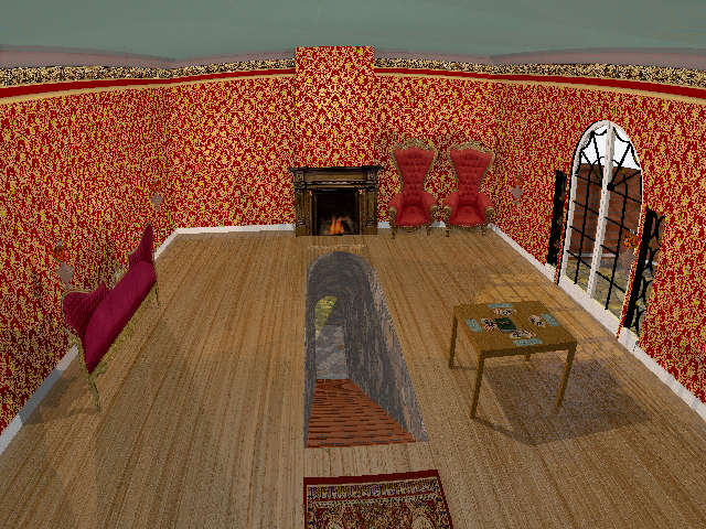
Here's what I've cobbled together with my limited skills so far.

I went with a completely literal representation of the topic.
(Hey - I actually read the book, so why not)

- The floor / tunnel are a giant block with a solid crackle pattern, a
transparent pigment, and an "inner" mortar block.
- Brick walls are macro-built (Jeff Lee) with same clear + mortar construction.

     (soot on fireplace is gradient black/clear image maps.  I need to back off
on it a bit)
- Candlesticks are from an IRTC entry
- Wood floor I think I nipped from Warp, and will be modified to give something
more suitable texture-wise and with varying individual planks
- Levitating lamps were modeled with EPSpline and lit with media, with much help
from Thomas, and which I seem to have broken. Again.
- Cards are image maps that I edited / varied in Paint.Net
- Carpet is an image map
- Furniture is all place-holder image maps until I figure out the best way to
model intricate Victorian era cruft.
- French doors and windows to the conservatory are CSG

[The thing on the floor is a label - was thinking I might put it in the scene
via screen.inc]

need to work on a card table (what's there is just a placeholder block)
My whist book got swallowed by the tabletop - oops.

Up to this point, I've mostly been working on making and including the "parts"
of the scene, and haven't devoted much time to placement, lighting, intricate
textures, etc.

Looking for comments and criticism, suggestions, inspiration, etc.
Thanks!
Post a reply to this message
Attachments:
Download 'secretpassage4.png' (1424 KB)
Preview of image 'secretpassage4.png'

|
|
| |
| |
|
|
|
|
| |
| |
|
|
Looks like it's coming along. Use a modeler for the Victorian chairs, it'll be a
lot easier than using SDL
Post a reply to this message
|
|
| |
| |
|
|
|
|
| |
| |
|
|
"jhu" <nomail@nomail> wrote:
> Looks like it's coming along. Use a modeler for the Victorian chairs, it'll be a
> lot easier than using SDL

I'm not quiet sure that a modeller would give better results. But in fact the
furniture looks a little bit displaced, especially the coach to the left, which
is a bit to flat IMO, and in a way, a bit out of the scene.


Best regards,
Michael
Post a reply to this message
|
|
| |
| |
|
|
|
|
| |
| |
|
|
"MichaelJF" <mi-### [at] t-online de> wrote:
But in fact the
> furniture looks a little bit displaced, especially the coach to the left, which
> is a bit to flat IMO, and in a way, a bit out of the scene.
The sofa and chairs are in fact infinitely flat - they're just image maps I was
using to explore what kind of furniture I might use.
By "out of the scene" - do you mean they look out of place? They don't fit the
decor of the room? It's actually a rather odd room from the description, and it
took me a while to wrap my head around its physical structure and what it
actually looked like, so there's sure to be plenty more experimentation. de> wrote:
But in fact the
> furniture looks a little bit displaced, especially the coach to the left, which
> is a bit to flat IMO, and in a way, a bit out of the scene.
The sofa and chairs are in fact infinitely flat - they're just image maps I was
using to explore what kind of furniture I might use.
By "out of the scene" - do you mean they look out of place? They don't fit the
decor of the room? It's actually a rather odd room from the description, and it
took me a while to wrap my head around its physical structure and what it
actually looked like, so there's sure to be plenty more experimentation.
Post a reply to this message
|
|
| |
| |
|
|
|
|
| |
| |
|
|
Good start. I have some misgivings about the brick walls which do not
seem very Victorian to me for indoors. See also how other camera
positions might increase the dramatic effect (cf Citizen Kane).

Thomas
Post a reply to this message
|
|
| |
| |
|
|
|
|
| |
| |
|
|
It's actually a rather odd room from the description, and it
took me a while to wrap my head around its physical structure and what it
actually looked like....

> I have some misgivings about the brick walls which do not
> seem very Victorian to me for indoors.

Right.  I wasn't really sure where to go with that, especially since it seemed
like it _should_ be out of place:

"Miss Loach's house was a mixture of old and new.  Formerly it had been
an unpretentious cottage like the others, but she had added a new wing
of red brick built in the most approved style of the jerry-builder, and
looking like the villas in the more modern parts of Rexton.  The
crabbed age and the uncultured youth of the old and new portions,
planted together cheek by jowl, appeared like ill-coupled clogs and
quite out of harmony.  The thatched and tiled roofs did not seem meet
neighbors, and the whitewash walls of the old-world cottage looked
dingy beside the glaring redness of the new villa.  The front door in
the new part was reached by a flight of dazzling white steps.  From
this, a veranda ran across the front of the cottage, its rustic posts
supporting rose-trees and ivy.  On the cottage side appeared an old
garden, but the new wing was surrounded by lawns and decorated with
carpet bedding.  A gravel walk divided the old from the new, and
intersected the garden.  At the back, Susan noted again the high brick
wall surrounding the half-completed mansion.  Above this rose tall
trees, and the wall itself was overgrown with ivy."

"The floor was of oak, and there was--strangely enough--no
hearth-stone.  The French windows opened into the conservatory, now
denuded of its flowers, and stepping into this Jennings found that the
glass roof was entirely closed, save for a space for ventilation."

> See also how other camera positions might increase the dramatic effect
> (cf Citizen Kane).

Hmmm.  I'll be the first to admit that I have no skill with, or natural sense
about how to go about lighting or framing most scenes.  I'm sure most of the
artistic details concerning CK's cinematography were lost on me, so I might have
to cue it up again and actually observe more rather than just "watch" it.
My first camera was placed to the right of the passage, since for whatever
reason I had it in my mind that that's where the door to the room was, and then
I moved it to give a better view angle for the conservatory which was the only
other major feature.

Part of my thinking was that there should be an angle that gives a decent look
down into the tunnel where the light acts as a visual cue to suggest that it
further leads to the place in the book.
Also right now, since it's still just a scene in the midst of development, I
wanted to pull the camera back and use the ultra-wide-angle camera to let me see
as many things as possible until things "got settled" and then maybe I'd run an
animation sequence to move the camera all over the place and see if anything
"popped".

I suppose the biggest thing that bothers me is the lack of contrast in the
image.  I actually made an attempt to run PowerStrip and adjust my screen gamma,
and the desktop is noticeably a bit more "washed out".

Next is the line curvature resulting from the ultra-wide camera.  Maybe I'll
have to narrow the angle or just switch back to a regular perspective.  I
haven't yet got the experience to decide.

Off the top of my head, I don't think I've done too much with textures, other
than for the paint, which is something that seems to work well enough for
another WIP, but it still too crude and "CGI-looking" for this.  IIRC I just
scaled up bumps in one direction to give the impression of brush marks.

I took a bit of a break to look over the PoitWriter code, and now I've got a bit
of gainful employment, so it might be another week yet until I delve into
hammering out a lot more SDL to flesh this thing out better.

Thanks for looking it over and helping me along.  This ought to be a good
opportunity to learn the finer POV skills and discover some new and useful tools
and methods.

I know _you guys_ get it, but it's always amusing when people see what I'm doing
and say, "WHY are you doing this...?"  :)
( .. or .. "Why are you:  photographing that brick wall / granite block /
painted wall /  textured counter in McDonalds / pebbled ashtray ???"
"Who are you calling BOZO?"
"I understood the first sentence of what you said, and then you went of onto
this solid geometry thing and isosurfaces and surface normals.... and my eyes
glazed over.   You're so pretty.")    :D

Thomas
Post a reply to this message
|
|
| |
| |
|
|
|
|
| |
| |
|
|
On 1-10-2014 15:53, Bald Eagle wrote:
> It's actually a rather odd room from the description, and it
> took me a while to wrap my head around its physical structure and what it
> actually looked like....
>
>> I have some misgivings about the brick walls which do not
>> seem very Victorian to me for indoors.
>
> Right.  I wasn't really sure where to go with that, especially since it seemed
> like it _should_ be out of place:
>
> "Miss Loach's house was a mixture of old and new.  Formerly it had been
> an unpretentious cottage like the others, but she had added a new wing
> of red brick built in the most approved style of the jerry-builder, and
> looking like the villas in the more modern parts of Rexton.  The

Definitely, this is a description oft the /outside/ of the new wing. As
is said later, there is also the contrast with the white-washed old
cottage walls, and the mismatch between the old thatched roof of the
cottage and the tiles of the new wing. So, you can choose some Victorian
wall paper now for the inside :-)

>
>> See also how other camera positions might increase the dramatic effect
>> (cf Citizen Kane).
>
> Hmmm.  I'll be the first to admit that I have no skill with, or natural sense
> about how to go about lighting or framing most scenes.  I'm sure most of the
> artistic details concerning CK's cinematography were lost on me, so I might have
> to cue it up again and actually observe more rather than just "watch" it.
> My first camera was placed to the right of the passage, since for whatever
> reason I had it in my mind that that's where the door to the room was, and then
> I moved it to give a better view angle for the conservatory which was the only
> other major feature.

Experimentation will get you to what you want. Nothing like experimentation.

>
> I suppose the biggest thing that bothers me is the lack of contrast in the
> image.  I actually made an attempt to run PowerStrip and adjust my screen gamma,
> and the desktop is noticeably a bit more "washed out".

Yes, that is something to pay attention to. The scene looks pale as if
there is too much ambient to the textures' finish. You should certainly
consider if you do not need a fade distance and power for the inside
light(s). I suppose there is also sunlight outside?

> Thanks for looking it over and helping me along.  This ought to be a good
> opportunity to learn the finer POV skills and discover some new and useful tools
> and methods.

We are here to serve.

>
> I know _you guys_ get it, but it's always amusing when people see what I'm doing
> and say, "WHY are you doing this...?"  :)
> ( .. or .. "Why are you:  photographing that brick wall / granite block /
> painted wall /  textured counter in McDonalds / pebbled ashtray ???"
> "Who are you calling BOZO?"
> "I understood the first sentence of what you said, and then you went of onto
> this solid geometry thing and isosurfaces and surface normals.... and my eyes
> glazed over.   You're so pretty.")    :D

Lol. Very familiar indeed.

Thomas
Post a reply to this message
|
|
| |
| |
|
|
|
|
| |
| |
|
|
"Bald Eagle" <cre### [at] netscapenet> wrote:
> Here's what I've cobbled together with my limited skills so far.
>
> Looking for comments and criticism, suggestions, inspiration, etc.
> Thanks!

It is a start, other than the obvious 2D elements that you are still to model
the textures of the other parts need a bit of work, the bricks are too linear
also, as has been mentioned don't really fit the rest of the scene/period you
are aiming for. Also, not too sure about the metal work around the patio doors,
I don't think I have ever seen anything like this.

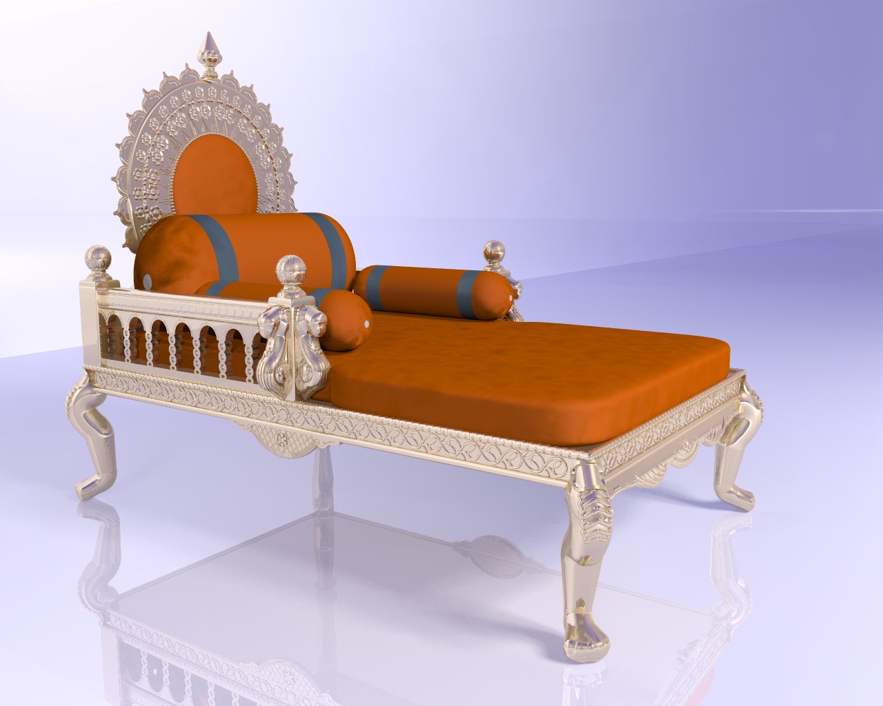
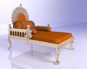
If you want I have an old model of a chair/throne (made way back in about 1998)
it is not exactly what you have but seeing your 2D version reminded me of this
one and I still have the source (although this was before I even knew how to use
macros/while loops in POV so lots of cut and paste was involved so it may be
very difficult to modify).

See image attached.

Look forward to seeing this improve as there is plenty of time still before the
deadline.

Sean
Post a reply to this message
Attachments:
Download 'throne.jpg' (116 KB)
Preview of image 'throne.jpg'
|
|
| |
| |
|
|
|
|
| |
| |
|
|
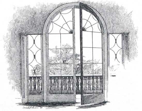
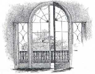
> Also, not too sure about the metal work around the patio doors,
> I don't think I have ever seen anything like this.

well, not having any real idea what constituted a "conservatory", neither did I,
but I searched around to get an overall idea of what a Victorian conservatory
might look like, and went with the attached design.


> If you want I have an old model of a chair/throne (made way back in about 1998)
> it is not exactly what you have but seeing your 2D version reminded me of this
> one and I still have the source (although this was before I even knew how to use
> macros/while loops in POV so lots of cut and paste was involved so it may be
> very difficult to modify).

Holy smokes.  That must have been a really massive investment of time and
brainpower!
I'd be happy to model my own, if the investment in time doesn't outweigh all
else, though I'll need to figure out how to get a nice clean flow to something
so elegantly carved and organic in shape.  I might have an easier time doing it
for real with chisels and gouges.

If I'm not AFK due to work IRL, then I'll make a stab at working on constructing
scene elements, experimenting with camera angle and lighting, and enriching my
good-enough-to-get-the-idea textures.  :)
Post a reply to this message
Attachments:
Download '945_french_window_in_taylor_house.jpg' (45 KB)
Preview of image '945_french_window_in_taylor_house.jpg'
|
|
| |
| |
|
|
|
|
| |
| |
|
|
"Bald Eagle" <cre### [at] netscapenet> wrote:
>
> well, not having any real idea what constituted a "conservatory", neither did I,
> but I searched around to get an overall idea of what a Victorian conservatory
> might look like, and went with the attached design.
>

Well, I like the sketch/design and it does look Victorian so I think it might be
the brick wall around it in your image that is making it look out of place.

>
> Holy smokes.  That must have been a really massive investment of time and
> brainpower!

Oh yes, back in the days when I had time to spend ages modelling (but not enough
time to RTM and workout how to use loops ;-)

> If I'm not AFK due to work IRL, then I'll make a stab at working on constructing
> scene elements, experimenting with camera angle and lighting, and enriching my
good-enough-to-get-the-idea textures.
 :)

Always the problem I have commenting on WIP's, I never am quite sure what part
are more WIP than others ;-)

Sean
Post a reply to this message
|
|
| |
| |
|
|
|
|
| |
| |
|
|
> Well, I like the sketch/design and it does look Victorian so I think it might be
> the brick wall around it in your image that is making it look out of place.

I don't have a firm idea of what Victorian looks like vs Edwardian or
Kardashian....  :)


> Always the problem I have commenting on WIP's, I never am quite sure what part
> are more WIP than others ;-)

It's all up for grabs at this point.  Have at it.
Other than the French doors that I'm not up for remodeling right now, and the
basic tunnel, it's all pretty much just a sketch with some texturing.

I'm looking to redo the room in wallpaper as suggested, add curtains, framed
paintings and mirrors, jazz up the fireplace with an ornate hearth and some
brass fireplace tools, do some work on the card table, and then maybe redo the
lighting.  I need some plants in the conservatory as well.

I'm not sure I'm happy with the little desk-lamps - I might see if I can do
something ceiling-mounted.

Part of why I wanted to take a stab at this is to learn how to do certain
things, do them better, and do them FASTER.  So, other than just the usual
comments and suggestions about the scene and its elements, I'm open and happy to
hear any and all suggestions about how to envision, arrange, and construct a
scene, lay out my SDL for efficient editing and revision, and where I can
benefit by using macros, loops, and interesting "tricks" folks have developed
throughout the years.  I'm loving the ability to render only a small section of
the WIP by selecting a box or using the command line options.  I haven't really
used Quick Colors, but often find myself rendering at Q5 - though that really
freaks me out sometimes when I forget it's set to that and certain features
(obviously) don't show up or are black).  Classic noob stuff.  :D
Post a reply to this message
|
|
| |
| |
|
|
|
|
| |
| |
|
|
So, I've spent a little while reworking some of this, and the thing that struck
me is how rich the image maps come out, and how dull and lifeless the
eye-dropper tool sampled rgb colors come out when I try to incorporate them into
a color map.

Maybe it's related to my monitor / gamma / contrast (non)issue, maybe I'm doing
something wrong using (rgb_value/255), or maybe it's just an optical effect of
not having any real texturing of the basic pigment.
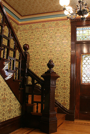
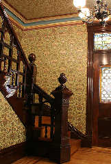
Whatever's going on, my floor is NOT coming out anywhere close to the rich honey
yellow of the reference photo.
I could use some schooling in this area if anyone has any experience/insights.

See the wood floor I color-sampled compared to the present WIP.

I DID notice that moving the order of the colors around in the color map can
have an interesting effect, though I haven't stumbled upon what I'd like yet.

#declare OakFloor = texture {
   pigment {bozo scale <1, 1, 10> color_map {
   [0.0 rgb <121/255,  52/255, 13/255> * Tone]
   [0.2 rgb <142/255,  73/255, 18/255> * Tone]
   [0.4 rgb <184/255, 115/255, 48/255> * Tone]
   [0.6 rgb <157/255,  81/255, 23/255> * Tone]
   [0.8 rgb <108/255,  45/255,  4/255> * Tone]
   [1.0 rgb <156/255,  72/255, 26/255> * Tone]
   }
  turbulence 0.5
  scale <1, 1, 10> * 0.5
  rotate y*YRotate
  }
Post a reply to this message
Attachments:
Download 'secretpassage6.png' (646 KB)
Preview of image 'secretpassage6.png'

|
|
| |
| |
|
|
|
|
| |
| |
|
|
Reference:
Post a reply to this message
Attachments:
Download 'centennial_foyer.jpg' (137 KB)
Preview of image 'centennial_foyer.jpg'
|
|
| |
| |
|
|
|
|
| |
| |
|
|
At first glance, I would say that - as is - the /colour/ of the floor is
oak-like, although a light one. However, I think you should do a couple
of things:

1) break up the floor in individual boards. In this wip, boards are
simulated by scaling the texture to the extreme but that is not
wood-like. In the thread 'Silentium - final' I uploaded an older image
of mine (De Dulle Griet) where you can see different wood textures,
particularly the floor which is a macro originally by Dan Hentschel
which I adapted to my own needs. If you are interested, I can put it in
p.b.s-f.

2) use a wood pattern properly scaled and rotated. Now, you will soon
discover that moiree effects will appear when applied to the floor. You
will need to play with the texture's scale and/or the colour contrasts
until they disappear.

3) if you want a more honey-coloured floor I suppose you should add more
'yellow' to your texture ;-) I shall look at your texture but be
patient: I am rendering a final version of Silentium and that is taking
most of my resources for the reminder of the week.

Thomas
Post a reply to this message
|
|
| |
| |
|
|
|
|
| |
| |
|
|
On 8-10-2014 20:53, Bald Eagle wrote:
> Whatever's going on, my floor is NOT coming out anywhere close to the rich honey
> yellow of the reference photo.

Try this. I believe it comes closer to what you want:

#local Tone = <1.2, 1.2, 0.3>;
#declare OakFloor =
texture {
    pigment {
     wood
     color_map {
       [0.0 srgb <121,  52, 13>/255 * Tone]
       [0.2 srgb <142,  73, 18>/255 * Tone]
       [0.4 srgb <184, 115, 48>/255 * Tone]
       [0.6 srgb <157,  81, 23>/255 * Tone]
       [0.8 srgb <108,  45,  4>/255 * Tone]
       [1.0 srgb <156,  72, 26>/255 * Tone]
     }
     warp {turbulence <0.6, 0.1, 0.1>}
     scale <1, 1, 10>*0.5
     scale 0.3
     rotate 1*x
     rotate y*10
   }
}


You could also experiment with the following texture by Nicolas Rougier,
which is an excellent wood texture:

//============= NR_Wood (2003) =============
#declare NR_wood_grain =
pigment {
   wood
   warp {cylindrical orientation y dist_exp 1}
   warp {turbulence 1.25}
   scale <.5,30,1>
   warp {turbulence .25}
   scale <1,10,1>
   warp {
     black_hole <0, 0.5, 0>, 1
     falloff 2
     strength 1.5
     repeat 7
     turbulence 2
     inverse
   }
}

#declare NR_wood_normal =
function {
   pigment {
     wood
     warp {cylindrical orientation y dist_exp 1}
     warp {turbulence 1.25}
     scale <.5,30,1>
     warp {turbulence .25}
     scale <1,5,1>
     color_map {[0 rgb <0,0,0>] [1 rgb <1,1,1>]}
   }
}

#declare NR_woodmap =
color_map {
     [0.00 srgb <0.949, 0.792, 0.514 >]
     [0.30 srgb <0.855, 0.651, 0.376 >]
     [0.60 srgb <0.831, 0.596, 0.275 >]
     [0.90 srgb <0.620, 0.447, 0.204 >]
}

#declare NR_Wood =
texture {
   pigment {NR_wood_grain
     color_map {NR_woodmap}
     ramp_wave
   }
   normal {
     function {NR_wood_normal(x,y,z).grey*0.5
     }
   }
   finish {diffuse 0.6 specular 0.1 roughness 0.005}
}


Thomas
Post a reply to this message
|
|
| |
| |
|
|
|
|
| |
| |
|
|
Le 14-10-06 18:14, s.day a écrit :
> "Bald Eagle" <cre### [at] netscapenet> wrote:
>>
>> well, not having any real idea what constituted a "conservatory", neither did I,
>> but I searched around to get an overall idea of what a Victorian conservatory
>> might look like, and went with the attached design.
>>
>
> Well, I like the sketch/design and it does look Victorian so I think it might be
> the brick wall around it in your image that is making it look out of place.
>
>>
>> Holy smokes.  That must have been a really massive investment of time and
>> brainpower!
>
> Oh yes, back in the days when I had time to spend ages modelling (but not enough
> time to RTM and workout how to use loops ;-)
>
>> If I'm not AFK due to work IRL, then I'll make a stab at working on constructing
>> scene elements, experimenting with camera angle and lighting, and enriching my
good-enough-to-get-the-idea textures.
>   :)
>
> Always the problem I have commenting on WIP's, I never am quite sure what part
> are more WIP than others ;-)
>
> Sean
>
>
>
As you made that trone way back in 1998, i'm not sure that loops where
possible at that time. Early 3.0 or late 2.x versions.
Post a reply to this message
|
|
| |
| |
|
|
|
|
| |
| |
|
|
Le 14-10-08 14:53, Bald Eagle a écrit :
> So, I've spent a little while reworking some of this, and the thing that struck
> me is how rich the image maps come out, and how dull and lifeless the
> eye-dropper tool sampled rgb colors come out when I try to incorporate them into
> a color map.
>

When using the eye-dropper, it's often good to, at least slightly, blur
the image.
Another thing to do is to zoom in by a large value. Here, zooming by 10x
or more can realy help.

You can always add a "varnish" to your floor by adding a layered texture
with a fully filtering yellow/golden hue. That top layer can also be
used to controll the reflection and highlights.
Post a reply to this message
|
|
| |
| |
|
|
|
|
| |
| |
|
|
I'm about done with edits for the day.

Thomas - thank you for sharing some of your texture collection.  I took some
time and fiddled with the second texture, jimmied the color map, and scaled it.
That seemed to give me a good start.
Laid down a loop of randomized boards for the floor - still needs work, I'd say.

Worked on the border and molding at the top of the fireplace.  Too stupid today
to difference the bevels.  Sometimes it's the simplest things that thwart me.
:\

Brick step texture is still botched.

Edited both stones.inc files to change everything to srgbt - maybe there's a
difference, but it's small.  Might have to snip out the ones I'm using and tweak
all of those textures in a special include file.

Tomorrow I think I'm going to work on adding ceiling fixtures and seeing what I
can do to make some real furniture.  THAT's gonna be a bit of a sticky wicket
for sure.

I was thinking about UV-mapping an SDL object with a ceiling medallion, but that
turned out to be an exercise in mind-bending frustration.  So many mapping types
and options and how to go about nesting what in what...

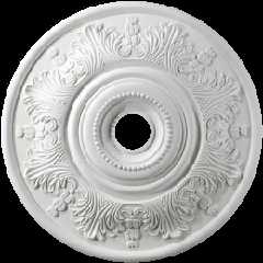
Is there a complete list of the mapping types?  all I found was

2.7.4.2 Map type constants
Plane_Map = 0
Sphere_Map = 1
Cylinder_Map = 2
Torus_Map = 5

But the docs say there is mapping for
bicubic_patch, box, lathe, sor, mesh, mesh2, ovus, parametric, sphere, and
torus.  What are the numerical constants for these?
Post a reply to this message
Attachments:
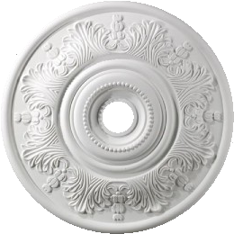
Download 'medallion1.png' (82 KB)
Preview of image 'medallion1.png'
|
|
| |
| |
|
|
|
|
| |
| |
|
|
Am 10.10.2014 05:45, schrieb Bald Eagle:

> I was thinking about UV-mapping an SDL object with a ceiling medallion, but that
> turned out to be an exercise in mind-bending frustration.  So many mapping types
> and options and how to go about nesting what in what...
>
> Is there a complete list of the mapping types?  all I found was
>
> 2.7.4.2 Map type constants
> Plane_Map = 0
> Sphere_Map = 1
> Cylinder_Map = 2
> Torus_Map = 5
>
> But the docs say there is mapping for
> bicubic_patch, box, lathe, sor, mesh, mesh2, ovus, parametric, sphere, and
> torus.  What are the numerical constants for these?

These are two separate things:

(1) In POV-Ray, the concept of a texture is generally 3-dimensional;
objects can be thought of as being cut out of a 3D material. This is
also true when you use an image_map: The 2D texture is "extruded" into
the 3rd dimension, normally using a simple orthographic projection. The
map_type can be used to change this projection.

(2) UV-mapping takes a single slice of a (3D) texture, and maps it onto
the surface of a given geometric primitive according to rules specific
to that primitive. There is generally no way to change this mapping,
unless the primitive explicitly allows to specify UV mapping coordinates
(such as mesh or mesh2).

Normally, when you use UV-mapping, you specifiy map_type 0 (or no
map_type at all, as it is the default), so that the texture slice taken
for the UV mapping is identical with the original image.
Post a reply to this message
|
|
| |
| |
|
|
|
|
| |
| |
|
|
clipka <ano### [at] anonymousorg> wrote:

> These are two separate things:

Well, ok, my original statement should have been "somehow mapping" instead of
specifically uv-mapping, it just came out that way since I intuited that the uv
method might be best suited.  :)

The counting still seems weird, like the way ACLU or Microsoft counts.  0, 1, 2,
5.  Who do I need to have induct me into the inner circle, what blood sacrifice
needs to be made for me to pierce the veil of the Inner Mysteries of POV-Ray
mapping codes?  Are those missing constants are only known to the 3&4th Degree
Master Masons?  I'm guessing they map a _pyramidal_ sweep, or the obverse of
worthless Federal Reserve Notes...


I might see if I can mesh model something, but I haven't really ever used a mesh
modeler.  Not looking forward to making all those acanthus leaves and
scrollwork...
A heightfield might give me something I could image map just to see if I like
one particular design more than another.  Though a nicely shaded planar image
map would likely serve the same purpose.

Lastly, I was toying with cobbling together an SDL object that would mimic the
gross contours of the object and then image map over that to quickly give a
textured object with an actual 3D shape.  Worth doing?

{"No, you dolt - use a modeler, or perform another blood sacrifice and be
inculcated with the sacred power of POV SDL....")
Post a reply to this message
|
|
| |
| |
|
|
|
|
| |
| |
|
|
Insufficient coffee made me forget to ask about scaling and repeating the image
mapping by omitting once and perhaps doing other clever things...
Post a reply to this message
|
|
| |
| |
|
|
|
|
| |
| |
|
|
On 10-10-2014 15:45, Bald Eagle wrote:
> I might see if I can mesh model something, but I haven't really ever used a mesh
> modeler.  Not looking forward to making all those acanthus leaves and
> scrollwork...

Both methods (sdl or modeller) have their pro and cons. With both you
need only to model a small part of the object and then copy
 >mirror>paste that to obtain the final result, with the better
alternative being: doing those last actions in POV-Ray. . I think that
sdl would take a little more time to get there but the basic workflow is
the same. For really complex models mesh2 models are to be preferred to
sdl models as they can be significantly faster to render. However, that
is less of an issue nowadays with faster PC's.

> A heightfield might give me something I could image map just to see if I like
> one particular design more than another.  Though a nicely shaded planar image
> map would likely serve the same purpose.

Yes, but you need a good quality height map for your height_field and
that is a bit more difficult to achieve imo.

>
> Lastly, I was toying with cobbling together an SDL object that would mimic the
> gross contours of the object and then image map over that to quickly give a
> textured object with an actual 3D shape.  Worth doing?

Yes, worth the try if the object is not too prominent in the camera view.

>
> {"No, you dolt - use a modeler, or perform another blood sacrifice and be
> inculcated with the sacred power of POV SDL....")

I would do both, which means /two/ blood sacrifices of course as you
need the infernal modeller powers too... ;-)

Thomas
Post a reply to this message
|
|
| |
| |
|
|
|
|
| |
| |
|
|
On 10-10-2014 16:09, Bald Eagle wrote:
> Insufficient coffee made me forget to ask about scaling and repeating the image
> mapping by omitting once and perhaps doing other clever things...
>

Hmm. If considering your image, which is circular, I guess you will need
'once'...

Thomas
Post a reply to this message
|
|
| |
| |
|
|
|
|
| |
| |
|
|
Thomas de Groot <tho### [at] degrootorg> wrote:

> Hmm. If considering your image, which is circular, I guess you will need
> 'once'...

I was thinking that since it's circular, if I had it repeat across the surface
so that I had 2 full images, each hemispherical, then I could map it onto an
oblate spheroid and then bury it halfway into the ceiling.

So there.

With regard to blood sacrifice, clipka has slayed the Gamma Dragon, so now
THAT's not an option.  Somehow Spline Ducks don't quite have the same sense of
grandeur.  But then..  wait ...  yes!  The Stanford Chocolate Bunny!!!

Bring out the Holy Hand Grenade!
Post a reply to this message
|
|
| |
| |
|
|
|
|
| |
| |
|
|
On 10/10/14 15:48, Bald Eagle wrote:
>
> Bring out the Holy Hand Grenade!
>

And the LORD spake, saying, "First shalt thou take out the Holy Pin,
then shalt thou count to three, no more, no less.
Three shall be the number thou shalt count, and the number of the
counting shall be three.
Four shalt thou not count, neither count thou two, excepting that thou
then proceed to three.
Five is right out.
Once the number three, being the third number, be reached, then lobbest
thou thy Holy Hand Grenade of Antioch towards thy foe, who being naughty
in My sight, shall snuff it.

John (Bishop of Antioch)
--
Protect the Earth
It was not given to you by your parents
You hold it in trust for your children
Post a reply to this message
|
|
| |
| |
|
|
|
|
| |
| |
|
|
Am 10.10.2014 15:45, schrieb Bald Eagle:

> The counting still seems weird, like the way ACLU or Microsoft counts.  0, 1, 2,
> 5.  Who do I need to have induct me into the inner circle, what blood sacrifice
> needs to be made for me to pierce the veil of the Inner Mysteries of POV-Ray
> mapping codes?  Are those missing constants are only known to the 3&4th Degree
> Master Masons?  I'm guessing they map a _pyramidal_ sweep, or the obverse of
> worthless Federal Reserve Notes...

Well, the truth about those missing values is more along the profane
Microsoft lines: They have been reserved for /some/ other fancy mappings
since so long ago - without ever actually being implemented - that even
the memory of /what/ mappings those were supposed to be is lost in the
absorbing and scattering media of time.


> Lastly, I was toying with cobbling together an SDL object that would mimic the
> gross contours of the object and then image map over that to quickly give a
> textured object with an actual 3D shape.  Worth doing?

Worth trying at least.
Post a reply to this message
|
|
| |
| |
|
|
|
|
| |
| |
|
|
> Well, the truth about those missing values is more along the profane
> Microsoft lines: They have been reserved for /some/ other fancy mappings
> since so long ago - without ever actually being implemented - that even
> the memory of /what/ mappings those were supposed to be is lost in the
> absorbing and scattering media of time.

Yes, I've had a number of "This Space Reserved" issues.
Now if only I'd taken that 2 seconds to add the comment in the code...

This also makes me wonder of you can map things onto media....  :O


> Worth trying at least.

Touche'.

I've hand coded my ceiling lamps out of spheres, cylinders, cones, and sphere
sweeps, so now I'm going to take a whack at the medallion.  I might see if I
have enough interconnecting brain cells to plot pixels varying in grayscale
value with the sine of the distance from the origin, make that a heightfield,
and then slap my image map onto that...
Post a reply to this message
|
|
| |
| |
|
|
|
|
| |
| |
|
|
Am 10.10.2014 22:04, schrieb Bald Eagle:
>
>
>> Well, the truth about those missing values is more along the profane
>> Microsoft lines: They have been reserved for /some/ other fancy mappings
>> since so long ago - without ever actually being implemented - that even
>> the memory of /what/ mappings those were supposed to be is lost in the
>> absorbing and scattering media of time.
>
> Yes, I've had a number of "This Space Reserved" issues.
> Now if only I'd taken that 2 seconds to add the comment in the code...
>
> This also makes me wonder of you can map things onto media....  :O

Well, you can use patterns to control the density.


>> Worth trying at least.
>
> Touche'.
>
> I've hand coded my ceiling lamps out of spheres, cylinders, cones, and sphere
> sweeps, so now I'm going to take a whack at the medallion.  I might see if I
> have enough interconnecting brain cells to plot pixels varying in grayscale
> value with the sine of the distance from the origin, make that a heightfield,
> and then slap my image map onto that...

Function image, maybe? (You can generate an internal greyscale image
from a function, and use that as input for a height field.)

Isosurface?

Parametric?

Lathe?
Post a reply to this message
|
|
| |
| |
|
|
|
|
| |
| |
|
|
clipka <ano### [at] anonymousorg> wrote:

> Function image, maybe? (You can generate an internal greyscale image
> from a function, and use that as input for a height field.)

http://www.povray.org/documentation/view/3.6.0/379/
That was an option I was unaware of.  Too much cool stuff to play with!  :)

> Isosurface?
That could totally be a very cool option considering what I've seen people do
with isosurfaces.  Especially since it's a small scene element and so might not
be a huge bottleneck.

> Parametric?
> Lathe?

Both good suggestions I'll have to explore.

With regard to the complex topology of some of the furniture, I'm wondering if
something like a sphere sweep would get me the bulk of what I was aiming for
quickly - especially in the case of the scroll work.  IIRC, there's a "cone
sweep" - is there a cylinder sweep?  blob sweep?
I suppose those are all just specific instances of "follow this spline and plot
this object{X} at the current point", so I could try and code that generalized
case by hand...

Thanks for the suggestions as always.  There are few threads I fail to profit
from in some way.

{Have a great weekend everyone!}
Post a reply to this message
|
|
| |
| |
|
|
|
|
| |
| |
|
|
Le 14-10-10 10:48, Bald Eagle a écrit :
> Thomas de Groot <tho### [at] degrootorg> wrote:
>
>> Hmm. If considering your image, which is circular, I guess you will need
>> 'once'...
>
> I was thinking that since it's circular, if I had it repeat across the surface
> so that I had 2 full images, each hemispherical, then I could map it onto an
> oblate spheroid and then bury it halfway into the ceiling.
>
> So there.
>
> With regard to blood sacrifice, clipka has slayed the Gamma Dragon, so now
> THAT's not an option.  Somehow Spline Ducks don't quite have the same sense of
> grandeur.  But then..  wait ...  yes!  The Stanford Chocolate Bunny!!!
>
> Bring out the Holy Hand Grenade!
>
Take a simple sphere, unevently scalled, and simply apply your image to
it as an image_map.
Something like this:

sphere{0, 1 scale <1,1, 0.2>
  pigment{
   image_map{ png "Medaillon1.png" translate -0.5 scale 2}
  rotate 90*x
  rotate y*Light_source_Fudge_Angle
  translate Final_Location
}

As the image is scaled to the same dimention as the sphere, you don't
need to use once.

Now, you only need to make sure that it's correctly oriented relative
the dominent light source so that the shadowings are coherent.

A beter way would be to create a hightfield of your medaillon and use
water_level to cut out the base. That way, the shadows will always be
correct.


Alain
Post a reply to this message
|
|
| |
| |
|
|
|
|
| |
| |
|
|
Le 14-10-10 22:26, Bald Eagle a écrit :
> clipka <ano### [at] anonymousorg> wrote:
>
>> Function image, maybe? (You can generate an internal greyscale image
>> from a function, and use that as input for a height field.)
>
> http://www.povray.org/documentation/view/3.6.0/379/
> That was an option I was unaware of.  Too much cool stuff to play with!  :)
>
>> Isosurface?
> That could totally be a very cool option considering what I've seen people do
> with isosurfaces.  Especially since it's a small scene element and so might not
> be a huge bottleneck.
>
>> Parametric?
>> Lathe?
>
> Both good suggestions I'll have to explore.
>
> With regard to the complex topology of some of the furniture, I'm wondering if
> something like a sphere sweep would get me the bulk of what I was aiming for
> quickly - especially in the case of the scroll work.  IIRC, there's a "cone
> sweep" - is there a cylinder sweep?  blob sweep?

No and No.

> I suppose those are all just specific instances of "follow this spline and plot
> this object{X} at the current point", so I could try and code that generalized
> case by hand...
>
> Thanks for the suggestions as always.  There are few threads I fail to profit
> from in some way.
>
> {Have a great weekend everyone!}
>
>

The cone sweep is only for prism. It makes the edges converge toward a
point. Good to create a pyramid.

In a sphere_sweep, each point require a radius. That radius can be
negative causing a pinch point in the sweep. OTH, each component can
only be perfectly spherical, NO scalling of any kind and NO other transform.

For a scroll, one option would be to use a sphere_sweep with components
having a very small radius, then, to apply very uneven scalling.
Something like using a radius on 0.001 unit and all points in the same
plane, then scalling by something like <1,1, 300000>.
If you only give 2D coordinates, the Z coordinate should default to zero.
Post a reply to this message
|
|
| |
| |
|
|
|
|
| |
| |
|
|
On 11-10-2014 22:16, Alain wrote:
> A beter way would be to create a hightfield of your medaillon and use
> water_level to cut out the base. That way, the shadows will always be
> correct.

The drawback of this is that the shadows from the light source are
incorporated into the height_field. The result may not be what you expect.

Thomas
Post a reply to this message
|
|
| |
| |
|
|
|
|
| |
| |
|
|
Le 14-10-12 03:18, Thomas de Groot a écrit :
> On 11-10-2014 22:16, Alain wrote:
>> A beter way would be to create a hightfield of your medaillon and use
>> water_level to cut out the base. That way, the shadows will always be
>> correct.
>
> The drawback of this is that the shadows from the light source are
> incorporated into the height_field. The result may not be what you expect.
>
> Thomas
>
>

I should have precised that the hight_field should be made from another
source image. That image should not rely on any light source to show the
relief.
Post a reply to this message
|
|
| |
| |
|
|
|
|
| |
| |
|
|
OK, after I got that all squared away, I worked out a shape that very closely
approximates the curvature of the actual medallion, and then after some further
frustration in trying to get THAT mapped it looks pretty good.

Left and top is the hemispheroid, and right, center, and bottom are the modeled
medallion shape.
Post a reply to this message
Attachments:
Download 'medallionfunction.png' (143 KB)
Preview of image 'medallionfunction.png'

|
|
| |
| |
|
|
|
|
| |
| |
|
|
On 13-10-2014 3:10, Bald Eagle wrote:
> OK, after I got that all squared away, I worked out a shape that very closely
> approximates the curvature of the actual medallion, and then after some further
> frustration in trying to get THAT mapped it looks pretty good.
>
> Left and top is the hemispheroid, and right, center, and bottom are the modeled
> medallion shape.
>

Yes, this will certainly do indeed.

Thomas
Post a reply to this message
|
|
| |
| |
|
|
|
|
| |
| |
|
|
Fireplace Mantel modeled in SDL.
Still needs a bit of touch-up.
Post a reply to this message
Attachments:
Download 'mantel.png' (248 KB)
Preview of image 'mantel.png'

|
|
| |
| |
|
|
|
|
| |
| |
|
|
On 14-10-2014 6:46, Bald Eagle wrote:
> Fireplace Mantel modeled in SDL.
> Still needs a bit of touch-up.
>

Nice!

Thomas
Post a reply to this message
|
|
| |
| |
|
|
|
|
| |
| |
|
|
Is there any explanation for why the emissive media lamp looks lit from this
angle, and not the others?

I'm having trouble also with trying to get the new ceiling fixtures lit.
Post a reply to this message
Attachments:
Download 'secretpassage_lit_lamp.png' (441 KB)
Preview of image 'secretpassage_lit_lamp.png'

|
|
| |
| |
|
|
|
|
| |
| |
|
|
On 15-10-2014 0:14, Bald Eagle wrote:
> Is there any explanation for why the emissive media lamp looks lit from this
> angle, and not the others?
>
> I'm having trouble also with trying to get the new ceiling fixtures lit.
>
>
I am not sure if an emissive media is appropriate for that. Why not use
a pointlight with fade distance, and an opaline glass?

Thomas
Post a reply to this message
|
|
| |
| |
|
|
|
|
| |
| |
|
|
Thomas de Groot <tho### [at] degrootorg> wrote:

> I am not sure if an emissive media is appropriate for that. Why not use
> a pointlight with fade distance, and an opaline glass?

Oh, believe me, the first thing I did was add a light source to the center of
the emissive media, and then delete the media and keep the light source...
I'm sure it's some ridiculous error I'm making - I keep hunting it down - I
often spot these things (late) at night and am too stupefied to work them out.

New day, new coffee.   A POVving I will go...
Post a reply to this message
|
|
| |
| |
|
|
|
|
| |
| |
|
|
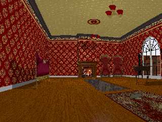
Update with CSG mantel, fireplace tools, CSG card table, and a few other minor
fixes.  Working on the more complex furniture now...
Post a reply to this message
Attachments:
Download 'secretpassage.png' (834 KB)
Preview of image 'secretpassage.png'
|
|
| |
| |
|
|
|
|
| |
| |
|
|
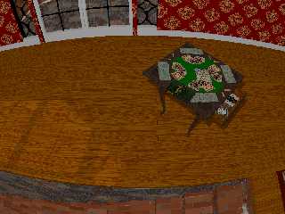
Table top rotates 45 degrees and table leaves fold out.
Drawer opens, with card game stuff inside.
Post a reply to this message
Attachments:
Download 'secretpassage_cardtable2.png' (608 KB)
Preview of image 'secretpassage_cardtable2.png'
|
|
| |
| |
|
|
|
|
| |
| |
|
|
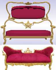
Working on a rudimentary framework for the sofa.
Could use some constructive (<---  Ha! :D  ) feedback on how to go about
creating the curved back, the dimples in the rear cushion {can I use multiple
black hole warps?), less rounded profiles, and the general ornate cruftwork.

Ja, Ich liebe das musik band "Kruftwerk"!
Post a reply to this message
|
|
| |
| |
|
|
|
|
| |
| |
|
|
Post a reply to this message
Attachments:
Download 'sofawip.png' (372 KB)
Preview of image 'sofawip.png'
|
|
| |
| |
|
|
|
|
| |
| |
|
|
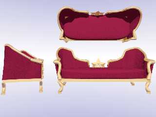
I got a lot of the sofa worked out - this spline business can be confusing as
all get-out for me sometimes.

There's still a few small issues with coverage, but it looks good from where my
camera is located...  ;)

Made entirely with CSG:  hand-coded sphere sweeps, splines, blobs, cylinders,
boxes and a superellipsoid.
Post a reply to this message
Attachments:
Download 'sofa_q9.png' (257 KB)
Preview of image 'sofa_q9.png'
|
|
| |
| |
|
|
|
|
| |
| |
|
|
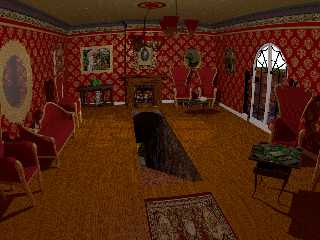
Current state of the WIP:

CSG Sofa and chairs
Mirrors and frames
Sepia-toned (in POV-Ray) photos with some speckled masking
CSG tables
CSG mantel and tools
Lots of minor tweaks in construction and texturing
Rendered on 1024 x 768 aa0.3 and using radiosity

I must admit - the radiosity is a very nice lighting enhancement, and really
makes the tunnel look much better and gives much better definition to many of
the objects in the room.

Some of the objects still are dull / washed out/ fuzzy / flat as compared to
when rendered as an include file WIP in empty space with only a bright sky
sphere - so I'm guessing that maybe I'll have to do some serious lighting work
to provide what is lacking.

Please chime in with constructive criticism - I think I have something perfectly
adequate and acceptable, but I'd honestly have to give much of the credit to all
of the contributors to the POV-Ray project - providing the tools to make POV-Ray
do what it can do - not due to any innate talent of mine.

So, I'm looking to hear about what I can do to really raise the level of quality
since I think I'm done modeling the bulk of the _things_ and can begin shifting
more of my focus to the crafting of textures normals and finishes, camera angle,
lighting, radiosity, HDRI lighting, media, etc.

Thanks so much to everyone so far - I'm starting to "get" a lot more of this.
Post a reply to this message
Attachments:
Download 'secretpassage_radiosity.png' (1293 KB)
Preview of image 'secretpassage_radiosity.png'
|
|
| |
| |
|
|
|
|
| |
| |
|
|
This is coming on very nicely indeed. Good progress!

I have a couple of (minor) comments.

- Nitpicking. The rod from the farthest ceiling fixture aligns too well
with the frame edge of the portrait over the mantelpiece. This is not
vital but it catches the eyes (mine at least). just shift the camera, or
the frame, or the lamp a little bit, whichever is best.

- The big mirror over the couch seem a bit flat to me.

- the carpet could use a bit of (more) thickness/fluffiness.

- The lighting of the scene. Much better than before but I am not sure
where the light is coming from now. Somewhere in between the two light
fixtures? In the final version I suppose you will light the lamps
themselves?

- The tunnel entrance. Shouldn't there not be some way to show /how/ the
entrance is closed? I suppose there should be some notches along the
edges for the missing boards. Nitpicking: The floor boards being aligned
parallel to the entrance, the closing lid must be especially reinforced
in order to remain rigid when somebody walks over it ;-)

- Detail. Could you give the painting of the lady with the flowers some
painterly aspect? It looks too much like a photograph to me but that
might be the effect of the distance. Impressionism would be the way to
go for the time period and the subject matter.

Thomas
Post a reply to this message
|
|
| |
| |
|
|
|
|
| |
| |
|
|
"Bald Eagle" <cre### [at] netscapenet> wrote:
> I must admit - the radiosity is a very nice lighting enhancement, and really
> makes the tunnel look much better and gives much better definition to many of
> the objects in the room.

Radiosity is almost always a dramatic improvement.  It gives depth to shadowed
areas.  Ambient occlusion (which falls out of radiosity) is a part of life, and
scenes look flat without it.

> Please chime in with constructive criticism - [snip]
>
> So, I'm looking to hear about what I can do to really raise the level of quality
> since I think I'm done modeling the bulk of the _things_ and can begin shifting
> more of my focus to the crafting of textures normals and finishes, camera angle,
> lighting, radiosity, HDRI lighting, media, etc.

The mirror on the left is too flush with the wall, and the reflection is too
cloudy (unless you intend it to be a very dingy mirror).

If that's sunlight coming through the door on the right, it needs to be /a lot/
stronger.

With the floor flush with the walls of the passage, how does the lid support
itself?
Post a reply to this message
|
|
| |
| |
|
|
|
|
| |
| |
|
|
Thomas de Groot <tho### [at] degrootorg> wrote:
>The rod from the farthest ceiling fixture...

I'll see what I can do about that.

> - The big mirror over the couch seem a bit flat to me.

It does, doesn't it.  It actually does have depth, but for some reason this
camera angle makes it look bad.

> - the carpet could use a bit of (more) thickness/fluffiness.

Yes, I need to do something with that for sure.

> - The lighting of the scene. Much better than before but I am not sure
> where the light is coming from now. Somewhere in between the two light
> fixtures? In the final version I suppose you will light the lamps
> themselves?
Correct.  My "WIP light".  I'm going to take a stab at getting those ceiling
lamps illuminated from within and see what sort of light they throw.


> - The tunnel entrance. Shouldn't there not be some way to show /how/ the
> entrance is closed? I suppose there should be some notches along the
> edges for the missing boards.
It is a bit mirky as to the mechanism - and there certainly aren't any visual
cues to suggest that where the entrance IS, the carpet USED TO BE.
Here and there I considered doing SOMETHING - I just haven't really latched onto
WHAT.
"Notches" - like tongue-and-groove?

> Nitpicking: The floor boards being aligned
> parallel to the entrance, the closing lid must be especially reinforced
> in order to remain rigid when somebody walks over it ;-)
It's about 2 full inches thick, so I figured that maybe there were
through-dowels or threaded rods or something.
There's actually a small ledge of stone on either side of the tunnel that the
sliding floor panel rests on - I suppose I ought to accentuate that, put a rail,
some rollers, a latch - something

> - Detail. Could you give the painting of the lady with the flowers some
> painterly aspect? It looks too much like a photograph to me but that
> might be the effect of the distance. Impressionism would be the way to
> go for the time period and the subject matter.

Good instinct - I felt it far too "clean" as well - and I like the simu-paint
idea.  I'll have to go back and look over that recent thread.
I hadn't the energy to mess with it prior to rendering it with radiosity since I
had only just emerged from a long and arduous debugging of my
Frame-plus-mirror/picture code.
It still seems a bit lacking and likely needs an overhaul.

Lesson learned: missing or flat-out wrong parentheses and curly braces are
annoying.  MISPLACED curly braces that allow the scene to render but don't give
you what you want can make you question your eyesight and sanity.
Post a reply to this message
|
|
| |
| |
|
|
|
|
| |
| |
|
|
"Cousin Ricky" <rickysttATyahooDOTcom> wrote:

> The mirror on the left is too flush with the wall, and the reflection is too
> cloudy (unless you intend it to be a very dingy mirror).

I don't know why that is, since it should be exactly the same texture as the
mirror in the back left corner.
From an earlier state:
http://postimg.org/image/omlhifip1/

> If that's sunlight coming through the door on the right, it needs to be /a lot/
> stronger.

Yes, lighting is indeed something that's only been done with makeshift
"worklights"  up until now - and so begins a whole new phase of learning and
experimentation.

> With the floor flush with the walls of the passage, how does the lid support
> itself?

"CG magic."  ;)

(See above - it has an inadequately visible ledge.)
Post a reply to this message
|
|
| |
| |
|
|
|
|
| |
|
|