|
|
|
|
|
|
| |
| |
|
|
|
|
| |
| |
|
|
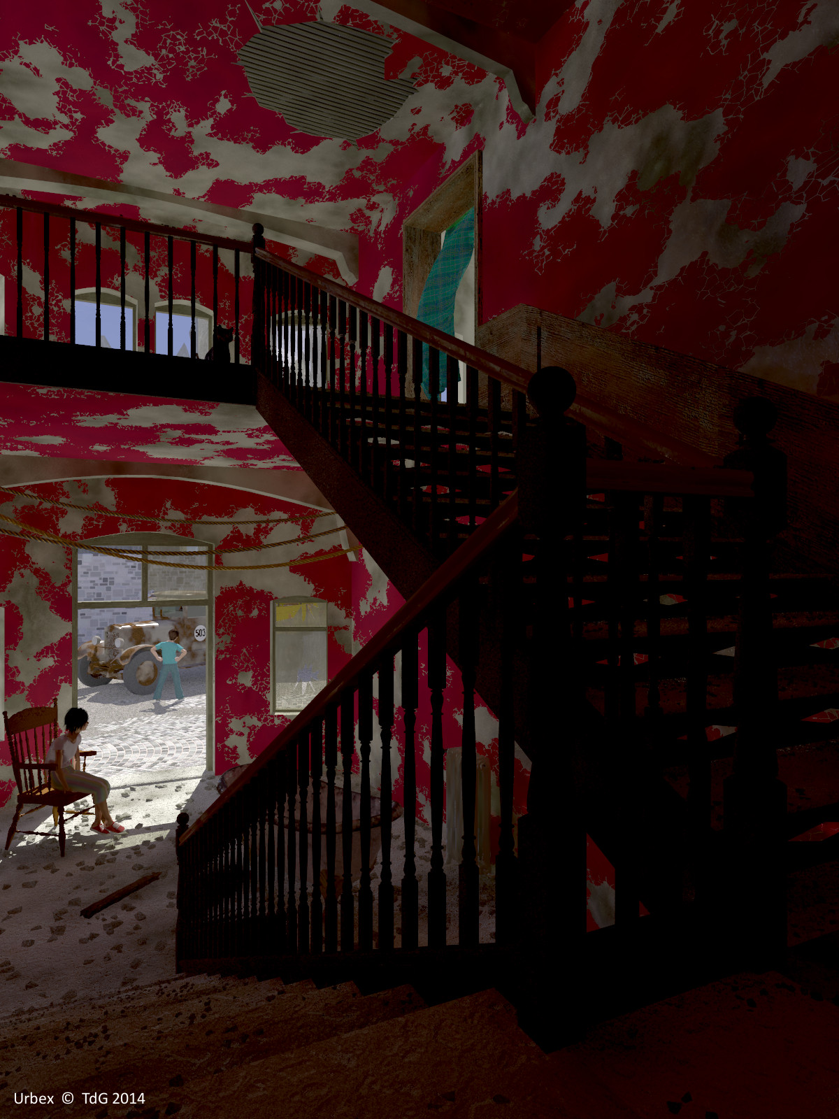
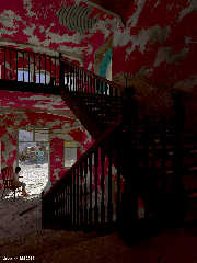
Getting nearer a final render. A large one to be able to assess the details.

Output render in exr format; postprocessed in IC for luminosity balance;
this copy as jpg.


Now as Cathy's World #13.

Thomas
Post a reply to this message
Attachments:
Download 'urbex_12.jpg' (487 KB)
Preview of image 'urbex_12.jpg'
|
|
| |
| |
|
|
|
|
| |
| |
|
|
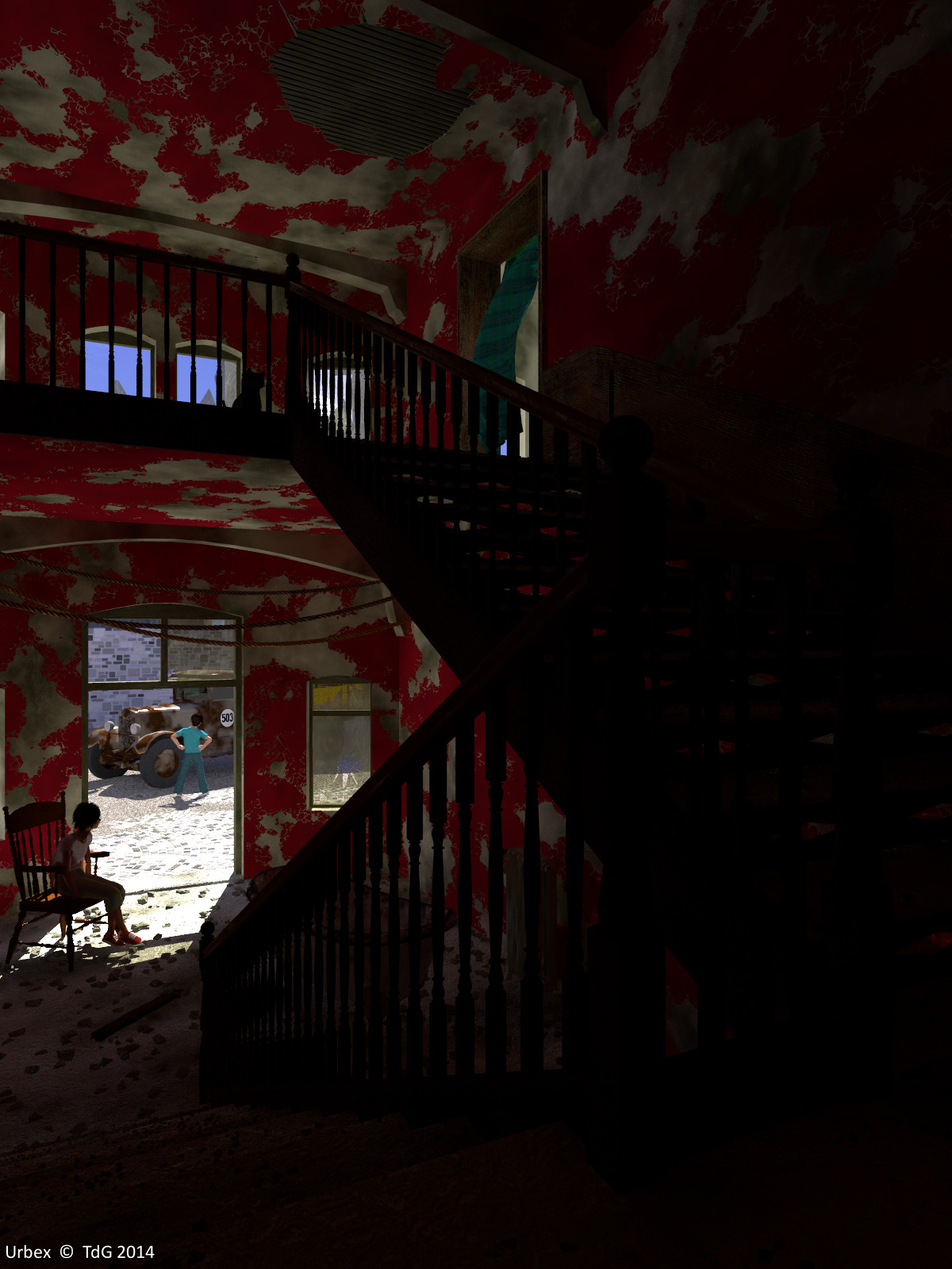
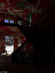
What do you think? This is a jpg copy of the original exr render,
without post-processing. Somehow, I prefer this although it is a bit too
dark.

Thomas
Post a reply to this message
Attachments:
Download 'urbex_12.jpg' (314 KB)
Preview of image 'urbex_12.jpg'
|
|
| |
| |
|
|
|
|
| |
| |
|
|
Am 08.08.2014 16:10, schrieb Thomas de Groot:
> What do you think? This is a jpg copy of the original exr render,
> without post-processing. Somehow, I prefer this although it is a bit too
> dark.

I prefer this one, too. I love images that play with light & darkness.
Post a reply to this message
|
|
| |
| |
|
|
|
|
| |
| |
|
|
Le 14-08-08 10:10, Thomas de Groot a écrit :
> What do you think? This is a jpg copy of the original exr render,
> without post-processing. Somehow, I prefer this although it is a bit too
> dark.
>
> Thomas

The very dark areas make the bright areas look brighter and beter, even
if I need to push the brightness of my monitor to the max. I think that
it beter show the often oppresive feeling you may have in this kind of
settin.
Post a reply to this message
|
|
| |
| |
|
|
|
|
| |
| |
|
|
On 8-8-2014 16:26, clipka wrote:
> Am 08.08.2014 16:10, schrieb Thomas de Groot:
>> What do you think? This is a jpg copy of the original exr render,
>> without post-processing. Somehow, I prefer this although it is a bit too
>> dark.
>
> I prefer this one, too. I love images that play with light & darkness.
>

Yes, me too. Additionally, the post processing flattens out the colour
contrast. I shall play a bit more with that last aspect but just as an
experiment not towards a 'final' image.

Thomas
Post a reply to this message
|
|
| |
| |
|
|
|
|
| |
| |
|
|
On 9-8-2014 1:38, Alain wrote:
> Le 14-08-08 10:10, Thomas de Groot a écrit :
>> What do you think? This is a jpg copy of the original exr render,
>> without post-processing. Somehow, I prefer this although it is a bit too
>> dark.
>>
>> Thomas
>
> The very dark areas make the bright areas look brighter and beter, even
> if I need to push the brightness of my monitor to the max. I think that
> it beter show the often oppresive feeling you may have in this kind of
> settin.

Yes, I agree.

Thomas
Post a reply to this message
|
|
| |
| |
|
|
|
|
| |
| |
|
|
On 09/08/2014 08:09, Thomas de Groot wrote:
> On 8-8-2014 16:26, clipka wrote:
>> Am 08.08.2014 16:10, schrieb Thomas de Groot:
>>> What do you think? This is a jpg copy of the original exr render,
>>> without post-processing. Somehow, I prefer this although it is a bit too
>>> dark.
>>
>> I prefer this one, too. I love images that play with light & darkness.
>>
>
> Yes, me too. Additionally, the post processing flattens out the colour
> contrast. I shall play a bit more with that last aspect but just as an
> experiment not towards a 'final' image.
>


I would be tempted to use a fill light on the stairs just to bring out
some detail. I would not know how to do that with radiosity. Would using
a diffuse reflective object do it. The way that photographers would use
a white sheet in RL?


--

Regards
     Stephen
Post a reply to this message
|
|
| |
| |
|
|
|
|
| |
| |
|
|
On 9-8-2014 10:40, Stephen wrote:

> I would be tempted to use a fill light on the stairs just to bring out
> some detail. I would not know how to do that with radiosity. Would using
> a diffuse reflective object do it. The way that photographers would use
> a white sheet in RL?
>

During testing I have used a shadowless light over the stairs. I am
thinking about a couple of things: a diffuse reflective screen is one
but may be too 'diffuse' to be effective; a skylight high in the wall
above the stairs is another. I am not too willing to use a direct light,
even an area one, as that would be counter to the state of the building ;-)

Thomas
Post a reply to this message
|
|
| |
| |
|
|
|
|
| |
| |
|
|
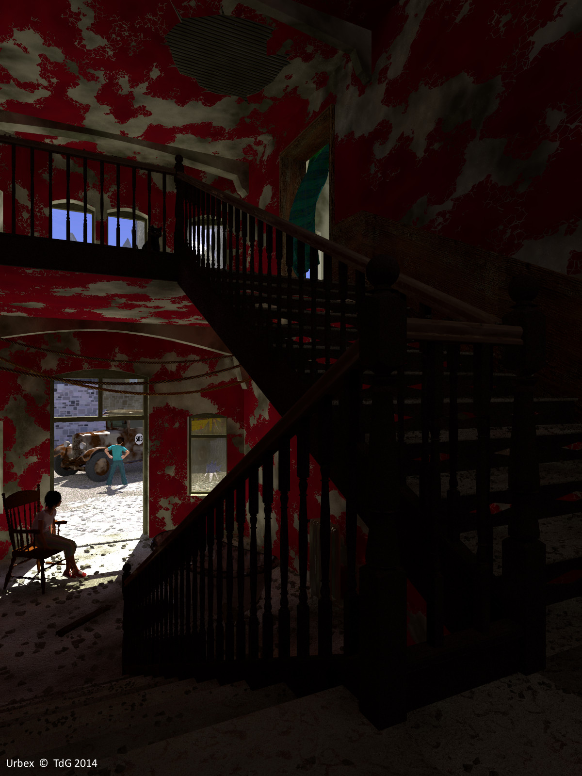
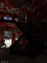
I believe I have a nice compromise now. I added a screen, simulating a
skylight in the upper wall of the staircase. With a bit of emission.

Thomas
Post a reply to this message
Attachments:
Download 'urbex_final3.jpg' (336 KB)
Preview of image 'urbex_final3.jpg'
|
|
| |
| |
|
|
|
|
| |
| |
|
|
On 8/8/2014 7:10 AM, Thomas de Groot wrote:
> What do you think? This is a jpg copy of the original exr render,
> without post-processing. Somehow, I prefer this although it is a bit too
> dark.
>
> Thomas
Hmm. Haven't commented on this prior, but.. the walls are too
artificial. While its a good look, walls don't peel quite like that,
which I think if the problem. There would be color differences in the
paint itself, lighted in "protected" spots, and discolored in others.
Their might be bleed through of texture from individual panels (if wall
board), or other materials, where the same disruptions that peeled the
paint has warped the underlying material. Also, more protected areas may
be less patchy, due to be less exposed to the conditions that caused the
peel, and others might have much bigger patches missing, due to being
more exposed to the same.

It doesn't "look" uniform, but... its too obviously algorithmic. Too
"cleanly" non-uniformly damaged. If you get what I mean.

Its one of the things that bugs me about this stuff, and why I never
dove that far into it over the years, instead of just once in a while.
POVRay textures are good, when you can't see, in the scale, the
repetitiveness of them, but not so good in scenes like this, but.. on
the other hand, I suck even more at "painting" believable details, using
a static, non-generated texture. lol

--
Commander Vimes: "You take a bunch of people who don't seem any
different from you and me, but when you add them all together you get
this sort of huge raving maniac with national borders and an anthem."
Post a reply to this message
|
|
| |
| |
|
|
|
|
| |
| |
|
|
On 11-8-2014 6:33, Patrick Elliott wrote:
> Hmm. Haven't commented on this prior, but.. the walls are too
> artificial. While its a good look, walls don't peel quite like that,
> which I think if the problem. There would be color differences in the
> paint itself, lighted in "protected" spots, and discolored in others.
> Their might be bleed through of texture from individual panels (if wall
> board), or other materials, where the same disruptions that peeled the
> paint has warped the underlying material. Also, more protected areas may
> be less patchy, due to be less exposed to the conditions that caused the
> peel, and others might have much bigger patches missing, due to being
> more exposed to the same.

Compare to the original photograph:
http://www.daanoe.nl/en/photos#.U-htPGPJAQg

I partly agree with you but the intention was to try to approach as much
as possible real life. I think I got close :-)

Otoh though, real life is /not/ the ultimate goal in my work ;-)

Thomas
Post a reply to this message
|
|
| |
| |
|
|
|
|
| |
| |
|
|
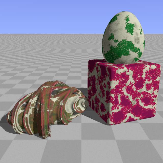
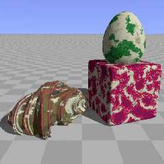
Following Patrick's comments I have been thinking about a couple of more
'sophisticated' applications of my peeling paint macro (see p.b.s-f).

In this image, the superellipsoid uses a classic granite pattern; the
ovus uses a pigment_pattern based on a granite pattern function; the
julia fractal uses the latter in combination with a proximity pattern.

Thomas
Post a reply to this message
Attachments:
Download 'peeling_test.png' (379 KB)
Preview of image 'peeling_test.png'
|
|
| |
| |
|
|
|
|
| |
| |
|
|
On 8/11/2014 12:28 AM, Thomas de Groot wrote:
> On 11-8-2014 6:33, Patrick Elliott wrote:
>> Hmm. Haven't commented on this prior, but.. the walls are too
>> artificial. While its a good look, walls don't peel quite like that,
>> which I think if the problem. There would be color differences in the
>> paint itself, lighted in "protected" spots, and discolored in others.
>> Their might be bleed through of texture from individual panels (if wall
>> board), or other materials, where the same disruptions that peeled the
>> paint has warped the underlying material. Also, more protected areas may
>> be less patchy, due to be less exposed to the conditions that caused the
>> peel, and others might have much bigger patches missing, due to being
>> more exposed to the same.
>
> Compare to the original photograph:
> http://www.daanoe.nl/en/photos#.U-htPGPJAQg
>
> I partly agree with you but the intention was to try to approach as much
> as possible real life. I think I got close :-)
>
> Otoh though, real life is /not/ the ultimate goal in my work ;-)
>
> Thomas
>
Hmm. Yeah, can see that. I would, based on the original, if the goal
"was" to match it, "A good start". But, yeah, the one obvious thing
missing is the "hanging" bits, where its still peeling, for one. Your
version, I suppose, looks more like what someone might get is being real
careful about scraping those bits off, to leave a smooth surface. I was
right about the greater variations of discoloration though. ;)

For me, frankly, it would be. A lot of the stuff I do right now (and
there just isn't a lot of practical ways to help it with POVRay) is for
Second Life, when I do any at all. And, I seriously hate the lack of
realism in so much of the stuff on there, especially when contrasted
with stuff that "is" being done with high realism. :p

--
Commander Vimes: "You take a bunch of people who don't seem any
different from you and me, but when you add them all together you get
this sort of huge raving maniac with national borders and an anthem."
Post a reply to this message
|
|
| |
| |
|
|
|
|
| |
| |
|
|
On 12-8-2014 0:27, Patrick Elliott wrote:
> Hmm. Yeah, can see that. I would, based on the original, if the goal
> "was" to match it, "A good start". But, yeah, the one obvious thing
> missing is the "hanging" bits, where its still peeling, for one. Your
> version, I suppose, looks more like what someone might get is being real
> careful about scraping those bits off, to leave a smooth surface. I was
> right about the greater variations of discoloration though. ;)

Ah! the hanging bits! That was my first concern (and my last). At
present, I see no elegant way out of that issue. I tried to write a
simulation macro but the results were horrible. Just as for peeling wall
paper, I am afraid that needs to be modelled separately :-(

Discolouration is another brain cracker. I use a texture_map but
obviously that is not the same at all.

>
> For me, frankly, it would be. A lot of the stuff I do right now (and
> there just isn't a lot of practical ways to help it with POVRay) is for
> Second Life, when I do any at all. And, I seriously hate the lack of
> realism in so much of the stuff on there, especially when contrasted
> with stuff that "is" being done with high realism. :p
>
That explains your comments :-)

Thomas
Post a reply to this message
|
|
| |
| |
|
|
|
|
| |
| |
|
|
Patrick Elliott <kag### [at] gmail com> wrote:
> But, yeah, the one obvious thing
> missing is the "hanging" bits, where its still peeling, for one. Your
> version, I suppose, looks more like what someone might get is being real
> careful about scraping those bits off, to leave a smooth surface.
This was discussed a while back, and no good solution was found. com> wrote:
> But, yeah, the one obvious thing
> missing is the "hanging" bits, where its still peeling, for one. Your
> version, I suppose, looks more like what someone might get is being real
> careful about scraping those bits off, to leave a smooth surface.
This was discussed a while back, and no good solution was found.
Post a reply to this message
|
|
| |
| |
|
|
|
|
| |
| |
|
|
Patrick Elliott <kag### [at] gmailcom> wrote:

> For me, frankly, it would be. A lot of the stuff I do right now (and
> there just isn't a lot of practical ways to help it with POVRay) is for
> Second Life, when I do any at all. And, I seriously hate the lack of
> realism in so much of the stuff on there, especially when contrasted
> with stuff that "is" being done with high realism. :p
>

There are still people on Second Life? (although there are people saying the
same thing about Povray!).

Do you have examples of what you're talking about in Second Life?


Also, I find this amusing: https://www.youtube.com/watch?v=OrAHBk4ZAeQ
Post a reply to this message
|
|
| |
| |
|
|
|
|
| |
| |
|
|
On 8/12/2014 1:54 PM, jhu wrote:
> Patrick Elliott <kag### [at] gmailcom> wrote:
>
>> For me, frankly, it would be. A lot of the stuff I do right now (and
>> there just isn't a lot of practical ways to help it with POVRay) is for
>> Second Life, when I do any at all. And, I seriously hate the lack of
>> realism in so much of the stuff on there, especially when contrasted
>> with stuff that "is" being done with high realism. :p
>>
>
> There are still people on Second Life? (although there are people saying the
> same thing about Povray!).
>
> Do you have examples of what you're talking about in Second Life?
>
>
> Also, I find this amusing: https://www.youtube.com/watch?v=OrAHBk4ZAeQ
>
Hmm. Well, some of the best stuff I have seen are from people like these:

https://marketplace.secondlife.com/stores/24073

They try for high realism, or as high as possible, but with the addition
of funky elements, like having one chair leg repaired oddly, or other
"ghostly" effects.

These guys do some real good stuff too.

https://marketplace.secondlife.com/stores/4427

A lot of things have taken off do to allowing mesh now, and some insane
stuff was, and still is, done with "prim torture", also known as
displacement mapping (or sculpties).

Also, the places made by "some" of the residents, and almost always by
Linden themselves, can be just insanely detailed and amazing. One major
part of the area I roleplay in is being remodeled (but not yet
"public"), with all the new lighting systems, mesh, texture support,
etc. in them. These people are.. still a bit out of my league, to say
the least. lol

--
Commander Vimes: "You take a bunch of people who don't seem any
different from you and me, but when you add them all together you get
this sort of huge raving maniac with national borders and an anthem."
Post a reply to this message
|
|
| |
| |
|
|
|
|
| |
| |
|
|
On 8/12/2014 1:54 PM, jhu wrote:
> There are still people on Second Life? (although there are people saying the
> same thing about Povray!).
>

Oh, and yeah, because a) all the others out there have either failed,
been found to be stealing, or allowing stealing, or just flat suck (and
many of them are based on the open source version of Second Life).

Also, apparently Linden has gotten the clue that a lot of their original
design was.. problematic, and needs to be reworked, to continue
improving things, so a Second Life 2.0 is in the works. About damn time
too.. If they had waited too much longer "someone" might have actually
managed to blow their current system out of the water. There are..
interesting things coming out, but, mostly in the "pure game" market,
and without the versatility that SL provided in terms of pure ability to
build what ever you wanted in it.

--
Commander Vimes: "You take a bunch of people who don't seem any
different from you and me, but when you add them all together you get
this sort of huge raving maniac with national borders and an anthem."
Post a reply to this message
|
|
| |
| |
|
|
|
|
| |
| |
|
|
On 8/12/2014 8:35 AM, Cousin Ricky wrote:
> Patrick Elliott <kag### [at] gmailcom> wrote:
>>   But, yeah, the one obvious thing
>> missing is the "hanging" bits, where its still peeling, for one. Your
>> version, I suppose, looks more like what someone might get is being real
>> careful about scraping those bits off, to leave a smooth surface.
>
> This was discussed a while back, and no good solution was found.
>
>
Had a thought on this.. Modifying the texture so you have, basically, a
white line that produces a hard transition to a height field, right
along the point of delineation between the peeled and non-peeled parts
would give you at least a start point, right? You would then have a sort
of "punch through" effect, where there is a ridge of material, all
around the point of transition. The problem then is doing something else
to the resulting height field so that its not a solid outline, but has a
more random "hang" and gaps in it, then... texturing gets a bit funky, I
admit, since you have to somehow get it to apply the right "underside"
coloration to the inside of this punch out, and the paint color, and
other variances, to the "outside". But, yeah, that is a tough one, since
I am not even sure how to get past the, "Use a modded version of the
texture to get a height field.", part. lol

--
Commander Vimes: "You take a bunch of people who don't seem any
different from you and me, but when you add them all together you get
this sort of huge raving maniac with national borders and an anthem."
Post a reply to this message
|
|
| |
| |
|
|
|
|
| |
| |
|
|
On the other hand.. Nah, that would be too thin and create possible
coincident surfaces. Was thinking to make the height field "wider" than
the hanging bit needs to be, then use difference to apply the texture to
the inside and outside parts, and to get the right material thickness.
Would, in theory, work, but, again, the material is so thin...

--
Commander Vimes: "You take a bunch of people who don't seem any
different from you and me, but when you add them all together you get
this sort of huge raving maniac with national borders and an anthem."
Post a reply to this message
|
|
| |
| |
|
|
|
|
| |
| |
|
|
On 10/08/2014 15:00, Thomas de Groot wrote:
> I believe I have a nice compromise now. I added a screen, simulating a
> skylight in the upper wall of the staircase. With a bit of emission.
>

To me that is much better, I can see the cat now. ;-)
IMO these images with deep shadows and bright sunlight need a compromise
as our eyes adjust in RL. But cannot do that on an image.
Don't you think that there should be some dust in the air?


--

Regards
     Stephen
Post a reply to this message
|
|
| |
| |
|
|
|
|
| |
| |
|
|
Those are a couple of interesting ideas... I'll shelf them for the time
being to let the brain cells time to adjust :-)

Thomas
Post a reply to this message
|
|
| |
| |
|
|
|
|
| |
| |
|
|
On 14-8-2014 0:07, Stephen wrote:
> To me that is much better, I can see the cat now. ;-)
> IMO these images with deep shadows and bright sunlight need a compromise
> as our eyes adjust in RL. But cannot do that on an image.
> Don't you think that there should be some dust in the air?
>
>
Yes, and the compromising is delicate as the notion of 'acceptable'
tends to vary from person to person in this case. In the present case a
bit lighter or darker would also be possible. ;-)

Some dust. Yes indeed. Totally forgot that.

Some images are never finished. There are a lot of things I could still
tweak, add, move, etc in this one :-)

Thomas
Post a reply to this message
|
|
| |
| |
|
|
|
|
| |
| |
|
|
On 14/08/2014 08:25, Thomas de Groot wrote:
>>
> Yes, and the compromising is delicate as the notion of 'acceptable'
> tends to vary from person to person in this case. In the present case a
> bit lighter or darker would also be possible. ;-)
>

It is IMO a tricky shot to call but I think that you have got it right
with this one.

> Some dust. Yes indeed. Totally forgot that.
>

You might be house proud I am not. :-)

> Some images are never finished. There are a lot of things I could still
> tweak, add, move, etc in this one :-)

That is so true.

--

Regards
     Stephen
Post a reply to this message
|
|
| |
| |
|
|
|
|
| |
| |
|
|
Am 14.08.2014 09:25, schrieb Thomas de Groot:
> On 14-8-2014 0:07, Stephen wrote:
>> To me that is much better, I can see the cat now. ;-)
>> IMO these images with deep shadows and bright sunlight need a compromise
>> as our eyes adjust in RL. But cannot do that on an image.
>> Don't you think that there should be some dust in the air?
>>
>>
> Yes, and the compromising is delicate as the notion of 'acceptable'
> tends to vary from person to person in this case. In the present case a
> bit lighter or darker would also be possible. ;-)

Not only does the notion of "acceptable" vary from person to person, but
-- I guess even more importantly -- it also varies from display to
display. Experience in these newsgroups has shown over and over again
that people complaining about images being too dark tend to change their
mind once they have been coaxed to calibrate their display properly.
Post a reply to this message
|
|
| |
| |
|
|
|
|
| |
| |
|
|
clipka <ano### [at] anonymousorg> wrote:
> Am 14.08.2014 09:25, schrieb Thomas de Groot:
> > On 14-8-2014 0:07, Stephen wrote:
> >> To me that is much better, I can see the cat now. ;-)
> >> IMO these images with deep shadows and bright sunlight need a compromise
> >> as our eyes adjust in RL. But cannot do that on an image.
> >> Don't you think that there should be some dust in the air?
> >>
> >>
> > Yes, and the compromising is delicate as the notion of 'acceptable'
> > tends to vary from person to person in this case. In the present case a
> > bit lighter or darker would also be possible. ;-)
>
> Not only does the notion of "acceptable" vary from person to person, but
> -- I guess even more importantly -- it also varies from display to
> display. Experience in these newsgroups has shown over and over again
> that people complaining about images being too dark tend to change their
> mind once they have been coaxed to calibrate their display properly.

Nonsense. They just need to increase/decrease the number and density of
rods/cones in their eyes.
Post a reply to this message
|
|
| |
| |
|
|
|
|
| |
| |
|
|
On 8/15/2014 10:55 AM, clipka wrote:
> Not only does the notion of "acceptable" vary from person to person, but
> -- I guess even more importantly -- it also varies from display to
> display. Experience in these newsgroups has shown over and over again
> that people complaining about images being too dark tend to change their
> mind once they have been coaxed to calibrate their display properly.
>
Old CRT I had before.. something must have overloaded the damn caps in
it, or something, at some point. It was so dark that even if you turned
up the gamma in games, or the like, it was still "darker" than it should
be. Never realized it was that bad, at all, until I decided to go with a
whole new system, with wide screen LCD, then.. Holy... lol

--
Commander Vimes: "You take a bunch of people who don't seem any
different from you and me, but when you add them all together you get
this sort of huge raving maniac with national borders and an anthem."
Post a reply to this message
|
|
| |
| |
|
|
|
|
| |
| |
|
|
On 15/08/2014 21:33, jhu wrote:
> Nonsense. They just need to increase/decrease the number and density of
> rods/cones in their eyes.

LOL
A nice trick if you can do it. :-)

--

Regards
     Stephen
Post a reply to this message
|
|
| |
| |
|
|
|
|
| |
| |
|
|
Am 15.08.2014 22:33, schrieb jhu:
> clipka <ano### [at] anonymousorg> wrote:
>> Am 14.08.2014 09:25, schrieb Thomas de Groot:
>>> On 14-8-2014 0:07, Stephen wrote:
>>>> To me that is much better, I can see the cat now. ;-)
>>>> IMO these images with deep shadows and bright sunlight need a compromise
>>>> as our eyes adjust in RL. But cannot do that on an image.
>>>> Don't you think that there should be some dust in the air?
>>>>
>>>>
>>> Yes, and the compromising is delicate as the notion of 'acceptable'
>>> tends to vary from person to person in this case. In the present case a
>>> bit lighter or darker would also be possible. ;-)
>>
>> Not only does the notion of "acceptable" vary from person to person, but
>> -- I guess even more importantly -- it also varies from display to
>> display. Experience in these newsgroups has shown over and over again
>> that people complaining about images being too dark tend to change their
>> mind once they have been coaxed to calibrate their display properly.
>
> Nonsense. They just need to increase/decrease the number and density of
> rods/cones in their eyes.

That actually wouldn't do the trick. Turning off any other light sources
in the room might though, if the problem is reflection glare.

For wearers of corrective eyegear like me, cleaning the glasses from
time to time might also help ;-)

(And yes, dusting off the display may also helpful.)
Post a reply to this message
|
|
| |
| |
|
|
|
|
| |
| |
|
|
On 15/08/2014 23:52, clipka wrote:
> For wearers of corrective eyegear like me, cleaning the glasses from
> time to time might also help ;-)
>
> (And yes, dusting off the display may also helpful.)

+1

Top tips :-)

--

Regards
     Stephen
Post a reply to this message
|
|
| |
| |
|
|
|
|
| |
| |
|
|
On 15-8-2014 18:45, Stephen wrote:
> On 14/08/2014 08:25, Thomas de Groot wrote:
>>>
>> Yes, and the compromising is delicate as the notion of 'acceptable'
>> tends to vary from person to person in this case. In the present case a
>> bit lighter or darker would also be possible. ;-)
>>
>
> It is IMO a tricky shot to call but I think that you have got it right
> with this one.

Yes, I believe so too. Now, I dearly need Bill's isosurface trick :-)

>
>> Some dust. Yes indeed. Totally forgot that.
>>
>
> You might be house proud I am not. :-)

Neither am I!

Only this morning I took a little time to clear away the dust that had
accumulated on the less-used parts of my desk over the last 8 months ;-)

>
>> Some images are never finished. There are a lot of things I could still
>> tweak, add, move, etc in this one :-)
>
> That is so true.
>

And especially when different scenes are being worked on at the same time...

Thomas
Post a reply to this message
|
|
| |
| |
|
|
|
|
| |
|
|