|
|
|
|
|
|
| |
| |
|
|
|
|
| |
| |
|
|
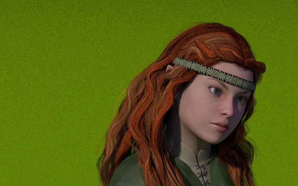
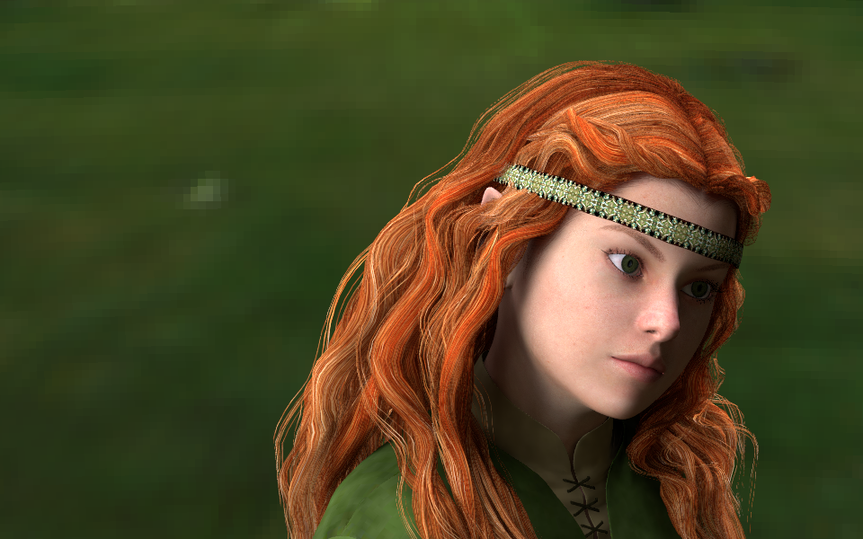
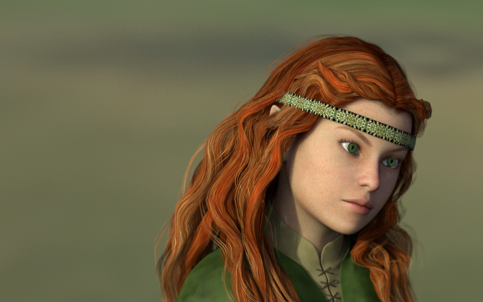
Taking a walk through the woods yesterday evening, by chance I met this
young lady, and instantly felt inspired to portray her. This is just a
first sketch, and doesn't do her beauty any justice, so stand by for more.

Figure is based on DAZ's Genesis model, using a blend of Young Teens 5
Julie and an adult character plus some modifications of my own; hair
(including hairband) is the gorgeous Udane Hair, and clothing is from
the Elven Warrior set.

Skin and eyes are based on the Victoria 5 Bree texture resources, which
all plugged in neatly into the framework I have been developing for
poser figure textures, indicating that I'm doing the right thing there.
The other textures were auto-converted by PoseRay, which of course also
did tne geometry conversion.

The hair still needs some work (DAZ studio renders indicate that there's
a hell lot of more potential in the texture, and it also deserves some
additional subdividing), as do the clothes textures (which aren't any
better in DAZ studio, but I'm sure I can improve on it using POV-Ray
procedural textures ;-)); I also plan to further modify her iris
texture, and then of course she'll feel more at home in the woods than
in featureless grassy plains.

Subsurface scattering would probably not be necessary for a human
character, but being a half-elf I might want her skin to have some
surrealistic translucency, so I'll give that a try.
Post a reply to this message
Attachments:
Download 'young_half_elf_woman_pov_scene.png' (956 KB)
Preview of image 'young_half_elf_woman_pov_scene.png'
|
|
| |
| |
|
|
|
|
| |
| |
|
|
On 03/08/2013 10:04 AM, clipka wrote:
> Taking a walk through the woods yesterday evening, by chance I met this
> young lady, and instantly felt inspired to portray her. This is just a
> first sketch, and doesn't do her beauty any justice, so stand by for more.

Nice. Are you going for the Irish princess look? Isolde, maybe?

--
Regards
     Stephen
Post a reply to this message
|
|
| |
| |
|
|
|
|
| |
| |
|
|
Looking very good indeed. Reminds me that I need to try Genesis in Poser
as I have the DSON importer. My todo list is getting pretty long.

Thomas
Post a reply to this message
|
|
| |
| |
|
|
|
|
| |
| |
|
|
Am 03.08.2013 12:42, schrieb Stephen:
> On 03/08/2013 10:04 AM, clipka wrote:
>> Taking a walk through the woods yesterday evening, by chance I met this
>> young lady, and instantly felt inspired to portray her. This is just a
>> first sketch, and doesn't do her beauty any justice, so stand by for
>> more.
>
> Nice. Are you going for the Irish princess look? Isolde, maybe?

No, not a princess. Just the daughter of someone wealthy enough that she
doesn't need to do hard work, and has enough spare time to tend her long
hair and occasionally do a bit of fine stitching work like that headband
of hers (at least I think she made it herself).

But the moment I saw her lovely face framed by that gorgeous red hair I
knew she'd have to wear green clothes from head to toe. She loves green,
you know.
Post a reply to this message
|
|
| |
| |
|
|
|
|
| |
| |
|
|
On 03/08/2013 9:47 PM, clipka wrote:
> No, not a princess. Just the daughter of someone wealthy enough that she
> doesn't need to do hard work, and has enough spare time to tend her long
> hair and occasionally do a bit of fine stitching work like that headband
> of hers (at least I think she made it herself).
>

Yes, as I said. A princess. ;-)


> But the moment I saw her lovely face framed by that gorgeous red hair I
> knew she'd have to wear green clothes from head to toe. She loves green,
> you know.

It is a very Irish look, especially with the green livery.
Does/will your beauty have very pale skin?

--
Regards
     Stephen
Post a reply to this message
|
|
| |
| |
|
|
|
|
| |
| |
|
|
Am 04.08.2013 11:03, schrieb Stephen:

>> But the moment I saw her lovely face framed by that gorgeous red hair I
>> knew she'd have to wear green clothes from head to toe. She loves green,
>> you know.
>
> It is a very Irish look, especially with the green livery.

... and the red hair of course.

> Does/will your beauty have very pale skin?

I don't think so. She's not a pureblood elf, and a very healthy girl, so
except for an uncommon translucency there'll be nothing special about
her complexion.
Post a reply to this message
|
|
| |
| |
|
|
|
|
| |
| |
|
|
Am 04.08.2013 15:13, schrieb clipka:
> Am 04.08.2013 11:03, schrieb Stephen:
>
>>> But the moment I saw her lovely face framed by that gorgeous red hair I
>>> knew she'd have to wear green clothes from head to toe. She loves green,
>>> you know.
>>
>> It is a very Irish look, especially with the green livery.
>
> .... and the red hair of course.

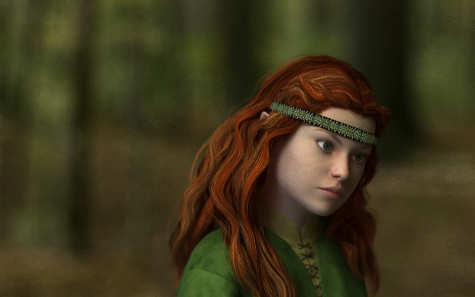
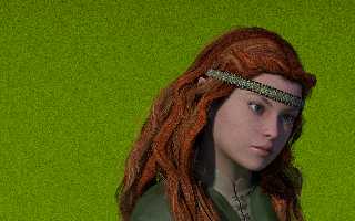
Well, I thought /this/ one was an exceptionally beautiful image (if it
wasn't for the artifacts in her face; don't blame it on POV-Ray, this
one was rendered using DAZ Studio's built-in renderer) - but... ah well,
just stay by for the render I'm currently running in POV-Ray; from what
I'm seeing in the preview window I guess it /might/ be worth the wait...
Post a reply to this message
Attachments:
Download '2013-08-02 2143 young half-elf woman 960x600.png' (806 KB)
Preview of image '2013-08-02 2143 young half-elf woman 960x600.png'
|
|
| |
| |
|
|
|
|
| |
| |
|
|
Yeah, this one looks amazing, but is even better if I hide her eyes with
my finger... then, suddenly, the skin looks almost real, specially her
lips.

--
Jaime
Post a reply to this message
|
|
| |
| |
|
|
|
|
| |
| |
|
|
>clipka  on date 03/08/2013 11.04 wrote:
> Taking a walk through the woods yesterday evening, by chance I met this
> young lady, and instantly felt inspired to portray her.
Interesting people in your neighbourhood. And interesting image.
Paolo
Post a reply to this message
|
|
| |
| |
|
|
|
|
| |
| |
|
|
Paolo Gibellini <p.g### [at] gmail com> wrote:
> >clipka on date 03/08/2013 11.04 wrote:
> > Taking a walk through the woods yesterday evening, by chance I met this
> > young lady, and instantly felt inspired to portray her.
> Interesting people in your neighbourhood. And interesting image.
> Paolo
Indeed a very fine image. I know that there are very interesting women in the
woods (more or less) close to your town. I married one of them.
Best regards,
Michael com> wrote:
> >clipka on date 03/08/2013 11.04 wrote:
> > Taking a walk through the woods yesterday evening, by chance I met this
> > young lady, and instantly felt inspired to portray her.
> Interesting people in your neighbourhood. And interesting image.
> Paolo
Indeed a very fine image. I know that there are very interesting women in the
woods (more or less) close to your town. I married one of them.
Best regards,
Michael
Post a reply to this message
|
|
| |
| |
|
|
|
|
| |
| |
|
|
Am 05.08.2013 09:03, schrieb Jaime Vives Piqueres:
> Yeah, this one looks amazing, but is even better if I hide her eyes with
> my finger... then, suddenly, the skin looks almost real, specially her
> lips.

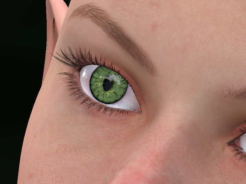
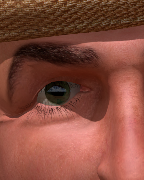
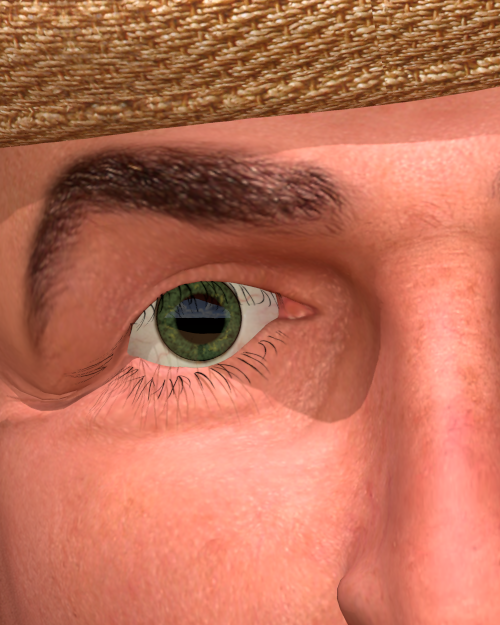
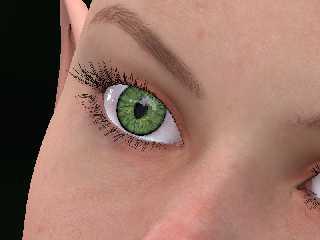
Speaking of eyes: While that render I mentioned before is still running,
I've conjured up a procedural iris texture that will feature in a later
render.
Post a reply to this message
Attachments:
Download 'eyes.png' (566 KB)
Preview of image 'eyes.png'
|
|
| |
| |
|
|
|
|
| |
| |
|
|
Le 13-08-05 15:25, clipka a écrit :
> Am 05.08.2013 09:03, schrieb Jaime Vives Piqueres:
>> Yeah, this one looks amazing, but is even better if I hide her eyes with
>> my finger... then, suddenly, the skin looks almost real, specially her
>> lips.
>
> Speaking of eyes: While that render I mentioned before is still running,
> I've conjured up a procedural iris texture that will feature in a later
> render.
>

It's probably one of the best iris I've ever seen, just next to some
actual iris photos...

Care to share it?


Alain
Post a reply to this message
|
|
| |
| |
|
|
|
|
| |
| |
|
|
Am 05.08.2013 23:45, schrieb Alain:
> It's probably one of the best iris I've ever seen, just next to some
> actual iris photos...

Thanks. I was actually quite surprised how easy it was to achieve.

> Care to share it?

Here it is; note that it is a UV-mapped texture designed to fit the DAZ
Genesis eyes; for other models, the main material (M_Iris) may need some
tweaking. Also note that the DAZ Genesis model has separate geometry for
the iris and the cornea; if this is not the case for your model, you
will also need to tweak the finish.

(Ah, and last not least, the slight "cat's pupil" effect in the image I
posted is in the geometry, not the material.)

--------------------------------------------------------------------
#declare P_Iris_Shadowed = pigment { color rgb 0 }

#declare P_Iris_Base = pigment {
   granite
   color_map {
     [ 0.0 color srgb <0.4,0.5,0.3> ] // <-- primary color
     [ 1.0 color srgb <0,0,0> ]
   }
   translate z
   scale 0.5
}

#declare P_Iris_A = pigment {
   P_Iris_Base
   scale 0.7
   warp { black_hole <0,0,0>, 1 strength 1 falloff 2 }
}

#declare P_Iris_B = pigment {
   granite
   pigment_map {
     [ 0.0 color srgb <0.7,0.7,0.3> ] // <-- secondary color
     [ 0.3 P_Iris_Base ]
   }
   scale 0.7
   warp { black_hole <0,0,0>, 1 strength 1 falloff 2 }
}

#declare M_Iris = material {
   texture {
     pigment {
       uv_mapping
       spherical
       pigment_map {
         [0.2  P_Iris_Shadowed]
         [0.3  P_Iris_A ]
         [0.4  P_Iris_A ]
         [0.5  P_Iris_B ]
         [0.6  P_Iris_B ]
         [0.65 P_Iris_Shadowed]
       }
       translate <1,1,0>
       warp { repeat 2*x }
       scale 0.25
     }
     finish { ambient 0 diffuse albedo 0.6 specular albedo 0 emission 0 }
   }
}
--------------------------------------------------------------------
Post a reply to this message
|
|
| |
| |
|
|
|
|
| |
| |
|
|
On 6-8-2013 4:25, clipka wrote:
> Am 05.08.2013 23:45, schrieb Alain:
>> It's probably one of the best iris I've ever seen, just next to some
>> actual iris photos...
>
> Thanks. I was actually quite surprised how easy it was to achieve.
>
>> Care to share it?
>
> Here it is; note that it is a UV-mapped texture designed to fit the DAZ
> Genesis eyes; for other models, the main material (M_Iris) may need some
> tweaking. Also note that the DAZ Genesis model has separate geometry for
> the iris and the cornea; if this is not the case for your model, you
> will also need to tweak the finish.

That's great, thanks a lot!

I shall try that with the Poser models. They have separate irises too.

Thomas
Post a reply to this message
|
|
| |
| |
|
|
|
|
| |
| |
|
|
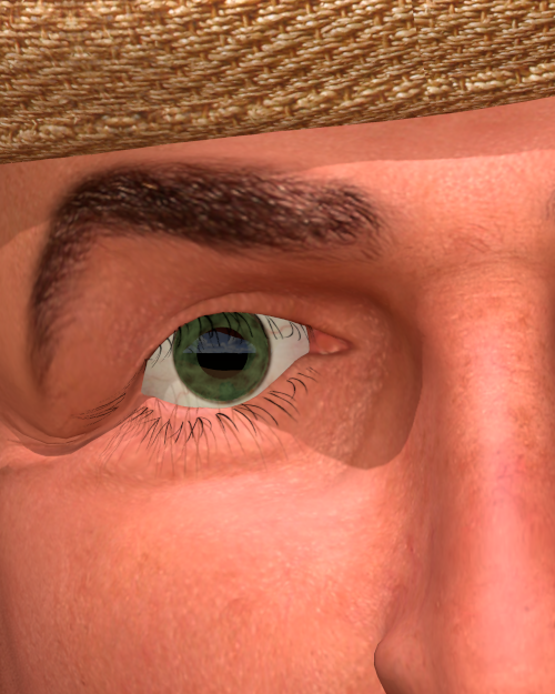
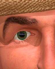
Not as easy as I thought (naively) ;-)

This is the best I can do presently using Poser's Simon, by commenting out:

[0.2  P_Iris_Shadowed]

in the material, otherwise the iris becomes totally black. Also, the
texture is not right even then.

This probably has to do with /how/ the iris is uv_mapped in the first
place. I shall have to go back to the figure and work upwards to see
where I need to tweak things.

Thomas
Post a reply to this message
Attachments:
Download 'poserfiguretest.png' (403 KB)
Preview of image 'poserfiguretest.png'
|
|
| |
| |
|
|
|
|
| |
| |
|
|
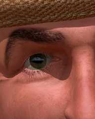
For testing purposes, I used a fill-in light to lessen the shadows
around the eyes in the preceding image.

To do justice to the model /and/ to Ive's excellent skin texture macro,
this is the image /without/ the fill-in.

Thomas
Post a reply to this message
Attachments:
Download 'poserfiguretest.png' (366 KB)
Preview of image 'poserfiguretest.png'
|
|
| |
| |
|
|
|
|
| |
| |
|
|
Am 06.08.2013 09:54, schrieb Thomas de Groot:
> Not as easy as I thought (naively) ;-)
>
> This is the best I can do presently using Poser's Simon, by commenting out:
>
> [0.2  P_Iris_Shadowed]
>
> in the material, otherwise the iris becomes totally black. Also, the
> texture is not right even then.
>
> This probably has to do with /how/ the iris is uv_mapped in the first
> place. I shall have to go back to the figure and work upwards to see
> where I need to tweak things.

The current DAZ people use a UV mapping scheme for the eye textures that
has the irises in the bottom left and bottom right quadrant (each one
almost filling the quadrant entirely), while the sclerae separately
occupy the top left and top right quadrant.

The Poser people (at least G2) instead use a scheme where the irises sit
amid the sclerae in the left and right half of the texture; thus the
irises are at a totally different place, and also a lot smaller.

This might help to get you started:

-----------------------------------------
#declare M_Iris = material {
   texture {
     pigment {
       uv_mapping
       spherical
       pigment_map {
         [0.2  P_Iris_Shadowed]
         [0.3  P_Iris_A ]
         [0.4  P_Iris_A ]
         [0.5  P_Iris_B ]
         [0.6  P_Iris_B ]
         [0.65 P_Iris_Shadowed]
       }
       scale 0.5           // <-- each copy of the iris is smaller
       translate <1,2,0>   // <-- iris centers are at different y
       warp { repeat 2*x }
       scale 0.25
     }
     finish { ambient 0 diffuse albedo 0.6 specular albedo 0 emission 0 }
   }
}
-----------------------------------------
Post a reply to this message
|
|
| |
| |
|
|
|
|
| |
| |
|
|
Thanks Christoph, I think I got it now with the following changes:

//--------------------------------------
#declare M_Iris =
material {
   texture {
     pigment {
       uv_mapping
       spherical
       pigment_map {
         [0.1  P_Iris_Shadowed]
         [0.2  P_Iris_A ]
         [0.4  P_Iris_A ]
         [0.5  P_Iris_B ]
         [0.6  P_Iris_B ]
         [0.65 P_Iris_Shadowed]
       }
       scale 0.37
       translate <0.99, 2.075, 0>
       warp { repeat 2*x }
       scale 0.25
     }
     finish { ambient 0 diffuse albedo 0.6 specular albedo 0 emission 0 }
   }
}
//--------------------------------------

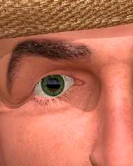
While this works for SimonG2, tweaking may be probably be necessary for
the other figures.

Note that a brownish line around the iris may appear. This comes from
the sclera map and shows a little part of the original iris as the iris
mesh does not cover exactly the image (or vice versa). This can
relatively well be solved by scaling down and translating a tiny bit the
pigment in the sclera material. This is done in the present image.

Thomas
Post a reply to this message
Attachments:
Download 'poserfiguretest.png' (409 KB)
Preview of image 'poserfiguretest.png'
|
|
| |
| |
|
|
|
|
| |
| |
|
|
Le 13-08-05 22:25, clipka a écrit :
> Am 05.08.2013 23:45, schrieb Alain:
>> It's probably one of the best iris I've ever seen, just next to some
>> actual iris photos...
>
> Thanks. I was actually quite surprised how easy it was to achieve.
>
>> Care to share it?
>
> Here it is; note that it is a UV-mapped texture designed to fit the DAZ
> Genesis eyes; for other models, the main material (M_Iris) may need some
> tweaking. Also note that the DAZ Genesis model has separate geometry for
> the iris and the cornea; if this is not the case for your model, you
> will also need to tweak the finish.
>
> (Ah, and last not least, the slight "cat's pupil" effect in the image I
> posted is in the geometry, not the material.)
>

The iris been distinct from the cornea surely play an important role in
the beleivability.


Alain
Post a reply to this message
|
|
| |
| |
|
|
|
|
| |
| |
|
|
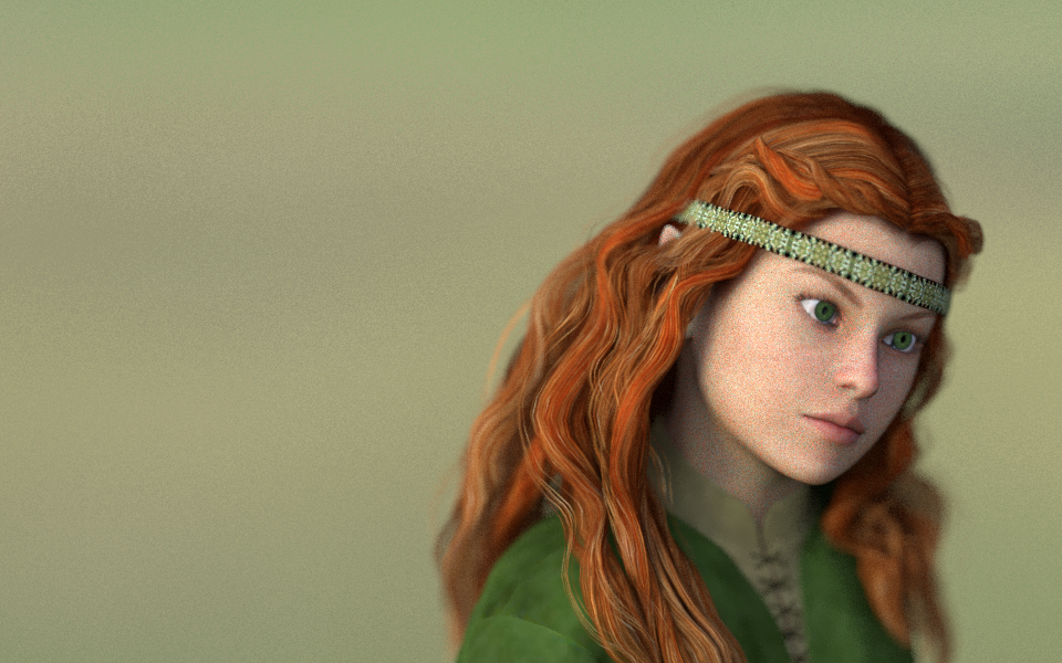
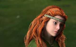
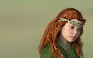
Two more versions. I'm not sure which lighting setup I like better - but
I do know that I'd really love to have MCPov's "render until I'm ok with
the noise" mode of operation right now... and/or faster SSLT, for that
matter.
Post a reply to this message
Attachments:
Download 'young_half_elf_woman_pov_scene 2013-08-07 0925.png' (481 KB)
Download 'young_half_elf_woman_pov_scene 2013-08-08 1300.png' (950 KB)
Preview of image 'young_half_elf_woman_pov_scene 2013-08-07 0925.png'
Preview of image 'young_half_elf_woman_pov_scene 2013-08-08 1300.png'
|
|
| |
| |
|
|
|
|
| |
| |
|
|
On 8-8-2013 13:11, clipka wrote:
> Two more versions. I'm not sure which lighting setup I like better - but
> I do know that I'd really love to have MCPov's "render until I'm ok with
> the noise" mode of operation right now... and/or faster SSLT, for that
> matter.
>
I would prefer the first (0925) maybe with a tiny bit more fill-in on
the right. The other one is a bit too flat to me. Also, I am not too
sure about the dof in that case. Too extreme for my taste.

Thomas
Post a reply to this message
|
|
| |
| |
|
|
|
|
| |
| |
|
|
clipka <ano### [at] anonymousorg> wrote:
> Subsurface scattering would probably not be necessary for a human
> character, but being a half-elf I might want her skin to have some
> surrealistic translucency, so I'll give that a try.

Are you kidding?
To me, skin is the only thing that really *needs* subsurface scattering,
especially on the face, which is one of the targets the human eye has been most
used and adjusted to scrutinize on earth under various lighting conditions.
Very nice procedural iris, considering it is an even more demanding challenge in
that respect. Do you mind if I use this Iris texture for the sample texture on
the blender to POV  exporter WIKI? or if I have to adapt it as a basis for that.


Faster SSS would be more than awsome, actually a grail for attracting animation
focused users along with motion blur.
Post a reply to this message
|
|
| |
| |
|
|
|
|
| |
| |
|
|
>> Subsurface scattering would probably not be necessary for a human
>> character, but being a half-elf I might want her skin to have some
>> surrealistic translucency, so I'll give that a try.
>
> Are you kidding?
> To me, skin is the only thing that really *needs* subsurface scattering,

I remember reading a good article in GPU gems:

http://http.developer.nvidia.com/GPUGems3/gpugems3_ch14.html
Post a reply to this message
|
|
| |
| |
|
|
|
|
| |
| |
|
|
Am 08.08.2013 13:38, schrieb Thomas de Groot:
> On 8-8-2013 13:11, clipka wrote:
>> Two more versions. I'm not sure which lighting setup I like better - but
>> I do know that I'd really love to have MCPov's "render until I'm ok with
>> the noise" mode of operation right now... and/or faster SSLT, for that
>> matter.
>>
> I would prefer the first (0925) maybe with a tiny bit more fill-in on
> the right. The other one is a bit too flat to me.

Surprisingly enough, the first one uses a HDR light probe of an overcast
sky (albeit in a park with some trees around, so there is /some/
uniformity to the illumination), while the latter one uses a light probe
of a clear sky. (I suspect the creator of the probe didn't include a
shot with a short enough exposure time to capture the true brightness of
the sun; I'll try again with an added light.)

> Also, I am not too
> sure about the dof in that case. Too extreme for my taste.

I guess you're right. Then again, the acceptable dof might also depend
on how detailed the background is.
Post a reply to this message
|
|
| |
| |
|
|
|
|
| |
| |
|
|
clipka <ano### [at] anonymousorg> wrote:
> Two more versions. I'm not sure which lighting setup I like better ...

The darker one (2013-08-07 0925), definitely.
Post a reply to this message
|
|
| |
| |
|
|
|
|
| |
| |
|
|
On 8-8-2013 16:15, clipka wrote:
> Am 08.08.2013 13:38, schrieb Thomas de Groot:

>> Also, I am not too
>> sure about the dof in that case. Too extreme for my taste.
>
> I guess you're right. Then again, the acceptable dof might also depend
> on how detailed the background is.
>
It is mostly the out-of-focus part of the figure itself that I question.
With a more detailed background, I would prefer the figure to be sharp
front to back, or maybe only a little out of focus in the farthest part.

Thomas
Post a reply to this message
|
|
| |
| |
|
|
|
|
| |
| |
|
|
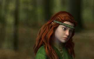
Am 08.08.2013 13:38, schrieb Thomas de Groot:

> I would prefer the first (0925) maybe with a tiny bit more fill-in on
> the right. The other one is a bit too flat to me. Also, I am not too
> sure about the dof in that case. Too extreme for my taste.

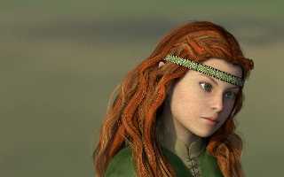
This one better?
Post a reply to this message
Attachments:
Download 'young_half_elf_woman_pov_scene 2013-08-08 2151.png' (793 KB)
Preview of image 'young_half_elf_woman_pov_scene 2013-08-08 2151.png'
|
|
| |
| |
|
|
|
|
| |
| |
|
|
Am 09.08.2013 22:01, schrieb clipka:
> Am 08.08.2013 13:38, schrieb Thomas de Groot:
>
>> I would prefer the first (0925) maybe with a tiny bit more fill-in on
>> the right. The other one is a bit too flat to me. Also, I am not too
>> sure about the dof in that case. Too extreme for my taste.
>
> This one better?

(BTW, yes, I know the illumination is too greenish.)
Post a reply to this message
|
|
| |
| |
|
|
|
|
| |
| |
|
|
On 9-8-2013 22:01, clipka wrote:
> Am 08.08.2013 13:38, schrieb Thomas de Groot:
>
>> I would prefer the first (0925) maybe with a tiny bit more fill-in on
>> the right. The other one is a bit too flat to me. Also, I am not too
>> sure about the dof in that case. Too extreme for my taste.
>
> This one better?
>

Yes, I love this one. To answer your second message, the 'greenish'
illumination has a real function here I believe. It enhances the red hear.

As for me, this would be final.

Thomas
Post a reply to this message
|
|
| |
| |
|
|
|
|
| |
| |
|
|
On 09/08/2013 9:01 PM, clipka wrote:
> This one better?

It’s one of those images that are worth looking at, as you would look
deeply into a painting.
The hair bothers me but she is Elvin so she doesn’t follow the rules. ;-)
The eyebrows need reddened to match hair, though.


--
Regards
     Stephen
Post a reply to this message
|
|
| |
| |
|
|
|
|
| |
| |
|
|
Am 10.08.2013 10:10, schrieb Stephen:

> The hair bothers me but she is Elvin so she doesn’t follow the rules. ;-)

Hm... what's it about the hair that bothers you?

> The eyebrows need reddened to match hair, though.

There's a technical problem there: The eyebrows are part of the skin
texture.
Post a reply to this message
|
|
| |
| |
|
|
|
|
| |
| |
|
|
Am 10.08.2013 09:07, schrieb Thomas de Groot:

> Yes, I love this one. To answer your second message, the 'greenish'
> illumination has a real function here I believe. It enhances the red hear.

I don't think it does. After all, the hair is illuminated by the same
greenish light source as her skin.

> As for me, this would be final.

Not for me. There's the clothes that need some detail in their textures;
the hair that needs subdividing; the eyes that need reflection (I
accidently rendered this image with the eye reflection turned off); and
the background that still waits for some plants to grow.
Post a reply to this message
|
|
| |
| |
|
|
|
|
| |
| |
|
|
On 10/08/2013 9:21 AM, clipka wrote:
> Am 10.08.2013 10:10, schrieb Stephen:
>
>> The hair bothers me but she is Elvin so she doesn’t follow the rules. ;-)
>
> Hm... what's it about the hair that bothers you?

Where I'm from, there are a larger proportion of red heads than anywhere
else. About 10% of my school class had read hair and about another 10%,
what is described as red hair, elsewhere. The mix of colours looks
unnatural to me. A mix of blond, nut brown and red is too many types.
I've known folk with the same carrot colour in some of the strands and
some with the deep red. But the colour seams to be homogeneous AFAICR.
It would mean changing the colour map which isn't difficult. But I'm
sure you know that.

That is beside the point. She is your fantasy woman so you can give her
what ever hair she likes.


>
>> The eyebrows need reddened to match hair, though.
>
> There's a technical problem there: The eyebrows are part of the skin
> texture.
>

In poser it is easy to select a copy of the image map that has been
modified. And it is obvious where the eyebrows are to paint. I keep the
image open in my image editor, then paint, save then render in poser to
see the effect.


--
Regards
     Stephen
Post a reply to this message
|
|
| |
| |
|
|
|
|
| |
| |
|
|
On 10-8-2013 10:30, clipka wrote:
> Am 10.08.2013 09:07, schrieb Thomas de Groot:
>
>> Yes, I love this one. To answer your second message, the 'greenish'
>> illumination has a real function here I believe. It enhances the red
>> hear.
>
> I don't think it does. After all, the hair is illuminated by the same
> greenish light source as her skin.

Well, I don't know. Somehow, the hair stands out remarkably by its
contrast with the overall more greenish tones around.

>
>> As for me, this would be final.
>
> Not for me. There's the clothes that need some detail in their textures;
> the hair that needs subdividing; the eyes that need reflection (I
> accidently rendered this image with the eye reflection turned off); and
> the background that still waits for some plants to grow.

<grin> of course.

Still, I think that not too much background interference is better.

Thomas
Post a reply to this message
|
|
| |
| |
|
|
|
|
| |
| |
|
|
Am 10.08.2013 13:14, schrieb Thomas de Groot:

>> Not for me. There's the clothes that need some detail in their textures;
>> the hair that needs subdividing; the eyes that need reflection (I
>> accidently rendered this image with the eye reflection turned off); and
>> the background that still waits for some plants to grow.
>
> <grin> of course.
>
> Still, I think that not too much background interference is better.

Don't worry - it'll be extremely out of focus.
Post a reply to this message
|
|
| |
| |
|
|
|
|
| |
| |
|
|
Am 10.08.2013 11:08, schrieb Stephen:

>>> The eyebrows need reddened to match hair, though.
>>
>> There's a technical problem there: The eyebrows are part of the skin
>> texture.
>>
>
> In poser it is easy to select a copy of the image map that has been
> modified. And it is obvious where the eyebrows are to paint. I keep the
> image open in my image editor, then paint, save then render in poser to
> see the effect.

No need to bother Poser with that (or DAZ studio for that matter -
that's what I use); I can just as easily pull in the texture from
POV-Ray. Actually more easily, because I've already done some tweaking
to the material (mainly finish parameters).
Post a reply to this message
|
|
| |
| |
|
|
|
|
| |