|
|
|
|
|
|
| |
| |
|
|
|
|
| |
| |
|
|
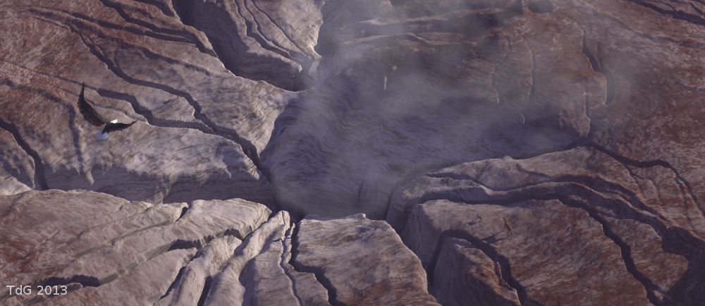
An interesting alternative
Thomas
Post a reply to this message
Attachments:
Download 'elements of geology2_06.png' (722 KB)
Preview of image 'elements of geology2_06.png'
|
|
| |
| |
|
|
|
|
| |
| |
|
|
On 24/05/2013 12:23 PM, Thomas de Groot wrote:
> Some changes and a couple of additions (for you to find).
>
> I think this is about the final stage. I feel that I should not work
> much more on this.
>
I hate to say it bit I prefer the mist in the first image.
The texture of the eagle is better in the second one and your other
things have been designed intelligently to evolve good camouflage. ;-)
--
Regards
Stephen
Post a reply to this message
|
|
| |
| |
|
|
|
|
| |
| |
|
|
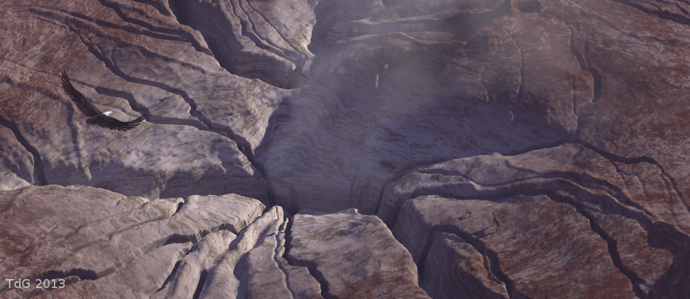
On 24-5-2013 15:56, Stephen wrote:
> I hate to say it bit I prefer the mist in the first image.
I lost the first :-(
> The texture of the eagle is better in the second one and your other
> things have been designed intelligently to evolve good camouflage. ;-)
>
Yes, the original eagle wings were wrongly textured by Poser, so I had
to go back to nature. Still have to do something about the tail.
Thomas
Post a reply to this message
|
|
| |
| |
|
|
|
|
| |
| |
|
|
On 24/05/2013 2:55 PM, Thomas de Groot wrote:
> An interesting alternative
>
It is in Bolivar. Some one has dropped his marching powder. :-P
I like this too.
--
Regards
Stephen
Post a reply to this message
|
|
| |
| |
|
|
|
|
| |
| |
|
|
On 24/05/2013 3:41 PM, Thomas de Groot wrote:
> On 24-5-2013 15:56, Stephen wrote:
>> I hate to say it bit I prefer the mist in the first image.
>
> I lost the first :-(
>
The way of the World, I'm afraid.
>> The texture of the eagle is better in the second one and your other
>> things have been designed intelligently to evolve good camouflage. ;-)
>>
> Yes, the original eagle wings were wrongly textured by Poser, so I had
> to go back to nature. Still have to do something about the tail.
>
That does happen.
--
Regards
Stephen
Post a reply to this message
|
|
| |
| |
|
|
|
|
| |
| |
|
|
Wonderful work again!
Like Stephen I prefer the first version of the smoke but the second version of
the stone texture. The eagle gives the scale to the picture so I can see no
scaling problem. May it be Gwaihir, who must have the size of a condor at least.
But he still has blueish tail feathers which is not natural I think. On the
other hand you need to contrast the bird against the brown texture of the
stones. With the more or less brown feathers of a golden eagle you cannot get
this contrast. The black feathers makes the bird recognizable and may be this is
the best compromise. But due to this issue I liked your first picture better.
Why not have a fantasy eagle with blue-green feathers as with the first picture?
Best regards,
Michael
Post a reply to this message
|
|
| |
| |
|
|
|
|
| |
| |
|
|
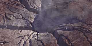
Everything considered, this would be the result.
Thomas
Post a reply to this message
Attachments:
Download 'elements of geology2_07.png' (723 KB)
Preview of image 'elements of geology2_07.png'
|
|
| |
| |
|
|
|
|
| |
| |
|
|
Don't know if it's a difference in our monitors or our tastes, but "levels >
auto" in Gimp brings out rich colors and details I didn't notice before.
-Shay
--------------------------------------------------
From: "Thomas de Groot" <tho### [at] degroot org>
Sent: Saturday, May 25, 2013 7:13 AM
Newsgroups: povray.binaries.images
Subject: Re: Elements of Geology: Take 4
> Everything considered, this would be the result.
>
> Thomas
> org>
Sent: Saturday, May 25, 2013 7:13 AM
Newsgroups: povray.binaries.images
Subject: Re: Elements of Geology: Take 4
> Everything considered, this would be the result.
>
> Thomas
>
Post a reply to this message
|
|
| |
| |
|
|
|
|
| |
| |
|
|
On 27-5-2013 14:40, Shay wrote:
> Don't know if it's a difference in our monitors or our tastes, but
> "levels >
> auto" in Gimp brings out rich colors and details I didn't notice before.
>
Well, /that/ completely changes the image :-) What it does is giving
more contrast to the colours it seems.
Nice, but I am not sure if I like that more, though...
Thomas
Post a reply to this message
|
|
| |
| |
|
|
|
|
| |
| |
|
|
Thomas de Groot wrote:
> Everything considered, this would be the result.
>
> Thomas
Definitely an improvement. I think the texture on the rock and eagle are
better. Funny I only noticed the animals (deer I assume) on this image
and had to look back to see when you added them. Say's a lot about my
powers of observation.
Sean
Post a reply to this message
|
|
| |
| |
|
|
|
|
| |