|
|
|
|
|
|
| |
| |
|
|
|
|
| |
| |
|
|
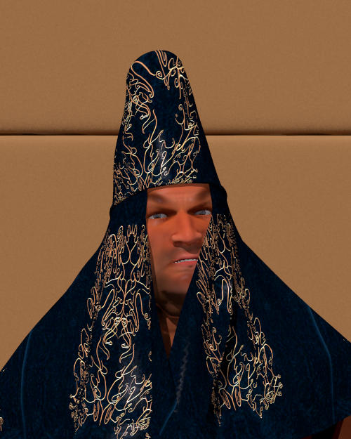
Timurtash, the Satrap of Gancaloon.

Thomas
Post a reply to this message
Attachments:
Download 'the satrap timurtash_06.png' (416 KB)
Preview of image 'the satrap timurtash_06.png'
|
|
| |
| |
|
|
|
|
| |
| |
|
|
That is really superb!
Post a reply to this message
|
|
| |
| |
|
|
|
|
| |
| |
|
|
On 14-12-2012 13:11, Kenneth wrote:
> That is really superb!
>
Thank you!

Some info:
- Using Diego (Latin variation of Ryan), Poser 8;
- Tackled eye squint problem by increasing the sideways rotation of the
eyes to 5 and -5 degrees respectively;
- Extensively morphed, including through the Face Room;
- Skin using Ive's technique;
- Standard cornea replaced by a POV-Ray material with interior;
- Texture for the hat coming from a Poser 6 Miki_CE version cloth texture;
- Wip :-)

Thomas
Post a reply to this message
|
|
| |
| |
|
|
|
|
| |
| |
|
|
Thomas de Groot wrote:

> Timurtash, the Satrap of Gancaloon.

... having had a rough day? ;)

Nice design. Although I perceive face and clothing more like two flat
layers in this image ... but maybe it is just the simple lighting.
Post a reply to this message
|
|
| |
| |
|
|
|
|
| |
| |
|
|
On 15-12-2012 2:35, Christian Froeschlin wrote:

> Nice design. Although I perceive face and clothing more like two flat
> layers in this image ... but maybe it is just the simple lighting.


Could you elaborate a bit on this? I am not sure I know what you mean.
As for the cloth, the dark colour hides the shadows of the folds
obviously; for the face I don't know. The cloth makes a shadow across it
anyway.

More info: for sky and light I use a Terragen hdr dome (courtesy Ive)
with a Cie sun.

Thomas
Post a reply to this message
|
|
| |
| |
|
|
|
|
| |
| |
|
|
Thomas de Groot <tho### [at] degroot org> wrote:
> On 15-12-2012 2:35, Christian Froeschlin wrote:
>
> > Nice design. Although I perceive face and clothing more like two flat
> > layers in this image ... but maybe it is just the simple lighting.
>
>
> Could you elaborate a bit on this? I am not sure I know what you mean.
> As for the cloth, the dark colour hides the shadows of the folds
> obviously; for the face I don't know. The cloth makes a shadow across it
> anyway.
>
> More info: for sky and light I use a Terragen hdr dome (courtesy Ive)
> with a Cie sun.
>
> Thomas
I'm looking at your picture yust only from my new smartphone.
So I will not see every detail. But the right scarf seems to not really at the
face
of the figure. May be this is the reason for the complaints. Otherwise a fine
picture.
Best regards,
Michael org> wrote:
> On 15-12-2012 2:35, Christian Froeschlin wrote:
>
> > Nice design. Although I perceive face and clothing more like two flat
> > layers in this image ... but maybe it is just the simple lighting.
>
>
> Could you elaborate a bit on this? I am not sure I know what you mean.
> As for the cloth, the dark colour hides the shadows of the folds
> obviously; for the face I don't know. The cloth makes a shadow across it
> anyway.
>
> More info: for sky and light I use a Terragen hdr dome (courtesy Ive)
> with a Cie sun.
>
> Thomas
I'm looking at your picture yust only from my new smartphone.
So I will not see every detail. But the right scarf seems to not really at the
face
of the figure. May be this is the reason for the complaints. Otherwise a fine
picture.
Best regards,
Michael
Post a reply to this message
|
|
| |
| |
|
|
|
|
| |
| |
|
|
Am 15.12.2012 19:50, schrieb MichaelJF:
> Thomas de Groot <tho### [at] degrootorg> wrote:
>> On 15-12-2012 2:35, Christian Froeschlin wrote:
>>
>>> Nice design. Although I perceive face and clothing more like two flat
>>> layers in this image ... but maybe it is just the simple lighting.
>>
>>
>> Could you elaborate a bit on this? I am not sure I know what you mean.
>> As for the cloth, the dark colour hides the shadows of the folds
>> obviously; for the face I don't know. The cloth makes a shadow across it
>> anyway.
>>
>> More info: for sky and light I use a Terragen hdr dome (courtesy Ive)
>> with a Cie sun.
>>
>> Thomas
>
> I'm looking at your picture yust only from my new smartphone.
> So I will not see every detail. But the right scarf seems to not really at the
> face
> of the figure. May be this is the reason for the complaints. Otherwise a fine
> picture.

I guess radiosity would help a lot (Thomas, you didn't use radiosity in
that image, did you?)
Post a reply to this message
|
|
| |
| |
|
|
From: Christian Froeschlin
Subject: Re: Another portrait from Gancaloon
Date: 15 Dec 2012 16:55:03
Message: <50ccf1b7@news.povray.org>
|
|
|
| |
| |
|
|
Thomas de Groot wrote:

>> Nice design. Although I perceive face and clothing more like two flat
>> layers in this image ... but maybe it is just the simple lighting.
>
> Could you elaborate a bit on this? I am not sure I know what you mean.
> As for the cloth, the dark colour hides the shadows of the folds
> obviously; for the face I don't know. The cloth makes a shadow across it
> anyway

I saw the shadow on the left side but it is rather harsh (point light?)
and the right side doesn't show any shadow or shading, the line is very
straight and the color change very sharp. I think this caused me to
see face and cloth as layers (maybe you know this kind of toy where
you have persons and pieces of clothing in cardboard and can then
combine them, this was my first impression).

I still think its mostly the lighting and maybe a lack of curves
on the right side of the cloth. The reduced depth perception due to
the dark color of the cloth probably doesn't help either.
Post a reply to this message
|
|
| |
| |
|
|
|
|
| |
| |
|
|
On 15-12-2012 21:34, clipka wrote:

> I guess radiosity would help a lot (Thomas, you didn't use radiosity in
> that image, did you?)
>

I always use radiosity!

And here there is even an area_light, according to Ive's technique for
Terragen skies.

Compare with the Sultana: the same scene settings there.

Thomas
Post a reply to this message
|
|
| |
| |
|
|
|
|
| |
| |
|
|
On 15-12-2012 19:50, MichaelJF wrote:

> I'm looking at your picture yust only from my new smartphone.
> So I will not see every detail. But the right scarf seems to not really at the
> face
> of the figure. May be this is the reason for the complaints. Otherwise a fine
> picture.

Well, it is close to the face, only really touching at the chin. The
cloth is relatively stiff due to the embroideries. I think that the dark
colour makes you see what you see ;-)

Thomas
Post a reply to this message
|
|
| |
| |
|
|
From: Thomas de Groot
Subject: Re: Another portrait from Gancaloon wip2
Date: 16 Dec 2012 04:12:54
Message: <50cd9096@news.povray.org>
|
|
|
| |
| |
|
|
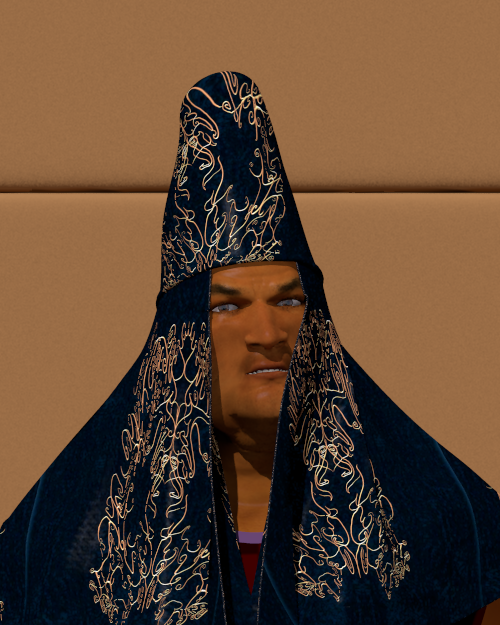
A couple of changes to the draping of the veil, and addition of cloth
thickness. Also reverting to original face map, with a different
skintone added.

Thomas
Post a reply to this message
Attachments:
Download 'the satrap timurtash_07.png' (420 KB)
Preview of image 'the satrap timurtash_07.png'

|
|
| |
| |
|
|
|
|
| |
| |
|
|
On 15-12-2012 22:55, Christian Froeschlin wrote:
> I saw the shadow on the left side but it is rather harsh (point light?)
> and the right side doesn't show any shadow or shading, the line is very
> straight and the color change very sharp. I think this caused me to
> see face and cloth as layers (maybe you know this kind of toy where
> you have persons and pieces of clothing in cardboard and can then
> combine them, this was my first impression).

As said, no point light but a hdr dome with area_light for the sun. It
must be the combination dark cloth / straight edge that played the trick.

>
> I still think its mostly the lighting and maybe a lack of curves
> on the right side of the cloth. The reduced depth perception due to
> the dark color of the cloth probably doesn't help either.

However, I think the wip2 below looks better.

Thomas
Post a reply to this message
|
|
| |
| |
|
|
|
|
| |
| |
|
|
On 14/12/2012 9:31 AM, Thomas de Groot wrote:
> Timurtash, the Satrap of Gancaloon.
>

Not a lot to say except, http://www.youtube.com/watch?v=pGD8-irj3sE

;-)

--
Regards
     Stephen
Post a reply to this message
|
|
| |
| |
|
|
|
|
| |
| |
|
|
Thomas de Groot wrote:

>> I still think its mostly the lighting and maybe a lack of curves on
>> the right side of the cloth. The reduced depth perception due to
>> the dark color of the cloth probably doesn't help either.
>
> However, I think the wip2 below looks better.

yes, this works better for me.

> As said, no point light but a hdr dome with area_light for the sun.
> It must be the combination dark cloth / straight edge that played the
> trick.

Another trick might have been that I thought of this as an indoor
scene from the background and overall darkness, while the shadows
where those of sunlight.

Maybe you could also try a brighter sun and a perspective or
sun position that shows some shadow against the back wall.
Post a reply to this message
|
|
| |
| |
|
|
|
|
| |
| |
|
|
On 16-12-2012 17:47, Christian Froeschlin wrote:
> Maybe you could also try a brighter sun and a perspective or
> sun position that shows some shadow against the back wall.

I could, but this is a test environment where I... test Poser figures
during development. It is not intended as a full fledged scene.

Thomas
Post a reply to this message
|
|
| |
| |
|
|
|
|
| |
| |
|
|
On 16-12-2012 16:09, Stephen wrote:
> Not a lot to say except, http://www.youtube.com/watch?v=pGD8-irj3sE

Holly Molly! LOL

Thomas
Post a reply to this message
|
|
| |
| |
|
|
|
|
| |
| |
|
|
Am 16.12.2012 10:12, schrieb Thomas de Groot:
> A couple of changes to the draping of the veil, and addition of cloth
> thickness. Also reverting to original face map, with a different
> skintone added.
>

I see the same effect Christian did mention - to me it looks like some
badly done photoshopping where the face is pasted but does not match the
lighting condition.
And as I did first use the web interface I did see this wip2 before the
other one and I do not see any improvement here. Even black velvet would
never appear that much darker than the unlit/shadowed parts of the face.
Not to human vision and not through a camera lens.
And BTW I do see the same effect on the ladies face you did post
recently - just not so dominant. Personally I think this is a shame as
your clothing work for poser people is quite outstanding and would
deserve better.

-Ive
Post a reply to this message
|
|
| |
| |
|
|
From: Thomas de Groot
Subject: Re: Another portrait from Gancaloon wip2
Date: 17 Dec 2012 07:08:43
Message: <50cf0b4b@news.povray.org>
|
|
|
| |
| |
|
|
On 17-12-2012 12:11, Ive wrote:
> I see the same effect Christian did mention - to me it looks like some
> badly done photoshopping where the face is pasted but does not match the
> lighting condition.
> And as I did first use the web interface I did see this wip2 before the
> other one and I do not see any improvement here. Even black velvet would
> never appear that much darker than the unlit/shadowed parts of the face.
> Not to human vision and not through a camera lens.
> And BTW I do see the same effect on the ladies face you did post
> recently - just not so dominant. Personally I think this is a shame as
> your clothing work for poser people is quite outstanding and would
> deserve better.

So, what is to be done? Because I have not the slightest clue (except
use a different colour for the cloth, which is not my intention).

Thomas
Post a reply to this message
|
|
| |
| |
|
|
|
|
| |
| |
|
|
On 17-12-2012 12:11, Ive wrote:
> I see the same effect Christian did mention - to me it looks like some
> badly done photoshopping where the face is pasted but does not match the
> lighting condition.

Additional thought: Why is it that I do not see at all what you and
Christian seem to see? Not because I am the maker, that is not good
enough for me. I am truly puzzled.

Thomas
Post a reply to this message
|
|
| |
| |
|
|
|
|
| |
| |
|
|
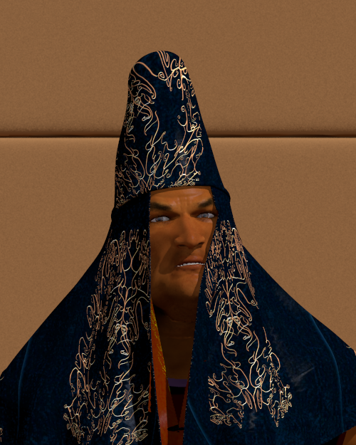
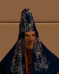
What do you make of this? Only changed the light's position.

Thomas
Post a reply to this message
Attachments:
Download 'poserfiguretest.png' (421 KB)
Preview of image 'poserfiguretest.png'
|
|
| |
| |
|
|
|
|
| |
| |
|
|
Am 17.12.2012 13:40, schrieb Thomas de Groot:
> What do you make of this? Only changed the light's position.

Now it's the other side not looking right :-P
Post a reply to this message
|
|
| |
| |
|
|
|
|
| |
| |
|
|
On 17-12-2012 16:11, clipka wrote:
> Am 17.12.2012 13:40, schrieb Thomas de Groot:
>> What do you make of this? Only changed the light's position.
>
> Now it's the other side not looking right :-P
>

Go fly a kite, my friend! :-)

Thomas
Post a reply to this message
|
|
| |
| |
|
|
|
|
| |
| |
|
|
Am 17.12.2012 16:36, schrieb Thomas de Groot:
> On 17-12-2012 16:11, clipka wrote:
>> Am 17.12.2012 13:40, schrieb Thomas de Groot:
>>> What do you make of this? Only changed the light's position.
>>
>> Now it's the other side not looking right :-P
>>
>
> Go fly a kite, my friend! :-)

For some reason I suspect that won't fix the Satrap's clothing problems :-P
Post a reply to this message
|
|
| |
| |
|
|
|
|
| |
| |
|
|
Am 17.12.2012 13:30, schrieb Thomas de Groot:
> On 17-12-2012 12:11, Ive wrote:
>> I see the same effect Christian did mention - to me it looks like some
>> badly done photoshopping where the face is pasted but does not match the
>> lighting condition.
>
> Additional thought: Why is it that I do not see at all what you and
> Christian seem to see? Not because I am the maker, that is not good
> enough for me. I am truly puzzled.
>

Note that I'm not concerned about photorealism, it is the inconsistence
that bothers me.
Given the shadow on the back wall gap and the sharp shadow line in the
face the scene suggest to be lit by direct sunlight. But in this case
the dynamic range between the lit/unlit parts of the face is way too
low. The shadowed face parts are also too bright compared to the
shadowed wall gap. In other words, the shadows in the face are way too
bright - or the lit parts way too dark, depending on the exposure
setting of your camera.
The only way to make the face look as soft within direct sunlight would
be by adding a lot of reflectors as done e.g. for outdoor fashion
photography, but in this case the veil would also look very different.
As the clothing is now it looks more like within an old master painting.
This inconsistence creates this copy'n'paste impression for me.
I think your setup for testing poser people/clothing is a bit
unfortunate. Personally I do use two different setups for *quick*
indoor/outdoor testing and textures are *good* when they pass both tests.

-Ive
Post a reply to this message
|
|
| |
| |
|
|
|
|
| |
| |
|
|
On 17/12/2012 3:36 PM, Thomas de Groot wrote:
> On 17-12-2012 16:11, clipka wrote:
>> Am 17.12.2012 13:40, schrieb Thomas de Groot:
>>> What do you make of this? Only changed the light's position.
>>
>> Now it's the other side not looking right :-P
>>
>
> Go fly a kite, my friend! :-)
>
> Thomas
>

Anyone know of a good second hand eye shop? Because it looks good to me.
Although, maybe a fill in light on his RHS (left as you look at it)
might help.

--
Regards
     Stephen
Post a reply to this message
|
|
| |
| |
|
|
|
|
| |
| |
|
|
Stephen wrote:

> Anyone know of a good second hand eye shop?

Don't discard the old eyes until you're sure the difference it
not from the monitor. Actually mine is very old and poorly calibrated
but I'm sure Ive has gamma correction at hand-counted photon level ;)
Post a reply to this message
|
|
| |
| |
|
|
|
|
| |
| |
|
|
On 17/12/2012 8:30 PM, Christian Froeschlin wrote:
> Stephen wrote:
>
>> Anyone know of a good second hand eye shop?
>
> Don't discard the old eyes until you're sure the difference it
> not from the monitor.

I won't discard them but I do wish I had younger ones. :-)

> Actually mine is very old and poorly calibrated
> but I'm sure Ive has gamma correction at hand-counted photon level ;)

I am not a betting man but I bet you a Mars bar that he has. ;-)

--
Regards
     Stephen
Post a reply to this message
|
|
| |
| |
|
|
From: James Holsenback
Subject: Re: Another portrait from Gancaloon
Date: 17 Dec 2012 17:09:55
Message: <50cf9833@news.povray.org>
|
|
|
| |
| |
|
|
On 12/17/2012 04:12 PM, Stephen wrote:
> On 17/12/2012 8:30 PM, Christian Froeschlin wrote:
>> Stephen wrote:
>>
>>> Anyone know of a good second hand eye shop?
>>
>> Don't discard the old eyes until you're sure the difference it
>> not from the monitor.
>
> I won't discard them but I do wish I had younger ones. :-)
>
>> Actually mine is very old and poorly calibrated
>> but I'm sure Ive has gamma correction at hand-counted photon level ;)
>
> I am not a betting man but I bet you a Mars bar that he has. ;-)
>
LOL ... raise ya a Snickers ;-)
Post a reply to this message
|
|
| |
| |
|
|
|
|
| |
| |
|
|
Thomas de Groot <tho### [at] degrootorg> wrote:
> On 17-12-2012 12:11, Ive wrote:
> > I see the same effect Christian did mention - to me it looks like some
> > badly done photoshopping where the face is pasted but does not match the
> > lighting condition.
>
> Additional thought: Why is it that I do not see at all what you and
> Christian seem to see? Not because I am the maker, that is not good
> enough for me. I am truly puzzled.

I, too, see the effect Christian and Ive talk about; it looks exactly like bad
Photoshopping.  (And like Ive, I must stress that photorealism is not the
issue.)  My first instinct was that the contrast on the face isn't deep enough;
but I know /just/ enough about color matters to consider the factors that I
don't know enough about.  I must defer to Ive on these matters.  (If he's good
enough for Jaime, he's good enough for me.)

("He"?  I don't know.  Curse the English language for requiring me to know this
information!  (Yes, formal grammar prescribes the word "he" in this situation.
Oink.))
Post a reply to this message
|
|
| |
| |
|
|
|
|
| |
| |
|
|
Am 17.12.2012 21:30, schrieb Christian Froeschlin:
>
> Don't discard the old eyes until you're sure the difference it
> not from the monitor. Actually mine is very old and poorly calibrated
> but I'm sure Ive has gamma correction at hand-counted photon level ;)
>
Yes, did this when I was young, patient and poor - meanwhile I let do
machines this kind of work for me.

But more seriously, I was always puzzled about the lack of interest in
well calibrated viewing devices that seems so common among people within
these newsgroups.
In my former line of work - among photographers - it was simply out of
the question that a perfectly calibrated high end monitor is a *basic*
requirement for judging any graphics related work.
Well, given that we are all just CGI hobbyists, and a good monitor isn't
cheap - but a gaming graphics card or quad-core machine isn't cheap
either and people seem to have no problem spending money for these. On
the contrary things seem even worse now as in former times every
calibrated mid-class CRT was already better than any contemporary
high-end TFT.

-Ive
Post a reply to this message
|
|
| |
| |
|
|
|
|
| |
| |
|
|
Am 18.12.2012 04:39, schrieb Ive:

> But more seriously, I was always puzzled about the lack of interest in
> well calibrated viewing devices that seems so common among people within
> these newsgroups.

I guess it's mainly underestimation (due to lack of personal experience)
what a difference a good and well-calibrated display can make.

The half-hearted support for gamma handling in older versions of POV-Ray
might also have contributed in the past.


 > On the contrary things seem even worse now as in former times every
> calibrated mid-class CRT was already better than any contemporary
> high-end TFT.

I suspect that's not true - if only because the CRTs of former times
were typically connected to the graphics adapter via some analog
interface and were therefore subject to both static and dynamic signal
distortions; suffered from both static and dynamic geometric
distortions; and came with ergonomic problems due to inherent flickering
and buildup of static electricity.

Of course all these problems were less prominent in mid-class CRTs than
in low-end ones, but I suspect that it would have taken high-end
equipment to reduce them to entirely unproblematic levels.

(BTW, just to avoid any misunderstanding: When I hear "high-end TFT" I
think "graphics enthusiast's dream", not "gamer's dream" or some such.
You know, the stuff that comes with an elaborate individual factory
calibration report included.)
Post a reply to this message
|
|
| |
| |
|
|
From: Thomas de Groot
Subject: Re: Another portrait from Gancaloon wip2
Date: 18 Dec 2012 03:44:25
Message: <50d02ce9@news.povray.org>
|
|
|
| |
| |
|
|
On 17-12-2012 18:17, Ive wrote:
> Note that I'm not concerned about photorealism, it is the inconsistence
> that bothers me.
> Given the shadow on the back wall gap and the sharp shadow line in the
> face the scene suggest to be lit by direct sunlight. But in this case
> the dynamic range between the lit/unlit parts of the face is way too
> low. The shadowed face parts are also too bright compared to the
> shadowed wall gap. In other words, the shadows in the face are way too
> bright - or the lit parts way too dark, depending on the exposure
> setting of your camera.

OK, fair enough. I know that this is a simple scene setting for testing
the look of clothing in particular, and /not/ intended for fashion
photography outdoors ;-) So the scene should not be judged in that
light. In the present case, the contrast with the dark cloth is too
revealing apparently.

> The only way to make the face look as soft within direct sunlight would
> be by adding a lot of reflectors as done e.g. for outdoor fashion
> photography, but in this case the veil would also look very different.
> As the clothing is now it looks more like within an old master painting.
> This inconsistence creates this copy'n'paste impression for me.
> I think your setup for testing poser people/clothing is a bit
> unfortunate. Personally I do use two different setups for *quick*
> indoor/outdoor testing and textures are *good* when they pass both tests.

In time, I shall look into a better setup for the testing ground, but I
must say that I am not as demanding as you are on this matter ;-)

Thomas
Post a reply to this message
|
|
| |
| |
|
|
|
|
| |
| |
|
|
On 18-12-2012 1:18, Cousin Ricky wrote:
> I, too, see the effect Christian and Ive talk about; it looks exactly like bad
> Photoshopping.  (And like Ive, I must stress that photorealism is not the
> issue.)  My first instinct was that the contrast on the face isn't deep enough;
> but I know /just/ enough about color matters to consider the factors that I
> don't know enough about.  I must defer to Ive on these matters.  (If he's good
> enough for Jaime, he's good enough for me.)

Ive is the authority indeed and I shall consider some improvements to
the test setup following his comments, but as I answered to his post, I
am not as demanding and am still fairly satisfied with this (test)
image. Later scene building with this figure will show how it reacts to
the real environment. In the mean time, I go on tweaking and experimenting.

Thomas
Post a reply to this message
|
|
| |
| |
|
|
|
|
| |
| |
|
|
On 17-12-2012 20:49, Stephen wrote:

> Anyone know of a good second hand eye shop? Because it looks good to me.
> Although, maybe a fill in light on his RHS (left as you look at it)
> might help.
>

I would need one too (an eye shop) although the eyes still function to
satisfaction. ;-)

One day I shall improve the scene setup (low priority) to make it
Ive-proof ;-)

Thomas
Post a reply to this message
|
|
| |
| |
|
|
|
|
| |
| |
|
|
James Holsenback <nom### [at] nonecom> wrote:
> On 12/17/2012 04:12 PM, Stephen wrote:

> >
> > I am not a betting man but I bet you a Mars bar that he has. ;-)
> >
> LOL ... raise ya a Snickers ;-)

Nope! The steaks are too high. I think that I will cash im my chips (fries to
you. ;-) )
Post a reply to this message
|
|
| |
| |
|
|
|
|
| |
| |
|
|
Thomas de Groot <tho### [at] degrootorg> wrote:
> On 17-12-2012 20:49, Stephen wrote:
>
> > Anyone know of a good second hand eye shop? Because it looks good to me.
> > Although, maybe a fill in light on his RHS (left as you look at it)
> > might help.
> >
>
> I would need one too (an eye shop) although the eyes still function to
> satisfaction. ;-)
>

Aye! Mine could focus quicker for my comfort.

> One day I shall improve the scene setup (low priority) to make it
> Ive-proof ;-)
>

Let me know when that happens. ;-)

Seriously, I look beyond the image and see the intent. Maybe because that in
real life you have to interpret what your eyes see to make sense to your brain,
until you no longer look at it. Or maybe it is the result of my misspent youth.
(Ooo! pretty colors)
Post a reply to this message
|
|
| |
| |
|
|
|
|
| |
| |
|
|
On 18-12-2012 14:31, Stephen wrote:
> Thomas de Groot <tho### [at] degrootorg> wrote:
>> On 17-12-2012 20:49, Stephen wrote:
>>
>>> Anyone know of a good second hand eye shop? Because it looks good to me.
>>> Although, maybe a fill in light on his RHS (left as you look at it)
>>> might help.
>>>
>>
>> I would need one too (an eye shop) although the eyes still function to
>> satisfaction. ;-)
>>
>
> Aye! Mine could focus quicker for my comfort.

I know what you mean.

>
>> One day I shall improve the scene setup (low priority) to make it
>> Ive-proof ;-)
>>
>
> Let me know when that happens. ;-)

I'll do my best ;-)

>
> Seriously, I look beyond the image and see the intent. Maybe because that in
> real life you have to interpret what your eyes see to make sense to your brain,
> until you no longer look at it. Or maybe it is the result of my misspent youth.
> (Ooo! pretty colors)

Yep, so true! And also in the good old days of B/W photography is my
experience. Oh well, I just learned successfully to turn a pair of boots
I took from Apollo Maximus into conforming ones for Ryan, by using
Poser's Setup Room. I am well pleased. A few little glitches remain but
overall the work was simple. Most work was in Silo where I had to adapt
the geometry to the new hierarchy.

Thomas
Post a reply to this message
|
|
| |
| |
|
|
|
|
| |
| |
|
|
Am 18.12.2012 05:50, schrieb clipka:
> Am 18.12.2012 04:39, schrieb Ive:
>
>> But more seriously, I was always puzzled about the lack of interest in
>> well calibrated viewing devices that seems so common among people within
>> these newsgroups.
>
> I guess it's mainly underestimation (due to lack of personal experience)
> what a difference a good and well-calibrated display can make.
>
> The half-hearted support for gamma handling in older versions of POV-Ray
> might also have contributed in the past.
>
>
>  > On the contrary things seem even worse now as in former times every
>> calibrated mid-class CRT was already better than any contemporary
>> high-end TFT.
>
> I suspect that's not true - if only because the CRTs of former times
> were typically connected to the graphics adapter via some analog
> interface and were therefore subject to both static and dynamic signal
> distortions; suffered from both static and dynamic geometric
> distortions; and came with ergonomic problems due to inherent flickering
> and buildup of static electricity.
>

By writing *calibrated* mid-class CRT, I was referring to professional
graphics usage and there was a Mac or PC equipped with a Matrox graphics
card (and its superior analog signal quality but lack of 3d
acceleration) de-facto standard.
My own CRT did run at a 1600x1200 resolution with 100Hz frequency. It
had minor divergence problems at the corner pixels but was able to
actually show pitch black pixels (and off course all shades of near
black) where my current TFT shows something my wife would call medium
anthracite.
This is what I really do miss. And - as it is winter again - it's
ability to heat the whole room. Not so fortunate during summer and one
of the reasons I had to dismiss it ;)

-Ive
Post a reply to this message
|
|
| |
| |
|
|
|
|
| |