|
|
|
|
|
|
| |
| |
|
|
From: Thomas de Groot
Subject: Re: Another portrait from Gancaloon wip2
Date: 16 Dec 2012 04:12:54
Message: <50cd9096@news.povray.org>
|
|
|
| |
| |
|
|
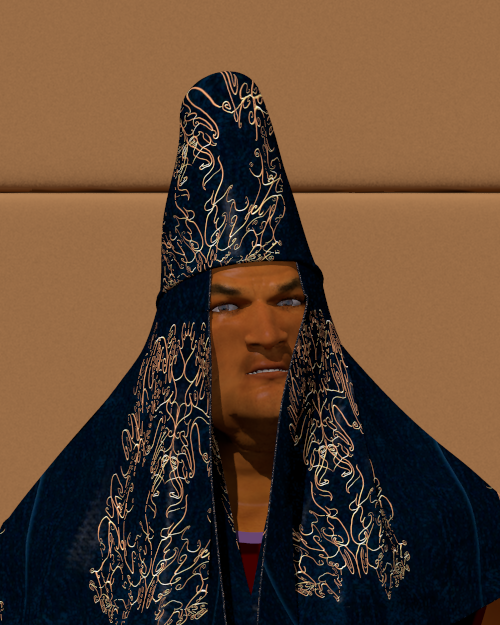
A couple of changes to the draping of the veil, and addition of cloth
thickness. Also reverting to original face map, with a different
skintone added.
Thomas
Post a reply to this message
Attachments:
Download 'the satrap timurtash_07.png' (420 KB)
Preview of image 'the satrap timurtash_07.png'

|
|
| |
| |
|
|
|
|
| |
| |
|
|
On 15-12-2012 22:55, Christian Froeschlin wrote:
> I saw the shadow on the left side but it is rather harsh (point light?)
> and the right side doesn't show any shadow or shading, the line is very
> straight and the color change very sharp. I think this caused me to
> see face and cloth as layers (maybe you know this kind of toy where
> you have persons and pieces of clothing in cardboard and can then
> combine them, this was my first impression).
As said, no point light but a hdr dome with area_light for the sun. It
must be the combination dark cloth / straight edge that played the trick.
>
> I still think its mostly the lighting and maybe a lack of curves
> on the right side of the cloth. The reduced depth perception due to
> the dark color of the cloth probably doesn't help either.
However, I think the wip2 below looks better.
Thomas
Post a reply to this message
|
|
| |
| |
|
|
|
|
| |
| |
|
|
On 14/12/2012 9:31 AM, Thomas de Groot wrote:
> Timurtash, the Satrap of Gancaloon.
>
Not a lot to say except, http://www.youtube.com/watch?v=pGD8-irj3sE
;-)
--
Regards
Stephen
Post a reply to this message
|
|
| |
| |
|
|
|
|
| |
| |
|
|
Thomas de Groot wrote:
>> I still think its mostly the lighting and maybe a lack of curves on
>> the right side of the cloth. The reduced depth perception due to
>> the dark color of the cloth probably doesn't help either.
>
> However, I think the wip2 below looks better.
yes, this works better for me.
> As said, no point light but a hdr dome with area_light for the sun.
> It must be the combination dark cloth / straight edge that played the
> trick.
Another trick might have been that I thought of this as an indoor
scene from the background and overall darkness, while the shadows
where those of sunlight.
Maybe you could also try a brighter sun and a perspective or
sun position that shows some shadow against the back wall.
Post a reply to this message
|
|
| |
| |
|
|
|
|
| |
| |
|
|
On 16-12-2012 17:47, Christian Froeschlin wrote:
> Maybe you could also try a brighter sun and a perspective or
> sun position that shows some shadow against the back wall.
I could, but this is a test environment where I... test Poser figures
during development. It is not intended as a full fledged scene.
Thomas
Post a reply to this message
|
|
| |
| |
|
|
|
|
| |
| |
|
|
On 16-12-2012 16:09, Stephen wrote:
> Not a lot to say except, http://www.youtube.com/watch?v=pGD8-irj3sE
Holly Molly! LOL
Thomas
Post a reply to this message
|
|
| |
| |
|
|
|
|
| |
| |
|
|
Am 16.12.2012 10:12, schrieb Thomas de Groot:
> A couple of changes to the draping of the veil, and addition of cloth
> thickness. Also reverting to original face map, with a different
> skintone added.
>
I see the same effect Christian did mention - to me it looks like some
badly done photoshopping where the face is pasted but does not match the
lighting condition.
And as I did first use the web interface I did see this wip2 before the
other one and I do not see any improvement here. Even black velvet would
never appear that much darker than the unlit/shadowed parts of the face.
Not to human vision and not through a camera lens.
And BTW I do see the same effect on the ladies face you did post
recently - just not so dominant. Personally I think this is a shame as
your clothing work for poser people is quite outstanding and would
deserve better.
-Ive
Post a reply to this message
|
|
| |
| |
|
|
From: Thomas de Groot
Subject: Re: Another portrait from Gancaloon wip2
Date: 17 Dec 2012 07:08:43
Message: <50cf0b4b@news.povray.org>
|
|
|
| |
| |
|
|
On 17-12-2012 12:11, Ive wrote:
> I see the same effect Christian did mention - to me it looks like some
> badly done photoshopping where the face is pasted but does not match the
> lighting condition.
> And as I did first use the web interface I did see this wip2 before the
> other one and I do not see any improvement here. Even black velvet would
> never appear that much darker than the unlit/shadowed parts of the face.
> Not to human vision and not through a camera lens.
> And BTW I do see the same effect on the ladies face you did post
> recently - just not so dominant. Personally I think this is a shame as
> your clothing work for poser people is quite outstanding and would
> deserve better.
So, what is to be done? Because I have not the slightest clue (except
use a different colour for the cloth, which is not my intention).
Thomas
Post a reply to this message
|
|
| |
| |
|
|
|
|
| |
| |
|
|
On 17-12-2012 12:11, Ive wrote:
> I see the same effect Christian did mention - to me it looks like some
> badly done photoshopping where the face is pasted but does not match the
> lighting condition.
Additional thought: Why is it that I do not see at all what you and
Christian seem to see? Not because I am the maker, that is not good
enough for me. I am truly puzzled.
Thomas
Post a reply to this message
|
|
| |
| |
|
|
|
|
| |
| |
|
|
What do you make of this? Only changed the light's position.
Thomas
Post a reply to this message
Attachments:
Download 'poserfiguretest.png' (421 KB)
Preview of image 'poserfiguretest.png'
|
|
| |
| |
|
|
|
|
| |