|
|
|
|
|
|
| |
| |
|
|
|
|
| |
| |
|
|
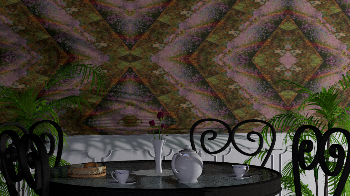
I'm sure you'd most likely NOT see wall paper like this but I like it
anyways. I used JVPs' wallpaper code he posted a while back with a Monet
(of all things) IMHO: it would seem that combining the geometry of the
tiling pattern and the fuzzy aspect of impressionism is a good thing.

I used a 3 point lighting scheme instead of radiosity this time. A 10x10
area light for the key, a shadowless point light for the fill, and the
bright spot on a hdr map as the back light.

The glass table top material needs some work for sure, and I'm thinking
about dropping the bagel/basket.
Post a reply to this message
Attachments:
Download 'bistro.png' (1226 KB)
Preview of image 'bistro.png'
|
|
| |
| |
|
|
|
|
| |
| |
|
|
Jim Holsenback wrote:

> I used a 3 point lighting scheme instead of radiosity this time. A 10x10
> area light for the key, a shadowless point light for the fill, and the
> bright spot on a hdr map as the back light.

Not sure I understand the back light part, how does the
hdr map contribute to lighting without radiosity?
Post a reply to this message
|
|
| |
| |
|
|
|
|
| |
| |
|
|
On 01/30/2012 09:42 PM, Christian Froeschlin wrote:
> Jim Holsenback wrote:
>
>> I used a 3 point lighting scheme instead of radiosity this time. A
>> 10x10 area light for the key, a shadowless point light for the fill,
>> and the bright spot on a hdr map as the back light.
>
> Not sure I understand the back light part, how does the
> hdr map contribute to lighting without radiosity?
>

I just moved the bright spot so it's influence is up and back in this
scene ;-)
Post a reply to this message
|
|
| |
| |
|
|
|
|
| |
| |
|
|
On 30/01/2012 10:56 PM, Jim Holsenback wrote:
> I'm sure you'd most likely NOT see wall paper like this but I like it
> anyways. I used JVPs' wallpaper code he posted a while back with a Monet
> (of all things) IMHO: it would seem that combining the geometry of the
> tiling pattern and the fuzzy aspect of impressionism is a good thing.
>
> I used a 3 point lighting scheme instead of radiosity this time. A 10x10
> area light for the key, a shadowless point light for the fill, and the
> bright spot on a hdr map as the back light.
>
> The glass table top material needs some work for sure, and I'm thinking
> about dropping the bagel/basket.

I like but a couple of points.
Have you got a small camera angle? The back wall looks very close to the
table, to me.
The saucers have got very high bases or are floating through the cups.
I like the basket but not the bagel (but then I don’t like bagels). How
about a cake stand instead?

--
Regards
     Stephen
Post a reply to this message
|
|
| |
| |
|
|
|
|
| |
| |
|
|
On 01/31/2012 07:11 AM, Stephen wrote:
> On 30/01/2012 10:56 PM, Jim Holsenback wrote:
>> I'm sure you'd most likely NOT see wall paper like this but I like it
>> anyways. I used JVPs' wallpaper code he posted a while back with a Monet
>> (of all things) IMHO: it would seem that combining the geometry of the
>> tiling pattern and the fuzzy aspect of impressionism is a good thing.
>>
>> I used a 3 point lighting scheme instead of radiosity this time. A 10x10
>> area light for the key, a shadowless point light for the fill, and the
>> bright spot on a hdr map as the back light.
>>
>> The glass table top material needs some work for sure, and I'm thinking
>> about dropping the bagel/basket.
>
> I like but a couple of points.
> Have you got a small camera angle? The back wall looks very close to the
> table, to me.

yep ... my setup is still a ways off. I was trying for some shadow play
with the palm. I need to widen the camera angle AND back the wall off,
but then the top part of the view will be left with some space to fill.
A painting didn't fit the bill ... LOL that's how the Monet found it's
way into this scene. I'm going to have to come up with a cupboard or
sideboard. If I use a little focal blur, maybe I can get away with
something low-ish detail. The up side, a little floor in the view would
probably be a good thing.

> The saucers have got very high bases or are floating through the cups.
> I like the basket but not the bagel (but then I don’t like bagels). How
> about a cake stand instead?
>

since you're not the 1st to mention that I probably ought to have a
closer look at the model. Don't like bagels either ... maybe some fruit
would look better.
Post a reply to this message
|
|
| |
| |
|
|
|
|
| |
| |
|
|
On 31/01/2012 12:59 PM, Jim Holsenback wrote:
> On 01/31/2012 07:11 AM, Stephen wrote:

>> I like but a couple of points.
>> Have you got a small camera angle? The back wall looks very close to the
>> table, to me.
>
> yep ... my setup is still a ways off. I was trying for some shadow play
> with the palm. I need to widen the camera angle AND back the wall off,
> but then the top part of the view will be left with some space to fill.
> A painting didn't fit the bill ... LOL that's how the Monet found it's
> way into this scene. I'm going to have to come up with a cupboard or
> sideboard. If I use a little focal blur, maybe I can get away with
> something low-ish detail. The up side, a little floor in the view would
> probably be a good thing.
>

You could always add a picture rail, and maybe a dado rail, which would
give a natural break.

>> The saucers have got very high bases or are floating through the cups.
>> I like the basket but not the bagel (but then I don’t like bagels). How
>> about a cake stand instead?
>>
>
> since you're not the 1st to mention that I probably ought to have a
> closer look at the model. Don't like bagels either ... maybe some fruit
> would look better.

If you could model a good looking croissant, I would love a copy of the
code. ;-)


--
Regards
     Stephen
Post a reply to this message
|
|
| |
| |
|
|
|
|
| |
| |
|
|
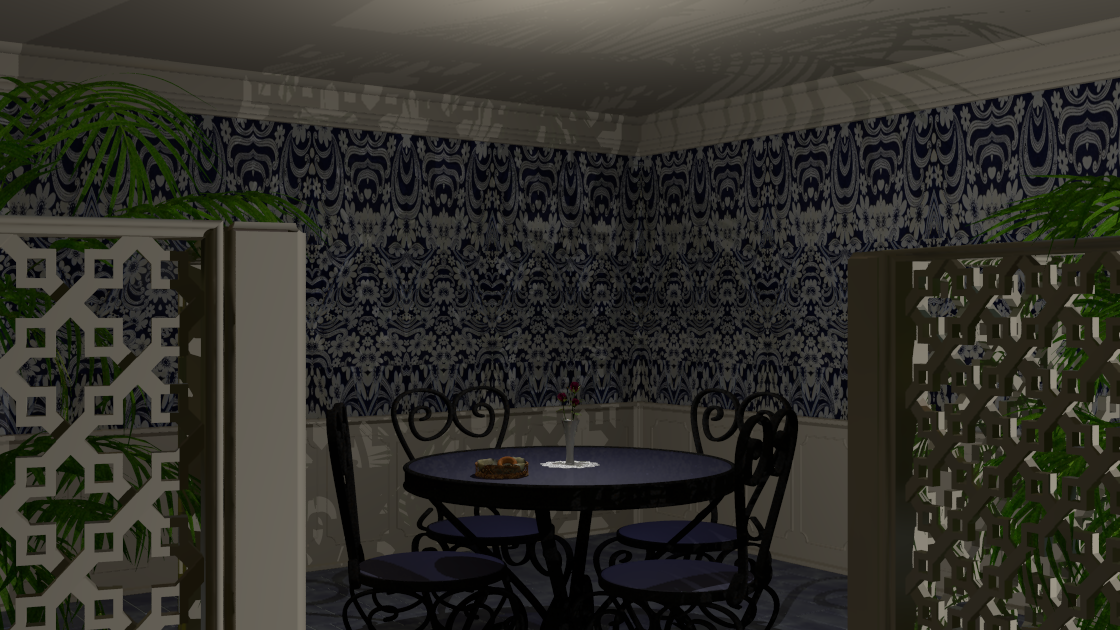
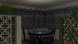
Well here's a follow up in a blue direction ... Still unsettled on
objects on the table, and I'm working on a hanging or maybe a ceiling
light for the fill light that's directly over the table.
Post a reply to this message
Attachments:
Download 'work.png' (794 KB)
Preview of image 'work.png'
|
|
| |
| |
|
|
|
|
| |
| |
|
|
On 13/02/2012 11:31 PM, James Holsenback wrote:
> Well here's a follow up in a blue direction ... Still unsettled on
> objects on the table, and I'm working on a hanging or maybe a ceiling
> light for the fill light that's directly over the table.

Ah! Just the place for a romantic acid trip. :-P

I suggest, a softer wallpaper pattern, softer shadows and throw out that
bagel it must be stale by now. ;-)
I like the composition and all the individual components but the
wallpaper kills it IMO. Send in Chef Ramsay. (BTW why do Americans call
him Chef Ramsay when his first name is Gordon?)
How about some subtle texture on the ceiling as well as a ceiling light,
maybe an art nouveau glass one. That would go with the fretwork screen
divider, I think.


--
Regards
     Stephen
Post a reply to this message
|
|
| |
| |
|
|
|
|
| |
| |
|
|
On 14-2-2012 1:13, Stephen wrote:
> On 13/02/2012 11:31 PM, James Holsenback wrote:
>> Well here's a follow up in a blue direction ... Still unsettled on
>> objects on the table, and I'm working on a hanging or maybe a ceiling
>> light for the fill light that's directly over the table.
>
> Ah! Just the place for a romantic acid trip. :-P
>
> I suggest, a softer wallpaper pattern, softer shadows and throw out that
> bagel it must be stale by now. ;-)
> I like the composition and all the individual components but the
> wallpaper kills it IMO. Send in Chef Ramsay. (BTW why do Americans call
> him Chef Ramsay when his first name is Gordon?)
> How about some subtle texture on the ceiling as well as a ceiling light,
> maybe an art nouveau glass one. That would go with the fretwork screen
> divider, I think.
>
>
I agree with Stephen about the wallpaper. I would prefer a more faded
one. Do you have an uv_mapping problem there? the pattern seems to
expand upwards which is a bit disturbing imo.

I seem to recognize the fretwork of the screen... some old, old macro by
a long-gone pover...? not Arabeske, but another one... I got a couple of
images: laticework, but by whom?

Thomas
Post a reply to this message
|
|
| |
| |
|
|
|
|
| |
| |
|
|
On 14-2-2012 9:06, Thomas de Groot wrote:

> I seem to recognize the fretwork of the screen... some old, old macro by
> a long-gone pover...? not Arabeske, but another one... I got a couple of
> images: laticework, but by whom?

Got it (I think): Stephen Lenehan, 1999!  :)

Thomas
Post a reply to this message
|
|
| |
| |
|
|
|
|
| |
| |
|
|
Thomas de Groot <tho### [at] degroot org> wrote:
> On 14-2-2012 9:06, Thomas de Groot wrote:
>
> > I seem to recognize the fretwork of the screen... some old, old macro by
> > a long-gone pover...? not Arabeske, but another one... I got a couple of
> > images: laticework, but by whom?
>
> Got it (I think): Stephen Lenehan, 1999! :)
I don't know if you're familiar with the UK TV quiz show Mastermind, but if you
were a contestant, your specialist subject would surely be "Notable POV-Ray
Include Files and Macros 1990-Present". org> wrote:
> On 14-2-2012 9:06, Thomas de Groot wrote:
>
> > I seem to recognize the fretwork of the screen... some old, old macro by
> > a long-gone pover...? not Arabeske, but another one... I got a couple of
> > images: laticework, but by whom?
>
> Got it (I think): Stephen Lenehan, 1999! :)
I don't know if you're familiar with the UK TV quiz show Mastermind, but if you
were a contestant, your specialist subject would surely be "Notable POV-Ray
Include Files and Macros 1990-Present".
Post a reply to this message
|
|
| |
| |
|
|
|
|
| |
| |
|
|
On 14/02/2012 9:11 AM, Bill Pragnell wrote:
> Thomas de Groot<tho### [at] degrootorg>  wrote:
>> On 14-2-2012 9:06, Thomas de Groot wrote:
>>
>>> I seem to recognize the fretwork of the screen... some old, old macro by
>>> a long-gone pover...? not Arabeske, but another one... I got a couple of
>>> images: laticework, but by whom?
>>
>> Got it (I think): Stephen Lenehan, 1999!  :)
>
> I don't know if you're familiar with the UK TV quiz show Mastermind, but if you
> were a contestant, your specialist subject would surely be "Notable POV-Ray
> Include Files and Macros 1990-Present".
>
>

LOL True. :-)

--
Regards
     Stephen
Post a reply to this message
|
|
| |
| |
|
|
|
|
| |
| |
|
|
On 02/14/2012 03:26 AM, Thomas de Groot wrote:
> On 14-2-2012 9:06, Thomas de Groot wrote:
>
>> I seem to recognize the fretwork of the screen... some old, old macro by
>> a long-gone pover...? not Arabeske, but another one... I got a couple of
>> images: laticework, but by whom?
>
> Got it (I think): Stephen Lenehan, 1999! :)

Correct ... give the man a Cheroot ;-)
Post a reply to this message
|
|
| |
| |
|
|
|
|
| |
| |
|
|
On 14-2-2012 10:11, Bill Pragnell wrote:
> Thomas de Groot<tho### [at] degrootorg>  wrote:
>> On 14-2-2012 9:06, Thomas de Groot wrote:
>>
>>> I seem to recognize the fretwork of the screen... some old, old macro by
>>> a long-gone pover...? not Arabeske, but another one... I got a couple of
>>> images: laticework, but by whom?
>>
>> Got it (I think): Stephen Lenehan, 1999!  :)
>
> I don't know if you're familiar with the UK TV quiz show Mastermind, but if you
> were a contestant, your specialist subject would surely be "Notable POV-Ray
> Include Files and Macros 1990-Present".
>
>

LOL Indeed! I have a fairly good visual memory and... a growing
collection of includes since the 90's, of which I try to keep also a
rendered image. It is not very systematic, only those that I find
interesting and potentially useful, otherwise I would surpass Ken
Tyler's collection surely (if that is still available though).

Thomas
Post a reply to this message
|
|
| |
| |
|
|
|
|
| |
| |
|
|
On 14-2-2012 12:42, James Holsenback wrote:
> On 02/14/2012 03:26 AM, Thomas de Groot wrote:
>> On 14-2-2012 9:06, Thomas de Groot wrote:
>>
>>> I seem to recognize the fretwork of the screen... some old, old macro by
>>> a long-gone pover...? not Arabeske, but another one... I got a couple of
>>> images: laticework, but by whom?
>>
>> Got it (I think): Stephen Lenehan, 1999! :)
>
> Correct ... give the man a Cheroot ;-)
>

Mmmm... puff... puff... nice smoke once in a while [cough]

Thomas
Post a reply to this message
|
|
| |
| |
|
|
|
|
| |
| |
|
|
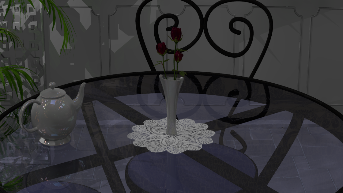
On 02/13/2012 06:31 PM, James Holsenback wrote:
> Well here's a follow up in a blue direction ... Still unsettled on
> objects on the table, and I'm working on a hanging or maybe a ceiling
> light for the fill light that's directly over the table.

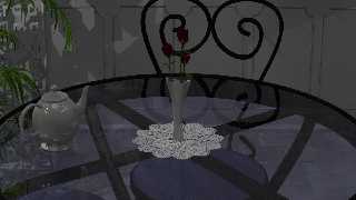
Well since I really suck at those room view (and landscapes for that
matter), I've taken this project in yet another direction.

I'm starting to like where this is going, because what you can't see
(directly) of the environment, you see in the table top. Also the teapot
... it has a bit of irid jazzed up the reflection of my favorite hdr
map. The roses didn't start looking good until I added some sslt to the
petals ... @Stephen translucency <1.4562, 1.4562,0.03325> at mm_per_unit
40 and subsurface { samples 400,40 } (last two params straight out of
subsurface.pov) in the globals block. The key light is very weak (just
enough to cast some shadows) ... I'm letting radiosity (obviously test
quality) and the hdr map do the work.
Post a reply to this message
Attachments:
Download 'work.png' (581 KB)
Preview of image 'work.png'
|
|
| |
| |
|
|
|
|
| |
| |
|
|
Good move! You have increased the subtlety of the scene. Much to look
and wonder at about the environment. I find this much better than the
previous version.

Thomas
Post a reply to this message
|
|
| |
| |
|
|
|
|
| |