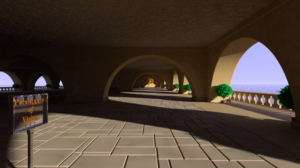
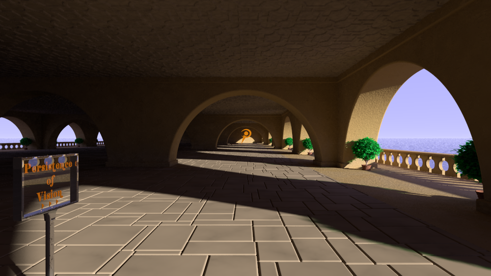
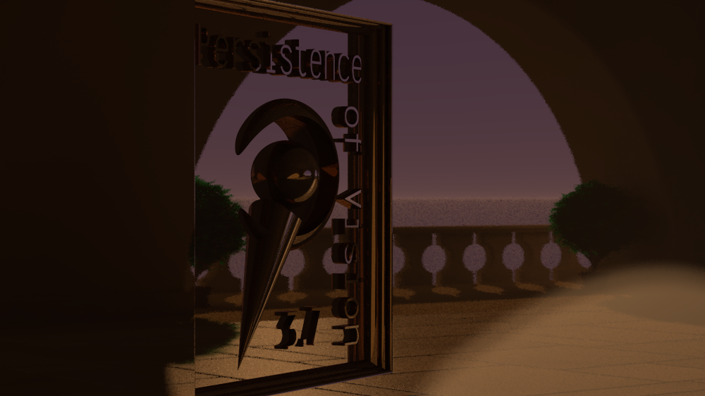
|
|
|
|
|
|
| |
| |
|
|
|
|
| |
| |
|
|
Stephen <mcavoys_at@aoldotcom> wrote:
> On 18/05/2011 10:46 AM, Jim Holsenback wrote:
> > On 05/17/2011 12:24 PM, Stephen wrote:
> >> On 17/05/2011 1:35 AM, Jim Holsenback wrote:
> >>>
> >>> I think I like this set up a bit better ... I see tho that I need to do
> >>> some work on the ceiling in the background structure.
> >>
> >> How about googling "Jacobean ceiling patterns" for some ideas.
> >
> > ah ... I've seen a few of those in my travels, maybe I can find an image
> > to use for a normal map ;-)
>
> I think an actual CSG would be better and give realistic shadows.

A height_field would be much easier, IMO. Maybe the new pavement pattern could
be used. Or, if someone can find a simple black/white solid Jacobean ceiling
pattern to use as a base, I've got a POV image beveling script I wrote a while
back to make chiseled height_field objects. Almost any image will work, so just
say the word I'll get it done :)

~Sam
Post a reply to this message
|
|
| |
| |
|
|
|
|
| |
| |
|
|
"Samuel Benge" <stb### [at] hotmail com> wrote:
> Stephen <mcavoys_at@aoldotcom> wrote:
> > On 18/05/2011 10:46 AM, Jim Holsenback wrote:
> > > On 05/17/2011 12:24 PM, Stephen wrote:
> > >> On 17/05/2011 1:35 AM, Jim Holsenback wrote:
> > >>>
> > >>> I think I like this set up a bit better ... I see tho that I need to do
> > >>> some work on the ceiling in the background structure.
> > >>
> > >> How about googling "Jacobean ceiling patterns" for some ideas.
> > >
> > > ah ... I've seen a few of those in my travels, maybe I can find an image
> > > to use for a normal map ;-)
> >
> > I think an actual CSG would be better and give realistic shadows.
>
> A height_field would be much easier, IMO. Maybe the new pavement pattern could
> be used. Or, if someone can find a simple black/white solid Jacobean ceiling
> pattern to use as a base, I've got a POV image beveling script I wrote a while
> back to make chiseled height_field objects. Almost any image will work, so just
> say the word I'll get it done :)
OK, here's a quick test. I haven't researched the subject much, just found an
image and processed it into a height map. The top one uses constructive
beveling, the bottom one, destructive. Tell me what you think. I can add extra
borders or whatever...
~Sam com> wrote:
> Stephen <mcavoys_at@aoldotcom> wrote:
> > On 18/05/2011 10:46 AM, Jim Holsenback wrote:
> > > On 05/17/2011 12:24 PM, Stephen wrote:
> > >> On 17/05/2011 1:35 AM, Jim Holsenback wrote:
> > >>>
> > >>> I think I like this set up a bit better ... I see tho that I need to do
> > >>> some work on the ceiling in the background structure.
> > >>
> > >> How about googling "Jacobean ceiling patterns" for some ideas.
> > >
> > > ah ... I've seen a few of those in my travels, maybe I can find an image
> > > to use for a normal map ;-)
> >
> > I think an actual CSG would be better and give realistic shadows.
>
> A height_field would be much easier, IMO. Maybe the new pavement pattern could
> be used. Or, if someone can find a simple black/white solid Jacobean ceiling
> pattern to use as a base, I've got a POV image beveling script I wrote a while
> back to make chiseled height_field objects. Almost any image will work, so just
> say the word I'll get it done :)
OK, here's a quick test. I haven't researched the subject much, just found an
image and processed it into a height map. The top one uses constructive
beveling, the bottom one, destructive. Tell me what you think. I can add extra
borders or whatever...
~Sam
Post a reply to this message
Attachments:
Download 'jacobeana.png' (102 KB)
Preview of image 'jacobeana.png'

|
|
| |
| |
|
|
|
|
| |
| |
|
|
Am 20.05.2011 21:13, schrieb Samuel Benge:

> OK, here's a quick test. I haven't researched the subject much, just found an
> image and processed it into a height map. The top one uses constructive
> beveling, the bottom one, destructive. Tell me what you think. I can add extra
> borders or whatever...

Personally I'd prefer the bottom one.

Is it possible to do something in between the two?
Post a reply to this message
|
|
| |
| |
|
|
|
|
| |
| |
|
|
clipka <ano### [at] anonymousorg> wrote:
> Am 20.05.2011 21:13, schrieb Samuel Benge:
>
> > OK, here's a quick test. I haven't researched the subject much, just found an
> > image and processed it into a height map. The top one uses constructive
> > beveling, the bottom one, destructive. Tell me what you think. I can add extra
> > borders or whatever...
>
> Personally I'd prefer the bottom one.
>
> Is it possible to do something in between the two?

Of course :)

The attached uses a few more beveling steps, and combines the two types evenly.
I could make plenty of minute changes to it, but first I need to extend the
pattern for ceiling use.

Sam
Post a reply to this message
Attachments:
Download 'jacobeanb.png' (50 KB)
Preview of image 'jacobeanb.png'

|
|
| |
| |
|
|
|
|
| |
| |
|
|
On 20/05/2011 8:13 PM, Samuel Benge wrote:
> OK, here's a quick test. I haven't researched the subject much, just found an
> image and processed it into a height map. The top one uses constructive
> beveling, the bottom one, destructive. Tell me what you think. I can add extra
> borders or whatever...

Excellent Sam, the combined image is top class.
I had been thinking something more along the lines of
http://www.tinceilingtile.org/wp-content/uploads/2010/10/Decorative-Ceilings.jpg

Or
http://2.bp.blogspot.com/_OthT1uwNPBs/TIriWxVehPI/AAAAAAAACqQ/bGHQ7KaqF7s/s1600/NM1.jpg

For a cloister’s ceiling.

Your work is more suited for an interior as it is so good.


--
Regards
     Stephen
Post a reply to this message
|
|
| |
| |
|
|
|
|
| |
| |
|
|
On 5/21/2011 4:02 AM, Stephen wrote:
> On 20/05/2011 8:13 PM, Samuel Benge wrote:
>> OK, here's a quick test. I haven't researched the subject much, just
>> found an
>> image and processed it into a height map. The top one uses constructive
>> beveling, the bottom one, destructive. Tell me what you think. I can
>> add extra
>> borders or whatever...
>
> Excellent Sam, the combined image is top class.
> I had been thinking something more along the lines of
> http://www.tinceilingtile.org/wp-content/uploads/2010/10/Decorative-Ceilings.jpg
>
> Or
>
http://2.bp.blogspot.com/_OthT1uwNPBs/TIriWxVehPI/AAAAAAAACqQ/bGHQ7KaqF7s/s1600/NM1.jpg
>
> For a cloister’s ceiling.
>
> Your work is more suited for an interior as it is so good.

I'll try making a cloister's ceiling, as it seems more interesting
without being too busy. If it doesn't get included in the scene, I'll
just find some other use for it :)

What's more important at this point? Saving parse time, render time or
memory?

I must say, Jacobean architecture is very nice. Who knows how the
modernist movement ever took hold :S

Sam
Post a reply to this message
|
|
| |
| |
|
|
|
|
| |
| |
|
|
Le 21/05/2011 19:25, stbenge nous fit lire :
>
> What's more important at this point? Saving parse time, render time or
> memory?

Copyright free components, I would guess.
Post a reply to this message
|
|
| |
| |
|
|
|
|
| |
| |
|
|
On 5/21/2011 10:30 AM, Le_Forgeron wrote:
> Le 21/05/2011 19:25, stbenge nous fit lire :
>>
>> What's more important at this point? Saving parse time, render time or
>> memory?
>
> Copyright free components, I would guess.

Hehe, no doubt. I'll be making it from scratch in Illustrator and
POV-Ray, so there /shouldn't/ be a problem...
Post a reply to this message
|
|
| |
| |
|
|
|
|
| |
| |
|
|
On 21/05/2011 6:25 PM, stbenge wrote:
> I'll try making a cloister's ceiling, as it seems more interesting
> without being too busy. If it doesn't get included in the scene, I'll
> just find some other use for it :)
>

That's good of you and as you say it might be useful.

> What's more important at this point? Saving parse time, render time or
> memory?
>

I can't say as I'm not doing the rendering. :-D

> I must say, Jacobean architecture is very nice.

It is isn't it? I always enjoy going round stately homes and castles of
that period.

> Who knows how the
> modernist movement ever took hold :S

I imagine it was just a reaction to what went before.

--
Regards
     Stephen
Post a reply to this message
|
|
| |
| |
|
|
|
|
| |
| |
|
|
On 5/21/2011 10:57 AM, stbenge wrote:
> On 5/21/2011 10:30 AM, Le_Forgeron wrote:
>> Le 21/05/2011 19:25, stbenge nous fit lire :
>>>
>>> What's more important at this point? Saving parse time, render time or
>>> memory?
>>
>> Copyright free components, I would guess.
>
> Hehe, no doubt. I'll be making it from scratch in Illustrator and
> POV-Ray, so there /shouldn't/ be a problem...

Good catch, though. I would have happily continued to use a copyrighted
image without thinking about the consequences... I guess I was still
believing in the "3 changes" rule, which is what we used to do at the
publishing company I worked for. I should look it up; I bet we were
infringing on copyrights, right and left...
Post a reply to this message
|
|
| |
| |
|
|
|
|
| |
| |
|
|
On 05/21/2011 03:15 PM, stbenge wrote:
> On 5/21/2011 10:57 AM, stbenge wrote:
>> On 5/21/2011 10:30 AM, Le_Forgeron wrote:
>>> Le 21/05/2011 19:25, stbenge nous fit lire :
>>>>
>>>> What's more important at this point? Saving parse time, render time or
>>>> memory?
>>>
>>> Copyright free components, I would guess.
>>
>> Hehe, no doubt. I'll be making it from scratch in Illustrator and
>> POV-Ray, so there /shouldn't/ be a problem...
>
> Good catch, though. I would have happily continued to use a copyrighted
> image without thinking about the consequences... I guess I was still
> believing in the "3 changes" rule, which is what we used to do at the
> publishing company I worked for. I should look it up; I bet we were
> infringing on copyrights, right and left...

1st off ... apologies for my lack of response lately as I've been busier
than a one arm wall paper hanger ;-)

after some of the comments on my last post i've started sitting with a
sketch pad when there is a lull in the shop trying to get some different
ideas with the structure ... it's a shame that the courtyard tiles
aren't seen better (looks killer from different view) and now the the
jacobean panel that you've developed ... well hopefully i can come up
with something that will do it justice. forge ahead and i'll do my best
to have something as soon as i can, even if i have to put on a big pot
of coffee and pull and all nighter ... excellent work sam
Post a reply to this message
|
|
| |
| |
|
|
|
|
| |
| |
|
|
On 5/21/2011 10:57 AM, Stephen wrote:
> On 21/05/2011 6:25 PM, stbenge wrote:
>> I'll try making a cloister's ceiling, as it seems more interesting
>> without being too busy. If it doesn't get included in the scene, I'll
>> just find some other use for it :)
>
> That's good of you and as you say it might be useful.

It would be great to have some automatic way to generate the tiles,
complete with floral and geometrical accents.

>> What's more important at this point? Saving parse time, render time or
>> memory?
>
> I can't say as I'm not doing the rendering. :-D

Ah, OK. Maybe Jim will speak up :)

>> Who knows how the
>> modernist movement ever took hold :S
>
> I imagine it was just a reaction to what went before.

What, like people burned out their aesthetic response, and just couldn't
handle the overload anymore? :P Modern architecture is so bleak and
hopeless, sterile and empty. I'd be tempted to find a prime example and
covertly deface it with some bit of fine art :D

Sam
Post a reply to this message
|
|
| |
| |
|
|
|
|
| |
| |
|
|
On Sat, 21 May 2011 19:30:03 +0200, Le_Forgeron <jgr### [at] freefr> wrote:

> Le 21/05/2011 19:25, stbenge nous fit lire :
>>
>> What's more important at this point? Saving parse time, render time or
>> memory?
>
> Copyright free components, I would guess.
>

I would also like to suggest portability (not too large a file). It would
be great if the scene could be included in the samples.

--
-Nekar Xenos-
Post a reply to this message
|
|
| |
| |
|
|
|
|
| |
| |
|
|
On 21/05/2011 7:52 PM, stbenge wrote:
> On 5/21/2011 10:57 AM, Stephen wrote:
>> On 21/05/2011 6:25 PM, stbenge wrote:
>>> I'll try making a cloister's ceiling, as it seems more interesting
>>> without being too busy. If it doesn't get included in the scene, I'll
>>> just find some other use for it :)
>>
>> That's good of you and as you say it might be useful.
>
> It would be great to have some automatic way to generate the tiles,
> complete with floral and geometrical accents.
>

I’ve been thinking about that myself and they are mostly plaster of
Paris put on using a mould then hand painted or gilded.
So for the square lattice type a simple while loop would do. The
paintings in the gaps could be applied separately

>>> Who knows how the
>>> modernist movement ever took hold :S
>>
>> I imagine it was just a reaction to what went before.
>
> What, like people burned out their aesthetic response, and just couldn't
> handle the overload anymore? :P

No, the new generation of artists wanted to do something radically
different.

> Modern architecture is so bleak and
> hopeless, sterile and empty. I'd be tempted to find a prime example and
> covertly deface it with some bit of fine art :D
>

LOL, your idea of modernist is different than mine. I know what you mean
though. In those days artisans and materials came cheap but today there
are so many regulations the buildings have to be built to, Gothic is out
of the reach of everyone.
Still some modern buildings have their own beauty.


--
Regards
     Stephen
Post a reply to this message
|
|
| |
| |
|
|
|
|
| |
| |
|
|
On 5/21/2011 11:48 AM, Jim Holsenback wrote:
> On 05/21/2011 03:15 PM, stbenge wrote:
>> On 5/21/2011 10:57 AM, stbenge wrote:
>>> On 5/21/2011 10:30 AM, Le_Forgeron wrote:
>>>> Le 21/05/2011 19:25, stbenge nous fit lire :
>>>>>
>>>>> What's more important at this point? Saving parse time, render time or
>>>>> memory?
>>>>
>>>> Copyright free components, I would guess.
>>>
>>> Hehe, no doubt. I'll be making it from scratch in Illustrator and
>>> POV-Ray, so there /shouldn't/ be a problem...
>>
>> Good catch, though. I would have happily continued to use a copyrighted
>> image without thinking about the consequences... I guess I was still
>> believing in the "3 changes" rule, which is what we used to do at the
>> publishing company I worked for. I should look it up; I bet we were
>> infringing on copyrights, right and left...
>
> 1st off ... apologies for my lack of response lately as I've been busier
> than a one arm wall paper hanger ;-)

It happens, no apology necessary :)

> after some of the comments on my last post i've started sitting with a
> sketch pad when there is a lull in the shop trying to get some different
> ideas with the structure ...

Sketches are definitely a great way to design a 3D scene. I've got some
weird free-association sketches that would probably make very cool 3D
renders. Some of the best ideas are the ones that are nearly accidental...

> it's a shame that the courtyard tiles
> aren't seen better (looks killer from different view)

I did improve the tile variation since I posted the macro. Long,
straight joints spanning several bricks don't happen as often anymore.
If you want the update, just say the word.

> and now the
> jacobean panel that you've developed ... well hopefully i can come up
> with something that will do it justice.

The one I posted won't be the one used, for copyright reasons. But I'll
come up with something, plus an easy way to tile an area.

> forge ahead and i'll do my best
> to have something as soon as i can, even if i have to put on a big pot
> of coffee and pull and all nighter ... excellent work sam

Thanks. I might just do the same :D

Sam
Post a reply to this message
|
|
| |
| |
|
|
|
|
| |
| |
|
|
On 05/21/2011 04:21 PM, Stephen wrote:
> Still some modern buildings have their own beauty.

yep ... modern-ish in age I suppose (built in 1915). the whole complex
is loaded with eye candy. My son and I (when he was a little shaver)
didn't have too much trouble spending the /whole/ day wandering around.
One of my all time favorites

http://en.wikipedia.org/wiki/Palace_of_Fine_Arts
Post a reply to this message
|
|
| |
| |
|
|
|
|
| |
| |
|
|
On 5/21/2011 11:56 AM, Nekar Xenos wrote:
> On Sat, 21 May 2011 19:30:03 +0200, Le_Forgeron <jgr### [at] freefr> wrote:
>
>> Le 21/05/2011 19:25, stbenge nous fit lire :
>>>
>>> What's more important at this point? Saving parse time, render time or
>>> memory?
>>
>> Copyright free components, I would guess.
>
> I would also like to suggest portability (not too large a file). It
> would be great if the scene could be included in the samples.

Hmm. Well, technically one would only need 1/4 of the original height
map, since it can be copied & mirrored to produce a full tile. Or I
could go the CSG route, which complicates things but keeps the file size
lower.

Sam
Post a reply to this message
|
|
| |
| |
|
|
|
|
| |
| |
|
|
On 5/21/2011 12:21 PM, Stephen wrote:
> On 21/05/2011 7:52 PM, stbenge wrote:
>> On 5/21/2011 10:57 AM, Stephen wrote:
>>> On 21/05/2011 6:25 PM, stbenge wrote:
>>>> Who knows how the
>>>> modernist movement ever took hold :S
>>>
>>> I imagine it was just a reaction to what went before.
>>
>> What, like people burned out their aesthetic response, and just couldn't
>> handle the overload anymore? :P
>
> No, the new generation of artists wanted to do something radically
> different.
>
>> Modern architecture is so bleak and
>> hopeless, sterile and empty. I'd be tempted to find a prime example and
>> covertly deface it with some bit of fine art :D
>
> LOL, your idea of modernist is different than mine. I know what you mean
> though. In those days artisans and materials came cheap but today there
> are so many regulations the buildings have to be built to, Gothic is out
> of the reach of everyone.
> Still some modern buildings have their own beauty.

I was going from what I could find here:
http://en.wikipedia.org/wiki/Modern_architecture and also from the few
buildings I've seen by Frank Lloyd Wright. There are some interesting
ideas spanning many different styles, but by and large, most designs
tend toward the utilitarian (form follows function) and simplistic. But
I won't deny that there /are/ some buildings that manage to be useful
/and/ look good.

As a person who loves detailed art and stylized geometry, I find most
modern architecture boring and just a little soul-destroying.

Sam
Post a reply to this message
|
|
| |
| |
|
|
|
|
| |
| |
|
|
On 21/05/2011 8:58 PM, stbenge wrote:
> I was going from what I could find here:
> http://en.wikipedia.org/wiki/Modern_architecture and also from the few
> buildings I've seen by Frank Lloyd Wright. There are some interesting
> ideas spanning many different styles, but by and large, most designs
> tend toward the utilitarian (form follows function) and simplistic.But
> I won't deny that there /are/ some buildings that manage to be useful
> /and/ look good.
>

Well you are not alone in your views. I could say that you are in the
company of Prince Charles but I'm not that cruel. ;-)
This is a difficult subject to be objective about.
I saw many examples of attractive buildings in the link you posted. But
then I was brought up in Glasgow, a very industrial city in my youth. I
see beauty in lots of industrial settings. I even found the Oil Rigs I
worked on had a strange beauty. The juxtaposition of wind farms against
the beauty of nature is something I find attractive to look at. Even
though I wouldn't want to live there.
I wonder, do you like the music of Bach?

> As a person who loves detailed art and stylized geometry, I find most
> modern architecture boring and just a little soul-destroying.

I do think that most modern housing is an eyesore.

--
Regards
     Stephen
Post a reply to this message
|
|
| |
| |
|
|
|
|
| |
| |
|
|
On 21/05/2011 8:41 PM, Jim Holsenback wrote:
> On 05/21/2011 04:21 PM, Stephen wrote:
>> Still some modern buildings have their own beauty.
>
> yep ... modern-ish in age I suppose (built in 1915). the whole complex
> is loaded with eye candy. My son and I (when he was a little shaver)
> didn't have too much trouble spending the /whole/ day wandering around.
> One of my all time favorites
>
> http://en.wikipedia.org/wiki/Palace_of_Fine_Arts
>
It knocks the Glasgow palace of art into a cocked hat.

http://www.theglasgowstory.com/image.php?inum=TGSE01309&t=1&urltp=story.php?id=TGSFH08


--
Regards
     Stephen
Post a reply to this message
|
|
| |
| |
|
|
|
|
| |
| |
|
|
On Sat, 21 May 2011 21:41:14 +0200, Jim Holsenback <nom### [at] nomailcom>
wrote:

> On 05/21/2011 04:21 PM, Stephen wrote:
>> Still some modern buildings have their own beauty.
>
> yep ... modern-ish in age I suppose (built in 1915). the whole complex
> is loaded with eye candy. My son and I (when he was a little shaver)
> didn't have too much trouble spending the /whole/ day wandering around.
> One of my all time favorites
>
> http://en.wikipedia.org/wiki/Palace_of_Fine_Arts
>

Beautiful. Now I want to go to the US.

--
-Nekar Xenos-
Post a reply to this message
|
|
| |
| |
|
|
|
|
| |
| |
|
|
On 05/21/2011 03:48 PM, Jim Holsenback wrote:
> after some of the comments on my last post i've started sitting with a
> sketch pad when there is a lull in the shop trying to get some different
> ideas with the structure ... it's a shame that the courtyard tiles
> aren't seen better (looks killer from different view) and now the the
> jacobean panel that you've developed ... well hopefully i can come up
> with something that will do it justice. forge ahead and i'll do my best
> to have something as soon as i can, even if i have to put on a big pot
> of coffee and pull and all nighter ... excellent work sam

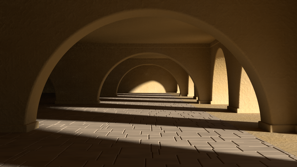
well ... what do y'all think?
Post a reply to this message
Attachments:
Download 'ndi.png' (493 KB)
Preview of image 'ndi.png'
|
|
| |
| |
|
|
|
|
| |
| |
|
|
On Tue, 24 May 2011 00:41:32 +0200, Jim Holsenback <nom### [at] nomailcom>
wrote:

> On 05/21/2011 03:48 PM, Jim Holsenback wrote:
>> after some of the comments on my last post i've started sitting with a
>> sketch pad when there is a lull in the shop trying to get some different
>> ideas with the structure ... it's a shame that the courtyard tiles
>> aren't seen better (looks killer from different view) and now the the
>> jacobean panel that you've developed ... well hopefully i can come up
>> with something that will do it justice. forge ahead and i'll do my best
>> to have something as soon as i can, even if i have to put on a big pot
>> of coffee and pull and all nighter ... excellent work sam
>
> well ... what do y'all think?
>

I love it!

--
-Nekar Xenos-
Post a reply to this message
|
|
| |
| |
|
|
|
|
| |
| |
|
|
On 5/21/2011 1:46 PM, Stephen wrote:
> On 21/05/2011 8:58 PM, stbenge wrote:
>> I was going from what I could find here:
>> http://en.wikipedia.org/wiki/Modern_architecture and also from the few
>> buildings I've seen by Frank Lloyd Wright. There are some interesting
>> ideas spanning many different styles, but by and large, most designs
>> tend toward the utilitarian (form follows function) and simplistic.But
>> I won't deny that there /are/ some buildings that manage to be useful
>> /and/ look good.
>
> Well you are not alone in your views. I could say that you are in the
> company of Prince Charles but I'm not that cruel. ;-)
> This is a difficult subject to be objective about.
> I saw many examples of attractive buildings in the link you posted. But
> then I was brought up in Glasgow, a very industrial city in my youth.

Some of those buildings were just horrible, others were better. My
dislike of modern architecture is probably not going to stop me from
rendering such things in the future, though. I might have already...

> I
> see beauty in lots of industrial settings. I even found the Oil Rigs I
> worked on had a strange beauty.

Yeah. There's this old cement plant nearby, totally industrial. Ugly
stuff, though strangely captivating. A blast to explore simply for its
nightmarish aspect (and the dizzying heights).

> I wonder, do you like the music of Bach?

Somewhat.

>> As a person who loves detailed art and stylized geometry, I find most
>> modern architecture boring and just a little soul-destroying.
>
> I do think that most modern housing is an eyesore.

Especially when the same design is copied over and over, in a big row :(
Post a reply to this message
|
|
| |
| |
|
|
|
|
| |
| |
|
|
Jim Holsenback <nom### [at] nomailcom> wrote:
> On 05/21/2011 03:48 PM, Jim Holsenback wrote:
> > after some of the comments on my last post i've started sitting with a
> > sketch pad when there is a lull in the shop trying to get some different
> > ideas with the structure ... it's a shame that the courtyard tiles
> > aren't seen better (looks killer from different view) and now the the
> > jacobean panel that you've developed ... well hopefully i can come up
> > with something that will do it justice. forge ahead and i'll do my best
> > to have something as soon as i can, even if i have to put on a big pot
> > of coffee and pull and all nighter ... excellent work sam
>
> well ... what do y'all think?

Excellent viewpoint, Jim! Very moody.

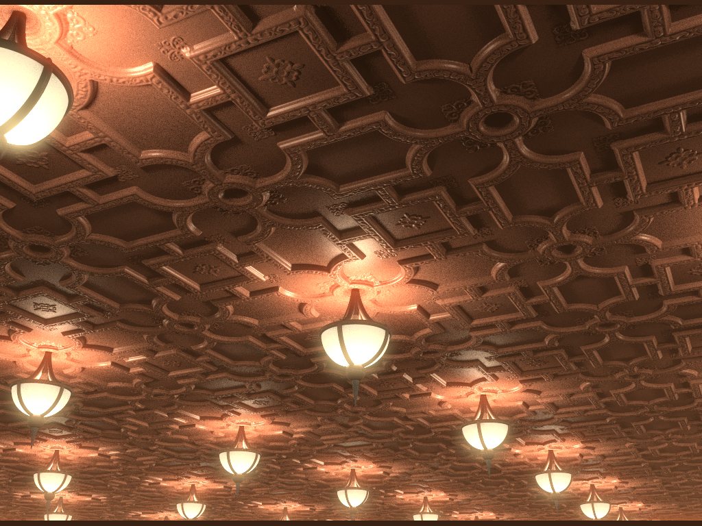
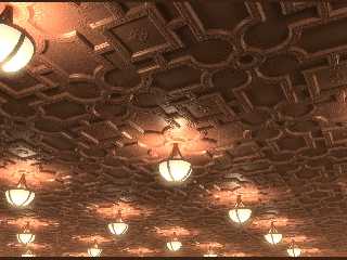
Attached is an example of the ceiling tiles macro (with added lights). The
design was created in Illustrator and beveled with POV. There's probably a good
scene here somewhere...

~Sam
Post a reply to this message
Attachments:
Download 'jacobeanc.jpg' (177 KB)
Preview of image 'jacobeanc.jpg'
|
|
| |
| |
|
|
|
|
| |
| |
|
|
On 24/05/2011 7:47 PM, Samuel Benge wrote:
> Attached is an example of the ceiling tiles macro (with added lights). The
> design was created in Illustrator and beveled with POV. There's probably a good
> scene here somewhere...

Yes!


--
Regards
     Stephen
Post a reply to this message
|
|
| |
| |
|
|
|
|
| |
| |
|
|
On Tue, 24 May 2011 20:39:38 +0200, stbenge <"egnebts
<-inverted"@hotmail.com> wrote:

> On 5/21/2011 1:46 PM, Stephen wrote:
>> On 21/05/2011 8:58 PM, stbenge wrote:
>>> I was going from what I could find here:
>>> http://en.wikipedia.org/wiki/Modern_architecture and also from the few
>>> buildings I've seen by Frank Lloyd Wright. There are some interesting
>>> ideas spanning many different styles, but by and large, most designs
>>> tend toward the utilitarian (form follows function) and simplistic.But
>>> I won't deny that there /are/ some buildings that manage to be useful
>>> /and/ look good.
>>
>> Well you are not alone in your views. I could say that you are in the
>> company of Prince Charles but I'm not that cruel. ;-)
>> This is a difficult subject to be objective about.
>> I saw many examples of attractive buildings in the link you posted. But
>> then I was brought up in Glasgow, a very industrial city in my youth.
>
> Some of those buildings were just horrible, others were better. My
> dislike of modern architecture is probably not going to stop me from
> rendering such things in the future, though. I might have already...
>
>> I
>> see beauty in lots of industrial settings. I even found the Oil Rigs I
>> worked on had a strange beauty.
>
> Yeah. There's this old cement plant nearby, totally industrial. Ugly
> stuff, though strangely captivating. A blast to explore simply for its
> nightmarish aspect (and the dizzying heights).
>
>> I wonder, do you like the music of Bach?
>
> Somewhat.
>
>>> As a person who loves detailed art and stylized geometry, I find most
>>> modern architecture boring and just a little soul-destroying.
>>
>> I do think that most modern housing is an eyesore.
>
> Especially when the same design is copied over and over, in a big row :(
>

I've heard that architects are extremely busy, working long hours. I guess
they don't have time to be creative with all these scyscrapers you need to
be more mathematical than creative...

--
-Nekar Xenos-
Post a reply to this message
|
|
| |
| |
|
|
|
|
| |
| |
|
|
On 5/24/2011 8:50 PM, Nekar Xenos wrote:
> On Tue, 24 May 2011 20:39:38 +0200, stbenge <"egnebts
> <-inverted"@hotmail.com> wrote:
>>>
>>> Well you are not alone in your views. I could say that you are in the
>>> company of Prince Charles but I'm not that cruel. ;-)
>>> This is a difficult subject to be objective about.
>>> I saw many examples of attractive buildings in the link you posted. But
>>> then I was brought up in Glasgow, a very industrial city in my youth.
>>
>> Some of those buildings were just horrible, others were better. My
>> dislike of modern architecture is probably not going to stop me from
>> rendering such things in the future, though. I might have already...
>>
>>> I do think that most modern housing is an eyesore.
>>
>> Especially when the same design is copied over and over, in a big row :(
>
> I've heard that architects are extremely busy, working long hours. I
> guess they don't have time to be creative with all these scyscrapers you
> need to be more mathematical than creative...
>

Lol! Ha... ah, ugh... no. I really for sorry for them :(

I love math, geometry, funny numbers. But set me to work before a large
monolith, and everything great about it becomes nonsense after awhile.
It's easy to forget /why/ you started something, when the end of it
can't be seen, when the reason behind it is dust in contrast against
what's really important.

I guess that's why I don't finish so many projects...

~Sam

Now Playing:
  "Nothing to Say" - Jethro Tull
Post a reply to this message
|
|
| |
| |
|
|
|
|
| |
| |
|
|
> Attached is an example of the ceiling tiles macro (with added lights). The
> design was created in Illustrator and beveled with POV. There's probably a good
> scene here somewhere...
>
> ~Sam

A very nice mood!
;-)
Paolo
Post a reply to this message
|
|
| |
| |
|
|
|
|
| |
| |
|
|
On 24/05/2011 7:39 PM, stbenge wrote:
> Some of those buildings were just horrible, others were better. My
> dislike of modern architecture is probably not going to stop me from
> rendering such things in the future, though. I might have already...
>

The low cost ones are an affront to the sensibilities.

>> I
>> see beauty in lots of industrial settings. I even found the Oil Rigs I
>> worked on had a strange beauty.
>
> Yeah. There's this old cement plant nearby, totally industrial. Ugly
> stuff, though strangely captivating. A blast to explore simply for its
> nightmarish aspect (and the dizzying heights).
>

It is even better to be inside these buildings at night with surreal
lighting.
Before oil rigs piped the gas ashore they flared/burned it off. The
flickering orange light was magic. Quite hypnotic at night.

>> I wonder, do you like the music of Bach?
>
> Somewhat.
>

His work is quite geometric with themes weaving in and out of each
other. Some of them very low frequency rhythms.

>>> As a person who loves detailed art and stylized geometry, I find most
>>> modern architecture boring and just a little soul-destroying.
>>
>> I do think that most modern housing is an eyesore.
>
> Especially when the same design is copied over and over, in a big row :(

I feel sorry for the people who have to live in them.

--
Regards
     Stephen
Post a reply to this message
|
|
| |
| |
|
|
|
|
| |
| |
|
|
On 05/18/2011 11:53 AM, Thomas de Groot wrote:
> "Stephen"<mcavoys_at@aoldotcom>  schreef in bericht
> news:4dd2931f$1@news.povray.org...
>> How about googling "Jacobean ceiling patterns" for some ideas.
>
> That would be nice indeed.
>
> Thomas
>
>
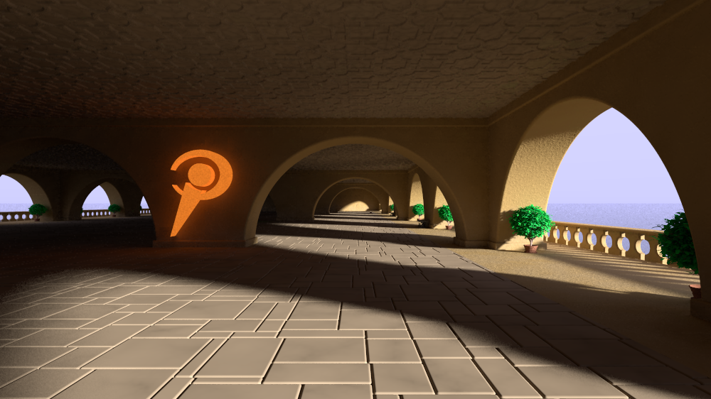
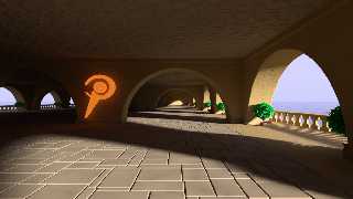
Finally got around to playing with Sams' ceiling tile macro ... I've had
yet another change in camera pose as I was having trouble getting a good
view of the ceiling like it was before. I'm not sure I like the emissive
logo, but it's there as I wasn't able to tune out the radiosity
artifacts any other way. I'm still playing around with a few things but
I think I'm getting close.

Jim
Post a reply to this message
Attachments:
Download 'ndi.png' (553 KB)
Preview of image 'ndi.png'
|
|
| |
| |
|
|
|
|
| |
| |
|
|
On 30/05/2011 2:31 PM, Jim Holsenback wrote:
>>
> Finally got around to playing with Sams' ceiling tile macro ... I've had
> yet another change in camera pose as I was having trouble getting a good
> view of the ceiling like it was before. I'm not sure I like the emissive
> logo, but it's there as I wasn't able to tune out the radiosity
> artifacts any other way. I'm still playing around with a few things but
> I think I'm getting close.

I like that view it is nice and clean. Although I prefer the multi
coloured conical logo. (More 3D IMO)

--
Regards
     Stephen
Post a reply to this message
|
|
| |
| |
|
|
|
|
| |
| |
|
|
"Jim Holsenback" <nom### [at] nomailcom> schreef in bericht
news:4de39c39@news.povray.org...
> I think I'm getting close.

Yes you are. This is very nice indeed. The logo indeed needs finetuning.

Thomas
Post a reply to this message
|
|
| |
| |
|
|
|
|
| |
| |
|
|
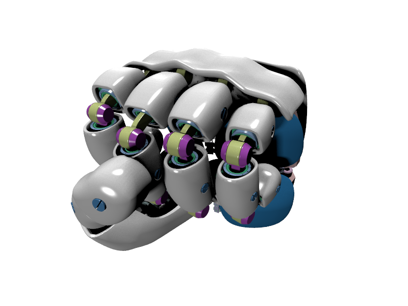
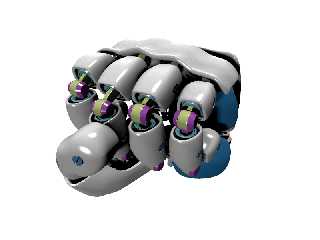
Ok, here my idea (very rough at the moment)

It's a robot hand. I'll work on this over the weekend. Next week, I will load up
the scene file to my blog.

Everyone than can work on this then and help to make it better and better.

Best rgds,
Holger
Post a reply to this message
Attachments:
Download 'povray_01.png' (160 KB)
Preview of image 'povray_01.png'
|
|
| |
| |
|
|
|
|
| |
| |
|
|
On Sat, 04 Jun 2011 05:07:14 +0200, H. Karsten <h-karsten <"web.de>">
wrote:

> Ok, here my idea (very rough at the moment)
>
> It's a robot hand. I'll work on this over the weekend. Next week, I will
> load up
> the scene file to my blog.
>
> Everyone than can work on this then and help to make it better and
> better.
>
> Best rgds,
> Holger
>
Cool!

--
-Nekar Xenos-
Post a reply to this message
|
|
| |
| |
|
|
|
|
| |
| |
|
|
On 05/31/2011 05:05 AM, Thomas de Groot wrote:
> "Jim Holsenback"<nom### [at] nomailcom>  schreef in bericht
> news:4de39c39@news.povray.org...
>> I think I'm getting close.
>
> Yes you are. This is very nice indeed. The logo indeed needs finetuning.
>
> Thomas
>
>
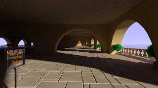
  I've worked on a few thinks, but this post is about needed a bit of
radiosity help. These are the settings I'm using:

pretrace_start 1/16
pretrace_end 1/64
count 256
error_bound 0.256
low_error_factor 0.125
nearest_count 12
gray_threshold 0
normal on

... but as you can see it's still a bit patchy. I don't think count is
the answer and was wondering if what's needed here is in the missing
ingredient ... min/max reuse ... right now it's default.

Any opinions?

Jim
Post a reply to this message
Attachments:
Download 'ndi.png' (540 KB)
Preview of image 'ndi.png'
|
|
| |
| |
|
|
|
|
| |
| |
|
|
Am 06.06.2011 23:20, schrieb Jim Holsenback:

> I've worked on a few thinks, but this post is about needed a bit of
> radiosity help. These are the settings I'm using:
>
> pretrace_start 1/16
> pretrace_end 1/64

I would reduce the pretrace_end...

> count 256

... set count to "256,10000" or some such (not sure whether it will make
much of a difference though)

> error_bound 0.256
> low_error_factor 0.125

... increase the low_error factor (0.5 seems a sane value)...

> nearest_count 12

... and set nearest_count to "20,10" or something alike, to make use of
adaptive pretrace.

> gray_threshold 0
> normal on
>
> .... but as you can see it's still a bit patchy. I don't think count is
> the answer and was wondering if what's needed here is in the missing
> ingredient ... min/max reuse ... right now it's default.

Recently an error has been reported in 3.70RC3 causing noticeable
splotches when using only very few pretrace steps with a high
pretrace_end setting; maybe that's related to what we're seeing here.

Unless you're using the current developers' version, that is. In that
case you're already running with a fix for that error.
Post a reply to this message
|
|
| |
| |
|
|
|
|
| |
| |
|
|
On 06/06/2011 07:50 PM, clipka wrote:
> Am 06.06.2011 23:20, schrieb Jim Holsenback:
>
>> I've worked on a few thinks, but this post is about needed a bit of
>> radiosity help. These are the settings I'm using:
>>
>> pretrace_start 1/16
>> pretrace_end 1/64
>
> I would reduce the pretrace_end...
>
>> count 256
>
> ... set count to "256,10000" or some such (not sure whether it will make
> much of a difference though)
>
>> error_bound 0.256
>> low_error_factor 0.125
>
> ... increase the low_error factor (0.5 seems a sane value)...
>
>> nearest_count 12
>
> ... and set nearest_count to "20,10" or something alike, to make use of
> adaptive pretrace.
>
>> gray_threshold 0
>> normal on
>>
>> .... but as you can see it's still a bit patchy. I don't think count is
>> the answer and was wondering if what's needed here is in the missing
>> ingredient ... min/max reuse ... right now it's default.
>
> Recently an error has been reported in 3.70RC3 causing noticeable
> splotches when using only very few pretrace steps with a high
> pretrace_end setting; maybe that's related to what we're seeing here.
>
> Unless you're using the current developers' version, that is. In that
> case you're already running with a fix for that error.

No I'm running the latest incantation ... initially I'd thought that was
my problem and when it was 1st reported I pulled the fix you'd posted.
Question about pretrace_end ... won't a smaller value make more of the
samples to be gathered in the final pass? I thought it was better to
shoot for having the final pass sample count about half the total. Oh
and thanks for the nudge, I'd forgotten about the adaptive settings for
nearest ... had been bouncing between 12 and 20 so (lol) I guess 20,12
it is then.
Post a reply to this message
|
|
| |
| |
|
|
|
|
| |
| |
|
|
So here my suggestion for a new logo.

In 3 or 4 days you can download the scenefile from
http://lightspeed.byethost24.com/

Enyone feel free to edit this, do some experiments.

Best rgds
Holger
Post a reply to this message
Attachments:
Download 'hand4povray_3.7.png' (410 KB)
Preview of image 'hand4povray_3.7.png'

|
|
| |
| |
|
|
|
|
| |
| |
|
|
Am 07.06.2011 01:40, schrieb Jim Holsenback:

> Question about pretrace_end ... won't a smaller value make more of the
> samples to be gathered in the final pass? I thought it was better to
> shoot for having the final pass sample count about half the total.

No. The smaller the pretrace_end, the higher the density the pretrace
can theoretically produce, and the fewer therefore the spots missed
during pretrace, which need to be sampled in the final pass (i.e. the
render proper).

(Theoretically we'd want the final pass sample count to be zero, but
then we also want the render to finish in our lifetime.)
Post a reply to this message
|
|
| |
| |
|
|
|
|
| |
| |
|
|
Am 07.06.2011 01:51, schrieb H. Karsten:
> So here my suggestion for a new logo.

The "w" in the word "power" is a double "v" ligature, isn't it? :-)

Looks cool. Is that SSLT I'm seeing?
Post a reply to this message
|
|
| |
| |
|
|
|
|
| |
| |
|
|
On 06/06/2011 08:59 PM, clipka wrote:
> Am 07.06.2011 01:40, schrieb Jim Holsenback:
>
>> Question about pretrace_end ... won't a smaller value make more of the
>> samples to be gathered in the final pass? I thought it was better to
>> shoot for having the final pass sample count about half the total.
>
> No. The smaller the pretrace_end, the higher the density the pretrace
> can theoretically produce, and the fewer therefore the spots missed
> during pretrace, which need to be sampled in the final pass (i.e. the
> render proper).
>
> (Theoretically we'd want the final pass sample count to be zero, but
> then we also want the render to finish in our lifetime.)

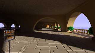
in addition to earlier changes I had to increase count to 384 ... it's
not too darn bad, so I think it's worth the cycles to go to 512 for the
beauty run. btw: I also corrected my (holy crap) spelling error in the sign.
Post a reply to this message
Attachments:
Download 'ndi.png' (520 KB)
Preview of image 'ndi.png'
|
|
| |
| |
|
|
|
|
| |
| |
|
|
I know you only asked about radiosity issues ;)

But I must admit I'm not too fond of the sign and the
logo here, they somehow seem to be artificial intruders in
the environment to me. I liked the earlier logo placement
better. Did you try how the scene looks with sun position
that illuminates the central column so a logo would be
visible without emissive media?

Other ideas might be to paint the logo on the floor
or on the inside of the arc to the right, maybe engrave
text on a floor slab, put up a stone sculpture, or a
mysterious pov-shaped cloud feature in the distance.
Post a reply to this message
|
|
| |
| |
|
|
|
|
| |
| |
|
|
On 06/07/2011 03:50 PM, Christian Froeschlin wrote:
> I know you only asked about radiosity issues ;)

hey ... no that's all good. I was wondering if/when I'd get some
comments about the logo/sign

>
> But I must admit I'm not too fond of the sign and the
> logo here, they somehow seem to be artificial intruders in
> the environment to me. I liked the earlier logo placement
> better. Did you try how the scene looks with sun position
> that illuminates the central column so a logo would be
> visible without emissive media?
>
> Other ideas might be to paint the logo on the floor
> or on the inside of the arc to the right, maybe engrave
> text on a floor slab, put up a stone sculpture, or a
> mysterious pov-shaped cloud feature in the distance.
>

hmmm .. the engrave idea has sparked a notion so I'll try a few things,
as I was also a bit uneasy about the current presentation ... thanks
Post a reply to this message
|
|
| |
| |
|
|
|
|
| |
| |
|
|
Jim Holsenback <nom### [at] nomailcom> wrote:
> On 06/06/2011 08:59 PM, clipka wrote:
> > Am 07.06.2011 01:40, schrieb Jim Holsenback:
> >
> >> Question about pretrace_end ... won't a smaller value make more of the
> >> samples to be gathered in the final pass? I thought it was better to
> >> shoot for having the final pass sample count about half the total.
> >
> > No. The smaller the pretrace_end, the higher the density the pretrace
> > can theoretically produce, and the fewer therefore the spots missed
> > during pretrace, which need to be sampled in the final pass (i.e. the
> > render proper).
> >
> > (Theoretically we'd want the final pass sample count to be zero, but
> > then we also want the render to finish in our lifetime.)
>
> in addition to earlier changes I had to increase count to 384 ... it's
> not too darn bad, so I think it's worth the cycles to go to 512 for the
> beauty run. btw: I also corrected my (holy crap) spelling error in the sign.

Hey Jim,

It's looking good!

Is the water messing with the radiosity? If so--and you don't plan to have
anything reflect in the water--you might be able to use an aoi pattern with a
texture_map, using careful color settings to fake fresnel reflections.

You might also want to try the new version of OTO.inc I dropped in
p.b.scene-files. I improved the size variation of the bricks and trimmed up the
edges.

~Sam
Post a reply to this message
|
|
| |
| |
|
|
|
|
| |
| |
|
|
On 06/07/2011 04:24 PM, Samuel Benge wrote:
> Jim Holsenback<nom### [at] nomailcom>  wrote:
>> On 06/06/2011 08:59 PM, clipka wrote:
>>> Am 07.06.2011 01:40, schrieb Jim Holsenback:
>>>
>>>> Question about pretrace_end ... won't a smaller value make more of the
>>>> samples to be gathered in the final pass? I thought it was better to
>>>> shoot for having the final pass sample count about half the total.
>>>
>>> No. The smaller the pretrace_end, the higher the density the pretrace
>>> can theoretically produce, and the fewer therefore the spots missed
>>> during pretrace, which need to be sampled in the final pass (i.e. the
>>> render proper).
>>>
>>> (Theoretically we'd want the final pass sample count to be zero, but
>>> then we also want the render to finish in our lifetime.)
>>
>> in addition to earlier changes I had to increase count to 384 ... it's
>> not too darn bad, so I think it's worth the cycles to go to 512 for the
>> beauty run. btw: I also corrected my (holy crap) spelling error in the sign.
>
> Hey Jim,
>
> It's looking good!
>
> Is the water messing with the radiosity? If so--and you don't plan to have
> anything reflect in the water--you might be able to use an aoi pattern with a
> texture_map, using careful color settings to fake fresnel reflections.

I've got radiosity importance set low on the water so I don't think I
was the source of my radiosity problems ... since the sun is low I was
wondering how to get it a bit of color, so maybe the aoi pattern/texture
map idea is worth some investigation.

>
> You might also want to try the new version of OTO.inc I dropped in
> p.b.scene-files. I improved the size variation of the bricks and trimmed up the
> edges.

Cool ... I was playing around with the tile scaling then ran into a seq
fault (see my post in beta NG) ... so it'll be interesting to see if
your new take on OTO makes a diff.

Hasta Bye
Post a reply to this message
|
|
| |
| |
|
|
|
|
| |
| |
|
|
On 6/7/2011 12:54 PM, Jim Holsenback wrote:
> On 06/07/2011 04:24 PM, Samuel Benge wrote:
>> Jim Holsenback<nom### [at] nomailcom> wrote:
>>> On 06/06/2011 08:59 PM, clipka wrote:
>>>> Am 07.06.2011 01:40, schrieb Jim Holsenback:
>>>>
>>>>> Question about pretrace_end ... won't a smaller value make more of the
>>>>> samples to be gathered in the final pass? I thought it was better to
>>>>> shoot for having the final pass sample count about half the total.
>>>>
>>>> No. The smaller the pretrace_end, the higher the density the pretrace
>>>> can theoretically produce, and the fewer therefore the spots missed
>>>> during pretrace, which need to be sampled in the final pass (i.e. the
>>>> render proper).
>>>>
>>>> (Theoretically we'd want the final pass sample count to be zero, but
>>>> then we also want the render to finish in our lifetime.)
>>>
>>> in addition to earlier changes I had to increase count to 384 ... it's
>>> not too darn bad, so I think it's worth the cycles to go to 512 for the
>>> beauty run. btw: I also corrected my (holy crap) spelling error in
>>> the sign.
>>
>> Hey Jim,
>>
>> It's looking good!
>>
>> Is the water messing with the radiosity? If so--and you don't plan to
>> have
>> anything reflect in the water--you might be able to use an aoi pattern
>> with a
>> texture_map, using careful color settings to fake fresnel reflections.
>
> I've got radiosity importance set low on the water so I don't think I
> was the source of my radiosity problems ... since the sun is low I was
> wondering how to get it a bit of color, so maybe the aoi pattern/texture
> map idea is worth some investigation.
>
>>
>> You might also want to try the new version of OTO.inc I dropped in
>> p.b.scene-files. I improved the size variation of the bricks and
>> trimmed up the
>> edges.
>
> Cool ... I was playing around with the tile scaling then ran into a seq
> fault (see my post in beta NG) ... so it'll be interesting to see if
> your new take on OTO makes a diff.

It probably won't, and it's not my fault <g> Maybe if you use
superellipsoids instead of rounded boxes, the memory requirement of the
macro will be lower (just a guess).
Post a reply to this message
|
|
| |
| |
|
|
|
|
| |
| |
|
|
> The "w" in the word "power" is a double "v" ligature, isn't it? :-)

I'm astounded how many people noticing this very little thing :)

> Looks cool. Is that SSLT I'm seeing?

Jep - and it's SLOW!!!

Scene-files now online now!
Have fun :)
Post a reply to this message
|
|
| |
| |
|
|
|
|
| |
| |
|
|
On 06/07/2011 10:13 PM, stbenge wrote:
> It probably won't, and it's not my fault <g> Maybe if you use
> superellipsoids instead of rounded boxes, the memory requirement of the
> macro will be lower (just a guess).

Yep ... no difference. The number of parsed tokens sky-rockets when
scaling is less than 0.75 (OTO). I ended up using twice that in this
version.

I /really/ like the reflected view but I'm not so sure about the pose.
The backside illumination on the shrubs turned out cool with the light
at this angle, I also put some specular and a normal on the floor.

Before I decide if I want to develop this approach and further I figured
I'd post to see what kind of reaction I get ;-)

Jim
Post a reply to this message
Attachments:
Download 'ndi.png' (357 KB)
Preview of image 'ndi.png'

|
|
| |
| |
|
|
|
|
| |
| |
|
|
On 4/10/2011 8:38 AM, Le_Forgeron wrote:
> See p.general : a challenge of sorts
>
> Recreating the image (provided scene is free of rights, update&  change
> as you wants)
>
> There is room for improvements.
>
> comment the arealight's line for a very quicker render (but stronger
> shadows)

The scene looks dated, IMO. Maybe we could come up with something new?

--
http://isometricland.com
Post a reply to this message
|
|
| |
| |
|
|
|
|
| |