|
|
|
|
|
|
| |
| |
|
|
|
|
| |
| |
|
|
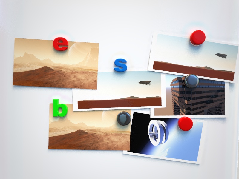
Some postcards from across the universe!

Obviously I don't have enough images yet, so I've duplicated some, but I
thought people might be interested in what I'm working on :)

BTW, I know this sounds like a newbie question but: has anyone got a nice
way to round or bevel the edges on those letters?

For my purposes it would suffice to have a mesh of a nicely rounded font,
but ideally i'd like an all-pov solution which could handle strings of text.
The only option I can think of is to intersect sheared version of the text
object to get a bevel... in fact that would work quite well! I'll do that if
nobody has a better solution!

Comments/criticism appreciated :)
--
Tek
http://evilsuperbrain.com
Post a reply to this message
|
|
| |
| |
|
|
|
|
| |
| |
|
|
"Tek" <tek### [at] evilsuperbrain com> wrote:
> Some postcards from across the universe!
>
> Obviously I don't have enough images yet, so I've duplicated some, but I
> thought people might be interested in what I'm working on :)
>
> BTW, I know this sounds like a newbie question but: has anyone got a nice
> way to round or bevel the edges on those letters?
>
> For my purposes it would suffice to have a mesh of a nicely rounded font,
> but ideally i'd like an all-pov solution which could handle strings of text.
> The only option I can think of is to intersect sheared version of the text
> object to get a bevel... in fact that would work quite well! I'll do that if
> nobody has a better solution!
>
> Comments/criticism appreciated :)
> --
> Tek
> http://evilsuperbrain.com
Oh just typical, not only did I forget to attach the picture but Outlook Express
has somehow lost all trace of the message. So I'm posting this via the web
interface. Grr... com> wrote:
> Some postcards from across the universe!
>
> Obviously I don't have enough images yet, so I've duplicated some, but I
> thought people might be interested in what I'm working on :)
>
> BTW, I know this sounds like a newbie question but: has anyone got a nice
> way to round or bevel the edges on those letters?
>
> For my purposes it would suffice to have a mesh of a nicely rounded font,
> but ideally i'd like an all-pov solution which could handle strings of text.
> The only option I can think of is to intersect sheared version of the text
> object to get a bevel... in fact that would work quite well! I'll do that if
> nobody has a better solution!
>
> Comments/criticism appreciated :)
> --
> Tek
> http://evilsuperbrain.com
Oh just typical, not only did I forget to attach the picture but Outlook Express
has somehow lost all trace of the message. So I'm posting this via the web
interface. Grr...
Post a reply to this message
Attachments:
Download 'stella.jpg' (98 KB)
Preview of image 'stella.jpg'

|
|
| |
| |
|
|
|
|
| |
| |
|
|
> BTW, I know this sounds like a newbie question but: has anyone got a nice
> way to round or bevel the edges on those letters?

Typically, I answered my own question! Here's a simple macro I just bashed
together:

#macro BevelledText( Font, Text, Thickness, AlignH, AlignV, Bevel )
 #local Obj = text { ttf Font Text Thickness, 0 #if ( AlignH )
h_align_center #end #if ( AlignV ) v_align_center #end }
 union {
  object { Obj clipped_by { plane { -z, -Bevel } } }
  intersection {
   #local a=0; #while ( a < 360 )
    object { Obj translate -Bevel*z Shear_Trans(x,y,vrotate(z+x,z*a))
translate z*Bevel }
   #local a=a+45;#end
   //plane { -z, 0 }
   clipped_by { plane { z, Bevel } }
  }
  bounded_by { object { Obj } }
 }
#end

It's not perfect (you can see some glitches in the concave corners) so if
anyone has a better solution I'd like to know :)

--
Tek
http://evilsuperbrain.com
Post a reply to this message
Attachments:
Download 'bevelled.jpg' (32 KB)
Preview of image 'bevelled.jpg'

|
|
| |
| |
|
|
|
|
| |
| |
|
|
On 10/04/2010 7:52 PM, Tek wrote:

>> BTW, I know this sounds like a newbie question but: has anyone got a nice
>> way to round or bevel the edges on those letters?
>>
>> For my purposes it would suffice to have a mesh of a nicely rounded font,
>> but ideally i'd like an all-pov solution which could handle strings of text.
>> The only option I can think of is to intersect sheared version of the text
>> object to get a bevel... in fact that would work quite well! I'll do that if
>> nobody has a better solution!
.

Sounds silly but have you googled “rounded fonts”?
http://www.urbanfonts.com/fonts/rounded-fonts.htm
Nice idea :-D


--

Best Regards,
	Stephen
Post a reply to this message
|
|
| |
| |
|
|
|
|
| |
| |
|
|
Tek wrote:
>
> Comments/criticism appreciated :)

Have you tried a height_field of a blurred image of the letter(s)?
Post a reply to this message
|
|
| |
| |
|
|
|
|
| |
| |
|
|
I mean rounded in the third dimension, not in the 2 dimensions of the font
itself.

And googling for rounded 3d font found lots of 2D fonts with drop shadows...
ho-hum.

--
Tek
http://evilsuperbrain.com

"Stephen" <mca### [at] aolDOTcom> wrote in message
news:4bc0d8d7@news.povray.org...
> On 10/04/2010 7:52 PM, Tek wrote:
>
>>> BTW, I know this sounds like a newbie question but: has anyone got a
>>> nice
>>> way to round or bevel the edges on those letters?
>>>
>>> For my purposes it would suffice to have a mesh of a nicely rounded
>>> font,
>>> but ideally i'd like an all-pov solution which could handle strings of
>>> text.
>>> The only option I can think of is to intersect sheared version of the
>>> text
>>> object to get a bevel... in fact that would work quite well! I'll do
>>> that if
>>> nobody has a better solution!
> .
>
> Sounds silly but have you googled “rounded fonts”?
> http://www.urbanfonts.com/fonts/rounded-fonts.htm
> Nice idea :-D
>
>
> --
>
> Best Regards,
> Stephen
Post a reply to this message
|
|
| |
| |
|
|
|
|
| |
| |
|
|
Considering that I'm trying to make them look like cheap plastic fridge
magnets, a heightfield of a blurred image would probably be a pretty good
simulation of the injection moulding process! I might give that a go :)

--
Tek
http://evilsuperbrain.com

"bart" <bar### [at] homeorg> wrote in message news:4bc0fe2f@news.povray.org...
> Tek wrote:
>>
>> Comments/criticism appreciated :)
>
> Have you tried a height_field of a blurred image of the letter(s)?
Post a reply to this message
|
|
| |
| |
|
|
|
|
| |
| |
|
|
Le 2010-04-10 15:56, Tek a écrit :
>> BTW, I know this sounds like a newbie question but: has anyone got a nice
>> way to round or bevel the edges on those letters?
>
> Typically, I answered my own question! Here's a simple macro I just bashed
> together:
>
> #macro BevelledText( Font, Text, Thickness, AlignH, AlignV, Bevel )
>   #local Obj = text { ttf Font Text Thickness, 0 #if ( AlignH )
> h_align_center #end #if ( AlignV ) v_align_center #end }
>   union {
>    object { Obj clipped_by { plane { -z, -Bevel } } }
>    intersection {
>     #local a=0; #while ( a<  360 )
>      object { Obj translate -Bevel*z Shear_Trans(x,y,vrotate(z+x,z*a))
> translate z*Bevel }
>     #local a=a+45;#end
>     //plane { -z, 0 }
>     clipped_by { plane { z, Bevel } }
>    }
>    bounded_by { object { Obj } }
>   }
> #end
>
> It's not perfect (you can see some glitches in the concave corners) so if
> anyone has a better solution I'd like to know :)
>

It's way beter than the beveled fonts you find as a demo scene that
ships wit POV-Ray... The sample use averaged object patterns.
It should also render faster.


Alain
Post a reply to this message
|
|
| |
| |
|
|
|
|
| |
| |
|
|
"Tek" <tek### [at] evilsuperbraincom> wrote:
> BTW, I know this sounds like a newbie question but: has anyone got a nice
> way to round or bevel the edges on those letters?

Were you aware of the macro Bevelled_Text from shapes.inc?

http://www.povray.org/documentation/view/3.6.1/468/
Post a reply to this message
|
|
| |
| |
|
|
|
|
| |
| |
|
|
"Cousin Ricky" <ric### [at] yahoocom> wrote in message
news:web.4bc124edfef3d34785de7b680@news.povray.org...
>
> Were you aware of the macro Bevelled_Text from shapes.inc?

Hah! I was not. There I go reinventing the wheel... :)

--
Tek
http://evilsuperbrain.com
Post a reply to this message
|
|
| |
| |
|
|
|
|
| |
| |
|
|
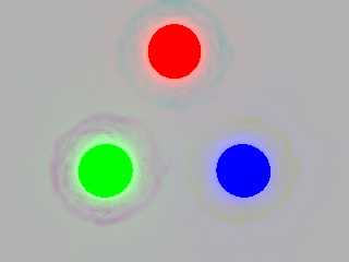
Here's a tweaked version with better radiosity and the aforementioned
bevelling. It looks much better but the radiosity has a strange artefact
around the brightly coloured things.

--
Tek
http://evilsuperbrain.com


"Tek" <tek### [at] evilsuperbraincom> wrote in message
news:4bc0c6f5@news.povray.org...
> Some postcards from across the universe!
>
> Obviously I don't have enough images yet, so I've duplicated some, but I
> thought people might be interested in what I'm working on :)
>
> BTW, I know this sounds like a newbie question but: has anyone got a nice
> way to round or bevel the edges on those letters?
>
> For my purposes it would suffice to have a mesh of a nicely rounded font,
> but ideally i'd like an all-pov solution which could handle strings of
> text.
> The only option I can think of is to intersect sheared version of the text
> object to get a bevel... in fact that would work quite well! I'll do that
> if
> nobody has a better solution!
>
> Comments/criticism appreciated :)
> --
> Tek
> http://evilsuperbrain.com
>
>
Post a reply to this message
Attachments:
Download 'stella.jpg' (100 KB)
Preview of image 'stella.jpg'
|
|
| |
| |
|
|
|
|
| |
| |
|
|
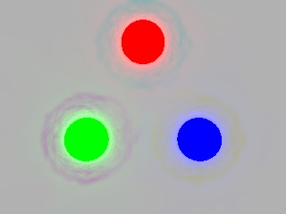
Am 11.04.2010 06:00, schrieb Tek:
> Here's a tweaked version with better radiosity and the aforementioned
> bevelling. It looks much better but the radiosity has a strange artefact
> around the brightly coloured things.

Would you mind posting your scene code (or throwing together a minimal
sample scene showing the effect)? I'd like to have a closer look at that
issue.
Post a reply to this message
|
|
| |
| |
|
|
|
|
| |
| |
|
|
Sure, I've just had a bit of a play with a test scene, here's a really good
example of the artefact:


#include "rad_def.inc"

global_settings {
 assumed_gamma 1
 radiosity { Rad_Settings(Radiosity_IndoorHQ,on,on) }
}

background { rgb .5 }

plane { -z, -1 pigment { rgb 1 } finish { diffuse .9 ambient 0 } }

sphere { vrotate(y*.3+z,0*z), .1 pigment { rgb x } finish { diffuse 0
ambient 4 } }
sphere { vrotate(y*.3+z,120*z), .1 pigment { rgb y } finish { diffuse 0
ambient 4 } }
sphere { vrotate(y*.3+z,240*z), .1 pigment { rgb z } finish { diffuse 0
ambient 4 } }


--
Tek
http://evilsuperbrain.com


"clipka" <ano### [at] anonymousorg> wrote in message
news:4bc1a516$1@news.povray.org...
> Am 11.04.2010 06:00, schrieb Tek:
>> Here's a tweaked version with better radiosity and the aforementioned
>> bevelling. It looks much better but the radiosity has a strange artefact
>> around the brightly coloured things.
>
> Would you mind posting your scene code (or throwing together a minimal
> sample scene showing the effect)? I'd like to have a closer look at that
> issue.
Post a reply to this message
Attachments:
Download 'temp.jpg' (11 KB)
Preview of image 'temp.jpg'
|
|
| |
| |
|
|
|
|
| |
| |
|
|
Le 2010-04-10 22:56, Tek a écrit :
> "Cousin Ricky"<ric### [at] yahoocom>  wrote in message
> news:web.4bc124edfef3d34785de7b680@news.povray.org...
>>
>> Were you aware of the macro Bevelled_Text from shapes.inc?
>
> Hah! I was not. There I go reinventing the wheel... :)
>

You'r version is much beter. Your imperfections are very light compared
to the result from that macro.


Alain
Post a reply to this message
|
|
| |
| |
|
|
|
|
| |
| |
|
|
Le 2010-04-11 08:16, Tek a écrit :
> Sure, I've just had a bit of a play with a test scene, here's a really good
> example of the artefact:
>
>
> #include "rad_def.inc"
>
> global_settings {
>   assumed_gamma 1
>   radiosity { Rad_Settings(Radiosity_IndoorHQ,on,on) }
> }
>
> background { rgb .5 }
>
> plane { -z, -1 pigment { rgb 1 } finish { diffuse .9 ambient 0 } }
>
> sphere { vrotate(y*.3+z,0*z), .1 pigment { rgb x } finish { diffuse 0
> ambient 4 } }
> sphere { vrotate(y*.3+z,120*z), .1 pigment { rgb y } finish { diffuse 0
> ambient 4 } }
> sphere { vrotate(y*.3+z,240*z), .1 pigment { rgb z } finish { diffuse 0
> ambient 4 } }
>
>

With 3.7, I don't see that.

What is strange, is the fact that the artefacts are of the complementary
colour.


Alain
Post a reply to this message
|
|
| |
| |
|
|
|
|
| |
| |
|
|
"Alain" <aze### [at] qwertyorg> wrote in message
news:4bc1d849$1@news.povray.org...
>
> With 3.7, I don't see that.

I get it in both Megapov 1.21 & Povray 3.6. I might try moving over to 3.7
but my scene's probably using a couple of megapov features.

> What is strange, is the fact that the artefacts are of the complementary
> colour.

It's as if it's using negative lighting values.

--
Tek
http://evilsuperbrain.com
Post a reply to this message
|
|
| |
| |
|
|
|
|
| |
| |
|
|
Am 11.04.2010 16:34, schrieb Tek:

> I get it in both Megapov 1.21&  Povray 3.6. I might try moving over to 3.7
> but my scene's probably using a couple of megapov features.

Um, sorry... I'm so focused on POV-Ray 3.7 that it didn't even cross my
mind that you may still be using 3.6. >_<

>> What is strange, is the fact that the artefacts are of the complementary
>> colour.
>
> It's as if it's using negative lighting values.

It is indeed! Thanks for pointing me in the right direction, that did
ring a bell:

At each radiosity sample location, POV-Ray 3.6 does not only compute the
total incoming diffuse illumination, but also tries to guesstimate the
illumination /gradient/ at that point.

I had always been suspicious of that mechanism's implementation, though
I never managed to demonstrate its bogosity with a sample scene. On the
other hand I couldn't make out any noticeable benefits either, so I
decided to disable it in POV-Ray 3.7, if only to save memory and
processing time.

To verify this theory, I just threw together a patched 3.7.0.beta.36
with the "gradient code" re-enabled, and it did indeed show the very
same complementary-color halos (current official 3.7 betas don't, as
already mentioned in this thread).

Patching POV-Ray 3.6 (or MegaPOV, for that matter) to fix this issue
should be pretty easy: In radiosity.cpp, just delete (or comment out)
the line reading:

     #define RAD_GRADIENT 1

That should be all that's needed.
Post a reply to this message
|
|
| |
| |
|
|
|
|
| |
| |
|
|
Glad I could help :)

I've been meaning to compile povray for a while (so I can make a few
changes), and this might finally give me the excuse I need.

--
Tek
http://evilsuperbrain.com


"clipka" <ano### [at] anonymousorg> wrote in message
news:4bc259cd$1@news.povray.org...
> Am 11.04.2010 16:34, schrieb Tek:
>
>> I get it in both Megapov 1.21&  Povray 3.6. I might try moving over to
>> 3.7
>> but my scene's probably using a couple of megapov features.
>
> Um, sorry... I'm so focused on POV-Ray 3.7 that it didn't even cross my
> mind that you may still be using 3.6. >_<
>
>>> What is strange, is the fact that the artefacts are of the complementary
>>> colour.
>>
>> It's as if it's using negative lighting values.
>
> It is indeed! Thanks for pointing me in the right direction, that did ring
> a bell:
>
> At each radiosity sample location, POV-Ray 3.6 does not only compute the
> total incoming diffuse illumination, but also tries to guesstimate the
> illumination /gradient/ at that point.
>
> I had always been suspicious of that mechanism's implementation, though I
> never managed to demonstrate its bogosity with a sample scene. On the
> other hand I couldn't make out any noticeable benefits either, so I
> decided to disable it in POV-Ray 3.7, if only to save memory and
> processing time.
>
> To verify this theory, I just threw together a patched 3.7.0.beta.36 with
> the "gradient code" re-enabled, and it did indeed show the very same
> complementary-color halos (current official 3.7 betas don't, as already
> mentioned in this thread).
>
> Patching POV-Ray 3.6 (or MegaPOV, for that matter) to fix this issue
> should be pretty easy: In radiosity.cpp, just delete (or comment out) the
> line reading:
>
>     #define RAD_GRADIENT 1
>
> That should be all that's needed.
Post a reply to this message
|
|
| |
| |
|
|
|
|
| |
| |
|
|
"Tek" <tek### [at] evilsuperbraincom> wrote:
> BTW, I know this sounds like a newbie question but: has anyone got a nice
> way to round or bevel the edges on those letters?

I don't think this is quite what you're looking for, but it does round the edges
of text. It would make a smoothly rounded edge if an infinite number of objects
were used. It can be adapted to make concave or other curved edges. It distorts
the outline of the letters, it's incredibly inefficient and can't realistically
make smoothly rounded edges. But I'm sharing it because maybe someone will have
an idea of how to improve it. I think that to do this right would require adding
support for rounding the edges of fonts to the POV-Ray code itself which is far
beyond my ability.

This "X" consists of 361 copies of the "X" object and took almost two hours to
render using version 3.7 with four microprocessors and radiosity recursion_limit
1. Each "layer" of the object is colored differently for demonstration purposes.

The source is posted in the text scene files group.

Regards,
Dave Blandston
Post a reply to this message
Attachments:
Download 'rounded edges.png' (149 KB)
Preview of image 'rounded edges.png'

|
|
| |
| |
|
|
|
|
| |
| |
|
|
"Dave Blandston" <nomail@nomail> wrote:

> I don't think this is quite what you're looking for, but it does round the edges
> of text. It would make a smoothly rounded edge...

Completely off-topic: Your .png image is showing up with different gamma
'values' depending if I look at it's 'preview' image here in the newsgroups vs.
clicking on the image link, to bring it up as a stand-alone image. (I'm using
the latest version of Firefox as my web browser, in both cases.) The preview has
much darker shadows, and more contrast overall. Anyway, I've never seen this
behavior here in the newsgroups before. Kind of a mystery! I can't tell which is
the 'correct' image. Makes me wonder if the newsgroup 'software' is altering the
gamma values of .png images when displaying a preview. OR, whether Firefox
itself has a gamma flaw.

Odd!

Ken
Post a reply to this message
|
|
| |
| |
|
|
|
|
| |
| |
|
|
Kenneth wrote:
> Completely off-topic: Your .png image is showing up with different gamma
> 'values' depending if I look at it's 'preview' image here in the newsgroups vs.
> clicking on the image link, to bring it up as a stand-alone image. (I'm using
> the latest version of Firefox as my web browser, in both cases.) The preview has
> much darker shadows, and more contrast overall. Anyway, I've never seen this
> behavior here in the newsgroups before. Kind of a mystery! I can't tell which is
> the 'correct' image. Makes me wonder if the newsgroup 'software' is altering the
> gamma values of .png images when displaying a preview. OR, whether Firefox
> itself has a gamma flaw.
>
Same here ... I recently switched to Thunderbird for news reader and I
see the same behavior when viewing image in-line (through news reader).
When I bring up the image as an attachment and view it with either eog
(default image viewer on gnome) or save the file and view with gimp they
look the same. Firefox/Thunderbird problem? They DO have common roots
coming from mozilla.

Jim
Post a reply to this message
|
|
| |
| |
|
|
|
|
| |
| |
|
|
"Kenneth" <kdw### [at] earthlinknet> wrote:
> Completely off-topic: Your .png image is showing up with different gamma
> 'values' depending if I look at it's 'preview' image here in the newsgroups vs.
> clicking on the image link, to bring it up as a stand-alone image. (I'm using
> the latest version of Firefox as my web browser, in both cases.) The preview has
> much darker shadows, and more contrast overall. Anyway, I've never seen this
> behavior here in the newsgroups before. Kind of a mystery! I can't tell which is
> the 'correct' image. Makes me wonder if the newsgroup 'software' is altering the
> gamma values of .png images when displaying a preview. OR, whether Firefox
> itself has a gamma flaw.
>
> Odd!
>
> Ken

It's probably something I'm doing wrong - I get an error message about gamma
settings every time I render a scene. One of these days I'll have to figure out
the new settings... I've also noticed that sometimes when I select a POV-Ray
v3.7 generated .png image as a desktop wallpaper for Windows XP the little
preview shows a really washed-out looking image, but then the actual desktop
image looks right.

Regards,
Dave Blandston
Post a reply to this message
|
|
| |
| |
|
|
|
|
| |
| |
|
|
Am 13.04.2010 10:55, schrieb Dave Blandston:

>> Completely off-topic: Your .png image is showing up with different gamma
>> 'values' depending if I look at it's 'preview' image here in the newsgroups vs.
>> clicking on the image link, to bring it up as a stand-alone image. (I'm using
>> the latest version of Firefox as my web browser, in both cases.) The preview has
>> much darker shadows, and more contrast overall. Anyway, I've never seen this
>> behavior here in the newsgroups before. Kind of a mystery! I can't tell which is
>> the 'correct' image. Makes me wonder if the newsgroup 'software' is altering the
>> gamma values of .png images when displaying a preview. OR, whether Firefox
>> itself has a gamma flaw.
>
> It's probably something I'm doing wrong - I get an error message about gamma
> settings every time I render a scene. One of these days I'll have to figure out
> the new settings... I've also noticed that sometimes when I select a POV-Ray
> v3.7 generated .png image as a desktop wallpaper for Windows XP the little
> preview shows a really washed-out looking image, but then the actual desktop
> image looks right.

Your .png file has a gAMA chunk indicating that you set File_Gamma=1.0,
or are using #version 3.6 and assumed_gamma 2.2 (I'm presuming here that
you're using POV-Ray 3.7); while this is not wrong /per se/, it has some
drawbacks:

- You're not taking advantage of /gamma encoding/; as a consequence, at
a depth of 8 bits per color channel you're risking noticeable color
banding in dark areas.

- The images are not inherently /gamma pre-corrected/ for a typical
computer; as a consequence, software that doesn't evaluate the gAMA
chunk will present the midtones /darker/ than they should be (except on
systems calibrated for a non-typical gamma, such as linear gamma).

With POV-Ray 3.7, it is strongly recommended to work without
assumed_gamma, and set File_Gamma=2.2, for any image (or scene, for that
matter) you plan to share with others.

That said, it seems to me that Firefox is doing it right (at least on
systems with a display subsystem gamma of around 2.2): In the case of
this particular file, it is the more washed-out version that is right.
Post a reply to this message
|
|
| |
| |
|
|
|
|
| |
| |
|
|
clipka <ano### [at] anonymousorg> wrote:

> That said, it seems to me that Firefox is doing it right (at least on
> systems with a display subsystem gamma of around 2.2): In the case of
> this particular file, it is the more washed-out version that is right.

I suspected so (although it's kind of hard to tell which one Dave Blandston
intended for us to see; neither one looks *quite* right.) So I've posted a
little comp of both of the images that I see on my own system (both as viewed in
Firefox)--done as simple screen captures, and saved as a jpeg file, which
doesn't --or *shouldn't*--have any embedded gamma. (My apologies to Tek for
co-opting his original message thread with an off-topic image of my own.) This
way, Dave can see what I see. The tonal values of this jpeg image 'match' those
of the original images I saw when using Firefox, on my Windows XP system. In
other words, on my own system everything matches up visually.

The mystery that remains is why the newsgroup 'preview' image should look
different than the downloaded image--since both are being viewed in the same
software at my end (Firefox.) Given that Dave's use of assumed_gamma in POV v3.7
may be wrong, how would that make a difference? The conclusion I reach--in my
best Sherlock Holmes fashion ;-) -- is that POV's newsgroup software (whatever
it is) may not be handling/presenting v3.7 gamma-encoded .png images
correctly(?) in the preview.

Or maybe it's some crazy Windows-specific problem. Anyway, just some thoughts.

Ken
Post a reply to this message
Attachments:
Download 'png_viewing_test.jpg' (91 KB)
Preview of image 'png_viewing_test.jpg'

|
|
| |
| |
|
|
|
|
| |
| |
|
|
clipka <ano### [at] anonymousorg> wrote:
> Your .png file has a gAMA chunk indicating that you set File_Gamma=1.0,
> or are using #version 3.6 and assumed_gamma 2.2 (I'm presuming here that
> you're using POV-Ray 3.7); while this is not wrong /per se/, it has some
> drawbacks:
>
> - You're not taking advantage of /gamma encoding/; as a consequence, at
> a depth of 8 bits per color channel you're risking noticeable color
> banding in dark areas.
>
> - The images are not inherently /gamma pre-corrected/ for a typical
> computer; as a consequence, software that doesn't evaluate the gAMA
> chunk will present the midtones /darker/ than they should be (except on
> systems calibrated for a non-typical gamma, such as linear gamma).
>
> With POV-Ray 3.7, it is strongly recommended to work without
> assumed_gamma, and set File_Gamma=2.2, for any image (or scene, for that
> matter) you plan to share with others.
>
> That said, it seems to me that Firefox is doing it right (at least on
> systems with a display subsystem gamma of around 2.2): In the case of
> this particular file, it is the more washed-out version that is right.

Hi,

I'm using version 3.7 on Windows XP. The darker image is closer to what I
intended (although it's a little too dark due to ineptness on my part). To
correct the gamma issues, I followed the instructions on the Beta page and added
the lines

     display_gamma=1.0
     file_gamma=1.0

to the povray.ini file, and removed "assumed_gamma 2.2" from the scene file.
That seemed to produce the desired result in the render window and the output
file. I know this isn't right either, since you're recommending setting
file_gamma to 2.2. However, when I set file_gamma to 2.2 the image appears
washed-out and I can't seem to fix that by adjusting the scene lighting. Maybe
my video card is set wrong or something.

On my computer:

     Version 3.7
          no assumed_gamma
          display_gamma=1.0
          file_gamma=1.0

seems to produce the same result as

     Version 3.6:
          assumed_gamma 2.2

If I'm not understanding something or doing something wrong I apologize.

Regards,
Dave Blandston
Post a reply to this message
|
|
| |
| |
|
|
|
|
| |
| |
|
|
Hi!

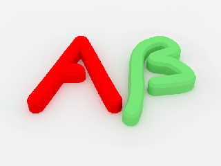
I've been following the discussions on how to bevel te edges of text.
Since I've been playing in my head with this kind of stuff for other
purposes (but never got to actualy make the macro for real), this seemed
to be a good moment to sit down and try the concept.

As a reult, i now have a macro that makes a beveled shape, following a
path defined by a spline. This way one could make letters (anyone has a
libray of splines that are shaped like letters?).

Thing to do: make the width of the shape variable using another spline.
This is needed to make thicker sections of letters.

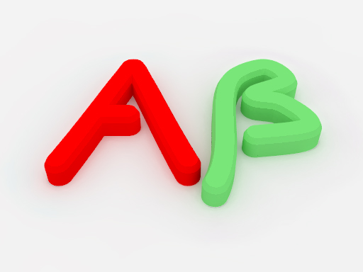
Don't know if it's usefull, just wanted to share it.

Attached is an image of an A (2 splines) and a Beta (1 ugly spline).

Comments and questions are welcome as usual!

JWV


Tek schreef:
> Some postcards from across the universe!
>
> Obviously I don't have enough images yet, so I've duplicated some, but I
> thought people might be interested in what I'm working on :)
>
> BTW, I know this sounds like a newbie question but: has anyone got a nice
> way to round or bevel the edges on those letters?
>
> For my purposes it would suffice to have a mesh of a nicely rounded font,
> but ideally i'd like an all-pov solution which could handle strings of text.
> The only option I can think of is to intersect sheared version of the text
> object to get a bevel... in fact that would work quite well! I'll do that if
> nobody has a better solution!
>
> Comments/criticism appreciated :)
Post a reply to this message
Attachments:
Download 'bevel.jpg' (70 KB)
Preview of image 'bevel.jpg'
|
|
| |
| |
|
|
|
|
| |
| |
|
|
Am 14.04.2010 05:22, schrieb Dave Blandston:

> On my computer:
>
>       Version 3.7
>            no assumed_gamma
>            display_gamma=1.0
>            file_gamma=1.0
>
> seems to produce the same result as
>
>       Version 3.6:
>            assumed_gamma 2.2

Yes, that's to be expected.

Note however that, technically speaking, working with assumed_gamma 2.2
/is/ wrong already, so it's no surprise you need to mess up your
settings to get the expected results.

The officially /right/ way to address the washed-out appearance you see
in 3.7 is to fix all the colors you use in your existing scenes: Raise
all RGB color values (but not transmit or filter) to the power of 2.2
and you should be quite ok with display_gamma=2.2 and file_gamma=2.2 in
3.7. Where that still doesn't match your expectations, you're actually
expecting physically unrealistic results. (For that "X", for instance,
you may need to reduce radiosity brightness to get what you expect.)

For backwards compatibility, using a "#version 3.6" statement and
"assumed_gamma 2.2" should also give you the same results as 3.6, but
this is not recommended for new scenes.
Post a reply to this message
|
|
| |
| |
|
|
|
|
| |
| |
|
|
Am 14.04.2010 11:18, schrieb JWV:

> As a reult, i now have a macro that makes a beveled shape, following a
> path defined by a spline. This way one could make letters (anyone has a
> libray of splines that are shaped like letters?).

How did you do this?
Post a reply to this message
|
|
| |
| |
|
|
|
|
| |
| |
|
|
clipka schreef:
> Am 14.04.2010 11:18, schrieb JWV:
>
>> As a reult, i now have a macro that makes a beveled shape, following a
>> path defined by a spline. This way one could make letters (anyone has a
>> libray of splines that are shaped like letters?).
>
> How did you do this?


I make a mesh that follows the spline, capping the ends with a cylinder
and a cone. The code is still a bit messy, but here it is:

#macro bevel_spline(S1,dd,eps,w,w2,H1, H2)

         #union{

         #mesh{
         #declare ctr = 0;
         #while (ctr < 1-(dd))

           #local dy = S1(ctr+eps).z-S1(ctr).z;
           #local dx = S1(ctr+eps).x-S1(ctr).x;
           #local ds = sqrt(dy*dy+dx*dx);
           #local vt1 = < -dy/ds,0, dx/ds>*sqrt(pow(dx/ds,2)+pow(dy/ds,2));

           #local dy = S1(ctr+dd+eps).z-S1(ctr+dd).z;
           #local dx = S1(ctr+dd+eps).x-S1(ctr+dd).x;
           #local ds = sqrt(dy*dy+dx*dx);
           #local vt2 = < -dy/ds,0, dx/ds>*sqrt(pow(dx/ds,2)+pow(dy/ds,2));

           #local P1 = S1(ctr)+w*vt1;
           #local P2 = S1(ctr)-w*vt1;
           #local P3 = S1(ctr)+(w+w2)*vt1-H1*y;
           #local P4 = S1(ctr)-(w+w2)*vt1-H1*y;
           #local P5 = P3-H2*y;
           #local P6 = P4-H2*y;

           #local P1_ = S1(ctr+dd)+w*vt2;
           #local P2_ = S1(ctr+dd)-w*vt2;
           #local P3_ = S1(ctr+dd)+(w+w2)*vt2-H1*y;
           #local P4_ = S1(ctr+dd)-(w+w2)*vt2-H1*y;
           #local P5_ = P3_-H2*y;
           #local P6_ = P4_-H2*y;


           triangle{P1,P2,P2_  }
           triangle{P1,P1_,P2_ }

           triangle{P1,P1_,P3  }
           triangle{P3_,P1_,P3  }

           triangle{P2,P4,P4_  }
           triangle{P2,P2_,P4_  }

           triangle{P5,P3,P3_  }
           triangle{P5,P5_,P3_  }

           triangle{P6,P4,P4_  }
           triangle{P6,P6_,P4_ }

           triangle{P5,P6,P6_ }
           triangle{P5,P5_,P6_ }

           #declare ctr = ctr + dd;
         #end
         }

         cone{ S1(0)-H1*y,(w+w2),S1(0),(w)}
         cone{ S1(0)-H1*y,(w+w2),S1(0)-(H1+H2)*y,(w+w2)}


         cone{ S1(1)-H1*y,(w+w2),S1(1),(w)}
         cone{ S1(1)-H1*y,(w+w2),S1(1)-(H1+H2)*y,(w+w2)}
         translate H1+H2*y
         }
  #end


object{bevel_spline(S1, 0.001, 0.00002, 0.075, 0.025, 0.05, 0.15)
pigment{Red} finish { diffuse 1 ambient 0 } }
Post a reply to this message
|
|
| |
| |
|
|
|
|
| |
| |
|
|
clipka <ano### [at] anonymousorg> wrote:
> Note however that, technically speaking, working with assumed_gamma 2.2
> /is/ wrong already, so it's no surprise you need to mess up your
> settings to get the expected results.
>
> The officially /right/ way to address the washed-out appearance you see
> in 3.7 is to fix all the colors you use in your existing scenes: Raise
> all RGB color values (but not transmit or filter) to the power of 2.2
> and you should be quite ok with display_gamma=2.2 and file_gamma=2.2 in
> 3.7. Where that still doesn't match your expectations, you're actually
> expecting physically unrealistic results. (For that "X", for instance,
> you may need to reduce radiosity brightness to get what you expect.)

Thank you - I appreciate the advice. That's very helpful. I turned my video
card's gamma setting down from the default setting and POV pictures rendered
with the display_gamma=2.2 and file_gamma=2.2 settings look correct.

Regards,
Dave Blandston
Post a reply to this message
|
|
| |
| |
|
|
|
|
| |
| |
|
|
Le 2010-04-14 05:18, JWV a écrit :
> Hi!
>
> I've been following the discussions on how to bevel te edges of text.
> Since I've been playing in my head with this kind of stuff for other
> purposes (but never got to actualy make the macro for real), this seemed
> to be a good moment to sit down and try the concept.
>
> As a reult, i now have a macro that makes a beveled shape, following a
> path defined by a spline. This way one could make letters (anyone has a
> libray of splines that are shaped like letters?).
>
> Thing to do: make the width of the shape variable using another spline.
> This is needed to make thicker sections of letters.
>
> Don't know if it's usefull, just wanted to share it.
>
> Attached is an image of an A (2 splines) and a Beta (1 ugly spline).
>
> Comments and questions are welcome as usual!
>
> JWV
>
>
>
> Tek schreef:
>> Some postcards from across the universe!
>>
>> Obviously I don't have enough images yet, so I've duplicated some, but
>> I thought people might be interested in what I'm working on :)
>>
>> BTW, I know this sounds like a newbie question but: has anyone got a
>> nice way to round or bevel the edges on those letters?
>>
>> For my purposes it would suffice to have a mesh of a nicely rounded
>> font, but ideally i'd like an all-pov solution which could handle
>> strings of text. The only option I can think of is to intersect
>> sheared version of the text object to get a bevel... in fact that
>> would work quite well! I'll do that if nobody has a better solution!
>>
>> Comments/criticism appreciated :)
>

For the thickness, you can have a 4D vector for your spline. Use the
first 3 components as usual to define the path, and use the 4th one to
define the thickness.

For the path, you have nothing special to do, the last component will be
ignored.
Use Spline[x].t to extract the last component when you set the thickness.


Alain
Post a reply to this message
|
|
| |
| |
|
|
|
|
| |
| |
|
|
Here is another way of rounding edges of fonts. The method isn't very innovative
or elegant but it's proven very versatile and useful and the results come out
okay, at least for simple objects like icons, which is mainly what I use it for.
It involves taking the outline of bezier curves -- exported from Illustrator or
CorelDRAW with a macro -- and using the curve as the path for the well-travelled
connect-the-dots, cones-and-spheres route. The sides are extruded with a
parallel, contour curve. The tricky part is telling the POV macro how to cut out
the holes. I'll post the set of macros when I get a chance.
Post a reply to this message
Attachments:
Download '9.3.png' (214 KB)
Preview of image '9.3.png'

|
|
| |
| |
|
|
|
|
| |
| |
|
|
Am 15.04.2010 13:01, schrieb Stephen Klebs:
> Here is another way of rounding edges of fonts. The method isn't very innovative
> or elegant but it's proven very versatile and useful and the results come out
> okay, at least for simple objects like icons, which is mainly what I use it for.
> It involves taking the outline of bezier curves -- exported from Illustrator or
> CorelDRAW with a macro -- and using the curve as the path for the well-travelled
> connect-the-dots, cones-and-spheres route. The sides are extruded with a
> parallel, contour curve. The tricky part is telling the POV macro how to cut out
> the holes. I'll post the set of macros when I get a chance.

The nagging thing about this all is that TrueType fonts /are/ based on
spline curves...
Post a reply to this message
|
|
| |
| |
|
|
|
|
| |
| |
|
|
> Am 15.04.2010 13:01, schrieb Stephen Klebs:
>> Here is another way of rounding edges of fonts. The method isn't very
>> innovative
>> or elegant but it's proven very versatile and useful and the results come
>> out
>> okay, at least for simple objects like icons, which is mainly what I use
>> it for.
>> It involves taking the outline of bezier curves -- exported from
>> Illustrator or
>> CorelDRAW with a macro -- and using the curve as the path for the
>> well-travelled
>> connect-the-dots, cones-and-spheres route. The sides are extruded with a
>> parallel, contour curve. The tricky part is telling the POV macro how to
>> cut out
>> the holes. I'll post the set of macros when I get a chance.

Ooh that looks nice!

"clipka" <ano### [at] anonymousorg> wrote in message
news:4bc6ff01@news.povray.org...
>
> The nagging thing about this all is that TrueType fonts /are/ based on
> spline curves...

I had the same thought. Surely it wouldn't be hard to patch a text-to-spline
function into pov's code?

Of course, I'm actually a programmer by day so I should really try it
myself, but I just can't be bothered to do any coding outside work!

--
Tek
http://evilsuperbrain.com
Post a reply to this message
|
|
| |
| |
|
|
|
|
| |
| |
|
|
Well the main problem with that is the surface normal is never going to
describe a slope, every ray hits either a vertical or horizontal surface. I
specifically want a very small amount of rounding to add a little highlight
to the edges of my letters. Basically to make them look like plastic fridge
magnets.

I think the best way to improve it would be to shear the object so you get
actual slopes, like my bevels, but then you could combine multiple shear
angles to get a good curve approximation. Though even there you only have a
finite number of angles not a smooth continuous surface.

Anyway, it doesn't really matter, I just want some nice fridge magnets.
Letters are proving too complicated so I'll go with other shapes :)

--
Tek
http://evilsuperbrain.com

"Dave Blandston" <nomail@nomail> wrote in message
news:web.4bc3b90cfef3d347cba3fb0f0@news.povray.org...
> "Tek" <tek### [at] evilsuperbraincom> wrote:
>> BTW, I know this sounds like a newbie question but: has anyone got a nice
>> way to round or bevel the edges on those letters?
>
> I don't think this is quite what you're looking for, but it does round the
> edges
> of text. It would make a smoothly rounded edge if an infinite number of
> objects
> were used. It can be adapted to make concave or other curved edges. It
> distorts
> the outline of the letters, it's incredibly inefficient and can't
> realistically
> make smoothly rounded edges. But I'm sharing it because maybe someone will
> have
> an idea of how to improve it. I think that to do this right would require
> adding
> support for rounding the edges of fonts to the POV-Ray code itself which
> is far
> beyond my ability.
>
> This "X" consists of 361 copies of the "X" object and took almost two
> hours to
> render using version 3.7 with four microprocessors and radiosity
> recursion_limit
> 1. Each "layer" of the object is colored differently for demonstration
> purposes.
>
> The source is posted in the text scene files group.
>
> Regards,
> Dave Blandston
>
Post a reply to this message
|
|
| |
| |
|
|
|
|
| |
| |
|
|
> Surely it wouldn't be hard to patch a text-to-spline
> function into pov's code?

That wouldn't be as simple as it sounds though. Different fonts - TrueType,
OpenType, Postscript, etc. - use different flavors of splines. It's always been
easier for me to just let a vector drawing program do the conversion to cubic
beziers, a beautifully efficient yet precise way of describing curves, and
export from there.  That way, too, you can use any curve not just fonts. What
would be more useful would be if POV could handle cubic beziers more directly in
a tubular shape like sphere sweeps, for example -- rather than having to
subdivide everything first into tiny linear splines and connect the dots. Never
had much luck with sphere_sweep, especially with transparent materials, because
it doesn't play nice with merge and seems to have too much tolerance for gaps.
Post a reply to this message
|
|
| |
| |
|
|
|
|
| |
| |
|
|
Am 17.04.2010 20:01, schrieb Stephen Klebs:
>> Surely it wouldn't be hard to patch a text-to-spline
>> function into pov's code?
>
> That wouldn't be as simple as it sounds though. Different fonts - TrueType,
> OpenType, Postscript, etc. - use different flavors of splines.

Given that POV-Ray only supports TrueType fonts anyway, we'd be talking
about a single spline type only.

While you do advocate Bezier splines (cubic I suppose), that's not
necessarily a contradiction: TrueType uses quadratic B-splines, which
can just as well be expressed in terms of cubic Bezier splines.

And speaking of it, PostScript happens to use cubic Bezier splines
"natively", while OpenType comes in two flavors, which "concidentally"
use the same underlying representation as TrueType and PostScript,
respectively.

So I guess there's no reason why POV-Ray shouldn't grow some feature to
automatically generate splines from fonts.

And yes, you're right: POV-Ray is definitely in lack of consistency
regarding support of spline types:

- b_spline is only available in sphere_sweep
- quadratic_spline is available everywhere /except/ in sphere_sweep
- natural_spline is only available in spline

And last not least, allowing to use predefined splines in sphere_sweep,
prism and lathe would be pretty neat I think (with sphere_sweep
obviously neding either a 4D spline or an additional 1D-spline to
represent radius).

What's really missing in POV-Ray is an internal framework for
consolidating all the spline-based stuff.
Post a reply to this message
|
|
| |
| |
|
|
|
|
| |
| |
|
|
On Sat, 17 Apr 2010 20:58:09 +0200, clipka <ano### [at] anonymousorg> wrote:

> Am 17.04.2010 20:01, schrieb Stephen Klebs:
>>> Surely it wouldn't be hard to patch a text-to-spline
>>> function into pov's code?
>>
>> That wouldn't be as simple as it sounds though. Different fonts -
>> TrueType,
>> OpenType, Postscript, etc. - use different flavors of splines.
>
> Given that POV-Ray only supports TrueType fonts anyway, we'd be talking
> about a single spline type only.
>
> While you do advocate Bezier splines (cubic I suppose), that's not
> necessarily a contradiction: TrueType uses quadratic B-splines, which
> can just as well be expressed in terms of cubic Bezier splines.
>
> And speaking of it, PostScript happens to use cubic Bezier splines
> "natively", while OpenType comes in two flavors, which "concidentally"
> use the same underlying representation as TrueType and PostScript,
> respectively.
>
> So I guess there's no reason why POV-Ray shouldn't grow some feature to
> automatically generate splines from fonts.
>
> And yes, you're right: POV-Ray is definitely in lack of consistency
> regarding support of spline types:
>
> - b_spline is only available in sphere_sweep
> - quadratic_spline is available everywhere /except/ in sphere_sweep
> - natural_spline is only available in spline
>
> And last not least, allowing to use predefined splines in sphere_sweep,
> prism and lathe would be pretty neat I think (with sphere_sweep
> obviously neding either a 4D spline or an additional 1D-spline to
> represent radius).
>
> What's really missing in POV-Ray is an internal framework for
> consolidating all the spline-based stuff.

I really think this should be considered for PovRay 4

--
-Nekar Xenos-

"The spoon is not real"
Post a reply to this message
|
|
| |
| |
|
|
|
|
| |
|
|